
The most 50 valuable charts drawn by Python Part III
Part I: https://medium.com/@benhui.ca/the-most-50-valuable-charts-drawn-by-python-4584d4626e55
Part II: https://medium.com/@benhui.ca/the-most-50-valuable-charts-drawn-by-python-part-ii-39ea11311d89
Setup environment:
import numpy as np
import pandas as pd
import matplotlib as mpl
import matplotlib.pyplot as plt
import seaborn as sns
import warnings
warnings.filterwarnings(action='once')
plt.style.use('seaborn-whitegrid')
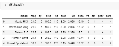
sns.set_style("whitegrid")We use mtcars dataset here: https://gist.github.com/seankross/a412dfbd88b3db70b74b
11. Diverging Bars
x = df.loc[:, ['mpg']]
df['mpg_z'] = (x - x.mean()) / x.std()
df['colors'] = ['red' if x < 0 else 'green' for x in df['mpg_z']]
df.sort_values('mpg_z', inplace=True)
df.reset_index(inplace=True)

# Draw plot
plt.figure(figsize=(10, 6), dpi=80)
plt.hlines(y=df.index,
           xmin=0,
           xmax=df.mpg_z,
           color=df.colors,
           alpha=0.8,
           linewidth=5)

# Decorations
plt.gca().set(ylabel='Model', xlabel='Mileage')
plt.yticks(df.index, df.model, fontsize=12)
plt.xticks(fontsize=12)
plt.title('Diverging Bars of Car Mileage')
plt.grid(linestyle='--', alpha=0.5)
plt.show()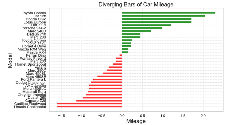
12. Diverging Bars with texts (horizontal)
x = df.loc[:, ['mpg']]
df['mpg_z'] = (x - x.mean())/x.std()
df['colors'] = ['red' if x < 0 else 'green' for x in df['mpg_z']]
df.sort_values('mpg_z', inplace=True)
df.reset_index(inplace=True)

# Draw plot
plt.figure(figsize=(10,8), dpi= 80)
plt.hlines(y=df.index, xmin=0, xmax=df.mpg_z,color=df.colors, alpha=0.8, linewidth=5)
for x, y, tex in zip(df.mpg_z, df.index, df.mpg_z):
    t = plt.text(x, y, round(tex, 2), horizontalalignment='right' if x < 0 else 'left',
                 verticalalignment='center', fontdict={'color':'black' if x < 0 else 'black', 'size':10})

# Decorations
plt.yticks(df.index, df.model, fontsize=12)
plt.xticks(fontsize=10)
plt.title('Diverging Text Bars of Car Mileage', fontdict={'size':15})
plt.grid(linestyle='--', alpha=0.5)
plt.xlim(-2.5, 2.5)
plt.show()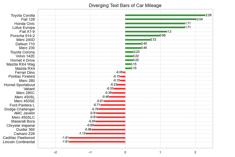
13. Diverging Bars with texts (vertical)
x = df.loc[:, ['mpg']]
df['mpg_z'] = (x - x.mean()) / x.std()
df['colors'] = ['red' if x < 0 else 'green' for x in df['mpg_z']]
df.sort_values('mpg_z', inplace=True)
df.reset_index(inplace=True)

# Draw plot
plt.figure(figsize=(10, 6), dpi=80)
plt.vlines(x=df.index,
           ymin=0,
           ymax=df.mpg_z,
           color=df.colors,
           alpha=0.8,
           linewidth=5)
for y, x, tex in zip(df.mpg_z, df.index, df.mpg_z):
    t = plt.text(x,
                 y+0.2,
                 round(tex, 1),
                 horizontalalignment='center',
                 fontdict={
                     'color': 'black' if x < 0 else 'black',
                     'size': 8
                 })

# Decorations
plt.xticks(df.index, df.model, fontsize=12, rotation=90)
plt.yticks(fontsize=12)
plt.title('Diverging Text Bars of Car Mileage', fontdict={'size': 12})
plt.grid(linestyle='--', alpha=0.5)
plt.show()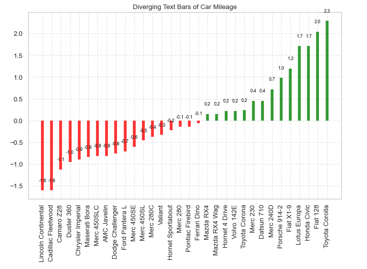
14. Diverging Dot Plot
x = df.loc[:, ['mpg']]
df['mpg_z'] = (x - x.mean()) / x.std()
df['colors'] = ['red' if x < 0 else 'darkgreen' for x in df['mpg_z']]
df.sort_values('mpg_z', inplace=True)
df.reset_index(inplace=True)

# Draw plot
plt.figure(figsize=(12, 10), dpi=80)
plt.scatter(df.mpg_z, df.index, s=250, alpha=.6, color=df.colors)
for x, y, tex in zip(df.mpg_z, df.index, df.mpg_z):
    t = plt.text(x,
                 y,
                 round(tex, 1),
                 horizontalalignment='center',
                 verticalalignment='center',
                 fontdict={'color': 'black','size': '10'})

# Decorations
# Lighten borders
plt.gca().spines["top"].set_alpha(.3)
plt.gca().spines["bottom"].set_alpha(.3)
plt.gca().spines["right"].set_alpha(.3)
plt.gca().spines["left"].set_alpha(.3)

plt.yticks(df.index, df.model,fontsize=10)
plt.xticks(fontsize=10)
plt.title('Diverging Dotplot of Car Mileage', fontdict={'size': 15})
plt.xlabel('Mileage',fontsize=10)
plt.grid(linestyle='--', alpha=0.5)
plt.xlim(-2.5, 2.5)
plt.show()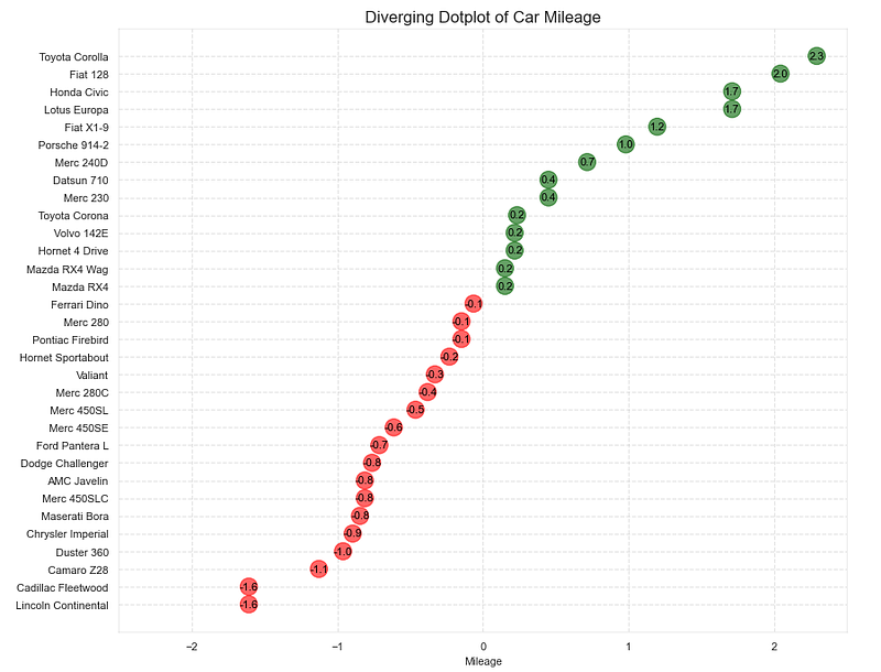
15. Diverging Lollipop Chart with Markers
x = df.loc[:, ['mpg']]
df['mpg_z'] = (x - x.mean()) / x.std()
df['colors'] = 'black'

# color fiat differently
df.loc[df.model == 'Fiat X1-9', 'colors'] = 'darkorange'
df.sort_values('mpg_z', inplace=True)
df.reset_index(inplace=True)

# Draw plot
import matplotlib.patches as patches

plt.figure(figsize=(10, 12), dpi=80)
plt.hlines(y=df.index,
           xmin=0,
           xmax=df.mpg_z,
           color=df.colors,
           alpha=0.4,
           linewidth=1)
plt.scatter(df.mpg_z,
            df.index,
            color=df.colors,
            s=[600 if x == 'Fiat X1-9' else 300 for x in df.model],
            alpha=0.6)
plt.yticks(df.index, df.model)
plt.xticks(fontsize=12)

# Annotate
plt.annotate('Mercedes Models',
             xy=(0.0, 11.0),
             xytext=(1.0, 11),
             xycoords='data',
             fontsize=15,
             ha='center',
             va='center',
             bbox=dict(boxstyle='square', fc='firebrick'),
             arrowprops=dict(arrowstyle='-[, widthB=2.0, lengthB=1.5',
                             lw=2.0,
                             color='steelblue'),
             color='white')

# Add Patches
p1 = patches.Rectangle((-2.0, -1),
                       width=.3,
                       height=3,
                       alpha=.2,
                       facecolor='red')
p2 = patches.Rectangle((1.5, 27),
                       width=.8,
                       height=5,
                       alpha=.2,
                       facecolor='green')
plt.gca().add_patch(p1)
plt.gca().add_patch(p2)
plt.xticks(fontsize=10)
plt.yticks(fontsize=10)

# Decorate
plt.title('Diverging Bars of Car Mileage', fontdict={'size': 15})
plt.grid(linestyle='--', alpha=0.5)
plt.show()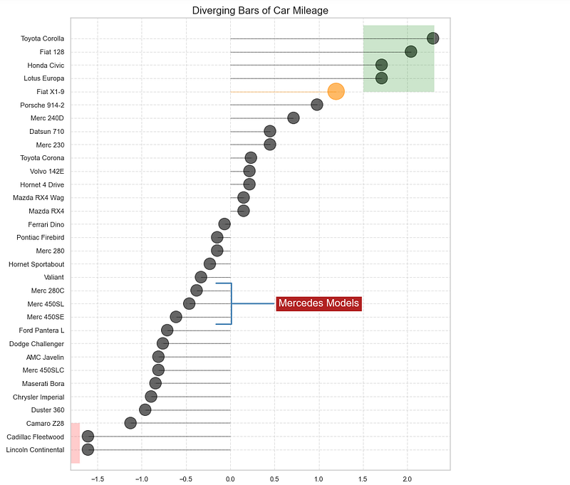
To be continued…
Thank you for reading.