
The Mighty Ellipsis
How 3 little dots can say so much
When I tell people that the ellipsis (…) is the most amazing character ever, most people look at me like I’m crazy. Before you label me a lunatic, let me try to explain.
For decades, interface designers have been using the ellipsis to communicate all sorts of important details to users. As you’ll soon see, these 3 dots can pack quite a lot of meaning in just a little space.
Let’s take a look at 5 different ways ellipses have been used in interface design throughout the years. By the end, you might just develop a newfound appreciation for this mighty little character.
1. Ellipsis = “There’s a follow-up decision”
The first time I remember seeing an ellipsis in an interface was on Windows 3.1. It was my first computer. Ellipses showed up on a few buttons and menu options, and it meant there was a follow-up decision I needed to make after clicking it.
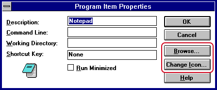
Ellipses were helpful here because it assured me the action wouldn’t happen immediately. I could start the action but then cancel it if I changed my mind.
This ellipsis pattern still exists on Windows and Mac today, but it’s used far less nowadays.
Look at how far we’ve come in 2 decades:

Google’s Material Design guidelines recommend leaving out ellipses from menu items and buttons. It’s probably because many options require a follow-up decision anyway, and using ellipses everywhere would just clutter up the interface.
This ellipsis pattern may be going out of style, but I think it did a noble job of helping people make decisions all these years—and all it took was 3 little dots.
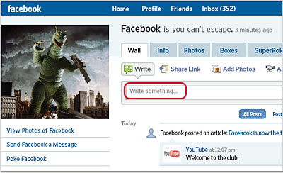
2. Ellipsis = “Type here”
In recent years, many products have been using ellipses to indicate text fields. It’s all the rage nowadays.
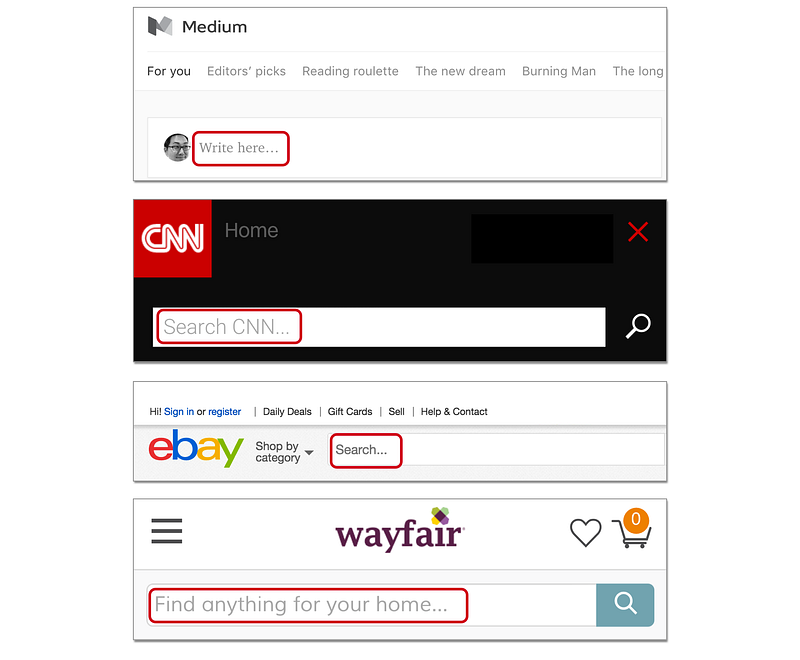
I don’t know who started this trend, but the earliest example I could find is from Facebook in 2008:
Why would someone use an ellipsis like this? My guess is that the ellipsis serves two purposes here:
- Visual effect: Sometimes it’s hard to notice a text field among everything else on the page, so an ellipsis adds visual prominence to the text field. It’s used to catch your attention.
- Psychological effect: Traditionally, an ellipsis indicates an omission of words. It means there’s something missing here. In a way, the ellipsis is nudging you to fill in the blank by entering your own words.
Some style guides even recommend using ellipses for all text fields. See the Salesforce Style Guide as an example. I personally don’t like to use an ellipsis in this way, but it’s clearly catching on as a design trend.
Without much fanfare, the ellipsis has quickly become a symbol for “type here.”
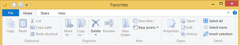
3. Ellipsis = “More actions”
More and more apps are now using a midline ellipsis (⋯) to indicate a menu with more actions. It basically means “Hey, there’s more stuff you can do here.”
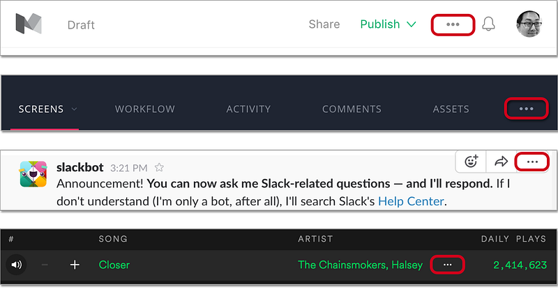
In many Android apps, you’ll often see a vertical ellipsis (⋮) to mean the same thing.

Some people don’t like this design because it might hide important actions in your app. Whether you like this design or not, you can’t deny that this symbol has become a hot trend in UI design — much like the hamburger button from a few years ago.
Back in the day, I bet nobody thought an ellipsis could mean “more actions.” And yet, in recent years, the ellipsis has suddenly taken on this new responsibility, and there’s no turning back now.
As interface designers strive for simplicity, these ellipses will likely become more and more prominent in apps everywhere.
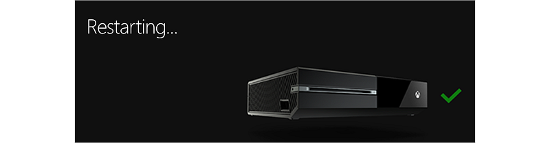
4. Ellipsis = “Wait a few seconds”
Another common use for ellipses is to show that an action is in progress. “Loading…” “Connecting…” “Uploading…” You’ve probably seen this pattern hundreds of times.
Now imagine what would happen if we didn’t use an ellipsis here. Because we’re so used to seeing an ellipsis for ongoing actions, we might think something’s wrong when we don’t see an ellipsis.
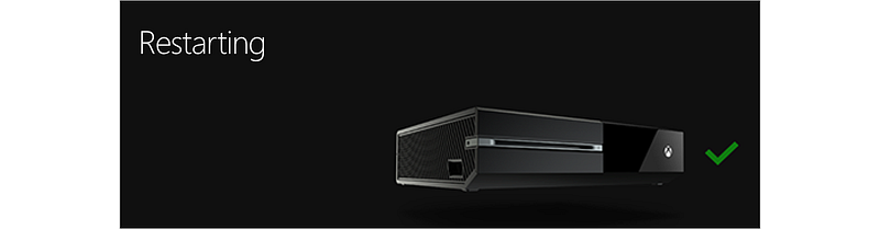
Doesn’t it seem like something’s not right here? At least to my eyes, using an ellipsis reassures me that something is happening in the background. The lack of an ellipsis makes me think something is stuck.
Many design guidelines recommend using an animation if the user needs to wait. But as long as the user only needs to wait a few seconds, I think an ellipsis can be another helpful indicator that the system is doing its thing.
Somehow, using 3 dots at the end of a word assures me that an action is in progress — even though they’re just 3 static dots. Isn’t that amazing?
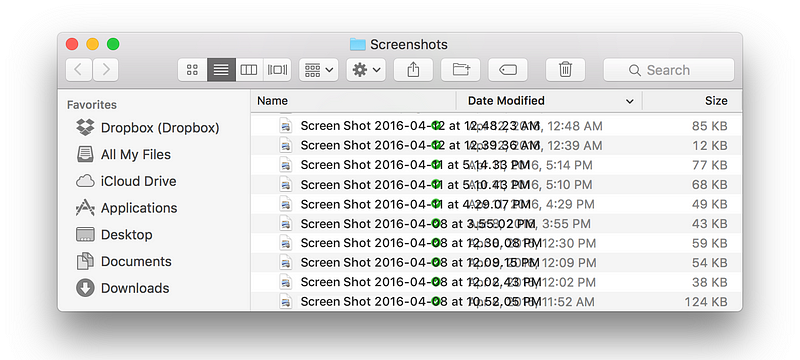
5. Ellipsis = “More characters”
Ellipses are also used to shorten words when the text gets too long. This is called truncation. You’ll often see this when working with long filenames.
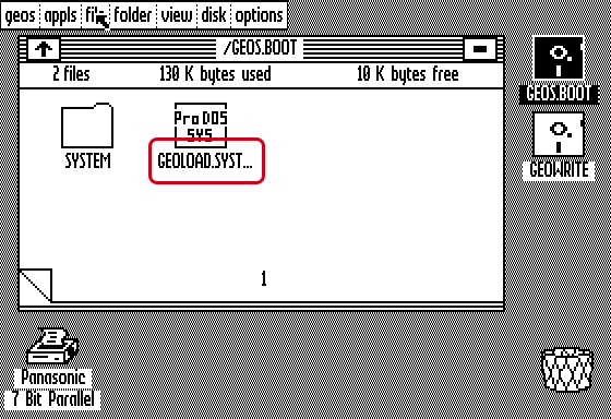
In the early days, long filenames were truncated at the end. Nowadays, many apps and operating systems truncate in the middle, so that you can still see the last few characters. This is smart, because the last few characters are often the most important characters in a filename.
If we didn’t have truncation, we’d have overlapping text all over the place. Thankfully, the ellipsis has come to our rescue, saving our interface from total chaos.
Small but mighty
Now that you’ve seen the many different ways ellipses have been used in interface design, do you agree the ellipsis is the most amazing character ever? I mean, who knew a few little dots could mean so much?
I haven’t even gone into all the wonderful ways ellipses can be used in chats and dialogue text. That’s a story for another day…
The next time you put an ellipsis in your interface, please give it some love for me. It might just be the most underappreciated character in your story.


