
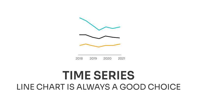
The line chart is always a good choice for your time series data
Incremental Improvements #09: Time series data
This week I decided to makeover a commonly overused chart in a market research field — a stacked column chart for time series. It took me a couple of years and a lot of bad chart choices to come up with the conclusion that the line chart is probably the best and the simplest way of presenting a time series.
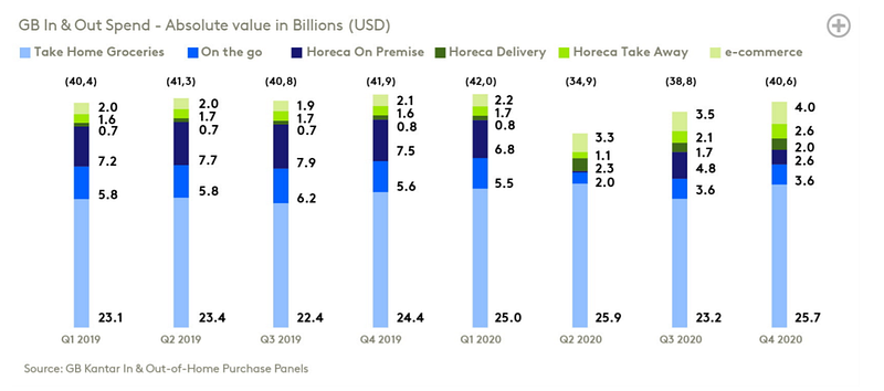
The chart I picked up is from one of the latest Kantar reports and it shows a change in GB spend on six categories over the course of 2 years. The main purpose of the chart is to show the impact of the pandemic on spending patterns as well as how the overall value change. That is why the stacked chart was used but I’ll show you how we can use the line chart to show the same message in a better way.
Original dataviz by Kantar
Good data visualization solutions✔️
Elements that work in this chart
- Horizontal orientation — that allows visualizing time flow in a way that is natural for western culture, which is from left to right. But this is not always the case and researchers have found that the direction of your writing determines how you orient the arrow of time. That’s why it’s worth keeping in mind that people from different cultures might have a different concept of how time flows. For Latin-based cultures, time flows from left to right, Arabic right to left, and Chinese top to bottom.
- Showing absolute values — instead of showing the part of the whole by using the 100% stacked column chart. The only problem is that the lack of a common baseline makes comparing the change over time for categories other than the bottom one laborious.
- Limiting data points — by showing data aggregated to quarters. Thanks to that the overall trend is easier to spot because we have fewer data to analyze. And the main message, that spending drop during the first months of the pandemic, is still delivered.
Bad data visualization choices❌
Elements that don’t work in this chart
- Showing time series as columns —When we have a time series we want to analyze the change between two points. When the data is encoded by length (as in the column chart) we need to check the height of two bars and then compare the difference. But when we have data encoded by position (as in the line chart) and change encoded by the orientation of the line we see the change at a first glance. Additionally, because columns are so visually separated it’s unclear that we are analyzing the time series and big gaps between columns make the height comparison even harder.
- Diverging palette — with the middle point in dark blueish-greenish color. This palette suggests some order of the categories, which doesn’t exist for categorical data. Color choice not only confusing but also poorly legible against a white background (check the first step where I maintain the color selection).
- Lack of common baseline — makes the analysis of change in all categories reserved only for people with exceptional vision. Others have to guess what really happened during the second quarter of 2020.
- Imbalance visual hierarchy — stress the data labels and encourage you to read the values rather than analyze the chart. For that, we might as well only have a table and it would be easier to read because the data for each category would be in a separate row. Another problem is the small chart title which we have to actively look for.
How to make this data visualization better❔
Step-by-step improvements

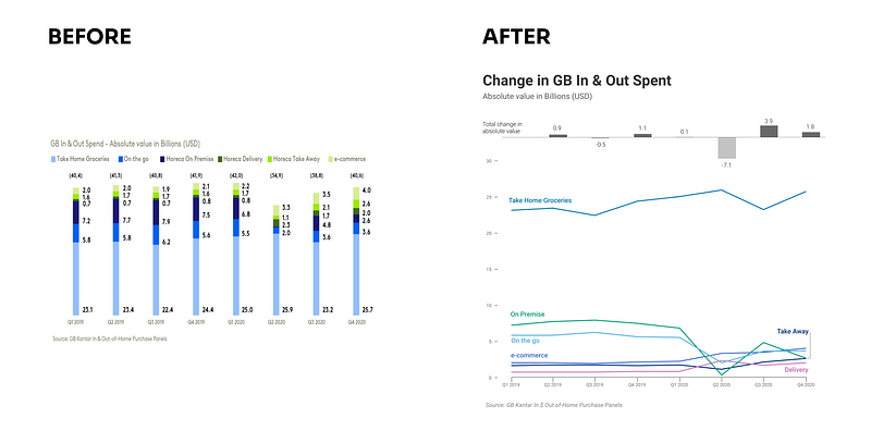
- Switch to line chart — so all categories have the common baseline and are easy to compare. Additionally, by removing the labels we simplified the chart and provide visual clues for analysis rather than numbers.
- Remove legend and adjust colors — Lighter shades of green were barely visible on the stacked chart and after switching to line chart they disappeared completely. Moreover, the palette selection wasn’t adequate for the presented type of scale. Using a categorical palette (palette in which colors don’t have order) suits categorical data better. The next step was removing legend and placing categories’ names close to the lines.
- Provide a context — Switching to a line chart depleted the visualization of information about the overall change. In order to bring this insightful information back, we can add a secondary axis on the right side of the chart, extend the scale and add a line for total, or display it on another chart. I chose the last option and used the deviation column chart to compare the delta between the current and the previous quarter.
- Create visual hierarchy — by emphasizing the important information such as title and de-emphasizing less important information like units. After that, we ended up with an easily noticeable title, a less prominent subtitle that describes the data, well-defined category names, and modest axis marks.
What do you think about these changes? Would you improve something else? If you have some suggestions for the next makeover feel free to drop them in the comments.
Links
- Orginal chart: can be found on page 12 in Kantar report that can be downloaded here
- Mentioned research: Cross-cultural Perspectives on Time
About Incremental Improvements
This is a series dedicated to small changes that can be done in order to make a visual design better. In each post, I analyze the data visualization to see what works, what doesn’t, and what to do to improve it.
You can find the list of all previous makeovers here


