
The Importance of Color Theory in Graphic Design
Color is an essential component of design, and graphic design is no exception. Understanding the principles of color theory is crucial for creating effective designs that capture the attention of the viewer. In this blog post, we’ll discuss the importance of color theory in graphic design, its basic principles, and how you can use it to create visually appealing designs.
What is Color Theory?
Color is an essential element of graphic design that plays a crucial role in capturing the viewer’s attention, conveying a message, and creating an emotional connection. Color theory is the study of how colors interact with each other and how they can be used to create visually appealing designs. In this article, we will discuss what color theory is and why it is so important in graphic design.
What is Color Theory? Color theory is the study of how colors interact with each other and how they can be used to create visually appealing designs. It involves understanding the color wheel, color harmonies, and color psychology to create effective color schemes in designs.
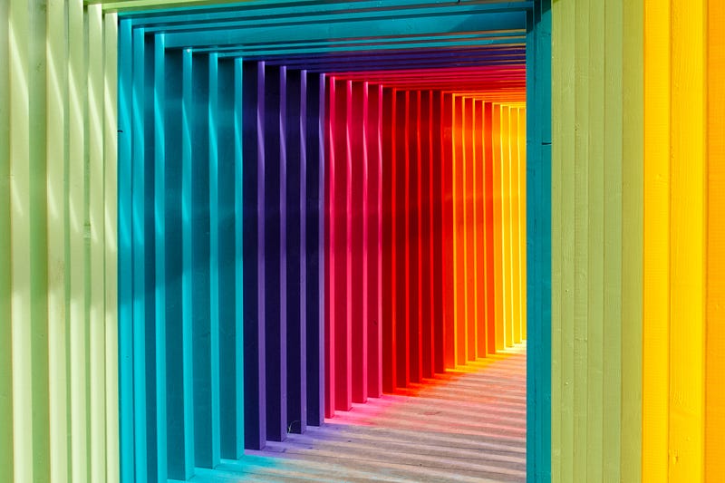
The Color Wheel The color wheel is a visual representation of the relationships between colors. It consists of primary, secondary, and tertiary colors. The primary colors are red, blue, and yellow, and they cannot be created by mixing other colors. The secondary colors are green, purple, and orange, and they are created by mixing two primary colors. Tertiary colors are created by mixing a primary color with a secondary color.
Color Harmonies Color harmonies are combinations of colors that are visually pleasing. There are several color harmonies, including complementary, analogous, triadic, and monochromatic.
Complementary colors are colors that are opposite each other on the color wheel, such as red and green or blue and orange. Using complementary colors in a design creates a high contrast and can be very eye-catching.
Analogous colors are colors that are adjacent to each other on the color wheel, such as blue, blue-green, and green. Analogous color schemes create a sense of harmony and can be used to create a calming effect.
Triadic color schemes use three colors that are evenly spaced around the color wheel, such as red, yellow, and blue. This creates a vibrant and dynamic color scheme.
Monochromatic color schemes use variations of a single color, such as light blue, blue, and dark blue. This creates a cohesive and harmonious design.
Color Psychology Color psychology is the study of how colors affect human behavior and emotions. Different colors can evoke different emotions and feelings in people. For example, red can represent passion and energy, while blue can represent calmness and trustworthiness.
In graphic design, color psychology is used to create a specific mood or feeling in the viewer. For example, a business may use blue in their logo to create a sense of trust and reliability.
Basic Principles of Color Theory
Color theory is a fundamental concept in graphic design that plays a vital role in creating visually appealing and effective designs. Understanding the basic principles of color theory can help designers make informed decisions about color choices, contrast, and color combinations. In this blog post, we will explore the basic principles of color theory and their importance in graphic design.
- Hue, Saturation, and Value The three basic components of color theory are hue, saturation, and value. Hue refers to the actual color, such as red, blue, or yellow. Saturation is the intensity of the color, while value refers to the lightness or darkness of the color. These components are used by designers to create color schemes that evoke different emotions and moods.
- Color Harmony Color harmony refers to the arrangement of colors in a way that is pleasing to the eye. There are several color harmonies that designers can use, including complementary, analogous, and triadic. Complementary colors are opposite each other on the color wheel, while analogous colors are next to each other. Triadic colors form an equilateral triangle on the color wheel.
- Contrast Contrast is the difference between two colors and is used to create visual interest and hierarchy in design. High contrast can make certain elements stand out and draw the viewer’s attention, while low contrast can create a more subdued and subtle effect. Designers must consider the contrast between the background and foreground colors to ensure legibility and readability.
- Color Psychology Color psychology refers to the study of how color affects human behavior and emotions. Different colors can evoke different emotions and moods, making them an essential consideration in graphic design. For example, blue is often associated with trust and stability, while red is associated with energy and passion. Designers must understand the psychological impact of color to effectively convey the message of the design.
Understanding the basic principles of color theory is essential for any graphic designer. The right color choices and combinations can greatly impact the effectiveness and appeal of a design. By using color theory principles, designers can create harmonious, visually interesting, and emotionally resonant designs that effectively communicate their intended message.

The Importance of Color Theory in Graphic Design
Graphic design is all about visual communication, and color is one of the most important tools in a designer’s toolkit. The right color palette can make or break a design, evoking emotion, communicating meaning, and helping to create a cohesive and effective visual message. This is where color theory comes in, providing designers with a set of principles and guidelines to create harmonious and effective color schemes.
Color theory is the study of how colors interact with each other and the human eye. It involves understanding the properties of color, including hue, saturation, and brightness, as well as the psychology behind color perception. By understanding color theory, designers can create color schemes that are visually appealing, communicate the intended message, and enhance the overall design.
So, what are the basic principles of color theory that designers should know? The first principle is the color wheel, which is a visual representation of the relationships between colors. The color wheel consists of three primary colors (red, blue, and yellow), three secondary colors (orange, green, and purple), and six tertiary colors (red-orange, yellow-orange, yellow-green, blue-green, blue-purple, and red-purple). The colors are arranged in a circle, with complementary colors opposite each other and analogous colors adjacent to each other.
Another important principle of color theory is color harmony. Color harmony refers to the way colors interact with each other and create a pleasing visual effect. There are several types of color harmony, including complementary, analogous, triadic, and monochromatic. Complementary colors are opposite each other on the color wheel, such as red and green, and create a bold and vibrant contrast. Analogous colors are adjacent to each other on the color wheel, such as yellow, orange, and red, and create a harmonious and cohesive color scheme. Triadic colors are three colors that are equally spaced on the color wheel, such as red, yellow, and blue, and create a balanced and dynamic color scheme. Monochromatic colors are variations of the same hue, such as light blue, blue, and dark blue, and create a subtle and sophisticated color scheme.
Understanding color theory is essential for effective graphic design because it allows designers to make informed decisions about color selection and use. By creating harmonious and effective color schemes, designers can create visual messages that are memorable, impactful, and engaging.
Color theory can also be used to create specific moods and emotions within a design. For example, warm colors like red, orange, and yellow are often associated with energy, excitement, and warmth, while cool colors like blue, green, and purple are often associated with calmness, serenity, and sophistication. By understanding these associations, designers can create color schemes that convey the intended mood or emotion.
Color theory is an essential tool for graphic designers. It provides a set of principles and guidelines for creating harmonious and effective color schemes that communicate meaning, evoke emotion, and enhance visual communication. By understanding color theory, designers can create impactful and engaging designs that leave a lasting impression on viewers.
How to Use Color Theory in Graphic Design
Color is one of the most important elements in graphic design. It has the power to evoke emotions, convey messages, and create a certain mood or atmosphere. That’s why understanding color theory is crucial for any graphic designer. In this blog post, we’ll explore how to use color theory in graphic design and its importance in creating effective designs.
- Start with a color scheme A color scheme is a selection of colors used in a design project. There are several color schemes to choose from, such as monochromatic, analogous, complementary, and triadic. Each color scheme has its own set of rules and guidelines that can help you create a cohesive design.
- Consider color psychology Color psychology is the study of how colors affect human emotions and behavior. Different colors can evoke different emotions, such as red for passion or anger, blue for calmness or sadness, and green for growth or relaxation. Understanding color psychology can help you choose the right colors to convey the message you want to communicate.
- Use contrast Contrast is the difference between two colors. Using contrasting colors can make elements stand out, create depth, and add visual interest to a design. However, be careful not to use too many contrasting colors, as it can create visual chaos and make the design confusing.
- Pay attention to color temperature Colors can be warm or cool, and this can affect how they are perceived. Warm colors like red, orange, and yellow can evoke feelings of energy, warmth, and happiness. Cool colors like blue, green, and purple can evoke feelings of calmness, serenity, and stability. Consider the mood you want to create and choose colors accordingly.
- Use color as a visual hierarchy Color can also be used to create a visual hierarchy, which is the arrangement of elements in order of importance. Using different colors for different elements can help the viewer navigate the design and understand the message more easily.
- Keep accessibility in mind Accessibility is an important consideration in graphic design. Make sure to choose colors that are legible and can be seen by people with color vision deficiencies. There are online tools available that can help you test the accessibility of your color choices.
In conclusion, color theory is an essential part of graphic design. It can help create an emotional connection with the audience, communicate a message effectively, and make a design stand out. By following these tips, you can use color theory to create visually appealing and effective designs.


