
The Expressive Power of the Scatter Plot
How to Visualize Multidimensional Data in 2D

Introduction
Data visualization is an important aspect of data science that enables its practitioner to obtain a graphical representation of the data at hand, detect anomalies, or recognize patterns and trends. While there are multiple ways of performing graphical data analysis, the scatter plot is a widely known and frequently used tool to visualize relationships among variables.
Although scatter plots typically only display two dimensions, more dimensions can be visualized without the need to add them orthogonally in space. This can be accomplished by leveraging visual attributes such as color, shape, size, or opacity. It is the use of these attributes that we will explore in this article.
Before diving in, it is worth noting that adding a third orthogonal dimension to the plot is certainly possible as well. However, this practice should generally be avoided unless the possibility to interact with the plot exists. The final section in this article elaborates more on this.
Dataset & Preprocessing
The scatter plots below were generated in Python, using the publicly available Auto MPG Data Set [1]. For illustrative purposes, only a random sample of 25% of the full dataset was used here (Table 1).
Let’s say we are most interested in visualizing horsepower as a function of miles per gallon (mpg). Thus, these two columns will serve as our orthogonal dimensions throughout this article. We will then add further dimensions through visual attributes.
2D
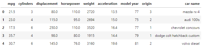
A simple two-dimensional scatter plot of horsepower and mpg already provides us with a significant insight into how these features relate to one another. It reveals an inversely proportional relationship, in which cars with higher mpg tend to have lower horsepower, and vice versa (Fig. 1).
3D
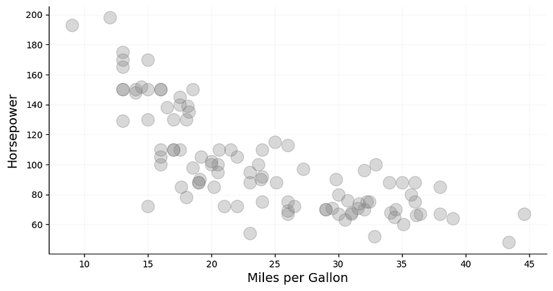
Let’s now add a third dimension in the form of color. For better expressiveness, it would be prudent to choose a dimension with discrete values and relatively low cardinality that makes it easy to visually differentiate among the colors. In our dataset, the column cylinders has only five unique values, which makes it a suitable candidate (Fig. 3).
Adding color as a visual attribute, more information can be extracted from the plot. Perhaps somewhat expectedly, the number of cylinders tends to decrease with decreasing horsepower and rising mpg. This is no surprise as less powerful cars typically contain fewer cylinders and have better fuel efficiency.
4D
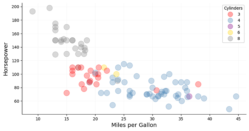
Similar to color, shape is another visual attribute we can add that favors a low-cardinality feature (Fig. 4). In our dataset, origin contains only three unique values, which represent the geographical location in which the cars were manufactured. This information has been label-encoded: 1 stands for USA, 2 for Europe, and 3 for Japan.
Drawing data points with various shapes based on their origin, we have surfaced another interesting trend in this dataset. It appears that the most powerful cars, based on horsepower and cylinders, all originated in the USA. Cars with the best fuel efficiency, on the other hand, come from Japan. European cars are occupying the mid-range and — despite not being significantly more powerful in terms of horsepower— have a lower mpg than Japanese cars. Another insight we can derive from this information is that 3-cylinder cars seem to be predominantly manufactured in the USA.
5D
Now let’s add yet another visual attribute: size. Unlike shape and color, size does not necessarily require the feature values to be discrete. Based on our dataset, weight seems like an appropriate feature that can be expressed by the size of the data points (Fig. 5).
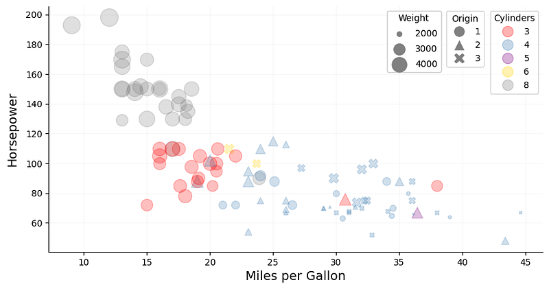
As expected, powerful American cars with low mpg tend to be on the heavier side, while less powerful European and Japanese cars with better fuel efficiency tend to be lighter.
Tip: The weight in this dataset ranges from 1760 to 4952 lbs. When plotting the data using matplotlib, a simple scaling factor is not sufficient to visually express the differences in weight as a data point from a light car would almost have the same size as that of a heavy one. In order to increase that contrast, the data can be scaled using sklearn’s MinMaxScaler. One needs to make sure, however, that the lower range of the transformed data is not zero, as data points with size zero would not be shown on the plot.
6D
Another dimension can be added to the plot by utilizing opacity. Again, we are not bound to discrete values here and can choose a continuous feature such as acceleration for instance. This feature represents the time needed — in seconds — to accelerate from 0–60 mph.
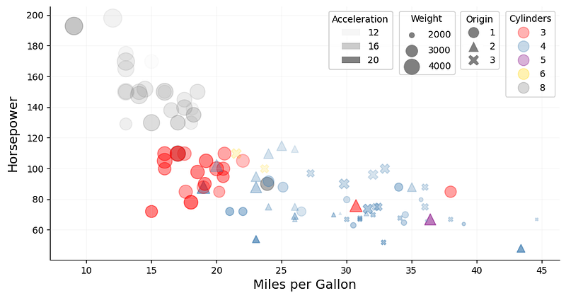
By adding this information to the plot, we can see that many of those powerful American cars require relatively little time to accelerate to 60 mph, whereas their fuel-efficient counterparts take much longer.
Similar to weight above, the acceleration feature was scaled using sklearn’s MinMaxScaler to increase the differences in opacity.
Avoid 3D Scatter Plots
It is technically possible to add a third orthogonal dimension to the plot. However, this is only useful if there is a possibility to interact with the plot and explore the data points that way.
The fundamental problem with 3D scatter plots is that two consecutive data transformations are required: (1) one that maps the data into the 3D visualization space, and (2) one that maps the data from its 3D visualization space into the 2D space of the final figure [2]. Therefore, a 3D plot projected onto two-dimensional space is really only 2.5D, whereby an illusion of depth is created on a flat surface [3]. This often introduces visual distortions and increases the difficulty of interpretability as it is challenging to envision how exactly the data points are distributed in space.
Moreover, if the plot is stationary, data points can easily end up being hidden behind others. While the introduction of opacity could help alleviate this problem, it certainly does not provide an acceptable solution to it.
Conclusion
This article explores how to effectively visualize multidimensional data by utilizing a conventional 2D scatter plot and adding more dimensions in the form of visual attributes. When using color or shape, it is best practice to choose a discrete feature with low cardinality for these attributes, as high-cardinality features can make it difficult to interpret and distinguish the wide variety of colors or shapes in the plot. For continuous features, size and opacity are suitable attributes that can provide additional insights into the data being presented.
Additionally, for continuous features, feature values can be scaled in order to increase the visual variance between lower and higher values.
Finally, it is worth stating that further dimensions can be added using attributes such as hue or texture for instance. However, an increasingly high dimensionality in the plot should be avoided as it can easily overwhelm its observer and thus decrease interpretability.
References
[1] Quinlan, R. (1993). Combining Instance-Based and Model-Based Learning. In Proceedings on the Tenth International Conference of Machine Learning, 236–243, University of Massachusetts, Amherst. Morgan Kaufmann.
[2] Claus Wilke. Data Visualization — Don’t Go 3D. Accessed 11 December 2022.
[3] Robin Kwong. How to make 3D charts great again. Financial Times (San Francisco, 27 March 2017).