
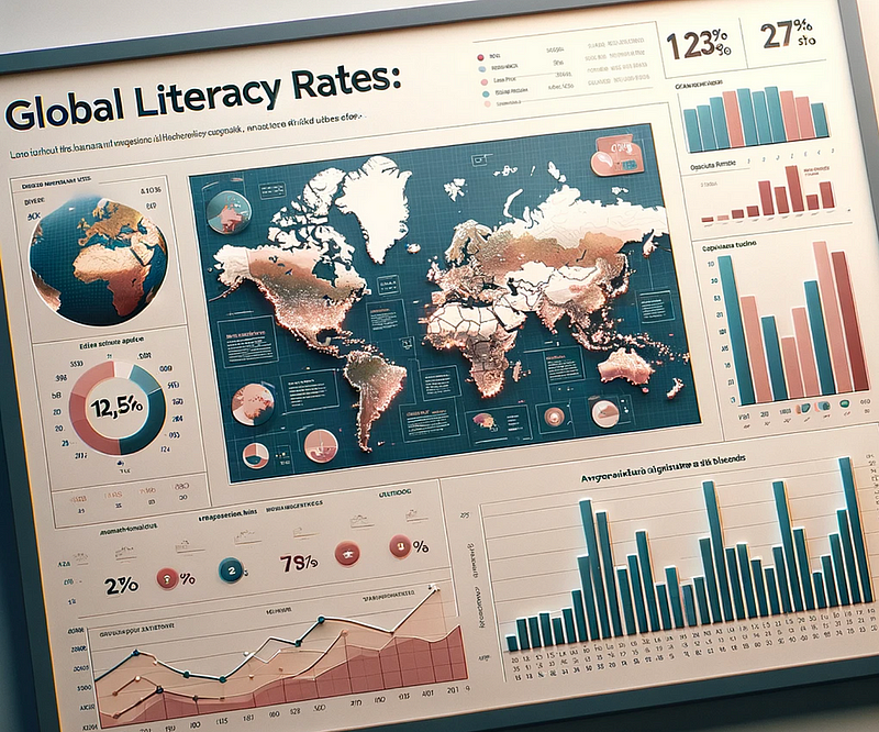
The Elements of Data Visualization: Which Chart Works Best To Tell Your Data Story?
Understanding which charts are most useful for your message
As a computer science professor with 20+ years of research, data visualization has become an ever-present component of my everyday life.
With so many chart types out there to choose from, it should be possible to effectively solve almost any task, whether it’s exploratory (i.e. researching and analyzing data to better understand it for yourself) or explanatory (i.e. reporting and communicating data to end users).
But even with this much experience, I am still often left with a tough decision to make.
Which chart should I use to tell the best story for this particular set of data?
We all want to be able to provide that data visualization that is not just good — it’s great!
To start with, we need a solid understanding of all the different chart types at our fingertips — then we can make an informed decision on which is the right chart for the story that we are telling.
Let’s take a look!
Understanding the Spectrum of Chart Types
Chart Selection Wisdom: The key to effective visualization lies in choosing the right chart for your data. Each chart type serves a specific storytelling purpose.
Some of the charting and graphing options that are available:
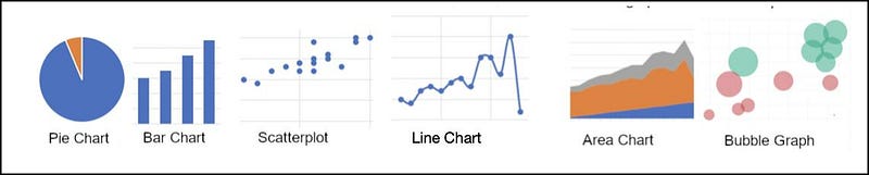
- Pie Charts and Donut Charts: While they show parts of a whole, they are best used sparingly due to potential interpretation difficulties. Donut charts, a variant of pie charts, can sometimes be more visually appealing and clearer.
- Bar Charts and Column Charts: These are fundamental for comparisons. Use horizontal bar charts when dealing with longer category names or many categories, and vertical column charts for simpler comparisons.

- Scatter Plots: Excellent for showing relationships and distributions. They are particularly effective in identifying correlations and outliers in large datasets.
- Line Graphs: Essential for trend analysis over time. Use them to show continuous data and observe trends, patterns, or anomalies.
- Area Charts: Similar to line graphs but with the area below the line filled in, these charts are useful for demonstrating cumulative trends over time. I love it when I have a situation that warrants an area chart because the story they tell can really be dramatic.

- Bubble Charts: An extension of scatter plots, where the size of the bubble adds an additional dimension — typically used to represent a third data variable. The Gapminder dataset (created by Hans Rosling, a data story pioneer) does a great job with bubble charts:

My very favourite Ted Talk of all time is Hans Rosling’s presentation on this particular dataset:
This presentation is now almost 20 years old — but still absolutely fascinating.
Definitely worth a watch — I show the first 10 minutes or so in all my Storytelling With Data workshops.
Some Lesser Known Charting Options

- Heat maps: Useful for representing complex data in a compact space. They use colors to represent data values, making them great for comparing categories or understanding patterns.
- Histograms: Ideal for showing frequency distributions. They help in understanding the underlying distribution of a data set, be it normal, skewed, or bimodal.
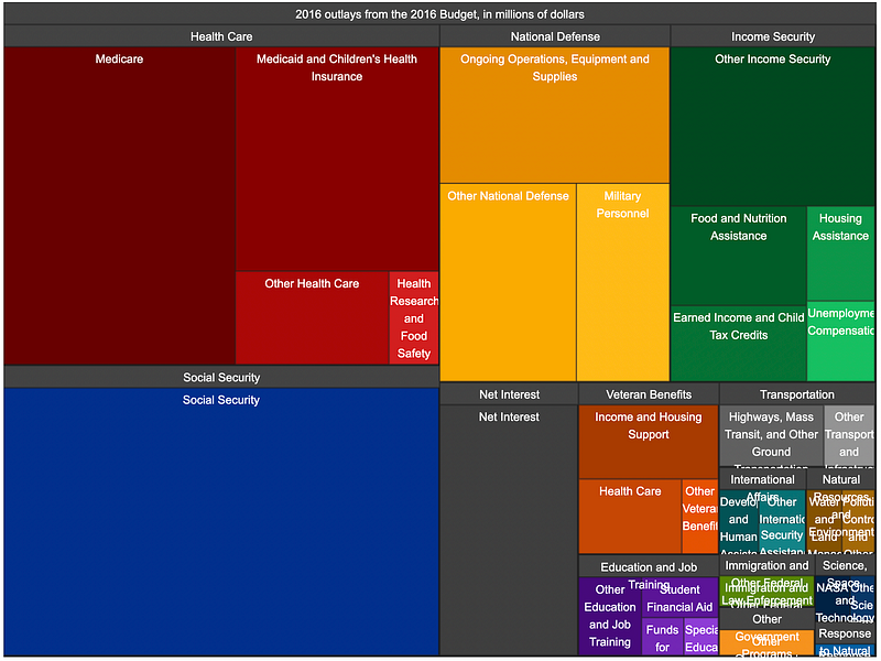
- Tree maps: Excellent for hierarchical data and part-to-whole relationships. Each branch of the tree is given a rectangle, which is then tiled with smaller rectangles representing sub-branches. The tree map that put tree maps on the map (ha ha) was the Obama White House 2016 budget tree map:
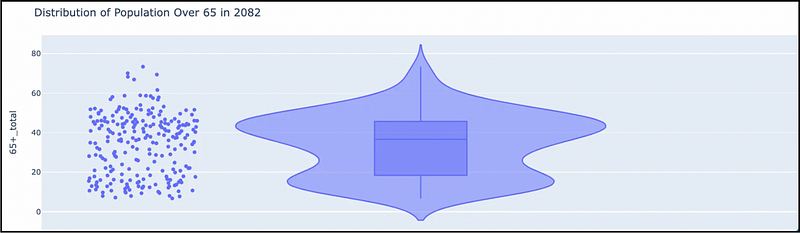
- Violin Charts: Ideal for showing peaks in the data. It is used to visualize the distribution of numerical data. Unlike a box plot that can only show summary statistics, violin plots depict summary statistics and the density of each variable. For example, a violin chart showing projected global population distributions for 2082:
- Waterfall Charts: Particularly useful for understanding the sequential contribution of various elements to a final result, often used in financial analysis to show how initial value is affected by a series of intermediate positive or negative values.
The Art of Matching Chart Type to Your Story
The type of chart you select plays a big role in how your audience perceives and interacts with the data. It’s not just about the numbers, it’s about shaping the narrative towards a clear interpretation.
So how can we better choose the right chart? Here are a few guidelines we can follow
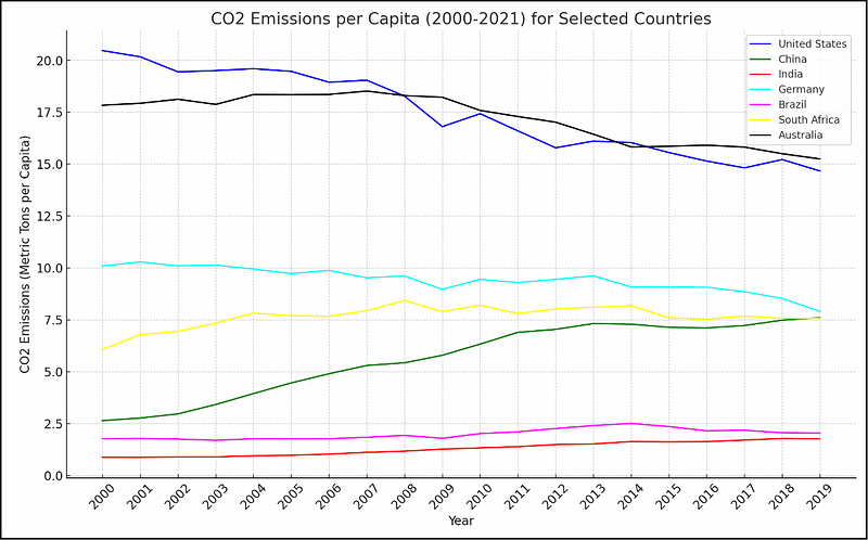
- Conveying Trends and Evolution: When your story is about change over time, line graphs are your go-to. Line graphs are terrific for showing how something has developed or fluctuated, drawing the viewer’s eye along the time-line. For example, a line graph tracking per capita CO2 emissions by country over time:
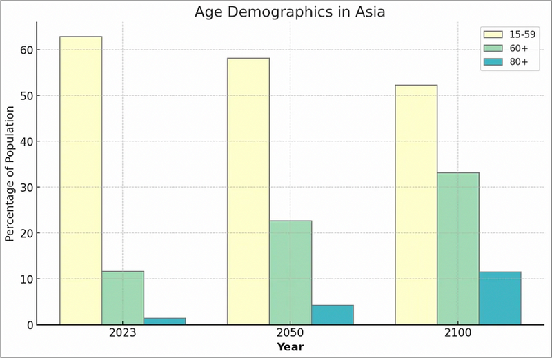
- Illustrating Comparisons and Contrasts: Bar charts shine when it comes to comparisons. They make it easy for the audience to compare different groups or categories side by side. For instance, using a bar chart to show projected changing age demographics in Asia.
- Highlighting Composition and Segmentation: Pie charts and stacked bar charts are perfect when the narrative focuses on breaking down a whole into its parts. They can effectively show how different segments contribute to the total. For example, a pie chart showing segmentation of projected population demographics.

- Showing Relationships and Correlations: Scatter plots are instrumental in narrating the story of how two variables interact with each other. They are used to identify patterns, trends, or outliers in data, telling a story of correlation or absence thereof. For example, a scatter plot comparing advertising spend against sales revenue can reveal the effectiveness of marketing efforts.
The Subtleties of Chart Selection
- Beyond the Obvious Choice: Sometimes the best way to tell a story isn’t with the most obvious chart type. Exploring less conventional options can lead to more compelling narratives. For example, a tree map could be an innovative way to present market share data, providing a fresh perspective compared to the traditional pie chart.
- Layering Stories with Multiple Charts: Often, a single chart isn’t enough to tell the whole story. Using a combination of chart types can provide a more comprehensive view. For instance, starting with a bar chart for overall comparisons, followed by a line graph for trend analysis, can give your audience a fuller picture. Dashboards are a super-useful way to represent multiple charts to tell your story. For example:

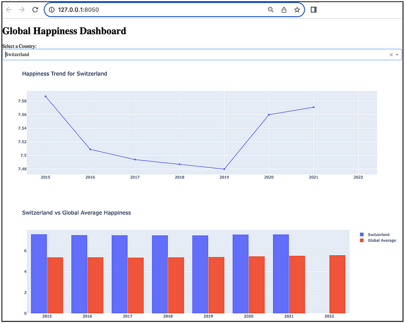
- Consider Your Audience: Tailor your chart selection to your audience’s level of data literacy. Complex charts might work well for a technically savvy audience but could confuse a general audience. The goal is always clarity and ease of understanding. Another dashboard example, with 2 simple charts:
Leveraging Colour for Impactful Visualization
Color can dramatically enhance or diminish the effectiveness of your data visualization. It’s not just about making the chart look pretty; it’s about using colour to communicate and emphasize key data points.
- Contrast for Emphasis: Use contrasting colours to draw attention to critical elements or to distinguish between different data sets.
- Harmony for Cohesion: Complementary colours create a balanced, visually appealing presentation, aiding in the viewer’s comprehension.
- Accessibility Considerations: Always remember colour blindness and visual impairments. Tools like colourblind-friendly palettes ensure your visualizations are inclusive.
For example, the concept of contrast for emphasis is based on the human cognition principle of pre-attentive attributes. The human visual system processes these unconsciously and rapidly, enabling quick and efficient recognition of key elements in visual display. As an example, look at the image below:

Where are your eyes immediately drawn to?
To the red sails — there is a reason why RED often stands for danger. Our eyes are automatically drawn to it.
Another example using contrasting color:
You really have to work to count the 9s in the image on the left. It is so much easier to find 4s in the image on the right.
So we can easily leverage this automatic human condition to highlight what we want our viewer to focus on. For example, a bar chart:
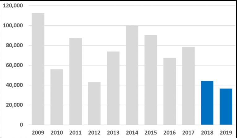
Obviously, 2018 and 2019 are important. In what way are they important?
That is what the story will tell. It we are highlighting sales, then we are clearly selling less — or conversely, if we are highlighting negative incidents, then we are clearly doing better.
We can leverage colour and contrast to immediately highlight the most important data in our visualization.
To Summarize…
We’ve covered a lot of ground in this article — from the basics of chart types to some of the nuances of color theory in data visualization.
The core takeaway is that data visualization is an intersection of art and science.
The right choices in chart type, color, and narrative construction can turn your data into a story that is both informative and inspiring AND stands out from the rest.
Thank you for reading!
If this type of story is right up your alley, and you want to support me as a writer, subscribe to my Substack.
On Substack, I publish a bi-weekly newsletter and articles that you won’t find on the other platforms where I create content.


