
The Don’ts of Dashboards
What are some Antipatterns in Business Intelligence and Designing Dashboards?
What are the don’ts when designing dashboards? Here are my experiences on what to avoid as a BI and Data Analytics team when creating dashboards and reports.
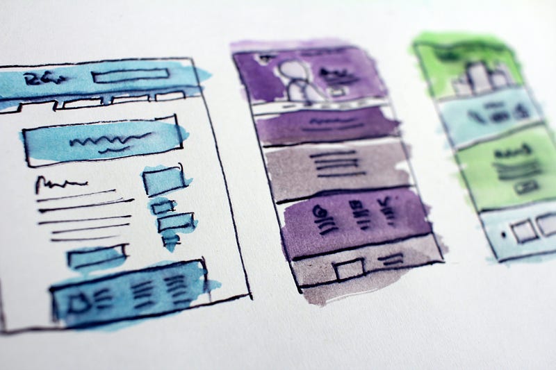
Mistake 1: Overloaded Dashboards
You should not overload your dashboards. Not by the number of charts and not by color or text. Here is an example from Google Data studio, which I would take as a negative example. I find the colors rather distracting for the reading experience and also the diagrams are just too much at once.
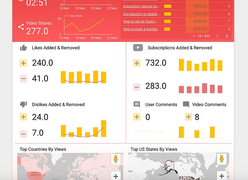
Therefore one can say: The simpler the better. Uncomplicated charts with simple color schemes can tell a compelling story. An instantly understandable dashboard quickly conveys the desired message and demonstrates your expertise. To make sure your audience understands the data, use visual best practices to guide your dashboards [1].
Mistake 2: Put Everything on one Page
This mistake is similar to the first point but is related more to the general structure of the report or dashboard. You should think about building the statements always from the big picture into the details. So you could use simple big diagrams at the beginning and then go more and more into the details until the data is finally set.
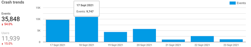
Here is also an example report from Google Data Studio, which I find much more readable. Here, we went from high abstraction level above to details below.
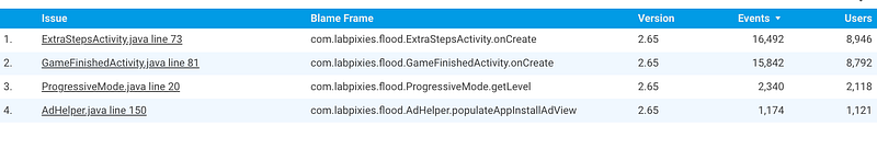
Mistake 3: Don’t make it to Complicated or Fancy
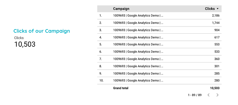
A lot is not always true. In the example below, a text would be nicer and also much easier to understand than presenting all values in a table and drawing a sum. Maybe a simple and large number is a better core statement as an overloaded table or diagram. The same applies of course to fancy diagrams, just because you can use them, you should not always do so. The rule of economy applies here.
Summary
In this article, I presented three tips to consider when creating your next report or dashboard. You should always make sure that the key messages are presented in a quick and easily understood way. Therefore, you should avoid unnecessary fancy diagrams, a lot of color or more numbers than necessary.
Sources and Further Readings
[1] Tableau, Was Sie bei Dashboards tun und was Sie vermeiden sollten (2019)