
The Disneyfication of Life
When two roads diverge — don’t take the one everyone else is on
Stupid people peeve me. Hot, sweaty crowds don’t agree with me, either. And rodents — especially a particular mouse often found in Orlando — get on my last frayed nerve.
Which is why I’m all in on a movement that has been gaining steam over the last couple of decades or so. The goal is to ban a font that is so overused it puts all the annoying, perturbing and just plain bad things Walt Disney World could possibly represent to shame.
The center of this long-time crusade features Comic Sans, a typically clichéd font that makes me want to hate all that is good, decent and convenient in our overly digitized world.
I’m not talking about a revolution, necessarily, but a quasi-loud rumbling against one of the most overused components in our computer universe. And despite the cutesy name of this perp, all the fuss, really, is no joke.
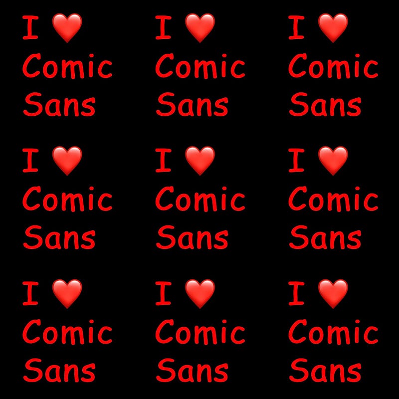
First things first. The graphic above, in my humble opinion, makes a clear enough point. The overuse of Comic Sans — in headlines, in emails, even in an image created to accompany this rant — pretty much covers the argument in favor of eliminating a sans-serif typeface from our laptop universe. Because it was created as a joke, and a commercial one, at that — a silly selling point, to make things “easier”, I guess, for the computer-phobic among us. Yes, Mary Poppins — she, the iconic creation of author P.L. Travers, not, God save us all, the Disney property — said, quite rightly, that “a spoonful of sugar helps the medicine go down”. That may be true, but when it leads to hackneyed, tired and stale typography, count me out.
Second things second. I come from a long line of “Old School” journalistas. I freakin’ studied typography in college. The digital revolution, armed with PCs decades ago and spreading in so many different directions since then, has cheapened typography. Johannes Gutenberg, the 15th-Century tinkerer who first brought moveable type to the European masses, might possibly be appalled by all that’s going on.
Typography is the way we use the written word to communicate. And it cheapens our communication to overuse a font like Comic Sans. This typeface, in essence, communicates nothing at all, except that the user possesses not one scintilla of original thought, and would rather turn to empty rhetoric rather than make a solid point.
It’s just too dang easy these days to have “fun with fonts,” as they say. Like the folks who go crazy with clutter — in writing, in words, in their lives. They favor the quantity over quality argument, and all standards be damned.
Plain and simple, those who choose to communicate with Comic Sans are just plain morons.
I guess you could say I’m the Marie Kondo of fonts. And proud of it.
When I studied typefaces in school, I learned about the classics, ranging from Bookman to New Century to Garamond to Bodoni and beyond. I delved into the notion of typography, essentially, as an art. I think it still is, in places. But Comic Sans, invented in 1994 by then-Microsoft geek Vincent Connare, makes this whole font business seem tawdry in a way. The inelegant nature of the clownish Comic Sans just plain galls me.
You young’uns might not realize this, but the PC and its successors did not always rule the world. The dinosaurs that preceded the Macs, androgynous laptops and ubiquitous touchscreens we use today didn’t really come into popular mass use until the late ’70s. Computers of various shapes and ginormous sizes — some “portables”, which preceded the slim and sometimes elegant cyber-machines we employ today, and weighing in at 15 to 20 pounds at one point — can you imagine lugging one of these along on a business trip? — became more widely used, heavy, clunky, unattractive though they were, in the early 1980s. By the time Microsoft committed solidly to the PC game, the mid-’90s were upon us, with the rollout of something called “Microsoft Bob”, a cartoon “helper” intended to make the use of Windows 95 (I know, right? Back in the Stone Age) more user-friendly.
Enter Vincent Connare, who wanted a “fun font” that didn’t have all that serious baggage like, say Times New Roman. He says he just couldn’t see Bob — who preceded “Clippy” and at one point enlisted the help of a dog named Rover— leading the computer-clumsy out of the digital wilderness in a too-“serious” font.
But there’s a reason Times New Roman has that particular appellation. Ever hear of that “Old Gray Lady”, The New York Times? Headlines and typeface courtesy of the Times New Roman font. Bodoni, used in scores of newspaper headlines to this day, was designed to bring you breaking news, for crying out loud, and first surfaced in 18th-Century Italian books published by the font’s creator, Giambattista Bodoni; an offshoot, Bodoni Poster Compressed, communicates the “Mama Mia!” message on Broadway posters. We’re talking serious font choices here, people!
I’m not the only one annoyed by Comic Sans. More than a decade ago the crusty, dusty, and oh, so serious Wall Street Journal stepped out of its comfort zone to denounce the perfidy and just plain silliness and incredibly annoying overuse of the font. WSJ reporter Emily Steel said at the time that Comic Sans was designed to look like comic book lettering. I can see that. Why can’t you?
“The jolly typeface has spawned the Ban Comic Sans movement, nearly a decade old but stronger now than ever, thanks to the Web,” Steel wrote in “Typeface Inspired by Comic Books Has Become a Font of Ill Will.” So, do the math. The Anti-Comic Sans Coalition has been active for, what — more than 20 years? Insert OMG emoji here.
(And this is just a postscript, but a strong case could be made that today’s emojis — the comic-like characters we use to substitute for real words in our digital discourse — are the 21st-Century version of Comic Sans.)
That’s back when the “Fun with Fonts” family met the “I’m Serious About Typography” association. And they’ve agreed to disagree ever since. Call it the war of the Romans, if you dare.
The mission of the Ban Comic Sans folks — and at this point that includes moi — is “to eradicate this font,” Steel said in her what-soon-became-prescient article way back in 2009. Detractors claim that using Comic Sans in any publication is “analogous to showing up for a black-tie event in a clown costume,” she opined. All these years later, I concur, wholeheartedly.
And I’m not the only one. The movement has the backing of millions, it seems. There are countless websites dedicated to hating on this doofy comic-like font. You can even sign a pledge to avoid the use of Comic Sans at all costs.
OK, Comic Sans is seen by some — including its inventor — as fun. It’s light. It’s bubbly. But overused, to the Nth degree. Just like all things Disney, if you think about it. I reckon I don’t have a lot of time to join any kind of crusade, especially one dedicated to the way one shapes his or her messages in print. But I’m all-in on this one. And it’s the least I can do to urge you to try another avenue when it comes to digital communication.
I once worked for a high school principal whom the faculty called “Mickey Mouse”, for obvious reasons. He wore Mickey Mouse ties and composed a lot of his building-wide communiqués in Comic Sans. BTDubs, he also implemented school-wide dictums aiming at behavior modification in the silliest of ways. Would you allow an oaf like that to be in charge of your child’s education? I don’t think so.
I guess our hatred to be directed in a more efficient and meaningful way. But the point is precisely that — we have too much on our plates these days to be bothered with the inanities of those who wish to pretend that nothing’s ever wrong. I liken those who overuse Comic Sans to the same folks, I reckon, who hit “Reply All” on all of their emails, resulting in the longest chain of waste on record, every time it happens. Annoying as you-know-what, if you get my drift.
Plainly put, there are folks who have dedicated their professional lives to hating on Comic Sans. Seriously. And I’m here for them.
While I’ve found no link between the font and the Disneyfication of Life As We Know It, Comic Sans could just be a larger metaphor. We want to have fun. We attempt to enjoy ourselves, often with the hollowness of misplaced hope. We think we could enjoy ourselves more, and forget our troubles, if we tried hard enough. We repeat the process, doubling down on the goal of a good time being had by all. Sort of like Disney World on mega-steroids. Totally insane, inane, not very fun, kinda sweaty and silly, but we pretend we’ve all relished the moment. We invested so much, after all. Then we repeat the process, ad infinitum. Or, should I say, ad nauseam. All in service to a silly mouse — or sometimes a silly font — who’s supposed to make us feel better, but only really succeeds in taking us to the bank. And then we’re bankrupt, either literally, or metaphorically. Big-time.
Is there a Mary Poppins ride at Disney World? I’m afraid to Google it. Just one more nail in the coffin of an icon who has no business being glorified by the Magic Kingdom.
One uses words to create meaning and to communicate ideas. The argument can be made that a dumb, clownish font might detract from that goal. I can see that. Trouble is, so many others just don’t.
All I ask is that the next time you’re being “creative” in the digital world, you stop for a minute. And think about where you’re headed and what you want to say. Quality, people. Never quantity, in a silly Disney World sort of way. Never follow a mouse down a rabbit hole (yes, Alice is a Disney property, too) when there’s always the road less-traveled. Because, just like Robert Frost says in his iconic poem, we might regret going down the path that everybody else is on.
Please, resist the temptation. You’ll just find yourself aiming for the elegance of Princess Jasmine, but end up looking just plain Goofy.


