
The Design Secret Behind Perfectly Balanced Whitespace
Make information easier to read and scan
The most challenging design element to work with is whitespace. Whitespace is the invisible element that permeates every screen between the cracks and crevices of each component.
There’s no standard on what the perfect amount of whitespace is. Designers must use their intuitive feeling to space elements, which is quite challenging. As a result, many designs either have too little or too much whitespace.
When you have too little whitespace, you make information harder to read. Elements cramp and crowd together, making them hard to distinguish individually.
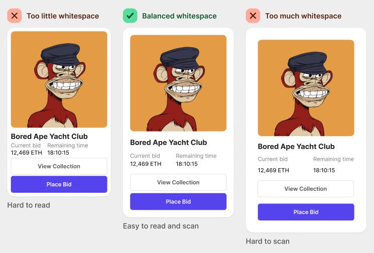
On the other hand, too much whitespace makes information harder to scan. Elements look distant and separated, making their relationship hard to distinguish.
The perfect balance of whitespace makes information easy to read and scan. Individual elements are easy to discern, and their relationships are also apparent.
The secret to finding the perfect balance of whitespace is to use a spacing system in multiples of six pixels. Multiples of six allow you to divide whitespace into halves and thirds to get a whole number. As a result, your elements will look more symmetrical and harmonious with each other.
The other secret is to apply less spacing around elements with a relationship and more spacing around unrelated ones. In other words, the more related two elements are to each other, the closer they should be. The less related they are, the further away they should be from each other.
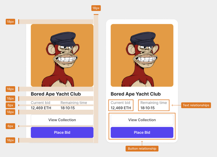
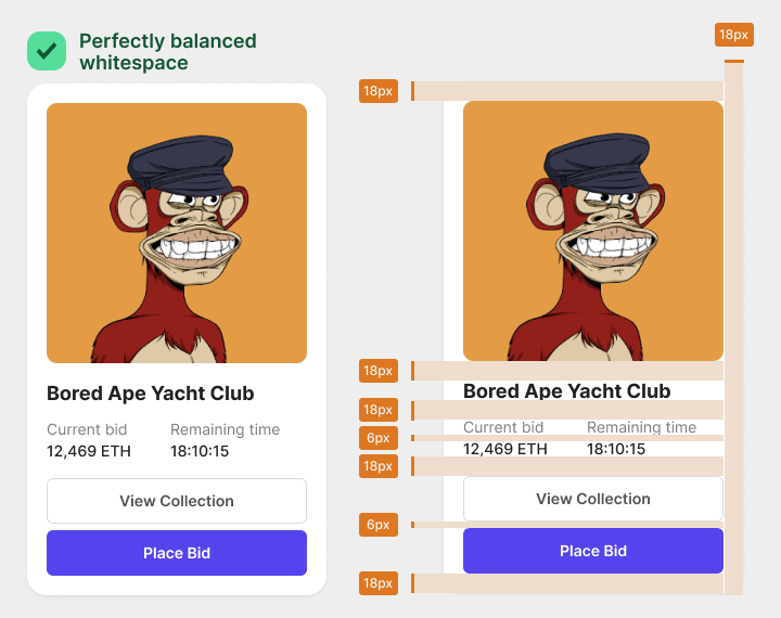
For example, this card component with balanced whitespace uses a 6-pixel and 18-pixel spacing. Eighteen pixels is three times six, giving proportional spacing all around.
Since the “Current bid” and “Remaining time” text labels are related to the numeric data, they share a 6-pixel spacing. However, these text labels don’t directly relate to the title or buttons. As a result, there’s an 18-pixel spacing that separates them.
The two buttons have a direct relationship with each other. Therefore, they are closer together and share a 6-pixel spacing. However, there’s an 18-pixel spacing around them because they don’t have a relationship with the surrounding elements. Keep related elements closer and unrelated elements further apart.
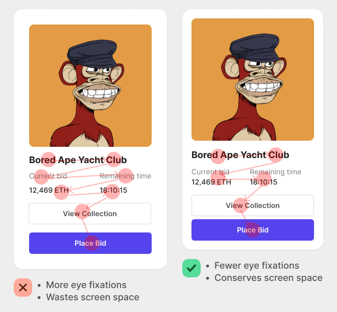
When you follow this principle, you’ll make information easier to scan. Users can scan groups of elements in chunks instead of individually. Too much whitespace causes users to scan each element separately, resulting in more eye fixations.
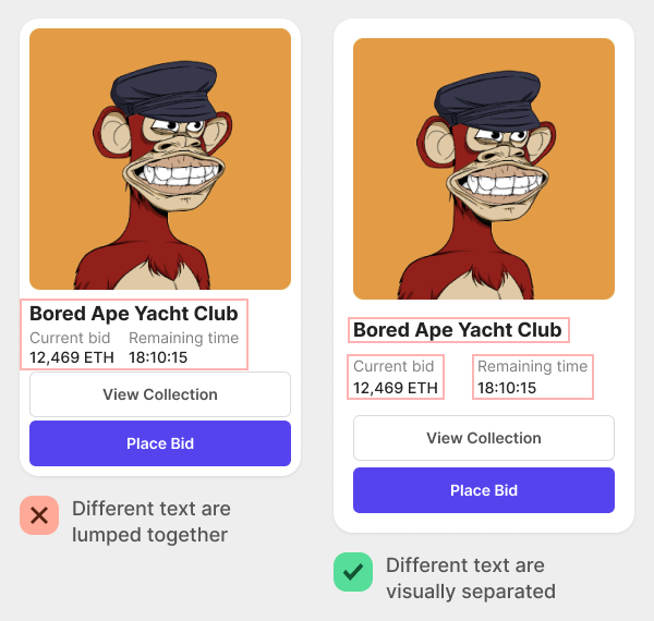
The multiple of six spacing system will make your information easier to read. You’ll know precisely the right amount of spacing to add between elements every time. As a result, you’ll prevent text from getting lumped together so that users can differentiate them.
The general rule is to use a pixel spacing of 6px or 12px to show a relationship between elements. But to separate elements and show a non-relationship, use a pixel spacing of 18px, 24px, or more.
Now you know the secret behind perfectly balanced whitespace. Stop using arbitrary pixel numbers and start using multiples of six. It’ll change the spatial harmony and symmetry of your designs.

For more insightful design articles, get a subscription to the official UX Movement Newsletter on Substack


