
The Curse of the 13th alphabet — having ‘M’ in a brand name causes logo to Change!
More than 5 examples that prove it!
If you clicked on this headline, let me assure you. It’s true.
This is not clickbait.
Having the 13th alphabet of the English alphabet in your brand name is a cause for concern.
If you have the letter ‘M’ in your brand name, your logo will change!
And before you scoff, I’ll give you the 5 examples I quoted in the subtitle. (I have more of course!)
Here we go:
Five examples of brands that changed their logos and have ‘M’ in their names are:
- Medium
- DataCamp
- Gmail
- BMW
- Olympics
of cymbals!>
Yes, from a writing platform to sports biggie to Search engine giant; it seems like domain and authority and enormity do not matter.
Beware! Beware brand names with ‘M’ in their name: You have been warned!
Your logo will change!
If you are still with me, here is a quick overview of each-
1. Medium
You can’t be reading this article on this platform without being aware of the changes. Medium went from a simple bold (literally) M to an ellipsis because blah blah blah!! I won’t say more because I love the redesigned logo. But most people hate it including people who read my work. (And those who might) And I like my readers more than a logo. So, enough said!
Though if you want to know, you can click the article here:
2. DataCamp
For the uninitiated, this is a leading online platform to learn data science skills. They have a huge number of courses on a variety of topics from non-coding essentials to data science and machine learning for professionals.
Just last afternoon, I received this email from the DataCamp team where they unveiled their new logo.
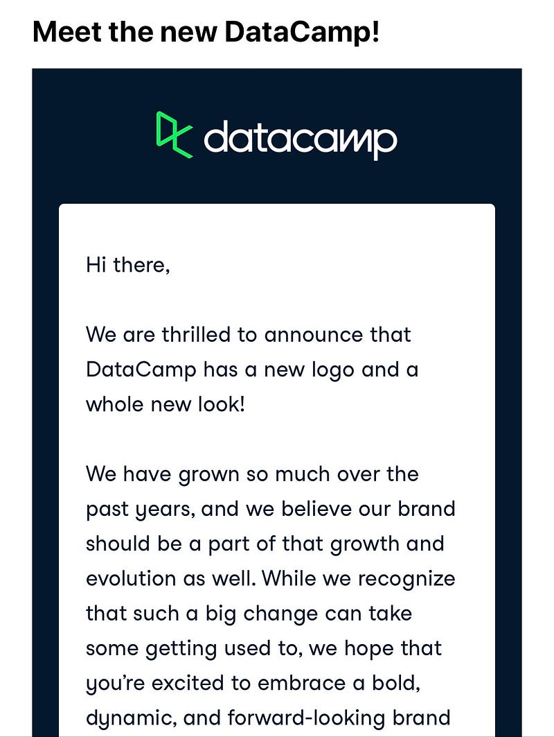
Their logo has changed dramatically. It’s like night and day.
To compare, this is a screengrab of their weekly email sent only this Monday.

Seriously!! So much change!
3. Gmail
Google products have been changing over time. So, this probably was expected.
But it still took me by surprise.
I have a ton of emails. Even after deleting thousands of promotional emails last year to reclaim my Google storage. Naturally then, whenever the page loads with my mail, I usually get to see the envelope icon as Gmail tries to valiantly show all the emails it’s been loyally storing for me. (Thanks Google)
So, you can imagine how I still get startled with the change in the icon even after a fortnight. (I’ve seen it like that for years after all!)
If you did not notice, here is the image from App Store:
What happened to my beloved envelope?
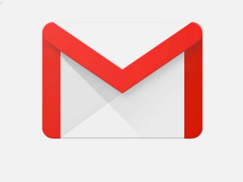
Notice how the M in the image visibly stands out? Like an angry frown? And looks creepy and cursed? And it’s RED!
Before I give myself a mild cardiac arrest, let’s move on to the next company on our list.
4. BMW
Did you know that BMW changed its icon after more than two decades?
Yes!
Their last change was in 1997.
The car manufacturer itself explains the change in their website. The relevant article can be found here.
A look at the old vs new logo:
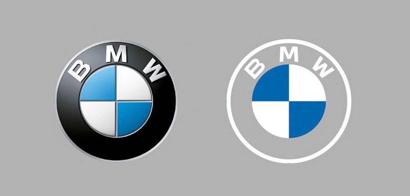
(Image source: Google and BMW.com)
I am not directly responsible for this picture resembling creepy eyes.
5. Olympics
Yes, the Olympics!
Yes, the event where we get to see the best of human sportsmanship and endurance and skill. Where amazing athletes and sportspersons like Michael Phelps, Serena Williams, Usain Bolt, and the likes compete and are not always guaranteed to win.
Specifically, Olympics 2020, now scheduled for 2021, got a logo redesign.
Don’t take my word for it. Google it yourself.
More Examples
I had stated that I had more than 5 examples. I do.
I give you three more:
- National Instruments
- Aunt Jemima
- Mr.coffee
Convinced?
Ready to delve into the dark realities?
The Reality:
All the points I gave you above are TRUE.
Except for the curse part. That’s just made up.
Though if you have read Agatha Christie, you’ll recognize these lines:
Never underestimate the power of superstition… of its influence on people!
To analyze the creepy parts I pointed out- those are just the power of suggestion and subconscious. Let’s face it. Not only is it Halloween season but also a year that has been nerve-wracking like a night at the Bates motel. (See what I did there?) it’s so easy to get lured into putting two and two together and make not a 4 but a 1 and 3 and then conjure up a 13 and spice it up to a spooky 13.
Without that fluff, what really has happened is that 2020 has been unusual. Businesses have transformed pretty drastically and companies have had to evolve to stay current. There is a whole slew of companies that changed their logos and branding that you can read here and here.
Naturally then, there are plenty of examples and I just cherry-picked the ones that helped to ‘make’ my point.
The real Lesson Here
I write this piece because I want readers to recognize that this sort of reporting happens all the time.
Beware of plots and stories that are connecting wildly disparate points like this. They might be true but not for the reasons we think. There is even a term for it — spurious correlation.
Put simply, it’s when two events or variables are related either by coincidence or by the presence of an unseen third factor.
Coming back to the story under consideration, if you were even a little convinced about the ‘curse’ don’t worry, I myself fell prey to it. And I wrote this story! I saw the DataCamp logo change and sat thinking about all the logo redesigns in recent times. And because I like making associations, I thought — “Oh, they all have an ‘M’ in them.”
A quick Google search and I thought of writing a humorous piece on the ‘relation’ I saw. But down that rabbit hole, and the Eureka moment that M is the 13th alphabet (thanks marketers for social distancing Halloween advertising)- and the story was born.
Take-Aways
To cut a long story short- follow these general guidelines when consuming any content.
- Be a responsible reader. Read more and read varying pieces.
- Think about the information you get. Don’t blindly accept at face value.
- Do question the validity of the source you are reading.
- And most importantly, use your judgment. All might not be what it seems!