
The Complete Mobile UI Design Guidelines 2022 — Android vs iOS #14
09 — Dialogs (Android dialogs vs iOS modal views and alerts)
Android dialogs provide actions or contextual information to help users to accomplish a task. Dialogs attract users' full attention to ensure they see the content. Android has 2 types of dialogs: basic and full-screen. Basic dialog typically has actions or relevant information that users need to know. Full-screen dialogs enable users to see more content or complex tasks like editing articles, or filling out forms, etc.
iOS modal views, like Android full-screen dialogs, can contain more content and create an immersive experience. We normally use modals for adding or editing content. iOS alerts, similar to Android basic dialogs, enable users to notice important information and take further actions by blocking the current view.
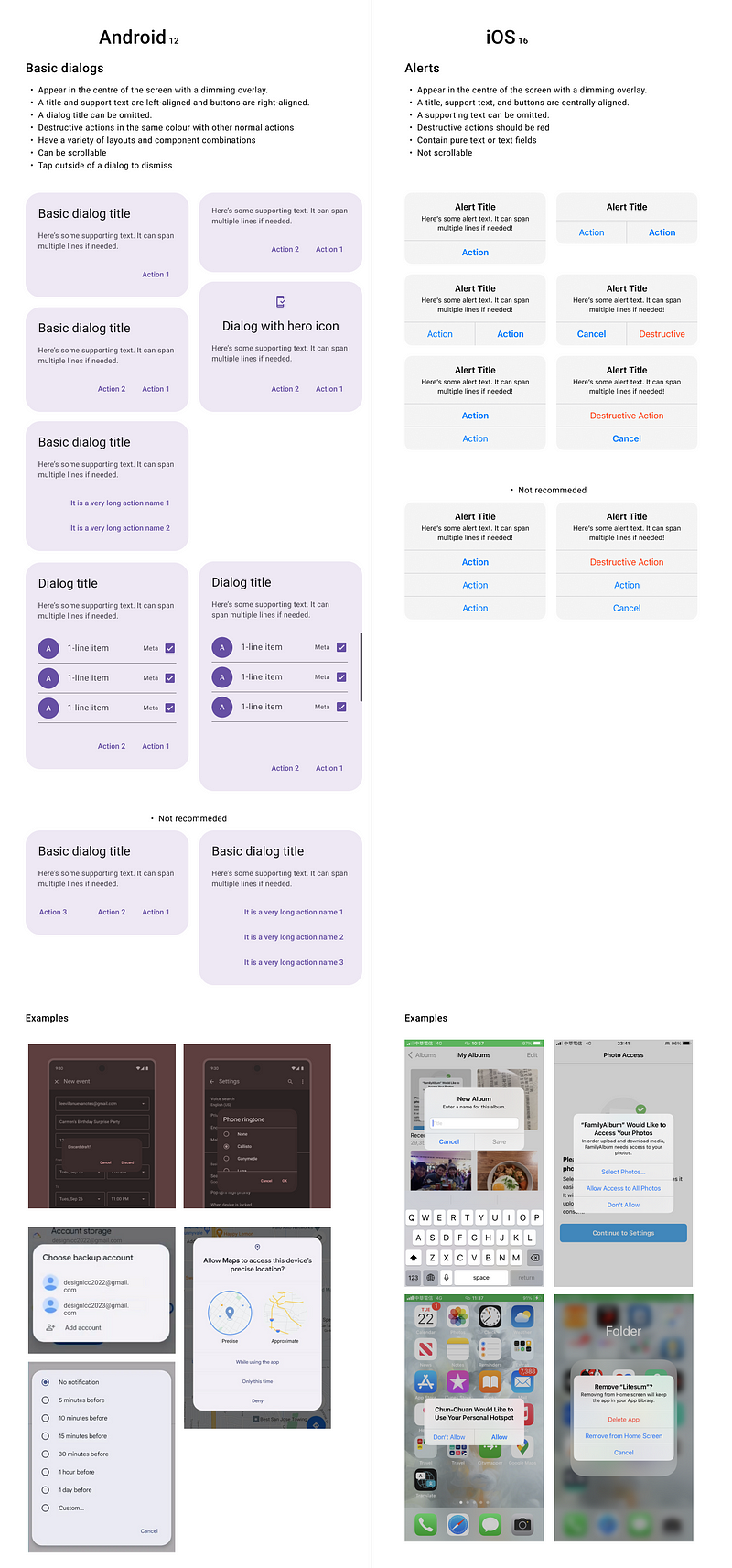
Android basic dialogs vs iOS alerts
Similarity
- Provide critical information or ask for a decision: Dialogs or alerts interrupt the user’s current task with urgent information, details, or actions. Common use cases include alerts, quick selection, and confirmation which need people to pay attention.
- A maximum of two actions: Normally there are 2 action buttons: a secondary button, which is a dismiss/cancel button most of the time, and a primary action button. If the dialogs or alerts provide information to users, there may be just one dismiss button. There might be 3 buttons on some occasions, but it is not encouraged in Android or iOS. iOS guidelines suggest using action sheets if there are more than 2 buttons.
- Button placement: Normally the action buttons are placed horitzally, the primary button is on the right-hand side of the secondary button. If the button text is long, we stock buttons vertically. In that case, the primary button is above the secondary button. For the destructive action, if it is the user’s intention, it will still sit in the primary button’s place.
- Appear in the centre of the screen with a dimming overlay: Both Android dialogs and iOS alerts are shown in the centre of the screen with a dimming overlay.
- Optional icon: From Material 3, the dialogs can have an additional icon above the dialog title. iOS doesn’t have an icon/graphic on its alerts normally. But in some cases, like using face ID, iOS does have one.
Difference
- Optional title or supporting text: A title can be omitted for Android dialogs, but a title is required for iOS alerts. Interestingly, supporting text on iOS alerts can be omitted when it doesn’t add value.
- Capitalisation: On Android dialogs, the title, supporting text, and button texts all use sentence cases. On iOS alerts, the title and button texts use title cases, but informative text uses sentence cases. The title can use sentence cases when only it is a sentence.
- Alignment: On Android, the title, and supporting text are aligned left and the buttons are aligned right. If there is an icon on the dialog, the icon and the title align centrally. On iOS, all the elements, including a title, supporting text, and button text are all aligned centrally.
- Action button text style: In Android’s confirmation dialogs, even if the primary action is destructive, the button text is the same as the secondary one. Normally they use a brand colour. On iOS, the destructive action button text should be red. iOS also can have a default action and its font-weight is bolder than another.
- A variety of layouts and component combinations: Unlike iOS alerts, Android basic dialogs can serve much more functions in addition to alerts. Dialogs often appear as an option list too as an alternative to menus and bottom sheets. More than that, dialogs can have a variety of layouts and component combinations, including lists, time and date pickers, text fields, etc. iOS alerts can have text fields only.
- Scrollability: Android dialogs can have long content with a scroll bar, but iOS alerts’ content should be brief and not scrollable.
- Tap outside to close: Android basic dialogs can be dismissed by tapping outside of it or the back key, but iOS alerts cannot be dismissed by doing so.
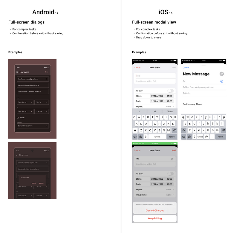
Android full-screen dialogs vs iOS full-screen modal view
Similarity
- For complex tasks: Full-screen dialogs or full-screen modal presentation contain actions that require a series of tasks to complete, like adding and editing content or input fields.
- Confirmation before exit without saving: When a full-screen dialog is closed without being saved, a basic dialog appears in front of it to confirm if the changes should be discarded. The same for the iOS modal view, but iOS tends to use an action sheet to double-confirm the action.
- Layouts: Both Android and iOS put the cancel button and primary action button, like add, create, save, etc, in the same row on the top app bar/navigation bar.
Difference
Cancel button: Android uses X icon as a cancel button, but iOS directly uses the text, Cancel.
Gesture to close: Android doesn’t support gestures to close the full-screen dialogs. iOS full-screen modal view can be closed by dragging down from the content region when it reaches the top of the content. When the screen scrolls down, users can drag it down from the navigation bar to close.
Upcoming…
10 — Brief feedback (Android snackbar vs iOS alerts)
11 — Date and time picker
12 — Cards
13 — Progress indicators
14 — Chips
15 — Sliders
16— Secondary navigation (Android tabs vs iOS segmented controls)


