
The BigQuery Execution Graph is now generally available
How to use the Query Execution Graph to diagnose Query Performance Issues

Google BigQuery offers high query performance but is also a complex distributed system with many internal and external factors that can impact query speed. Due to the declarative nature of the SQL language, the complexity of query execution can be hidden, making it difficult to identify the cause if your queries are running slower than expected or slower than previous executions. Therefore, Google now made the Query Execution Plan for anyone available[1][2].
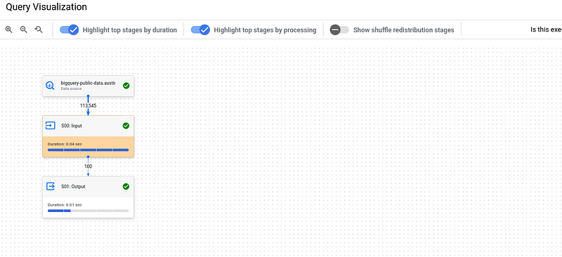
The in BigQuery built-in Query Execution Plan provides an intuitive user interface for retrieving query performance details. It allows you to examine the query plan information in a graphical format for each query, whether it is currently running or already completed[2]. After you started/finished a query, you can find the function under “Execution Graph”.
Google has developed the Query Execution Plan to provide suggestions to improve query performance. As query performance is multifaceted, the performance insights may only provide an incomplete picture of the overall query performance[1][2].
There are two main use cases: The Data Analysts who execute queries within a project. They want to understand why a previously executed query is running unexpectedly slower and how to improve the performance of a query and the Data Lake or Data Warehouse administrators, who manage the BigQuery resources and reservations of your organization.
So for me, this is a pretty nice new feature. From time to time, you will encounter some long running queries — with the Execution Plan you will now be able to analyze why. If you are interested in other tips and tricks on how to tune your queries and/or reduce costs, the following article might be also interesting for you.
Sources and Further Readings
[1] Google, BigQuery release notes (2023)
[2] Google, Statistiken zur Abfrageleistung abrufen (2023)


