
The Best Kindle Settings for Speed Reading
After adopting these settings, I read almost 50 books per year, with full comprehension.
If you came across this article, it already means that you’re curious about the world. Subscribe to my YouTube channel, The Expat, and satisfy your curiosity.
To read faster is useless if it damages your comprehension.
So this article is not about skimming pages or cheap gimmicks like reading only the first and the last words of a phrase. These tricks degrade content absorption. This is an article about making reading ebooks more comfortable, reducing the mental and physical efforts, so you can learn more without getting tired.
The recommended settings you will see in the next paragraphs helped me to jump from 22 to 45 pages per hour of reading. My taste for books is diverse, although most of them are classics like Seneca or Epictetus, non-fiction like Nassim Nicholas Taleb or Cal Newport, and historical fiction.
1st step —Measure your current reading speed.
While this step by itself will not improve your speed, it will be essential to fine-tune your Kindle settings. Therefore, before changing any configuration of your Ebook reader, do this:
- Download a new book on a subject similar to what you usually read.
- Jump the summary and introductions and go directly to the first page.
- Mark the number of this page (Eg: page number 7). If your kindle does not show the page number, activate it by tapping the top part of the screen. The menu bar will appear. Tap Page Display then Font & Page settings. In the new pop-up, select reading and mark the option Page in Book. On some devices, you can also exhibit it by just tapping the lower-left corner.
- Start a chronometer — I use the website Stopwatch, but any other chronometer is fine.
- Read 10 pages. So if you started at page 7, when you arrive at 17, stop the chronometer and see how long time it took.
In my case, before I adopt the 4-step process explained in this article, my time to read 10 pages of a non-fiction book like On Writing Well, from William Zinsser, was near 26 minutes. This is for reading with attention enough to recall the content of each paragraph hours after closing the book — or rather, turning off the ebook reader.
This level of content absorption is good, but the speed was terribly slow, and worse: it made me tired quickly.
After measuring your reading speed in good absorption mode, start configuring your kindle to increase it, as explained in the next step.
2nd Step — Add serif.
If you change the letter style on Microsoft Word or other text editors, probably you saw terms like Serif and Sans serif. But what do they mean?
The small pieces, strokes in the beginning and the end of each letter of some fonts are the Serifs. Fonts that do not have are also called sans serif. To use the example of two popular fonts, Times New Roman is a serifed font, while Arial is sans serif.
Serifs increase readability, even though they are merely decorative strokes. This is because these details lead the reader’s eye from one letter to the next. The serifs will close the gap in the white space between letters. The little jumps our eyes do from one character to the next are reduced. This adds speed and reduces eye effort.
Just be aware that some serif typefaces do not have the simple strokes that Times New Roman has, but are rather artistic and complex. These fonts, often used for wedding invitations or fancy restaurant menus, are not good for speed reading. The serifs will help you, but better to keep it simple.
Some Kindle fonts with serif are:
- Baskerville —A font with notable contrast between strokes. It has a good consistency, both in form and size.
- Georgia — A common font in magazines, it is elegant but still legible even on low-resolution screens.
- Palatino — Clean, this font has a solid structure and favors clear reading.
- Courier — This typeface has letters similar to a typewriter, which adds familiarity if you are from the typewriter era.
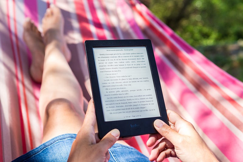
3rd Step — Go landscape.
This is a polemical setting, but it is because we are used to the vertical mode. This habit comes from books printed in a vertical layout — probably to make it easier to place them on shelves.
But a vertical layout means shorter lines. Shorter lines result in more line jumping. This brings two problems:
1 — Higher chances of jumping to the wrong line and then needing to backtrack or even re-start the entire paragraph.
2 — Increasing visual effort to jump from one line to the next, making your eyes tired faster.
When I shifted my Ebook reader to landscape mode, it took some time to adapt. It was even difficult to hold the device in the horizontal while reading because for years I used it in the vertical position. But after some time it will feel natural.
With longer lines, and fewer jumps, you will read faster and your eyes will be less tired. There is, however, the risk of missing a line, and since they are longer in the horizontal mode, this would mean wasted time.
The fourth step solves this issue.
4th Step — Use a marker.
Markers are rectangular pieces of card familiar to readers of printed books. As the name denounces, they are useful to mark pages. But there is another way you can use them, and this time, even on Ebook readers.
Use your marker as a visual pacer, placing it just below the line that you are reading. When you finish a line, move it down to reveal the next. This will have a double benefit. The first is that it avoids that you jump to the wrong line since the marker covers it. The second is that your hand will pace the reading speed and avoid backtrack.
While using a marker is not a Kindle configuration, I included it here because it is one of the things that drastically improved my reading speed. It is the cherry on the cake if you used all the previous steps.
Conclusion
Reading faster and with better comprehension is a meta-skill — an ability that helps you to acquire other abilities.
In this article, there are no gimmicks for skimming pages and harm your content absorption. There are no tricks, but proven ways to increase reading efficiency and make your eyes less tired, so you can do it for longer periods.
The steps are:
1 — Measure your current speed by reading 10 pages of a new book, from a subject of your interest.
2 — Change the font setting of your Ebook reader to a serif typeface. This means fonts like Baskerville, Georgia, or Courier.
3 — Change the reading position to landscape mode. This will reduce the eye effort that unconsciously makes your vision tired. It also will decrease the chances of jumping to the wrong line and backtracking.
4 — Use a marker to guide your eyes and pace your reading speed.
After finishing the fourth step, repeat step one with the next 10 pages of the book that you started. Check the new reading speed. Then test other fonts (and font sizes) with the next 10 pages of the book, to see how it improves.
In my case, the time to complete step one decreased from 26 minutes to 16 minutes, with the same content absorption level.
In my old speed, a 300-page book would take me 13 hours to read. Now, I need only 8. That is how I read almost 50 books per year.
If, after increasing your speed with the methods above, you need suggestions about what to read, check the 7 best business books that I read in 2020 and 5 great books from ancient Roman authors that make you think.
Levi Borba is CEO of expatriateconsultancy.com and a best-selling author. You can check his books here, his other articles here, or his Linkedin here.


