
The Best Filter UI Design for Large-Scale Apps
Optimizing filter layout and interaction
Navigating a large-scape application without filters is like browsing a library without a catalog. It’s impossible to find what you’re looking for if you can’t narrow it down by criteria.
Providing users with a set of criteria to choose from isn’t easy. The first challenge is figuring out the best page layout to display the input fields. The second is figuring out the optimal way for users to interact with them.
Layout
There are two common filter layouts: left sidebar or horizontal toolbar.
Left Sidebar
The advantage of a left sidebar is that it allows you to display more filters on the page without hiding the options. Since a page has infinite vertical space, you can stack them.
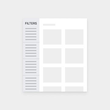
However, the downside is that users will often overlook and ignore these filters. It’s unclear to users that the sidebar is connected to the main content area they’re viewing (source).
Not only that, but users also have to scroll to see any filters at the bottom. As a result, they might miss some if they don’t scroll down all the way. Requiring users to do extra work to see the filters isn’t a realistic expectation.
Horizontal Toolbar
A horizontal toolbar is a better layout for filters. The same study found that users interpreted controls above the content area as filters even when they weren’t. This means that users expect filters to be there. They perceive it as more connected with the main content and more accessible.
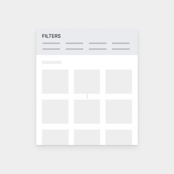
However, the challenge with a horizontal toolbar is displaying the filters in a viewable way due to space limitations. You cannot stack them like you can with a sidebar because you don’t have infinite horizontal space. This space limitation can present interaction issues.
Interaction
When interacting with filters, users need to be able to make selections quickly with minimal effort. They also need to be able to confirm their selection when they apply a filter. Lastly, they need a quick way to remove any filters they don’t want anymore.
Selecting Filters
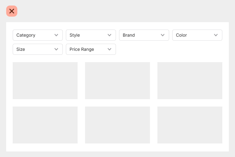
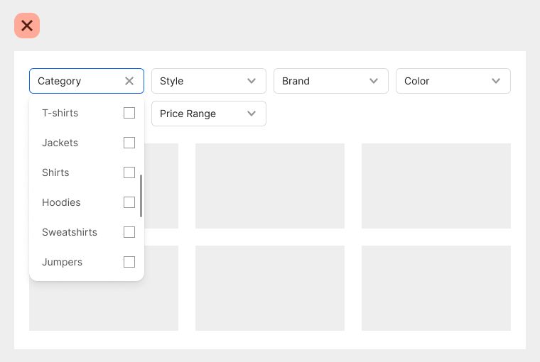
The typical way to display filters on a horizontal toolbar is to use multiple dropdowns. The issue with this approach is that users have to click and open a dropdown to view the options for each criteria. Doing this requires extra physical and cognitive effort.
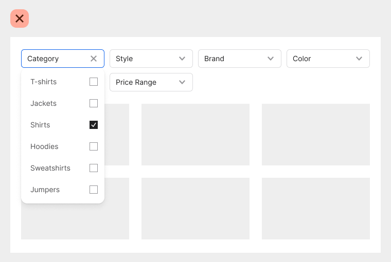
First, the user has to scan each dropdown label to find the filter they want. If any of them are mislabeled with an unfamiliar term, the user can’t find it. Also, if two or more dropdowns labels have a similar meaning, users need to open those dropdowns to understand the difference.
The criteria options provide descriptive details about the filters. When they’re all hidden, it makes it harder for users to find the filters they want. As a result, it takes them more time to complete their task.
Confirming Filters
Another issue is with the user confirming the filters they applied. When you select a filter from a dropdown, a checkmark signifies the selection, but there’s no indication of that when the dropdown closes. If the user needs to check which filters are applied, they must reopen the dropdown to see.
Removing Filters
It’s also difficult for users to remove a filter they’ve applied. To remove it, they have to recall which dropdown the filter is in, open it, and deselect the option. Sometimes they’ll have to scroll through the dropdown to find an option if it’s at the bottom of the list.
Optimal Filter UI
When you have many filters, rows of dropdowns aren’t the optimal design. It’s far better to dedicate a modal screen to display them. The extra screen space allows users to see the criteria options at a glance to make easier selections.
Batch Filter Screen
Instead of opening and closing several menus, all they need to do is click a “Filters” button to open them in a modal screen. The “Filters” button is placed above the content adjacent to the “Sort by” dropdown.
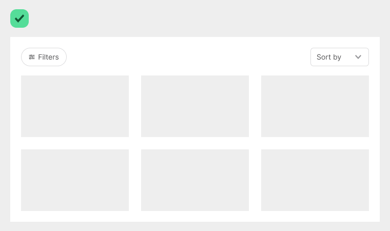
Filtering differs from sorting, so separating these functions is important to avoid confusing users. When the user sorts data, they put it in a specific order. However, when they filter data, they hide what’s irrelevant and reveal what’s relevant based on particular criteria.
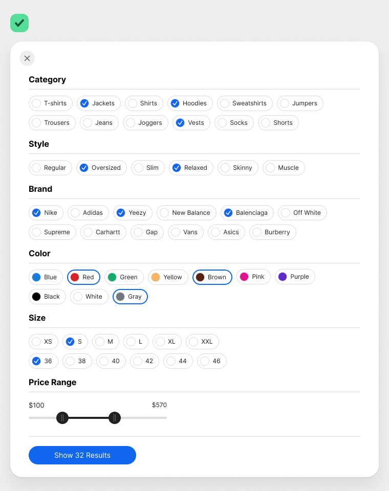
The batch filter screen displays each criterion in bold titles and a gray border that separates them into rows. Instead of checkboxes, it uses check chips, a more user-friendly variant of traditional checkboxes.
Check chips allow users to make selections easier because they have larger hit targets and distinguished borders. They also conserve a lot of space because they stack horizontally rather than vertically. Displaying many options with checkboxes would increase the page length and lead to excessive scrolling.
Not only that, but a horizontal stack also helps with scanning. If the check chips aren’t in a particular order, users can scan them more efficiently in a horizontal direction (source).
You can create variant components with check chips. In the example, the filter options for “Color” display a color palette next to each label. Since the palette occupies the regular checkmark cue, it uses a thick border for the selection cue instead.
Dynamic Button
The “Show Results” button is dynamic because the label updates based on the number of results loaded. As the user selects options, the filter loads the data on the server side but doesn’t display the results until they click the button. This approach is beneficial because the user doesn’t have to wait for the page to load after every selection.
Mobile-Friendly
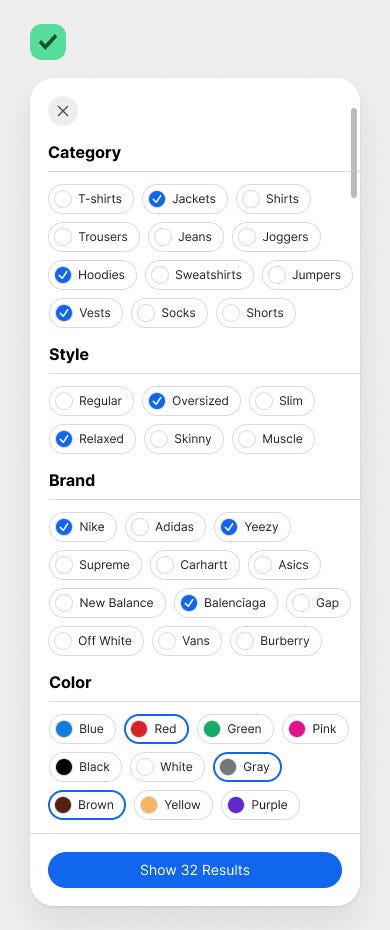
Making this batch filtering system responsive and mobile-friendly is easy. The modal would take the full screen, and the criteria options would span the screen width. The user can scroll to see more criteria, and the “Show Results” button will stay visible and fixed at the bottom. Doing this prevents users from having to scroll down to apply the filters.
Clear Feedback and Easy Reset
After the user applies the filters, they’ll see clear visual feedback on which options they selected. A row of X chips displays below the filter button, indicating all of the user’s selections. They don’t have to click anything to go back and check their selections. Their filter state is right in front of them.
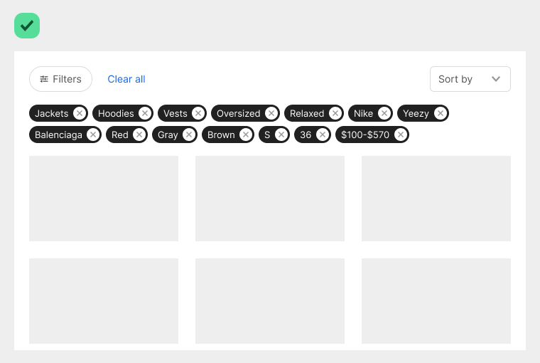
The X chips allow users to remove filters with ease. All they have to do is click the X icon, and it’ll remove the filter and update the results instantly. If users need to remove all the selected filters, a “Clear All” button is available. Clicking it will reset the filters back to the default starting state.

Conclusion
The new filter UI design meets all of the user’s needs. They’re able to view all criteria options with minimal effort. They have clear visual feedback to confirm their selections. They can also remove individual filters or clear all filters quickly. This batch filter pattern is the new standard to follow for large-scale apps.

For more insightful design articles, get a subscription to the official UX Movement Newsletter on Substack


