
Data Science
1 Best Alternative To Seaborn Distplot in Python
Seaborn Distplot is deprecated — let’s explore its alternatives

Seaborn is a well-known data visualization library in Python.
As it is built on top of matplotlib and works perfectly with pandas data structures, it is handy while working with data in Python, as it transforms data into insightful visualizations. It helps in focusing on the required information and grasping the results faster.
However, each library evolves over a period of time and so the Seaborn is.
When I used Seaborn to create distribution plots in my project, I come across the function deprecation warning as below.

So, I started looking for alternatives and am sharing my findings today.
In this quick read, you’ll learn why Seaborn deprecated the amazing function distplot(), the current best alternative for it, and how to use it to create graphs the same as distplot().
Here is a sneak peek into the contents —
· Distplot in Seaborn · Why Seaborn Distplot is Deprecated? · What are the Alternatives of Seaborn Distplot()? ∘ displot() in Seaborn · Use-cases of displot() in seaborn ∘ Bivariate distribution ∘ Plots with the Subsets of Data
I’ve taken amazing examples to make this read interesting and used Dry Beans Dataset from the UCI Machine Learning repository which is available under CC BY 4.0 license.
Let’s dive in!
Before looking at the alternatives, let’s first understand the function distplot() and how it is useful.
Distplot in Seaborn
Distplot() is a versatile function in the Seaborn library which is widely used for univariate data analysis. It helps you to create a histogram and Kernel Density Estimate (KDE) plot in the same visualization.
What is univariate data analysis?
It is used to explore the characteristics and distribution of a single variable at a time, without considering its relationship with other variables in the dataset.
So back to distplot(), which is comprised of a histogram and a KDE plot.
The histogram in distplot() shows the frequency or the count of data points that fall into different buckets i.e. bins.
The entire series or list of data points is binned into different buckets of the same size. The visualization is simply a bar chart where the X axis is usually buckets or bins and the Y axis represents the number of data points in the buckets.
Such a plot helps you understand how the data is distributed over the range of values.
Whereas KDE plot helps you to visualize the distribution of a variable by analyzing the underlying probability distribution function. In simpler words, it helps you understand the likeliness of observing the data points in different buckets or bins.
Using KDE plots you can learn about the shape of the data distribution, its peaks, and its spread.
For example, let’s use the distplot() function on the column — Perimeter.
import pandas as pd
import seaborn as sns

df = pd.read_excel("Dry_Bean_Dataset.xlsx")

sns.distplot(df["Perimeter"])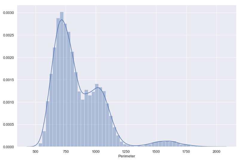
As you see in the above visual, the bars represent the histogram whereas the smooth line is for the KDE plot.
As I mentioned, distplot() creates a KDE plot on the top of the already created histogram, and that’s why on the Y-axis you can see probability density values.
Don’t confuse Probability with Probability Density!
You need to multiply the probability density by the area under the curve to get probability from each probability density value.
Such KDE values can be used only for the relative comparison between different bins.
Now, let’s understand why you should not use it in the future.
Why Seaborn Distplot is Deprecated?
Distplot() is one of the first few functions added in the Seaborn library, so its function definition is significantly different than the other functions which were added at a later stage.
Here is the distplot() function definition as per Seaborn official documentation.
seaborn.distplot(a=None, bins=None, hist=True, kde=True, rug=False,
fit=None, hist_kws=None, kde_kws=None, rug_kws=None, fit_kws=None,
color=None, vertical=False, norm_hist=False, axlabel=None, label=None,
ax=None, x=None)
Michael Waskom explains it precisely — distplot() API neither has the x, y parameter to select DataFrame columns nor it has conditional hue mapping.
So when the Seaborn developers were updating the distribution modules in Seaborn v0.11.0, they found no better way than the deprecation of distplot() to be more consistent with the other distribution plot functions.
As a result, Seaborn distplot() is deprecated in Seaborn v0.11.0.
Calling this function does not really stop you from creating plots, but it will issue a deprecation warning as I mentioned earlier.
That’s why I started exploring the alternatives.
What are the Alternatives to Seaborn Distplot()?
Seaborn documentation suggests two alternatives — displot() and histplot(). But, I personally found displot() as a versatile solution.
Let me show you how similar or different it is compared to the deprecated distplot().
displot() in Seaborn
This is a one-stop solution for all types (univariate and bivariate) of distribution plots. All you need to do is pass a DataFrame and the column name whose distribution you want to see.
So, to get a similar distribution plot as above, for the column ‘Perimeter’ you can use the below code.
sns.displot(df, x="Perimeter")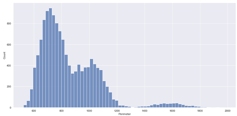
It simply creates a histogram which the same as the one created by the deprecated distplot() function. You can get this type of plot using the function histplot(), another alternative to the deprecated function.
But what about the KDE plot?
You can get a KDE plot as well, using this displot() function. This is when the kind parameter of this function is useful. You can assign kde to the parameter kind to get the Kernel Density Estimate plot like below.
sns.displot(df, x="Perimeter", kind='kde')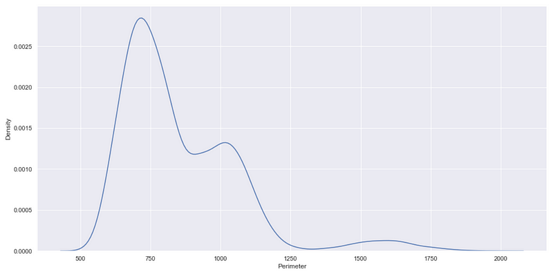
So far, so good!
But still, you may have a question — how does the function displot() create a plot similar to the one created using distplot where KDE is plotted on the top of the histogram?
And the answer is — the kde parameter.
As you saw, by default displot() creates a histogram. So to create a KDE plot on the top of a histogram, you can set the kde parameter True, as shown below.
sns.displot(df, x="Perimeter", kde=True)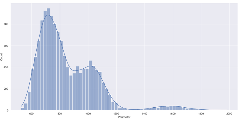
What really makes the displot function different than distplot is the Y-axis of the above chart.
In the deprecated function distplot() the Y-axis represents probability density whereas in the function displot() the Y-axis represents the count i.e. the number of data points in each bin.
The count on the Y-axis can be useful straightaway to understand which bin or range of values contains maximum/minimum data points, which is not the case with the probability density.
Well, the flexibility of the function displot() doesn’t stop here. Let me show you what else you can do with this function which was not an easy task with distplot().
Use-cases of displot() in seaborn
The function displot() has a huge range of parameters that you can adjust to create a variety of plots.
seaborn.displot(data=None, *, x=None, y=None, hue=None, row=None, col=None,
                weights=None, kind='hist', rug=False, rug_kws=None,
                log_scale=None, legend=True, palette=None, hue_order=None,
                hue_norm=None, color=None, col_wrap=None, row_order=None,
                col_order=None, height=5, aspect=1, facet_kws=None, **kwargs)
You can see in the above definition, the parameter kind is by default set to ‘hist’ which explains why displot() creates a histogram when the kind parameter is not specified.
I’m not diving into each of these parameters, but I must mention some of the interesting ones.
Bivariate distribution
The ability of the displot() function to get input in terms of a DataFrame and X-Y — axis variables from that DataFrame makes it highly useful when you want to get bivariate distribution i.e. distribution of two variables.
For example, suppose you want to get the distribution of data points when two variables Perimeter and roundness are considered. You need to simply mention these variable names in X and Y parameters as shown below.
sns.displot(df, x="Perimeter", y="roundness")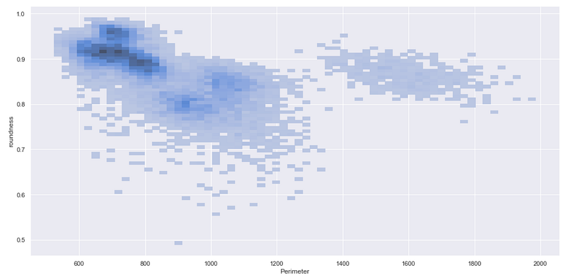
The above chart clearly presents that the maximum number of data points falls in the dark region where Perimeter is between 600 and 800 and the roundness is more than 0.85.
So you can get such a type of bivariate distribution for all the numerical columns.
But what about categorical columns?
In the dataset, you can see that there is a categorical column — Class, which represents the different classes of beans. You can use this variable to create subsets of the data which can be easily plotted using displot.
Plots with the Subsets of Data
While using the function displot(), you never need to create subsets of your DataFrame separately. You can simply use the parameter hue to create histograms or KDE plots for each subset of the data.
Let’s see it in action —
sns.displot(df, x="Perimeter", hue='Class')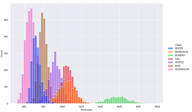
This is how you can see different histograms for each subset of the data.
If you would like to get these different histograms on different subplots. In such case, instead of hue you should use col parameter as shown below.
sns.displot(df, x="Perimeter", col='Class')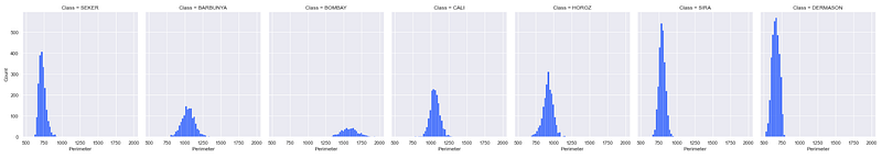
In this way, displot() will create as many subplots as many different subsets you have.
You can explore the remaining parameters in displot() as and when needed in your project.
I hope you found this article useful. Every data analytics library evolves over time. As a result, some functions get deprecated and get replaced with improved functions having better and easier user experience.
Although, distplot() in Seaborn is deprecated, it is not completely out of the market. You can still use it, but it is good to switch to the better function— displot to get different distribution charts.
Interested in reading more stories on Medium??
💡 Consider Becoming a Medium Member to access unlimited stories on medium and daily interesting Medium Newsletter. I will get a small portion of your fee and No additional cost to you.
💡 Be sure to Sign-up & join 100+ others to never miss another article on data science guides, tricks and tips, and best practices in SQL and Python.
Thank you for reading!
Dataset: Dry Beans Dataset Citation: Dry Bean Dataset. (2020). UCI Machine Learning Repository. https://doi.org/10.24432/C50S4B. License: CC BY 4.0


