
The Art of Typography: Proper Letter Spacing
Elevate Your Website’s Aesthetics and Readability
In the digital age, typography is frequently referred to as an art form, and with good reason. Your website’s text layout can have a big impact on how it looks, reads, and feels to users. One of the most important elements of typography is letter spacing, often known as kerning. It’s not only about how the letters are arranged; it’s also about presenting readers with a welcoming visual environment. In this blog post, we’ll delve into expert strategies to improve the appearance of your website and investigate the complex realm of appropriate letter spacing.
The Fundamentals of Letter Spacing
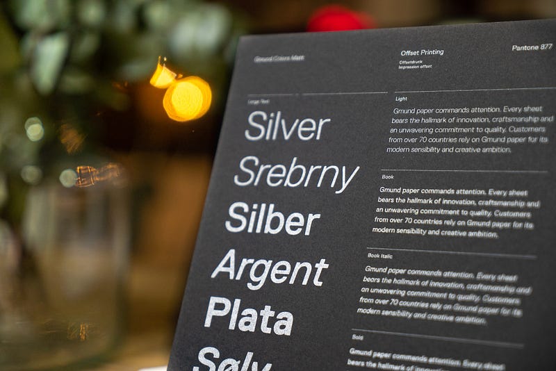
The process of adjusting the distance between letters in text is known as proper letter spacing, or kerning. Achieving harmonious, aesthetically acceptable spacing that makes reading easier is the aim. Letter spacing issues can make your content difficult to read and appear cluttered, which may turn off visitors to your website.
Why Letter Spacing Matters
Beyond just being aesthetically pleasing, letter spacing has a profound effect on how your audience interacts with and understands your information. Effective kerning improves more than just the appearance of your text; it also makes it simpler to read and comprehend, which eventually improves your website’s accessibility.
First and foremost, readability is greatly enhanced by thoughtful letter spacing. Readers may find it difficult to distinguish words and comprehend the information when letters are spaced too far apart or too closely together. On the other hand, well-kerned text moves easily from one word to the next and flows naturally. To ensure that your message is effectively communicated to a large and diverse audience, it is essential to improve readability.
Furthermore, it’s important to recognize the professionalism and attention to detail displayed by deliberate letter spacing. When someone visits your website, they frequently form quick opinions, and typography greatly influences these opinions. Text that is well-kerned conveys accuracy and care, demonstrating your dedication to giving the user a satisfying experience.
Additionally, research has shown the advantages of appropriate kerning for the brain. It has been demonstrated that well-kerned text can increase reading comprehension and speed by up to 20%. This is a huge advantage in a world where readers are competing with digital material for their time. It improves the user experience on your website by enabling your audience to take in information faster and more efficiently. Essentially, letter spacing matters for much more than just appearances; it affects the accessibility and impact of your text.
The Role of Font Choice
Your website’s font selection should complement your letter spacing plan in a natural way. For best reading and beauty, the spacing of letters depends on the unique qualities of each typeface.
To retain readability, bold and condensed fonts, for example, sometimes benefit from slightly more generous letter spacing due to their heavier and more compressed letterforms. Words stay distinct and readable by preventing letters from colliding with one another because to the additional spacing. Conversely, to preserve a consistent and streamlined appearance, lighter and more open fonts could need closer kerning. Cutting down on the distance between characters can assist preserve the text’s coherence and prevent it from seeming jumbled.
Essentially, the letter spacing and font selection should be a deliberate, complimentary combination. The intention is to produce text that is aesthetically beautiful and readable by achieving a visual harmony where the spacing modifications and the font’s intrinsic qualities complement each other. The user’s reading experience is improved and your website’s overall typographic quality is raised by the harmonious combination of fonts and letter spacing.
Practical Tips for Letter Spacing
A careful balancing act between technical accuracy and artistic sensibility is required to achieve correct letter spacing. Here are some useful pointers to help you with this undertaking:
Optical Kerning
One technique to take into consideration is optical kerning, which utilizes the kerning data embedded in the font. Predefined kerning values, which are carefully crafted to guarantee balanced and harmonious spacing, are frequently included with fonts. Accurate corrections can be made quickly and efficiently with optical kerning, eliminating the need to manually modify each character pair.
Beware of Rivers and Widows
It’s important to be mindful of rivers and widows in addition to letter spacing. Rivers are accidental voids or gaps that appear in your writing, typically in the intervals between sentences. Conversely, widows are isolated words or lines of text that do not belong in the paragraph as a whole. Both can interfere with your content’s readability and visual flow. A unified and professional image is ensured by paying attention to these details.
Test on varied Devices and Screen Sizes
Different screen sizes and devices can provide very varied typographic looks. When viewed on a mobile device, something that looks well-kerned on a desktop screen could not hold the same. It’s critical to test your letter spacing on a variety of devices and screen sizes to ensure uniformity and readability. By going through this procedure, you may spot such problems and fix them so that your typography remains readable and high-quality no matter where or how it is viewed.
By incorporating these useful pointers into your letter spacing approach, you may improve your website’s readability and user experience as well as its visual appeal, making your material more aesthetically pleasing and easily readable by your target audience.
Real-World Examples
Analyzing actual websites that demonstrate excellent letter spacing gives important information about how this typographic strategy is used in practice. Apple and Airbnb are two prominent instances of websites that pay close attention to letter spacing in their design.
Apple
On its website, Apple, a computer titan renowned for its dedication to design quality, features perfect font spacing. Not only is the writing incredibly easy to read, but is also very enticing. The combination of accurate kerning with Apple’s font selection makes for a user interface that is both aesthetically pleasing and easily navigable. Because each character has room to breathe on high-resolution displays, their use of generous letter spacing guarantees that material is readable even on these screens. This strategy gives readers a comfortable reading experience while enhancing the brand’s overall professionalism and dependability.
Airbnb
Another excellent example of careful letter spacing in web design is Airbnb. The business’s website makes use of letter space to keep everything looking polished and uncluttered. A general impression of order and clarity is enhanced by the regular and well-balanced spacing between characters and lines of text. This strategy is consistent with Airbnb’s dedication to delivering a flawless user experience and making sure that guests can quickly assimilate details regarding vacation experiences and property listings.
Effective letter spacing may improve a website’s readability and attractiveness, which will eventually improve user experience and strengthen brand identity. Apple and Airbnb are two examples of this. These illustrations highlight the value of careful typography and how it may boost a website’s visibility and success in the online world.
The visual attractiveness and user experience of your website can be improved with the subtle yet effective tool of proper letter spacing. You may produce material that not only looks beautiful but also communicates effectively by becoming an expert in typography. Knowing the ins and outs of letter spacing is crucial for anyone building or managing a website if they want to create an engaging and educational online experience. Thus, invest some effort in optimizing the letter spacing on your website and reap the rewards of better readability and appearance. Your efforts will be appreciated by your visitors.
If you enjoyed my article, I would greatly appreciate your support in my creative work. The easiest way to do so is by simply buying me a coffee. Thank you very much for your support.


