
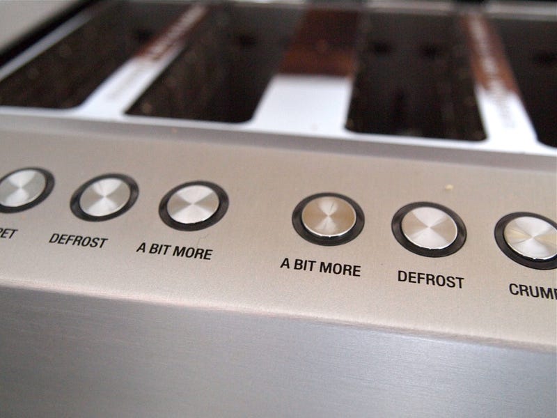
The ‘A Bit More’ button on the Breville Professional 800 Collection 4-slice Toaster
Everyday Interaction Design Classics #3
What I love about the ‘A Bit More’ button on this toaster is not just the functionality, though that’s clearly come some from careful observation of everyday habits, but the name. It could so easily have been called ‘Power boost’ or ‘Toast+’ or ‘Extend’, or something else unthinkingly derived from an engineering- or technology-led process.
But no. The button is simply marked ‘A Bit More’. Because that’s what it does, and also because it has a touch of the conversational, domestic, familial, colloquial. Entirely appropriate for its context. And it’s funny, in a gently everyday way.
That choice of name — and the function, and its simple realisation in a sturdy button with a good action — is a deft bit of design, and for me, the ability to produce deft, including through good copy, is one of the key differentiating factors setting apart good designers from average.
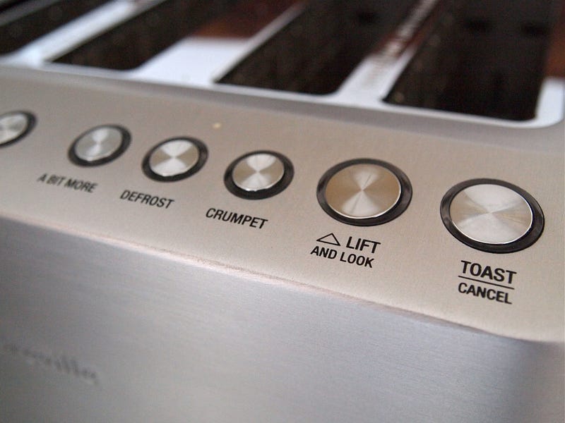
The ‘Lift and Look’ button isn’t bad either — equally self-explanatory, but it doesn’t quite have the essential humanity and wit of a phrase like ‘A Bit More’ applied to a button. (I quite like that it has a button marked ‘Crumpet’ too, but that’s just the Englishman in me.) Well done Breville.
Elsewhere, on Everyday Interaction Design Classics#1 The ‘progress bar’ on the Voice-O-Graph in ‘Badlands’
#2 The big pink arrow from ‘Grand Theft Auto’
#3 The ‘A Bit More’ button on the Breville Professional 800 Collection 4-slice Toaster
#4: The Melnikov House intercom system
#5: Alan Partridge’s Rover 200 fascia control systemThis post was first published at cityofsound.com, on 25 July 2010.


