
Text decoration in Flutter
This article discusses some of the text styling options with the aid of the TextStyle class.
Introduction
Text widget displays text (strings) in a Flutter app. In the absence of styling properties, the Text widget uses the DefaultTextStyle class for default text styling.
The duo of — TextStyle class and style property of Text widget, can be used to add styling. The style property takes an object of the TextStyle class. The TextStyle class has properties to specify foreground color (text color), background color, font-size, font-weight, font-family, letter spacing, word spacing, decoration, and other text styling characteristics.
In another article, I have talked about some elementary styling elements such as specifying color, font-size, font-weight, font-style and font-family. Now, I will talk about letter spacing, word spacing, text decoration features etc.
Spacing between letters and words
TextStyle class helps in defining letter spacing as well as word spacing.
Letter spacing is about adding and removing space between letters. Letter-spacing affects the whole line of text.
Word spacing is defined as space between words, as opposed to letter-spacing which is the space between the letters of a word.
Letter spacing and word spacing are adjusted to enhance readability or may be for creating elementary artistic effects.
The TextStyle class has two properties, — letterSpacing and wordSpacing to adjust letter spacing and word spacing respectively. Both of them take a double value.
The code snippet to define letter and word spacing is as follows:
body:  const Text(
            'Text widget is a visible widget',
style: TextStyle(
// color: Colors.teal.withOpacity(0.5),
letterSpacing: 25,
wordSpacing: 50,
),Both properties letterSpacing and wordSpacing specify the amount of white-space in logical pixels. Hence, a negative value brings the letters or words closer.
Text decoration
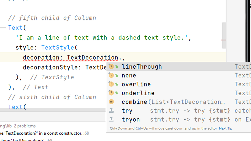
Whenever, a line needs to be placed alongside text, the decoration property, comes in handy. This property of TextStyle determines the location of ‘the line’. There are four pre-defined location values (constants). These line-location constants are defined in TextDecoration class. Default value is ‘none’.
Android Studio lets you select a line-location value effortlessly as shown in the image below.
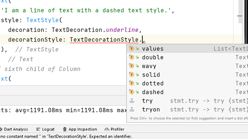
Text decoration style
The decoration property decides ‘where the line is placed’. Another property, decorationStyle of the TextStyle class specifies ‘how the line is drawn’. The decorationStyle property takes values (constants) defined in TextDecorationStyleclass. There are five such constants as depicted in the image below.
Decoration Thickness
The decorationThickness property of TextStyle class can be used to decide thickness of decoration (line). In the absence of this property, the decoration thickness is determined by the font size. This property takes in a double value.
Decoration color
The decorationColor property of the TextStyle class defines the color which is used to draw the line.
This color is a third color parameter of text-styling besides color and backgroundColor, which specifies foreground (font) and background colors of text, respectively.
The complete code
import 'package:flutter/material.dart';void main() {
runApp(const MyApp());
}class MyApp extends StatelessWidget {
const MyApp({super.key}); // This widget is the root of your application.
@override
Widget build(BuildContext context) {
return MaterialApp(
title: 'Text widget demo',
theme: ThemeData(
// This is the theme of the application.
primarySwatch: Colors.teal,
),
home: Scaffold(
appBar: AppBar(
title: const Text('The Text Widget Demo'),
),
body: Column(
mainAxisAlignment: MainAxisAlignment.spaceEvenly,
children: const [
// first child of Column
Text(
'I am a line of text with a letter-spacing of 25 pixels.',
style: TextStyle(
letterSpacing: 25,
),
), // second child of Column
Text(
'I am a line of text with a word-spacing of 50 pixels.',
style: TextStyle(
wordSpacing: 50,
),
), // third child of Column
Text(
'I am a line of text with a line beneath me.',
style: TextStyle(
decoration: TextDecoration.underline,
),
),
// fourth child of Column
Text(
'I am a line of text with a line above me.',
style: TextStyle(
decoration: TextDecoration.overline,
),
),
// fifth child of Column
Text(
'I am a line of text with a line through me.',
style: TextStyle(
decoration: TextDecoration.lineThrough,
),
), // fifth child of Column
Text(
'I am a line of text with a dashed line text style with thickness 2.0',
style: TextStyle(
decoration: TextDecoration.underline,
decorationStyle: TextDecorationStyle.dashed,
decorationThickness: 2.0,
),
),
// sixth child of Column
Text(
'I am a line of text with a dotted line text style and line thickness is 3.0 .',
style: TextStyle(
decoration: TextDecoration.underline,
decorationStyle: TextDecorationStyle.dotted,
decorationThickness: 3.0,
),
), // seventh child of Column
Text(
'I am a line of text with a solid line, having 4.5 thickness.',
style: TextStyle(
decoration: TextDecoration.underline,
decorationStyle: TextDecorationStyle.solid,
decorationThickness: 4.5,
),
), // eighth child of Column
Text(
'I am a line of text with a wavy line style.',
style: TextStyle(
decoration: TextDecoration.underline,
decorationStyle: TextDecorationStyle.wavy,
decorationColor: Colors.green,
),
),
// ninth child of Column
Text(
'I am a line of text with a double line having thickness of 2.5, amberAccent background and red decoration color.',
style: TextStyle(
decoration: TextDecoration.underline,
decorationStyle: TextDecorationStyle.double,
decorationColor: Colors.red,
backgroundColor: Colors.amberAccent,
color: Colors.white, // font (foreground) color
decorationThickness: 2.5,
),
),
],
),
));
}
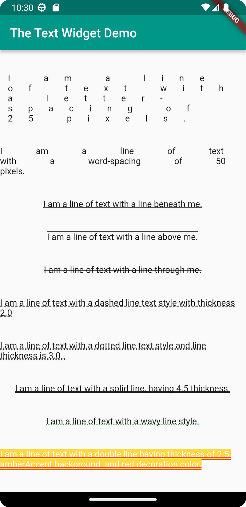
}The output is shown in the image below.
Recapitulate
This article has talked about some of the most often used text decoration and paragraph formatting features in Flutter.
With that we have reached the end of this article. Thank you once again for reading. Don’t forget to 👏 and follow 😍. Also subscribe our newsletter at https://www.devtechie.com


