
Tempo mail review, is it a minimalist dream come true?
Focus, there are moments in life when you are in the zone; all that is visible in your sight is the objective, and that is what this app brings; moments of clarity and lucidity in what you are doing.
People spend an average of five hours every week on email, and that data is from 2018!
Some spend a lot more and imagine how frustrating it is to use the old software on your phone or computer to check and manage your emails.
I’m one of those who spend at least six hours checking and responding, also organizing my emails. Truth be told, I am not a role model, and I spend way too much time on something almost insignificant in my life.
Tempo
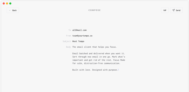
It is the cleanest email client I have ever seen. Super minimal and extremely functional.
With Tempo, you won’t have to worry about an advertisement or hundreds of characters squashed in one line. A benefit is not getting distracted by constant notifications.
The app has been designed with simplicity in mind, and that is why I love it.
This article will analyze the design of Tempo as well as reviewing some of its features.
Getting on Board
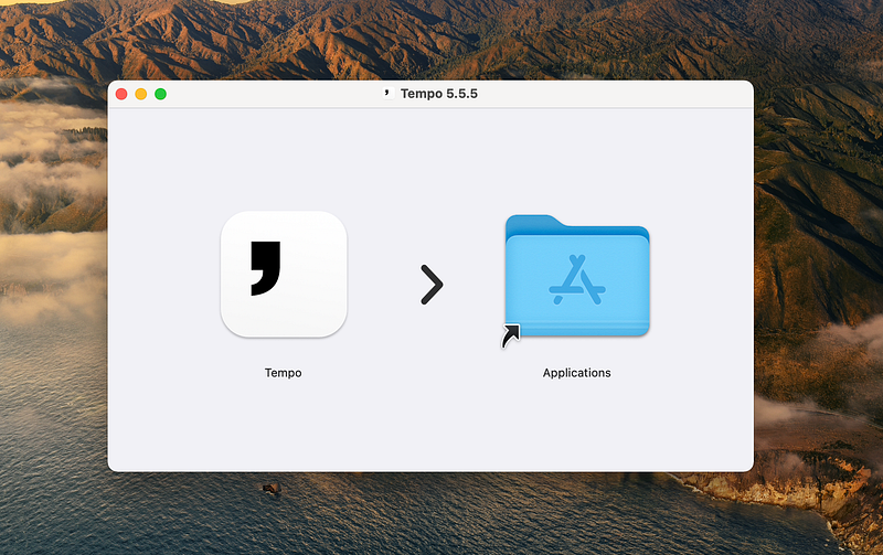
Downloading the app is super simple, just visit the https://www.yourtempo.co and click on the blue button, which says, “Download for Mac.”
The file was over 150MB, which is quite a large file considering the many applications on the AppStore with sizes of less than 20MB, and speaking of the AppStore, why not put the app over on apple’s official store where I could automatically install/update and manage it? I guess the app doesn’t comply with the policies provided by apple, or maybe the product managers don’t see any point in paying the fee to apple.
Setting Up My Email
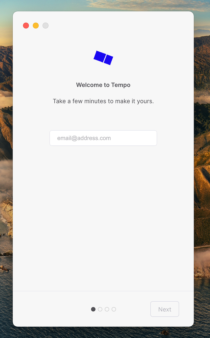
Upon opening the app, you will come across the first few screens that will ask you to enter your email address and allow the permission required by them.
This is typical behavior of email clients, and I don’t have any critique in that regard.
The design of its user interface elements is problematic. Primarily the text input where you have to enter your email address; what if I type some letters here, then receive a phone call (or any distractive action) and then return here and forget what I was doing?
The 6th Law of Jakob’s Ten Usability Heuristics talks about this in great detail.
A quick fix is including a simple text above the input field, reminding me what I was doing.
Setting up the scheduling
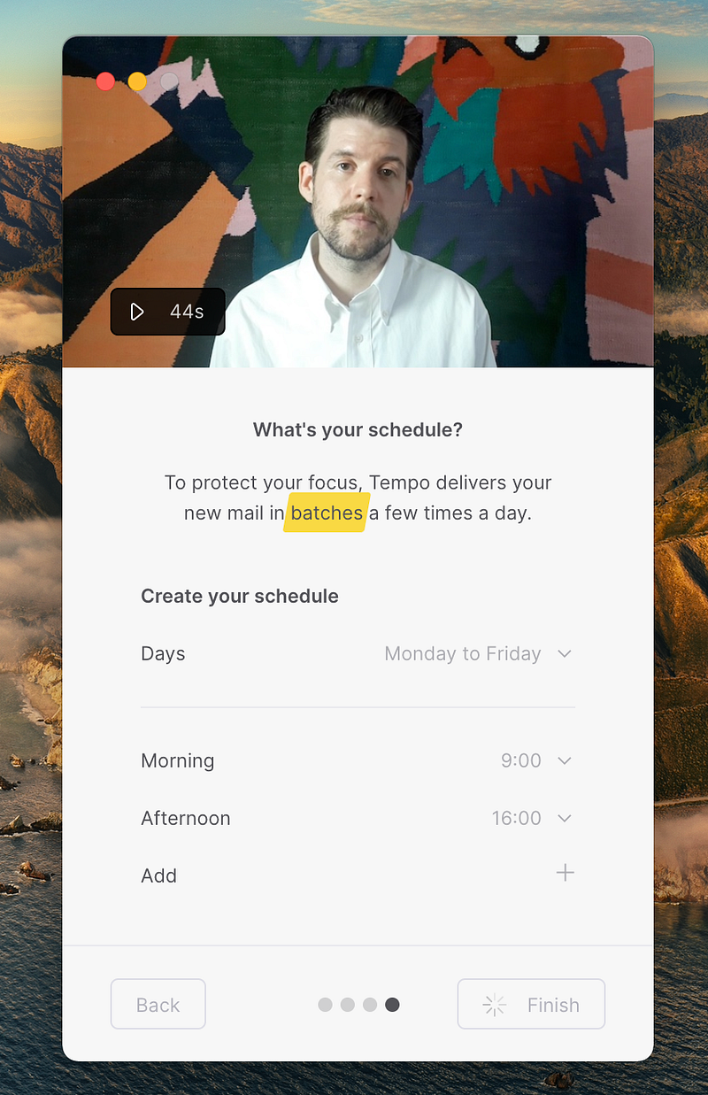
A good design is user-centered. Throughout the app, you will come to the conclusion that this email client has been designed for you.
For an app that claims to save your time and let you focus, seeing a 44s video encourages me to understand the why behind Tempo.
It also allows me to customize my email experience right off the bat, giving me the freedom I usually don’t get from other email clients.
It is the intentional designs that make me fall in love with the UX designers of certain products.
First Impressions
Everything is very pale, minimal, and organized. I love the theme here. I don’t particularly like the design language used, but I encourage more developers and designers to get inspired by such designs.
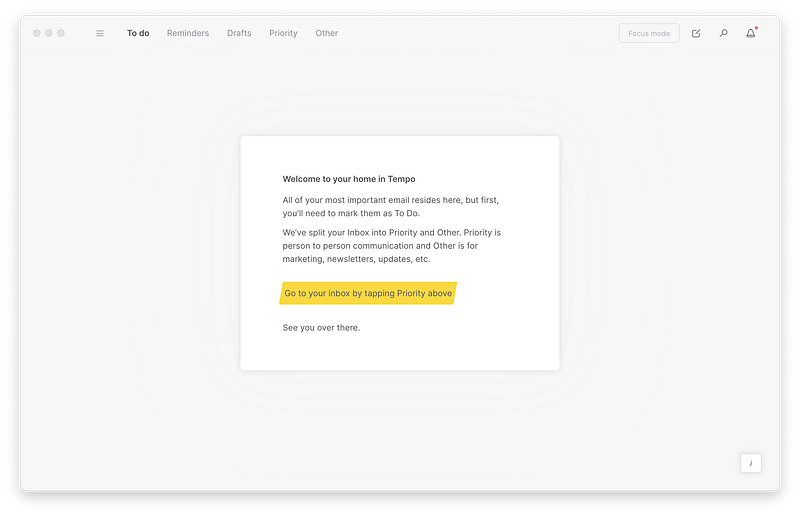
The first time opening the app, I was prompted to go to a section called Priority and sort my messages. I get why this is needed as it could be a learning opportunity for the user to navigate between different areas of the app, yet I wonder why these extra steps are required from me.

My mental model of checking my inbox is getting outside the house and looking for the mailbox, and picking up whatever mail I have received. Again, I wonder, why can’t I have the same experience in the digital world?
The Learning Curve
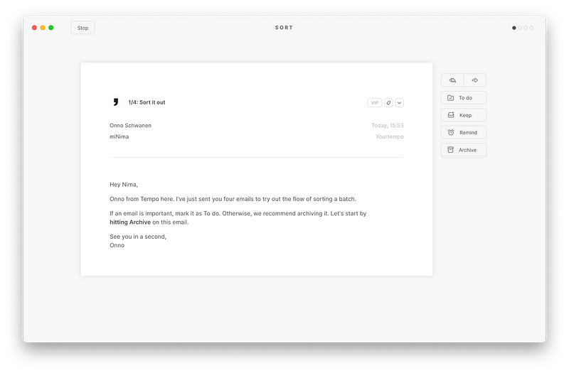

As you saw, I had to spend my time learning five different actions that I would use to manage and organize my digital life.
In my opinion, this is an excellent user experience design.
Miller’s Law states that an average person tends to remember 7 items in their short-term memory (minus or plus 2).
Based on that law, I was introduced into using this application and remembering only five main actions that I will come across with my emails — this is why this design is well thought.
I do, however, have a few problems with the user flow of the app:
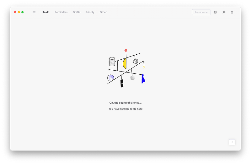
- Why are there so many sections for managing my emails? (To do, Reminders, Drafts, Priority, Other)
- Why is there a hamburger menu when I am using the app on my 13" Macbook with plenty of viewable space?
- Why is it so difficult for me to find a central place for my inbox? As a first-time user, I guess I would be confused about what items belongs to where.
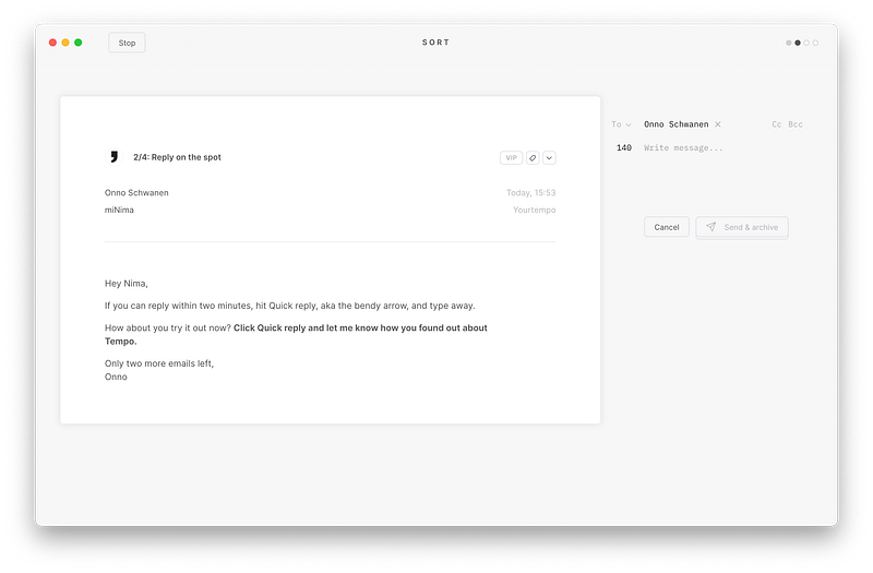
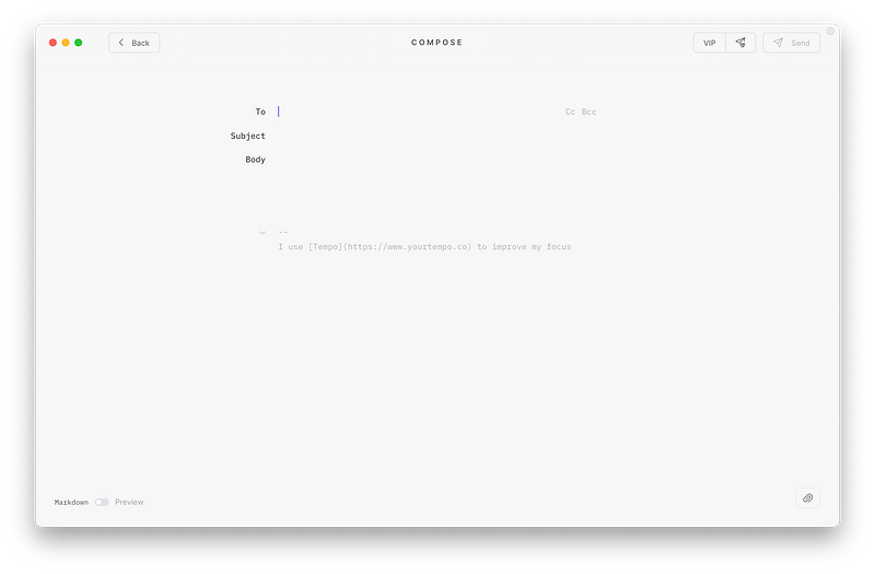
The Learning Curve — Sending an Email
Some design issues are apparent. This heat-map discerns many areas where the main user interface components like send, attachment, preview, etc., are located, and I have to roll my eyes to find where each item is located.
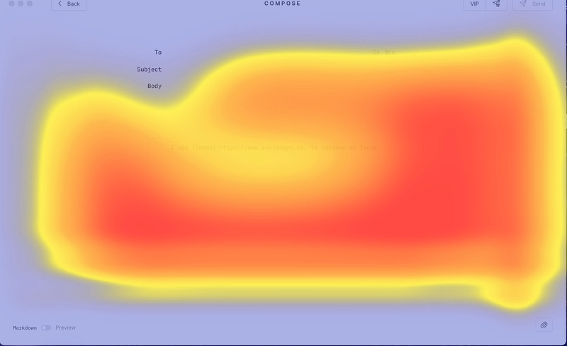
Having said all that, I believe this minimal design achieves its goal. Yes. There is a small learning curve, and it probably is not a viable solution for users with large screens. Still, having used it, I can’t think of any other way to send an email to someone without this app since the clarity and representation of some information are outstanding.
Viewing Emails
This is the part that is confusing to me, which brings a couple of questions:
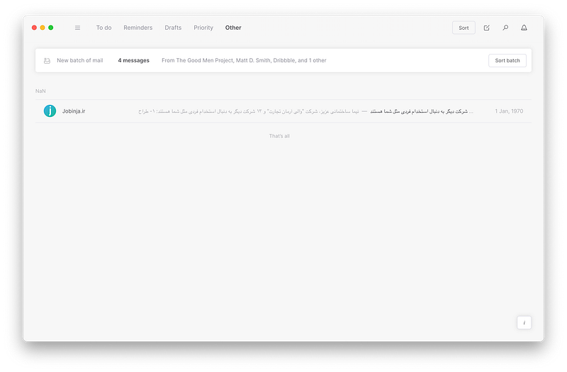
- Why should my inbox hide behind a button called Other?
- Why can’t I see all my emails at once?
- Why do I have to see them one by one instead of managing them by a simple click?
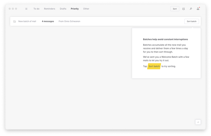
- Why does NaN in the other section mean?
- Why doesn’t it let me disable batching in the first place?
These questions, along with many others, are some of the reasons that might frustrate me.
Planning and Saving Time
In regards to time management, Tempo’s landing page promises:
- Taking control of your time
- A dedicated space for what’s important
- Providing reminders, and much more
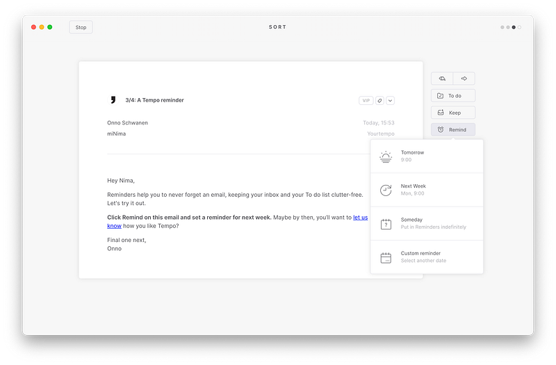
Having used the app for some months in the beta phase, and now in its official rollout, I found out that the most important feature was a dedicated space for the emails I would look into in a future time.
Open Gmail and look under your inbox, you will see a label called reminders, and it basically shows that Tempo utilizes labels to separate your important messages from the others.
This is a smart idea that made me create more labels of my own (i.e., Work, Design, Job Interview, etc.), and I wish I could move my messages from the other’s section to them.
Does using Tempo save your time? If you have a personal system for managing your inbox (like archiving or deleting messages), Tempo might not be very useful. If you are one of those who have tons of undread emails and miss important ones, Tempo can save you some time and bring a little smile.
Tempo (in my opinion) is supposed to reduce digital clutter, use minimal intentional design, and integrate time management techniques to save you your most important asset: TIME.
As described above, for people who have already achieved inbox-zero or have a system for organizing their emails, it might not do much. Still, for other individuals who receive many emails and focus on important ones and want to reduce distractions, I suggest it.
What the future holds

Tempo is at a stage where it has to carefully add new features without creating clutter or unwanted experiences.
As a long time user, I would love to see how the same design implementation would come into the picture for their upcoming iOS and Android mobile apps.
These days the majority of our time is spent on our smartphones. Because of our addiction to them, companies have implemented great solutions like Screen Time. Moreover, some apps offer their own way of helping users use their smartphones less and less; I would like to see how Tempo would handle this in their mobile apps.
I would also love to see how their design implementation matches Apple’s latest design guidelines for large iPads with 9.7" screens.
A quick list of features I would love to see being added are:
- Integration with smart devices like Apple HomePods, Amazon Echos, Google Home
- An Apple Watch app
- A native Mac app where lack of internet doesn’t cause the app to malfunction
- M1-Optimized Mac App
- Use of apple’s design guidelines for a more streamlined design
- Dedicated privacy section to control how my data is being used with the app
The Road to Success

It has been said many times that a product will be useful when user research is the center of all its design.
Understanding your users’ real problem, contextually observing them while using the app, and evaluating your designs is some of the primary critical points for a project’s success.
So far, the design of Tempo showed me the following highlights:
- Little Design
- Unobtrusive Design
- Great Aesthetics
- Innovativeness
Basically, most of the 10 Principles of Good Design by Dieter Rams is met here.
I hope this success continues throughout the future versions of this app.
About the Pricing
The app has a monthly price of $9.99 or $99.99 for its yearly plan. It is a little bit expensive compared to many premium options out there that charge less, yet, you need to consider that this app brings many useful features many still lack.
Conclusion
All in all, if you are someone who has a lot of unmanaged, unread, and unorganized emails, then Tempo is an excellent option for you, especially at its monthly price of $10.
But if you are already on top of your game with handling emails, then you might be ok with default mail apps on your existing computers.
Having said that, I, as someone who loves technology and someone who has reached inbox-zero and never lets emails clutter, will continue to use Tempo as the design is what most apps should be.
Thanks for reading this article, and it has been super fun for me to review Tempo.
I would love to hear your comments on how I could write better articles and how this one affected you in any way.


