
Streamlit (VoC) Sentiment Analysis: Customer Sentiments in Smartphone Reviews
Welcome to the Voice of the Customers (VoC) Sentiment Analysis project!
In this project, we will analyze the sentiment of customer reviews for different phone brands, including Nokia, HUAWEI, and Samsung. By applying sentiment analysis techniques, we aim to gain insights into customer opinions and attitudes towards these brands.

Working Files:
To get started, let’s set up the required files for this project. We need two files: main.py and requirements.txt.
requirements.txt:
In the requirements.txt file, we specify the necessary Python packages and libraries that we'll use in this project. These packages will enable us to build the sentiment analysis application with Streamlit, manipulate data, visualize results, and perform natural language processing tasks.
Here are the required packages:
streamlit
numpy
plotly
pandas
wordcloud
matplotlib
nltk
main.py:
Now, let’s dive into the main code for the sentiment analysis application using Streamlit. In the main.py file, we'll explain each block of code clearly with accurate details and visual results.
import streamlit as st
import numpy as np
import pandas as pd
import plotly.express as px
from wordcloud import WordCloud, STOPWORDS
import matplotlib.pyplot as plt
from nltk.sentiment.vader import SentimentIntensityAnalyzer
analyzer = SentimentIntensityAnalyzer()

st.set_page_config(
    page_title="VoC Sentiment Analysis",
    page_icon="🕸️",
    layout="wide",
    initial_sidebar_state="expanded"
)

st.title("VoC: Sentiment Analysis POC")
st.markdown("------------------------------------------------------------------------------------")We first import the necessary libraries and set up the Streamlit page’s title, layout, and initial sidebar state.
We also display a title for our sentiment analysis POC using Streamlit markdown.
filename = st.sidebar.file_uploader("Upload reviews data:", type=("csv", "xlsx"))

if filename is not None:
    data = pd.read_csv(filename)
    data["body"] = data["body"].astype("str")
    data["score"] = data["body"].apply(lambda x: analyzer.polarity_scores(x)["compound"])
    data["sentiment"] = np.where(data['score'] >= .5, "Positive", "Negative")
    data = data[['brand', 'body', 'sentiment', 'score', 'date']]
    data['date'] = pd.to_datetime(data['date'])
data['quarter'] = pd.PeriodIndex(data.date, freq='Q')We allow users to upload their reviews data in CSV or Excel format through the Streamlit sidebar.
The uploaded data is then processed for sentiment analysis using the VADER (Valence Aware Dictionary and sentiment Reasoner) sentiment analysis tool from the NLTK library.
We add the calculated sentiment scores and sentiment labels (Positive or Negative) to the data. Additionally, we convert the ‘date’ column to a pandas datetime format and extract the quarter information for further analysis.
per_dt = data.groupby(['brand', 'sentiment']).size().reset_index()
per_dt = per_dt.sort_values(['sentiment'], ascending=False)
per_dt1 = data.groupby(['brand']).size().reset_index()
per_dt2 = pd.merge(per_dt, per_dt1, how='left', on='brand')
per_dt2['Sentiment_Percentage'] = per_dt2['0_x'] / per_dt2['0_y']
per_dt2 = per_dt2[['brand', 'sentiment', 'Sentiment_Percentage']]

brand_c = data.groupby(['brand']).size().reset_index()
st.sidebar.write("Reviews count by brand:")
st.sidebar.write("Nokia   : " + str(brand_c[0][1]))
st.sidebar.write("HUAWEI  : " + str(brand_c[0][0]))
st.sidebar.write("Samsung : " + str(brand_c[0][2]))We perform some data manipulations to obtain the count and percentage of positive and negative sentiment reviews for each brand.
The results are then displayed in the Streamlit sidebar for easy access.
st.subheader("Phone Reviews Sentiment Distribution")

col3, col4 = st.columns(2)

with col4:
    data1 = data[data['brand'] == 'Nokia']
    sentiment_count = data1.groupby(['sentiment'])['sentiment'].count()
    sentiment_count = pd.DataFrame({'Sentiments': sentiment_count.index, 'sentiment': sentiment_count.values})
    fig = px.pie(sentiment_count, values='sentiment', names='Sentiments', width=550,
                 height=400).update_layout(title_text='Sentiment distribution for Nokia', title_x=0.5)
    st.plotly_chart(fig, use_container_width=True)

with col3:
    trend_dt = data[data['brand'] == 'Nokia']
    trend_dt['Review_Month'] = trend_dt['date'].dt.strftime('%m-%Y')
    trend_dt1 = trend_dt.groupby(['Review_Month', 'sentiment']).size().reset_index()
    trend_dt1 = trend_dt1.sort_values(['sentiment'], ascending=False)
    trend_dt1.rename(columns={"0": "Sentiment_Count"}, inplace=True)

    fig2 = px.line(trend_dt1, x="Review_Month", y="Sentiment_Count", color='sentiment', width=600,
                   height=400).update_layout(title_text='Trend analysis of sentiments for Nokia', title_x=0.5)
    st.plotly_chart(fig2, use_container_width=True)

st.markdown("------------------------------------------------------------------------------------")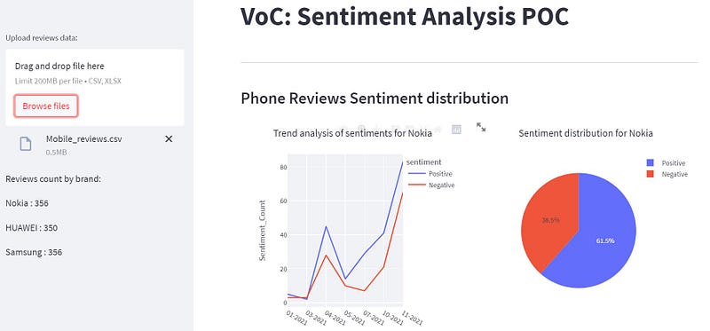
We visualize the sentiment distribution and trend analysis for the Nokia brand.
We use Pie and Line charts from Plotly Express to display the distribution of sentiments and analyze sentiment trends over time for Nokia.
col1, col2 = st.columns(2)

with col1:
    fig = px.histogram(data, x="brand", y="sentiment",
                       histfunc="count", color="sentiment", facet_col="sentiment",
                       labels={"sentiment": "Sentiment"}, width=550, height=400).update_layout(
        title_text='Distribution by count of sentiment', title_x=0.5)
    st.plotly_chart(fig, use_container_width=True)

with col2:
    fig1 = px.histogram(per_dt2, x="brand", y="Sentiment_Percentage", color="sentiment", facet_col="sentiment",
                        labels={"sentiment": "Sentiment"}, width=550, height=400).update_layout(
        yaxis_title="Percentage", title_text='Distribution by percentage of sentiment', title_x=0.5)
    st.plotly_chart(fig1, use_container_width=True)

st.markdown("------------------------------------------------------------------------------------")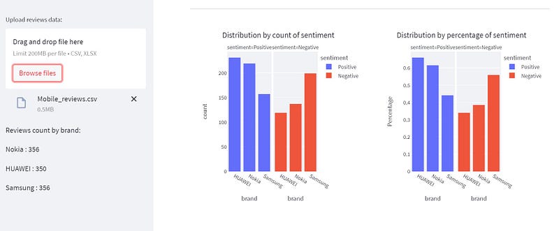
We visualize the overall distribution of sentiments by count and percentage for all brands using histograms from Plotly Express.
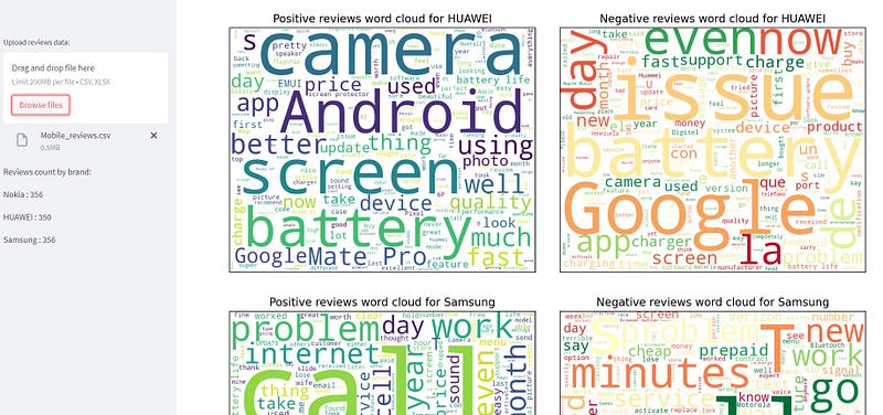
st.subheader("Word Cloud for Reviews Sentiment")

word_ls = ['phone.', 'phone,', 'will', 'window', 'really', 'andoid', 'tracfone', 'minute', 'best', 'time', 'amazon',
           'need', 'still', 'work', 'phone', 'Huawei', 'Samsung', 'Nokia', 'Windows Phone', 'great', 'good', 'use',
           'love', 'one', 'amazing', 'still used', 'Lumia', 'iPhone']
data['body1'] = data['body'].apply(lambda x: ' '.join([word for word in str(x).split() if word.lower() not in (word_ls)]))
data['body1'] = data['body1'].str.replace('phone', ' ')

col5, col6 = st.columns(2)

with col5:
    st.set_option('deprecation.showPyplotGlobalUse', False)
    df = data[(data["sentiment"] == "Positive") & (data["brand"] == "Nokia") & (data['score'] > .9)]
    words = " ".join(df["body1"])
    wordcloud = WordCloud(stopwords=STOPWORDS, background_color="white", width=800, height=640).generate(words)
    plt.imshow(wordcloud)
    plt.xticks([])
    plt.yticks([])
    plt.title("Positive reviews word cloud for Nokia")
    st.pyplot()

with col6:
    st.set_option('deprecation.showPyplotGlobalUse', False)
    df = data[(data["sentiment"] == "Negative") & (data["brand"] == "Nokia") & (data['score'] <= .2)]
    words = " ".join(df["body1"])
    wordcloud = WordCloud(stopwords=STOPWORDS, background_color="white", width=800, height=640, colormap="RdYlGn").generate(
        words)
    plt.imshow(wordcloud)
    plt.xticks([])
    plt.yticks([])
    plt.title("Negative reviews word cloud for Nokia")
    st.pyplot()

col7, col8 = st.columns(2)

with col7:
    st.set_option('deprecation.showPyplotGlobalUse', False)
    df = data[(data["sentiment"] == "Positive") & (data["brand"] == "HUAWEI") & (data['score'] > .9)]
    words = " ".join(df["body1"])
    wordcloud = WordCloud(stopwords=STOPWORDS, background_color="white", width=800, height=640).generate(words)
    plt.imshow(wordcloud)
    plt.xticks([])
    plt.yticks([])
    plt.title("Positive reviews word cloud for HUAWEI")
    st.pyplot()

with col8:
    st.set_option('deprecation.showPyplotGlobalUse', False)
    df = data[(data["sentiment"] == "Negative") & (data["brand"] == "HUAWEI") & (data['score'] <= .2)]
    words = " ".join(df["body1"])
    wordcloud = WordCloud(stopwords=STOPWORDS, background_color="white", width=800, height=640, colormap="RdYlGn").generate(
        words)
    plt.imshow(wordcloud)
    plt.xticks([])
    plt.yticks([])
    plt.title("Negative reviews word cloud for HUAWEI")
    st.pyplot()

col9, col10 = st.columns(2)

with col9:
    st.set_option('deprecation.showPyplotGlobalUse', False)
    df = data[(data["sentiment"] == "Positive") & (data["brand"] == "Samsung") & (data['score'] > .9)]
    words = " ".join(df["body1"])
    wordcloud = WordCloud(stopwords=STOPWORDS, background_color="white", width=800, height=640).generate(words)
    plt.imshow(wordcloud)
    plt.xticks([])
    plt.yticks([])
    plt.title("Positive reviews word cloud for Samsung")
    st.pyplot()

with col10:
    st.set_option('deprecation.showPyplotGlobalUse', False)
    df = data[(data["sentiment"] == "Negative") & (data["brand"] == "Samsung") & (data['score'] <= .2)]
    words = " ".join(df["body1"])
    wordcloud = WordCloud(stopwords=STOPWORDS, background_color="white", width=800, height=640, colormap="RdYlGn").generate(
        words)
    plt.imshow(wordcloud)
    plt.xticks([])
    plt.yticks([])
    plt.title("Negative reviews word cloud for Samsung")
    st.pyplot()

st.markdown("------------------------------------------------------------------------------------")We create word clouds to visualize the most common words used in positive and negative reviews for each phone brand (Nokia, HUAWEI, and Samsung).
We remove common phone-related words and display the word clouds side by side using columns.
st.subheader("Top 5 Positive Reviews for Nokia:")

pos = data[(data['brand'] == 'Nokia') & (data['score'] > .9)].reset_index()
pos = pos.sort_values(['score'], ascending=False)
st.write("1. " + str(pos['brand'][6]) + "| Positive | Sentiment Score: " + str(pos['score'][6]) + " - " + str(
    pos['body'][6]))
st.write("2. " + str(pos['brand'][7]) + "| Positive | Sentiment Score: " + str(pos['score'][7]) + " - " + str(
    pos['body'][7]))
st.write("3. " + str(pos['brand'][8]) + "| Positive | Sentiment Score: " + str(pos['score'][8]) + " - " + str(
    pos['body'][8]))
st.write("4. " + str(pos['brand'][9]) + "| Positive | Sentiment Score: " + str(pos['score'][9]) + " - " + str(
    pos['body'][9]))
st.write("5. " + str(pos['brand'][10]) + "| Positive | Sentiment Score: " + str(pos['score'][10]) + " - " + str(
    pos['body'][10]))

st.markdown("------------------------------------------------------------------------------------")
st.subheader("Top 5 Negative Reviews for Nokia:")

neg = data[(data['brand'] == 'Nokia') & (data['score'] < .1)].reset_index()
st.markdown("1. " + str(neg['brand'][1]) + "| Negative | Sentiment Score: " + str(neg['score'][1]) + " - " + str(
    neg['body'][1]))
st.markdown("2. " + str(neg['brand'][2]) + "| Negative | Sentiment Score: " + str(neg['score'][2]) + " - " + str(
    neg['body'][2]))
st.markdown("3. " + str(neg['brand'][3]) + "| Negative | Sentiment Score: " + str(neg['score'][3]) + " - " + str(
    neg['body'][3]))
st.markdown("4. " + str(neg['brand'][4]) + "| Negative | Sentiment Score: " + str(neg['score'][4]) + " - " + str(
    neg['body'][4]))
st.markdown("5. " + str(neg['brand'][5]) + "| Negative | Sentiment Score: " + str(neg['score'][5]) + " - " + str(
neg['body'][5]))We display the top 5 positive and negative reviews for the Nokia brand based on the highest and lowest sentiment scores.
Running the Project with Streamlit
To run this sentiment analysis application using Streamlit, follow these steps:
- Make sure you have installed all the required libraries specified in the
requirements.txtfile. - Create a new Python file named
main.pyand paste the above code into it. - Save the
requirements.txtfile andmain.pyin the same directory. - Open a terminal or command prompt and navigate to the directory containing the files.
- Run the Streamlit app by typing the following command:
streamlit run main.pyA local development server will start, and you should see the VoC Sentiment Analysis POC web application in your web browser.
Upload your customer reviews data in CSV or Excel format to analyze the sentiment for different phone brands.
Explore the interactive visualizations and insights provided by the application.
Conclusion
In this project, we successfully built a sentiment analysis application using Streamlit to analyze customer reviews for different phone brands, including Nokia, HUAWEI, and Samsung. By employing sentiment analysis techniques and visualizations, we gained valuable insights into customer sentiments and opinions towards these brands.
The word clouds provided a clear picture of frequently used words in positive and negative reviews. The top 5 positive and negative reviews highlighted some of the most influential sentiments shared by customers.
This proof of concept demonstrates the potential of sentiment analysis to understand customer perceptions and make informed business decisions.
See you soon!
In Plain English
Thank you for being a part of our community! Before you go:
- Be sure to clap and follow the writer! 👏
- You can find even more content at PlainEnglish.io 🚀
- Sign up for our free weekly newsletter. 🗞️
- Follow us on Twitter, LinkedIn, YouTube, and Discord.


