
Streamline Data Exploration with a Custom Slicer/Filter Pane in Power BI
Simplify Filtering Options and Enhance User Experience in Your Reports
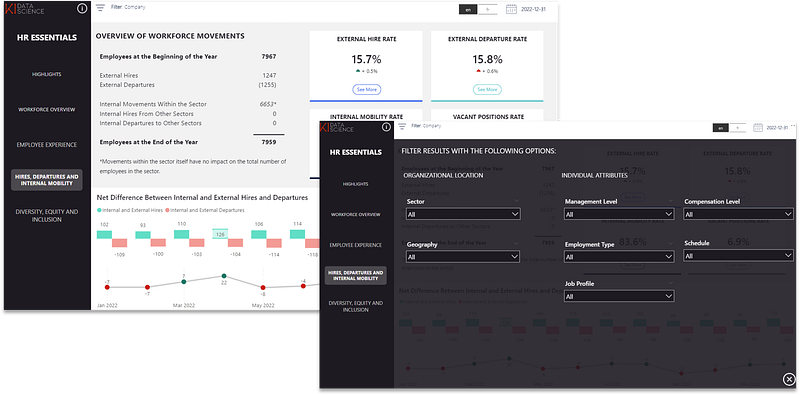
When report page realestate is limited and you want to offer your dashboard users all filtering options in a central location, custom slicer panes can come in very handy.
They are a neat way of displaying all options users can slice and dice their report while being very intuitive to use.
Two things that are important when using slicer panes to avoid interpretation mistakes by your end users.
- Consider synchronizing slicers across the dashboard: The slicer pane should be synchronized across report pages. This means that if your dashboard is on multiple pages, filtering options set in one page should follow through other report pages under normal circumstances.
- Make applied slicers obvious: While the slicer pane is hidden unless in use, it is important for users to be reminded of which filters have been applied to avoid interpration mistakes. Make sure applied slicers are made obvious in the report (whether at the top of the page or within a visual).
I will take you through step by step on how this can be accomplished in Power BI.
Step 1: Create a Filter Button
We will use an icon image to set a button that opens the slicer pane.

Upload the image you would like to use and place it where you would like the user to click to open the filter pane. This icon comes from Flaticon.
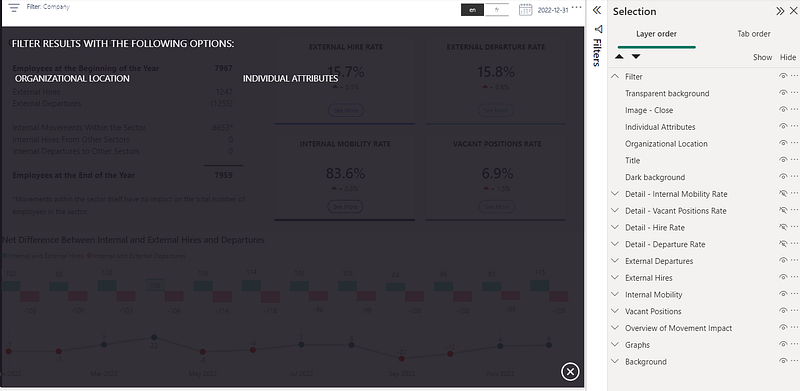
Step 2: Create the Panel Skeleton
Using shapes and bookmarks, we will create the panel skeleton in a first report page.
To view the placement of all shapes, open the “Selection” panel under “View”. A good practice is to name all objects to facilitate their manipulation and group them as required. In our case, all elements linked to the filter panel should be grouped and called this “Filter”.
First, take a rectangle shape and format it in the colour and size you would like to use as background. Place at your desired location.
Second, upload a close button image and place at an obvious spot a user would tend to go to and click to close the filter pane. This image also came from Flaticon.
Third, add a transparent shape that covers the whole dashboard. We will be assigning the action of closing the slicer pane to this shape (instead of the icon) to avoid user navigation errors (e.g. the user clicks back on the filter image instead of the close button image to try to close the pane).
Additionnally, you can add text boxes to help organize the view.
Step 3: Add the slicers
Add all required slicers to the panel, while making sure their order is infront of the transparent background image.

Step 4: Create Bookmarks to Open and Close the Panel
We will assign 2 bookmarks to our view: one to open the filter pane and one to close it.
Under “View”, open the “Bookmark” tab. While selecting the grouped shapes “Filter”, click on the “Add” to add a bookmark. We can rename this bookmark to “Filter Open”.
Make sure “Data” and “All Visuals” are unselected when right clicking on the bookmark. This is to ensure that only the shapes and not the slicer selections are saved under the bookmark.
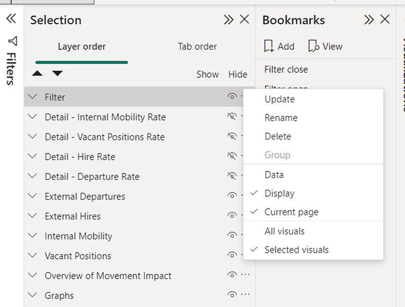
Create a similar bookmark named “Filter Close” by adding a bookmark while having the filter shapes groups selected, but hidden. As previously, ensure that data and only selected visuals is selected.
Finally, assign the “Open Filter” bookmark as an action to the Filter icon and the “Close Filter” to the transparent background shape.
You can then test it to make sure that when the Filter icon is clicked, the panel opens, and then when you click anywhere in the dashboard (except for the slicers), the panel closes.
Step 5: Display Applied Filters
To support report understanding, it can be helpful for users to see which slicers have been applied, even when the filter panel is closed.

I personally like to integrate a DAX measure that displays in a text format the slicers that have been applied at the top of the dashboard. Below is an excerpt of what that measure can look like:
Selected Slicers =

VAR country_selected =
    IF(
        ISFILTERED(Geography[Country]),
        " >"&[TR Country] & ": " &  CONCATENATEX(ALLSELECTED(Geography[Country]), Geography[Country], ",")
    )
VAR city_selected =
    IF(
        ISFILTERED(Geography[City]),
        " >"&[TR City] & ": " &  CONCATENATEX(ALLSELECTED(Geography[City]), Geography[City], ",")
    )
VAR management_level_selected =
    IF(
        ISFILTERED('Management Level'[Management Level]),
        " >"&[TR Management Level] & ": " &  CONCATENATEX(ALLSELECTED('Management Level'[Management Level]), 'Management Level'[Management Level], ",")
    )
RETURN "Filter: " & country_selected & city_selected & management_level_selected
The measure that was created to return this text is the following. Each variable represents a slicer’s column.
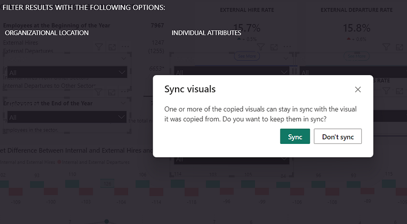
Step 6 (Optional): Copying Over the Filter Panel Across Multiple Report Pages
If the panel is available across multiple report pages, the shapes can be copied over and new bookmarks need to be assigned per page. Note that to synchronize the slicers across multiple pages, they need to copied over separately from the other shapes to have the following option appear.
Conclusion
In conclusion, creating a custom slicer/filter pane in Power BI provides a centralized and intuitive way for users to slice and dice reports. To ensure effective usage and avoid interpretation mistakes, it is important to synchronize slicers across the dashboard and make applied slicers obvious. The following step-by-step process can be followed:
- Create a filter button using an icon image to open the slicer pane.
- Build the panel skeleton on a report page using shapes and bookmarks. Include a background rectangle, a close button image, and a transparent shape to close the filter pane.
- Add the required slicers to the panel, ensuring they are in front of the transparent background image.
- Create bookmarks to open and close the panel. Assign the “Open Filter” bookmark as an action to the filter icon and the “Close Filter” bookmark to the transparent background shape.
- Display applied filters to support report understanding, such as using a DAX measure to show the applied slicers at the top of the dashboard.
- (Optional) If the panel is available across multiple report pages, copy over the shapes and assign new bookmarks per page, ensuring slicer synchronization.
By following these steps, you can create a custom slicer/filter pane in Power BI that optimizes the use of limited report page space and provides a user-friendly experience for data exploration and analysis.


