Stop Fighting The Reason CSS Exists With These Dumbass “Frameworks”
Warning, this article is both meant to be educational, and to vent. It may repeat things I have said in previous articles, and I’m going to keep repeating it unto you folks get it. You have a problem with repetition or “harsh language”, please just GTFO now. You’re beyond reach, and I’m far past wasting my time trying to be “civil” about how utterly stupid you are if you think these “frameworks” have ANY merit!

For quite some time I’ve written about how HTML/CSS frameworks are monuments to those pesky 3i of web development: ignorance, incompetence and ineptitude. Still the fanboys of these middle fingers to usability, accessibility, and efficiency blindly parrot the propaganda, and unfounded gibberish claims of why they “need” these frameworks.
Worse, the very nature by which they work is the bleeding edge of 1990’s methodology, but every last know-nothing who defends these shit-shows claim I’m the one stuck in the past. I just had an employee at a client’s say that to me and I look him over, and shot back:
What the hell do you know about the 1990’s, I’d be shocked if you weren’t still suckling from your mothers teat in ‘95!
It really seems comical when these KIDS try to tell my Gen-X tuchas that I’m the one stuck in the ‘90’s, when they weren’t even there or aren’t old enough to even remember it. It’s like when 20-somethings would “stolen glory” wars they weren’t old enough to be in. You end up diving for the old joke: “What were you, the little drummer boy?”
Almost all of the problems with these dipshit frameworks — bootstrap, tailwind, w3.css, pure — stems from how most people NEVER learn to use HTML properly. I’ve written multiple articles about how the people who MAKE these frameworks clearly don’t understand the most basic of semantics. That lack of understanding HTML gets doubled down on when it comes to the use of CSS, or the batshit crazy hoops people jump through to make HTML behave like it did (incorrectly) back in the 3.2 days.
Those who CREATE these frameworks do not understand HTML, but more importantly are devoid of any knowledge of why CSS stands apart from it.
I’ve said it time and time again, the point of HTML is to say what things ARE; structurally; grammatically. the point of CSS is to say what things look like… But that’s not saying enough about why presentation should be separate.
So Why Should All Presentation Be Separate From The Markup?
It’s the one detail I’ve not really covered, and thanks to a few of you for pointing this out. Let’s briefly re-cover the point of HTML first.
HTML, Your Content For EVERYONE!
The entire reason for HTML semantics — which is different from the semantics of other markup languages — is device neutral delivery of content to users. The audience for HTML semantics is not data exchange between devices or clarity for programmers. It’s so that the User-Agent — a browser is a UA but a UA isn’t always a browser — can best convey the meaning of the content to the user within the limitations of the device or any disabilities. In that way HTML is about MORE than just perfectly sighted users sitting at screens, it is meant to convey MEANING to USERS, and thus if you’re pissing presentation into it, you have failed to divine its purpose!
This is a concept your folks using H1..H6 just to control the text size/weight, slopping endless pointless presentational classes like “text-center color-white text-small col-4-s col-6-m” have utterly and totally failed to grasp.
Now let’s talk the point of CSS.
CSS, More Or Less
This is where the majority of people making websites are telling users with accessibility needs, bandwidth concerns, and just plain efficiency and ease of maintenance to BOHICA. (Bend over, here it comes again!) There are multiple reasons why CSS being separate brings massive benefits, benefits that pissing presentational classes all over your markup completely throws away!
These advantages include:
#1 More Than Just Screen
You can see it in every HTML / CSS framework driven codebase, where they have no media=”” attribute on their stylesheet <link>. You’ll often have framework fanboys — and creators like Wathan — reject or even make fun of CSS Zen Garden. If one is thinking about just what your site does on a screen, that can seem a rational choice. It is not because you’re ignoring print, speech, tty, search engines, and dozens of other devices and users that don’t give a rodent’s posterior about your screen layout! That’s why when you see a stylesheet <link> or <style> without a media attribute, or set to media=”all” you’re looking at outright ignorance on display.
By using media=”screen” for your screen layout, you can avoid sending your styles where they are irrelevant. Thus when such UA’s access your page, your not wasting bandwidth on stuff they don’t care about. The same applies for all those garbage presentational classes replicating the worst of mid ‘90’s markup.
#2 Parallelism
User-agents and servers are able to transfer more than one file at a time. Really good UA’s will realize “hey I need this stylesheet” and start downloading it in parallel with the page. That’s the ideal behavior and sadly rare (I only ever saw Presto, the engine behind “real” Opera do it), so sub-files are not loaded until AFTER the HTML is complete. See this waterfall from Vivaldi (A Chrome-like)
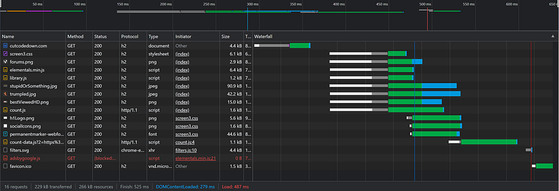
The thing is, the longer it takes for your HTML to load, in most browsers the longer it takes to start every other file! By moving your presentation into the markup with all those idiotic pointless classes, you are recreating one of the very things CSS was created to prevent and/or alleviate!
And don’t give me that “oh it’s only a couple hundred milliseconds” crap. We have site owners now looking at paint times and bitching about page-loads that take more than a second for SEO purposes. These things do matter and your casual dismissal of it reeks more of “I don’t want to do my job” than it does legitimate counterpoints.
An even more important advantage though is how you can move so much out of the markup into those separate files, not just to make those separate files start downloading sooner, but also to enhance…
#3 Caching Models
External CSS can be cached. Internal CSS — <style> or style=”” — generally is not if your content is ever-changing or dynamic, or when style is shared across multiple pages. You get into full Gungan brain-dead trash like Tailwind where they basically make a class for every Joe-blasted CSS property, you’re undoing one of CSS’ most important advantages!
It is to this end that wasting 100–200k of markup on doing 10–15k’s job thanks to those presentational classes wastes far more bandwidth and server processing time than people realize. You’ll get the endless stream of lame excuses to say it doesn’t matter, but that’s all they are. Unfounded nonsensical flaccid cock EXCUSES.
This is a particular worry when it comes to serving multiple pages. The more you can cache the faster sub-pages on the same site load. If you have a site where you expect people to have more than one page-view cache-empty, maintaining those separations can be a thousand times more effective than the wasteful JavaScript trickery people dive for such as SPA. (Single page applications).
I’ve even had clients and other developers ask “How are you implementing SPA” on the sites I’ve built, when there is none. “But why don’t you have FOUC” or “How is it so fast on subpages”. Hurr Durrz folks, it’s called caching. STOP writing two to ten times the markup needed and get as much presentation out of the markup, and boom you have sub-pages that load faster.
THINK ABOUT IT! The entire premise of using a single page application and other scripted content loading is to avoid re-loading stuff that hasn’t changed on the page. That seems like a good idea… it is. But where you put your efforts towards in that is more important. Adding half a megabyte of JS framework numbnuttery is sweeping the problems under the rug. What if instead of adding a metric arse-load of JavaScript to load “only what changed” you could make the entire HTML document smaller than the markup/content you’d be loading via JS, and have everything else cached?
The way people dive for SPA these days as the answer to every blasted problem leaves me feeling like McCoy in a 20th century hospital. “My god man, drilling holes in his head isn’t the answer. The artery must be repaired, put away those butchers knives and let me save this patient!” In the vast majority of cases in places people are using SPA, they could have faster loading pages WITHOUT the JavaScript if they had just practiced the separation of presentation from content in their markup.
More so if you use a monolithic stylesheet for the whole site, so that the presentation of sub-pages can be pre-cached when the first page a user visits is loaded.
#4 Reduced Load Both Server and Client Side
Larger markup takes longer for the server to assemble. It takes longer for things like JS frameworks DOM building (React, Vue) to create. It takes longer for things like gzip compression to compress and decompress. It takes longer for the parser to create. It takes longer to render due to the excess rules. It delays parallelism. It consumes more memory on the server.

Cutting all that wasteful garbage out of the markup means less code to have to integrate into your CMS or other server-side content delivery. If presentation is NONE of HTML’s flipping business, it sure as shine-ola has ZERO damned business in your server-side code.
This is where most React, Vue, and Angular codebases just quadruple down on the double dumbass. Not because the systems themselves are stupid in that way, but because the developers using them can’t seem to stop themselves from placing style in the markup. Get a freaking clue, AND CUT IT OUT!
#5 It’s Easier To See Semantic Flubs In The Markup
If you have moved presentation out of the markup, resulting in half to a tenth the code — depending how full Gungan you went with the framework lunacy — it no longer becomes a chore to see what tags are in use, and for obvious semantic screwups to be obvious. When you use dipshit trash like:
<div class="col-span-1 bg-white lg:block hidden">
            <h1 class="py-6 border-b-2 text-xl text-gray-600 px-8">Order Summary</h1>
            <ul class="py-6 border-b space-y-6 px-8">
                <li class="grid grid-cols-6 gap-2 border-b-1">
                    <div class="col-span-1 self-center">
                        <img src="https://bit.ly/3oW8yej" alt="Product" class="rounded w-full">
                    </div>
                    <div class="flex flex-col col-span-3 pt-2">
                        <span class="text-gray-600 text-md font-semi-bold">Studio 2 Headphone</span>
                        <span class="text-gray-400 text-sm inline-block pt-2">Red Headphone</span>
                    </div>
                    <div class="col-span-2 pt-3">
                        <div class="flex items-center space-x-2 text-sm justify-between">
                            <span class="text-gray-400">2 x €30.99</span>
                            <span class="text-pink-400 font-semibold inline-block">€61.98</span>
                        </div>
                    </div>
                </li>
                <li class="grid grid-cols-6 gap-2 border-b-1">
                    <div class="col-span-1 self-center">
                        <img src="https://bit.ly/3lCyoSx" alt="Product" class="rounded w-full">
                    </div>
                    <div class="flex flex-col col-span-3 pt-2">
                        <span class="text-gray-600 text-md font-semi-bold">Apple iPhone 13</span>
                        <span class="text-gray-400 text-sm inline-block pt-2">Phone</span>
                    </div>
                    <div class="col-span-2 pt-3">
                        <div class="flex items-center space-x-2 text-sm justify-between">
                            <span class="text-gray-400">1 x €785</span>
                            <span class="text-pink-400 font-semibold inline-block">€785</span>
                        </div>
                    </div>
                </li>
            </ul>
            <div class="px-8 border-b">
                <div class="flex justify-between py-4 text-gray-600">
                    <span>Subtotal</span>
                    <span class="font-semibold text-pink-500">€846.98</span>
                </div>
                <div class="flex justify-between py-4 text-gray-600">
                    <span>Shipping</span>
                    <span class="font-semibold text-pink-500">Free</span>
                </div>
            </div>
            <div class="font-semibold text-xl px-8 flex justify-between py-8 text-gray-600">
                <span>Total</span>
                <span>€846.98</span>
            </div>
        </div>
Taken straight from one of the most popular Tailwind “components”, that I’ve had multiple clients actually deploy online? It’s hard to point out the COMPLETE lack of proper semantics when it’s hidden behind endless pointless DIV for nothing, endless pointless SPAN doing semantic tags job, and the metric shit-ton of presentational classes THAT SHOULDN’T BE IN THE HTML IN THE FIRST BLOODY PLACE!!! The gibberish use of H1 and abuse of lists and inlined style for what is clearly tabular data gets completely lost in the din!
Remember, tables are for data that has semantic relationships between its rows and columns, thus the existence of THEAD, TBODY, TFOOT, CAPTION, TH, SCOPE, AXIS, etc, etc. Two-thirds of said tags and attributes the majority of developers seem utterly unaware of.
That ignorance of the most basic of HTML semantics is why they have that 2.7k monstrousity DIV, SPAN, garbage presentational classes, and outright INCOMPLETE information doing the job of a 1k table.
<table class="orderSummary">
  <caption>Order Summary</caption>
  <thead>
    <tr>
      <th colspan="2" scope="col">Item</th>
      <th scope="col">Quantity</th>
      <th scope="col">Unit Price</th>
      <th scope="col">Total</th>
    </tr>
  </thead><tbody>
    <tr>
      <td><img src="https://bit.ly/3oW8yej" alt="Studio 2 Headphone, red"></td>
      <th scope="row"><div>Studio 2 Headphone</div>Red Headphone</th>
      <td>2</td>
      <td>€30.99</td>
      <td>€61.98</td>
    </tr><tr>
      <td><img src="https://bit.ly/3lCyoSx" alt="Apple iPhone 13"></td>
      <th scope="row"><div>Apple iPhone 13</div>Phone</th>
      <td>1</td>
      <td>€785</td>
      <td>€785</td>
    </tr>
  </tbody><tfoot>
    <tr>
      <th colspan="4" scope="row">Subtotal</th>
      <td>€846.98</td>
    </tr><tr>
      <th colspan="4" scope="row">Shipping</th>
      <td>Free</td>
    </tr><tr>
      <th colspan="4" scope="row">Grand Total</th>
      <td>€846.98</td>
    </tr>
  </tfoot>
<!-- .orderSummary --></table>
When I say these clowns aren’t qualified to write a single damned line of HTML, that’s what I’m talking about! Every other thing they are doing belongs in the external stylesheet, and there is NO reason to be shitting classes all over that.
#6 DRY.AM Don’t Repeat Yourself; As Much…
These garbage frameworks — ALL OF THEM — seem to be built around WET. “We Enjoy Typing”. Look at that Failwind code above, how many times do they say “text-gray-400” or “flex flex-col col-span-3 pt-2”? For things that could be said once with a selector in the stylesheet. When you have large amounts of uniform data, this “you HAVE to use classes to declare style” does nothing but make you mindlessly and idiotically repeat yourself in the output.
Sure, HTML has a lot of repetition that same way, but when that’s the case why double down on that making everything harder?
It’s what I’ve said time and time again this past decade: The difference between
<center><font size="2" color="yellow">Test</font></center>and
<div class="text-center font-l text-yellow-400">Test</div>Is quite literally jack shit. You are recreating everything wrong with HTML 3.2, and throwing every advantage and reason for CSS existence in the trash! That’s why every codebase using these half-tweet CSS frameworks looks like the same “screw usability and accessibility” that was common in mid ‘90’s browser-wars era markup!
A Real World Example
I’ve done a slew of these, but let’s do another to truly illustrate just how stupid something like Tailwind is.
Let’s pick a component at random here… ok yeah, take this simple — or what should be simple — account form.
What we have here is a poster child for exactly what’s wrong with presentational markup. It’s (not counting the footer) 6.21k of gibberish non-semantic markup, designed to make an SPA with React (see the htmlfor?) on something that has no business having JS thrown at it if you care in the slightest about accessibility.
But setting aside the epic /fail/ of how it’s for React whackjobs, let’s look at what’s really wrong here.
First off, illegible colour contrasts on multiple headings. #94A3B8 on white?REALLY?!?
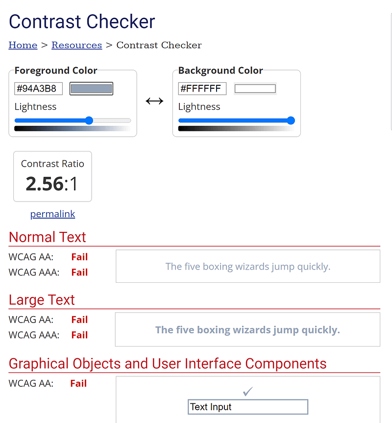
Likewise it’s using absurdly undersized fixed metric fonts, which tells users like myself to sod off with our non-standard default metrics. More so when all the media queries are busted, and trigger long before they should because for desktop they went full Pakled with percentage widths instead of just leveraging max-width properly. This is why most failwind layouts are utterly and completely banjaxed on every single one of my computers.
But sure, you get “well tested components” from this idiocy. Of course you do.
So it’s inaccessible trash before we even look at the code. Digging deeper, let’s go through this bit by bit.
The first thing we see endless pointless div with cryptic hard to understand presentational classes.
<section class=" py-1 bg-blueGray-50">
  <div class="w-full lg:w-8/12 px-4 mx-auto mt-6">
    <div class="relative flex flex-col min-w-0 break-words w-full mb-6 shadow-lg rounded-lg bg-blueGray-100 border-0">
None of that seems to serve any purpose, particularly since the blueGray declaration is so light, I can’t even tell the difference between it and white. NONE of that code should even be present, if anything the FORM (being section-level) should be elevated to the outer container.
    <div class="rounded-t bg-white mb-0 px-6 py-6">
      <div class="text-center flex justify-between">
        <h6 class="text-blueGray-700 text-xl font-bold">
          My account
        </h6>
        <button class="bg-pink-500 text-white active:bg-pink-600 font-bold uppercase text-xs px-4 py-2 rounded shadow hover:shadow-md outline-none focus:outline-none mr-1 ease-linear transition-all duration-150" type="button">
          Settings
        </button>
      </div>
    </div>
More pointless DIV — likely doing HEADING’s job — how the blazes are we down to H6 depth? In all likelihood assuming the page has a proper site header, that should be a H2 as the start of a major subsection of the page. It’s almost like they choose heading depths based on default appearance and not what they mean.
Much less the script-tard button for what should probably be an anchor.
And again, a bjillion classes that no sane well informed developer would even consider using.
The next section is comedy gold.
    <div class="flex-auto px-4 lg:px-10 py-10 pt-0">
      <form>
        <h6 class="text-blueGray-400 text-sm mt-3 mb-6 font-bold uppercase">
          User Information
        </h6>
        <div class="flex flex-wrap">
More cryptic hard to remember classes, an H6 indicating that “user information” is a SIBLING to the “My Account” before it and not a subsection of it… and to be frank the FORM, DIV, and H6 should be FIELDSET and LEGEND. More proof those suckered into using Failwind do not know enough about HTML to be building it for others.
Then even more comedy:
          <div class="w-full lg:w-6/12 px-4">
            <div class="relative w-full mb-3">
              <label class="block uppercase text-blueGray-600 text-xs font-bold mb-2" htmlfor="grid-password">
                Username
              </label>
              <input type="text" class="border-0 px-3 py-3 placeholder-blueGray-300 text-blueGray-600 bg-white rounded text-sm shadow focus:outline-none focus:ring w-full ease-linear transition-all duration-150" value="lucky.jesse">
            </div>
          </div>
Two DIV doing what the LABEL could/should probably handle, HTMLFOR that has no corresponding ID’s defeating the point of even declaring them, and even more endless pointless rubbish classes to try and hide how ineptly built this code is.
It goes on like that for some time with more DIV, even more DIV, and endless bloated presentational classes mindlessly repeated over and over again.
So How Would I Have Written That?
<form class="accountCard"> <header>
<h2>My Account</h2>
<a href="#settings">Settings</a>
</header>
<fieldset class="userInformation">
<legend>User Information</legend>
<label>
Username<br>
<input type="text" name="username" value="lucky.jesse"><br>
</label><label>
Email address<br>
<input type="email" name="email" value="[email protected]"><br>
</label><label>
First Name<br>
<input type="text" name="firstName" value="Lucky"><br>
</label><label>
Last Name<br>
<input type="text" name="lastName" value="Jesse"><br>
</label>
</fleldset>
<fieldset class="contactInfo">
<legend>Contact Information</legend>
<label>
Address<br>
<input type="text" name="address" value="Bld Mihail Kogalniceanu, nr. 8 Bl 1, Sc 1, Ap 09"><br>
</label><label>
City<br>
<input type="text" name="city" value="New York"><br>
</label><label>
Country<br>
<input type="text" name="country" value="United States"><br>
</label><label>
Postal Code<br>
<input type="text" name="postalCode" value="Postal Code"><br>
</label>
</fieldset>
<fieldset class="additionalInfo">
<legend>Additional Info</legend>
<label>
About Me<br>
<textarea name="aboutMe" rows="4">A garbage halfwit UI Kit and Admin for JavaScript & Failwind CSS. It is Free and Open Source.</textarea>
</label>
</fieldset>
<footer>
<button>Submit Changes</button>
<input type="hidden" name="auth" value="randomAuthTokenHere">
</footer>
<!-- .accountCard --></form>FIELDSET to group each … group. LABEL wrapping the input to act as our multiline flex containers and without needing the for/id pairings, a DIV for non-changeable elements like hidden inputs and submits… ADDING a submit button for non-scripted behaviors that should be built before you even THINK about enhancing the page with JavaScript, and classes where and only as needed to describe what things ARE… EVERYTHING ELSE belongs in the external stylesheet.
Which is where the REAL comedy begins. Not counting the reset and a sample page’s min-height layout against it, it’s barely a hair over 1.8k of code. 1.8k of CSS + 1.7k of markup === 3.5k of code, nearly half what your typical Failwind developer would use in markup ALONE.
.accountCard {
  margin-bottom:1em;
  padding:1em;
  background:#FFF6;
  color:#456;
  border:0.0625em solid #0003;
  border-radius:0.5em;
  box-shadow:0.0625em 0.0625em 0.25em #0002;
}
.accountCard header {
display:flex;
}.accountCard h2 {
font-size:1.25rem;
line-height:2em;
}.accountCard header a,
.accountCard button {
display:inline-block;
padding:0.5em 1em;
text-decoration:none;
text-transform:uppercase;
font-weight:bold;
background:#E49;
border:none;
border-radius:0.25em;
color:#FFF;
text-shadow:0.125em 0.125em 0.25em #000C;
transition:transform 0.3s, background 0.3s;
}.accountCard header a {
flex-grow:0;
}.accountCard header a:focus,
.accountCard header a:hover,
.accountCard button:focus,
.accountCard button:hover {
background:#C08;
transform:scale(1.1);
}.accountCard fieldset {
display:flex;
flex-wrap:wrap;
gap:1em;
width:100%;
padding-top:1em;
margin-bottom:1em;
font-weight:bold;
}.accountCard fieldset + fieldset {
border-top:1px solid #ABC;
}.accountCard legend,
.accountCard label {
text-transform:uppercase;
}.accountCard legend {
color:#578;
}.accountCard label {
width:34%;
text-indent:0.5em;
}.accountCard .contactInfo label {
width:26%;
}.accountCard .contactInfo label:first-of-type {
width:100%;
}.accountCard input,
.accountCard textarea {
width:100%;
padding:0.5em;
margin-top:0.25em;
background:#FFF;
border:1px solid #ABC;
border-radius:0.25em;
color:#456;
transition:box-shadow 0.3s;
}.accountCard input:focus,
.accountCard textarea:focus {
outline:none;
box-shadow:0 0 0.125em 0.25em #08E;
}.accountCard > footer {
text-align:right;
}@media (max-width:36em) {
.accountCard fieldset {
display:block;
}
.accountCard legend {
margin-bottom:1em;
}
}Admittedly this assumes a reset is in use that makes sure all elements start as flex:1 0 auto, that LEGEND are float:left and 100% width to strip off their default behavior, that FIELDSET have their borders stripped off, the box model is set to border-box, etc, etc. I don’t count the reset the same way we won’t count the size of the deployed tailwind css against the original.
Why not count those things? Because we want to look at the effort needed to create this form, not the stuff we’d pretty much use off the shelf anyways.
If I have to explain most of that style, and you’re using a CSS framework, this is why you’re using a CSS framework. The only real changes is fixing the colour contrast issues, not telling users to f*** themselves with “font-size:0.75rem” (aka 12px for “normal” users, 15px for “large”, and 24px for me these days with these 4k displays), the addition of hover states to the buttons, the addition of the submit button, fixing their broken/garbage pathetic ATTEMPT at being responsive, etc, etc.
Live Demo
Can be found here:
As with all my examples the parent directory… https://cutcodedown.com/for_others/medium_articles/failwindAccountCard/
…is wide open for access to the gooey bits and pieces, but if you want to play with it yourself I’ve also provided a .rar.
Likewise for those of you not willing to “trust” some yahoo’s random server, here’s a pen.
To Sum Up
As is plainly evident, all these frameworks with their presentational classes accomplish is suckering you into throwing EVERY advantage of CSS in the trash, make you type more, make you deploy broken less accessible sites, and in general bend yourself over the table. AT BEST they dupe you into moving presentation out of the CSS and into the markup for the same amount of code. At worst they make you write more code.
And make no mistake, this scales upwards, and it’s why most of the time when you see ACTUAL custom sites built with these frameworks, they’re bloated, slow, and waste hundreds of K on doing tens of K’s job! But tell me again how much “easier” or “better for collaboration” it is to layer this broken, overweight, slow, garbage where you have to learn 500+ classes rather than just using CSS properly.
I encounter these same failings site after site, client after client, and I’ve NEVER seen a damned thing built with these frameworks that weren’t an absolute disaster! The sheer incompetence and “fuck you” to USERS is rarely to be found in equal measure elsewhere in development.
Those of you who defend this witlessly absurd hairbrained crack-addled bullshit and the know-nothing quacks, morons, and fools who create them are outright delusional if you think ANY of the unfounded claims about how great they are is in any way, shape, or form based in reality. You sound like part of some whackjob extremist group based around lies held up as eternal truths! One step away from shoving jade eggs up steamed clams, spewing nonsense about the evils of vaccines, how masks “don’t work”, or thinking some douche calling himself an avocado can give you healthy living advice.
Y’all are working harder, not smarter; and in the process screwing over yourself, your clients/employers, your companies, AND the end users and for what “wah wah, eye duns wunna lurn teh sum antic marcoop?”
This is why Wathan, Otto, Thornton, Radut, and their ilk are at best snake oil peddling con-men, and at worst ignorant morons I wouldn’t trust to write a single damned line of HTML properly, much less be allowed to tell others how to build websites. The only reason they have reached the heights of popularity they have is through being slick, well packaged, and preying upon those who just don’t know any better!
And yet people continue to yum up this bullshit like they were following Pam Anderson around with a waffle cone for the strawberry ice cream that comes out her bung.
Not that I should complain too loudly. This constant “3i of web development” with this imbecilic chazerei framework dross y’all vomit up? Well, that’s keeping me where I have so many requests for aid, I can actually afford to turn work down.
Which is good, as a lot of the disasters I’m walking away from I wouldn’t wish on my worst enemy.
Final Note
Disagree? Rather than one-line butt-hurt “wah wah is not”: wonder-f*** posts devoid of rational counterpoints, how about you show me something built with this crap that you think isn’t an incompetent disaster.
As Geralt would say, show me the pond, and I’ll show you the drowners.


