
Statistics for Data Science: Comparing Two Means
The Student’s t-test
For those who are familiar with data analysis/science, you know that one of the most common problems in this area is the need to compare two means or two proportions, whether from two different samples (or populations), from the same sample but at different times, or even from the same sample but for different variables. In order to solve this type of problem, statistical inference is used. In this article, we will cover the parametric tests used to compare two means.
T-test
The comparison of two means obtained from two different populations or from two samples is called a two-sample problem. Its main objective is to compare the characteristics of two different populations. It can also be used to compare two random samples. To use the t-test, the data must comply with two assumptions: normal distribution and the samples must be independent. Before applying any statistical tests we can visualize our data, and the ideal plots for comparing two means are histograms and box plots.
For this example, I will use the Kaggle database ‘Breast Cancer Wisconsin (Diagnostic) Data Set’ which can be found by clicking here. For comparison, we will use two independent samples that will be the cases classified as malignant or not. So let’s get our hands dirty on our database and have fun.
#import the necessary libraries:
import pandas as pd
import numpy as np
import seaborn as sns
import matplotlib.pyplot as plt
import scipy.stats as stats
import math
import statistics
#import and load dataset:
df = pd.read_csv('/content/data.csv')
df#Get all columns names
for col_name in df.columns:
print(col_name)
#Drop column Unnamed 32:
df.drop(['Unnamed: 32'], axis=1)
Now we can build our plots. The first plots we will build are the density plots:
#Density-plot comparing radius_mean according to diagnosis status:fig, axs = plt.subplots(5, 6, figsize=(40, 25))sns.kdeplot(data=df, x="radius_mean", hue="diagnosis", fill=True, common_norm=False, alpha=0.4, ax=axs[0, 0])
sns.kdeplot(data=df, x="texture_mean", hue="diagnosis", fill=True, common_norm=False, alpha=0.4, ax=axs[0, 1])
sns.kdeplot(data=df, x="perimeter_mean", hue="diagnosis", fill=True, common_norm=False, alpha=0.4, ax=axs[0, 2])
sns.kdeplot(data=df, x="area_mean", hue="diagnosis", fill=True, common_norm=False, alpha=0.4, ax=axs[0, 3])
sns.kdeplot(data=df, x="smoothness_mean", hue="diagnosis", fill=True, common_norm=False, alpha=0.4, ax=axs[0, 4])
sns.kdeplot(data=df, x="compactness_mean", hue="diagnosis", fill=True, common_norm=False, alpha=0.4, ax=axs[0, 5])sns.kdeplot(data=df, x="concavity_mean", hue="diagnosis", fill=True, common_norm=False, alpha=0.4, ax=axs[1, 0])
sns.kdeplot(data=df, x="concave points_mean", hue="diagnosis", fill=True, common_norm=False, alpha=0.4, ax=axs[1, 1])
sns.kdeplot(data=df, x="symmetry_mean", hue="diagnosis", fill=True, common_norm=False, alpha=0.4, ax=axs[1, 2])
sns.kdeplot(data=df, x="fractal_dimension_mean", hue="diagnosis", fill=True, common_norm=False, alpha=0.4, ax=axs[1, 3])
sns.kdeplot(data=df, x="radius_se", hue="diagnosis", fill=True, common_norm=False, alpha=0.4, ax=axs[1, 4])
sns.kdeplot(data=df, x="texture_se", hue="diagnosis", fill=True, common_norm=False, alpha=0.4, ax=axs[1, 5])sns.kdeplot(data=df, x="perimeter_se", hue="diagnosis", fill=True, common_norm=False, alpha=0.4, ax=axs[2, 0])
sns.kdeplot(data=df, x="area_se", hue="diagnosis", fill=True, common_norm=False, alpha=0.4, ax=axs[2, 1])
sns.kdeplot(data=df, x="smoothness_se", hue="diagnosis", fill=True, common_norm=False, alpha=0.4, ax=axs[2, 2])
sns.kdeplot(data=df, x="compactness_se", hue="diagnosis", fill=True, common_norm=False, alpha=0.4, ax=axs[2, 3])
sns.kdeplot(data=df, x="concavity_se", hue="diagnosis", fill=True, common_norm=False, alpha=0.4, ax=axs[2, 4])
sns.kdeplot(data=df, x="concave points_se", hue="diagnosis", fill=True, common_norm=False, alpha=0.4, ax=axs[2, 5])sns.kdeplot(data=df, x="symmetry_se", hue="diagnosis", fill=True, common_norm=False, alpha=0.4, ax=axs[3, 0])
sns.kdeplot(data=df, x="fractal_dimension_se", hue="diagnosis", fill=True, common_norm=False, alpha=0.4, ax=axs[3, 1])
sns.kdeplot(data=df, x="radius_worst", hue="diagnosis", fill=True, common_norm=False, alpha=0.4, ax=axs[3, 2])
sns.kdeplot(data=df, x="texture_worst", hue="diagnosis", fill=True, common_norm=False, alpha=0.4, ax=axs[3, 3])
sns.kdeplot(data=df, x="perimeter_worst", hue="diagnosis", fill=True, common_norm=False, alpha=0.4, ax=axs[3, 4])
sns.kdeplot(data=df, x="area_worst", hue="diagnosis", fill=True, common_norm=False, alpha=0.4, ax=axs[3, 5])sns.kdeplot(data=df, x="smoothness_worst", hue="diagnosis", fill=True, common_norm=False, alpha=0.4, ax=axs[4, 0])
sns.kdeplot(data=df, x="compactness_worst", hue="diagnosis", fill=True, common_norm=False, alpha=0.4, ax=axs[4, 1])
sns.kdeplot(data=df, x="concavity_worst", hue="diagnosis", fill=True, common_norm=False, alpha=0.4, ax=axs[4, 2])
sns.kdeplot(data=df, x="concave points_worst", hue="diagnosis", fill=True, common_norm=False, alpha=0.4, ax=axs[4, 3])
sns.kdeplot(data=df, x="symmetry_worst", hue="diagnosis", fill=True, common_norm=False, alpha=0.4, ax=axs[4, 4])
sns.kdeplot(data=df, x="fractal_dimension_worst", hue="diagnosis", fill=True, common_norm=False, alpha=0.4, ax=axs[4, 5])plt.show()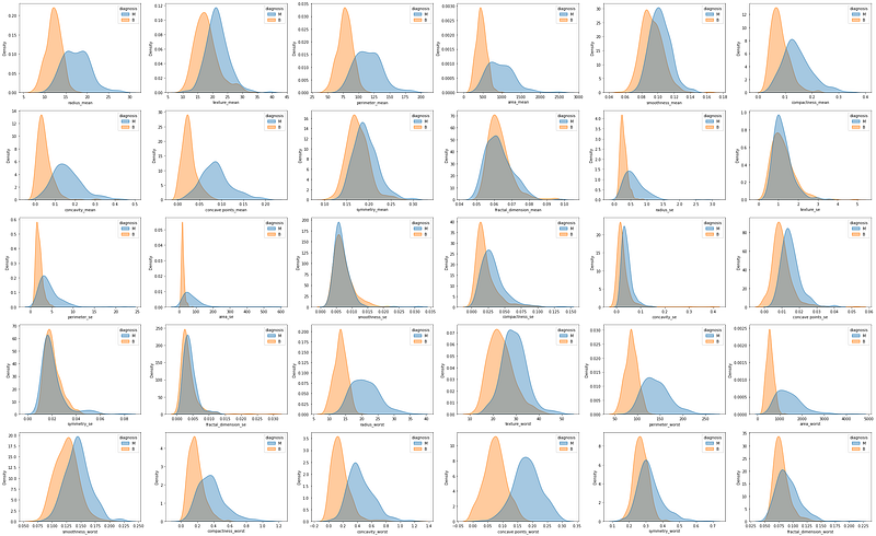
And the box plots:
#Box-plot comparing radius_mean according to diagnosis status:fig, axs = plt.subplots(5, 6, figsize=(40, 25))sns.boxplot(data=df, x="radius_mean", y="diagnosis", ax=axs[0, 0])
sns.boxplot(data=df, x="texture_mean", y="diagnosis", ax=axs[0, 1])
sns.boxplot(data=df, x="perimeter_mean", y="diagnosis", ax=axs[0, 2])
sns.boxplot(data=df, x="area_mean", y="diagnosis", ax=axs[0, 3])
sns.boxplot(data=df, x="smoothness_mean", y="diagnosis", ax=axs[0, 4])
sns.boxplot(data=df, x="compactness_mean", y="diagnosis", ax=axs[0, 5])sns.boxplot(data=df, x="concavity_mean", y="diagnosis", ax=axs[1, 0])
sns.boxplot(data=df, x="concave points_mean", y="diagnosis", ax=axs[1, 1])
sns.boxplot(data=df, x="symmetry_mean", y="diagnosis", ax=axs[1, 2])
sns.boxplot(data=df, x="fractal_dimension_mean", y="diagnosis", ax=axs[1, 3])
sns.boxplot(data=df, x="radius_se", y="diagnosis", ax=axs[1, 4])
sns.boxplot(data=df, x="texture_se", y="diagnosis", ax=axs[1, 5])sns.boxplot(data=df, x="perimeter_se", y="diagnosis", ax=axs[2, 0])
sns.boxplot(data=df, x="area_se", y="diagnosis", ax=axs[2, 1])
sns.boxplot(data=df, x="smoothness_se", y="diagnosis", ax=axs[2, 2])
sns.boxplot(data=df, x="compactness_se", y="diagnosis", ax=axs[2, 3])
sns.boxplot(data=df, x="concavity_se", y="diagnosis", ax=axs[2, 4])
sns.boxplot(data=df, x="concave points_se", y="diagnosis", ax=axs[2, 5])sns.boxplot(data=df, x="symmetry_se", y="diagnosis", ax=axs[3, 0])
sns.boxplot(data=df, x="fractal_dimension_se", y="diagnosis", ax=axs[3, 1])
sns.boxplot(data=df, x="radius_worst", y="diagnosis", ax=axs[3, 2])
sns.boxplot(data=df, x="texture_worst", y="diagnosis", ax=axs[3, 3])
sns.boxplot(data=df, x="perimeter_worst", y="diagnosis", ax=axs[3, 4])
sns.boxplot(data=df, x="area_worst", y="diagnosis", ax=axs[3, 5])sns.boxplot(data=df, x="smoothness_worst", y="diagnosis", ax=axs[4, 0])
sns.boxplot(data=df, x="compactness_worst", y="diagnosis", ax=axs[4, 1])
sns.boxplot(data=df, x="concavity_worst", y="diagnosis", ax=axs[4, 2])
sns.boxplot(data=df, x="concave points_worst", y="diagnosis", ax=axs[4, 3])
sns.boxplot(data=df, x="symmetry_worst", y="diagnosis", ax=axs[4, 4])
sns.boxplot(data=df, x="fractal_dimension_worst", y="diagnosis", ax=axs[4, 5])plt.show()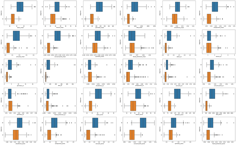
By observing the graphic results we can already expect to find some significant differences in the means of the two groups. So let’s now learn how to calculate the t-value and its significance.
The t-value is given by the following formula:
Looking at the formula, we can see that the t-value is given by the ratio between the difference between the means of the two groups, and the square root of the sum of the variance divided by the number of samples in each group. We can compute the t-value manually with Python:
#create different dataframes for the two groups:
df_M = df.loc[df['diagnosis'] == 'M']
df_B = df.loc[df['diagnosis'] == 'B']
#get the N for both groups:
print('The n for Malignant is: ', len(df_M))
print('The n for Benign is: ', len(df_B))[OUT] The n for Malignant is: 212
[OUT] The n for Benign is: 357Now we will find the difference between the two means:
#Find the difference between the two means:
mean_radius_mean_M = statistics.mean(df_M['radius_mean'])
print(mean_radius_mean_M)[OUT] 17.462830188679245mean_radius_mean_B = statistics.mean(df_B['radius_mean'])
print(mean_radius_mean_B)[OUT] 12.14652380952381mean_diff_radium_mean = mean_radius_mean_M - mean_radius_mean_B
print(mean_diff_radium_mean)[OUT] 5.316306379155435And the variance:
#Find the variances:var_radius_mean_M = statistics.variance(df_M['radius_mean'])
print(var_radius_mean_M)[OUT] 10.26543081462935var_radius_mean_B = statistics.variance(df_B['radius_mean'])
print(var_radius_mean_B)[OUT] 3.1702217220438738Now we are ready to calculate the t-value:
#Applying t-value formula:
t_value = mean_diff_radium_mean/(math.sqrt(((var_radius_mean_M/212)+(var_radius_mean_B/357))))
print('The t-value is: ', t_value)[OUT] The t-value is: 22.208797758464517The last value we will need is the degrees of freedom in our samples:
#Degrees of Freedom:
dof = (212+357)-1
print('Dof: ', dof)[OUT] Dof: 568Now we just need to look up in a table with the t-distribution the value of p according to our t-value and the DoF value. I can tell you that the p-value is lower than 0.001, so the difference between the two means is statistically significant.
However, we don’t always need to do all these calculations. I just did these calculations to help you understand how the t-test works. With Python, we can use pre-defined functions for this statistical test, which facilitates, speeds up, and prevents errors. Let’s see how easy it is:
#Variable radius_mean:
ttest = stats.ttest_ind(a=df_M['radius_mean'],
                        b=df_B['radius_mean'],
                        equal_var =False)
print(ttest)
[OUT] Ttest_indResult(statistic=22.208797758464524,
pvalue=1.6844591259582747e-64)Now that we have the p-value for the t-test, we can see how this value manifests visually if we look again at the density plot and at the box plot:
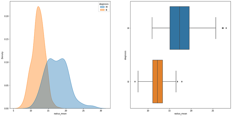
It is possible to see that the density plots have an area of overlap, but the means are still different. On the box plot, we can see that the area with the mean and standard deviation of the two groups does not have any overlap. Now let´s see another example where the p-value is higher than 0.05:
#Variable smoothness_se:
ttest = stats.ttest_ind(a=df_M['smoothness_se'], b=df_B['smoothness_se'], equal_var =False)
print(ttest)
[OUT] Ttest_indResult(statistic=-1.6228692577349724,
pvalue=0.10529700302804572)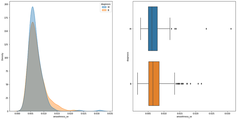
The graphical differences are huge, as you can see overlaps everywhere.
__________________________________________________________
Thank you for reading! Don’t forget to subscribe to receive notifications about my future publications.
If: you liked this article, don’t forget to follow me and thus receive all updates about new publications.
Else If: you want to read more on the topic, you can buy my book “Data-Driven Decisions: A Practical Introduction to Machine Learning” which will give you all the information you need to start with Machine Learning. It will cost you only a coffee, and give me a small tip!
Else: Thank you!