
Stacked LSTM, BiLSTM, and NeuralProphet Analysis of Univariate Time Series
In the realm of modern data science, time series analysis remains an intriguing and paramount area of study. It presents a unique set of challenges and opportunities, primarily due to its temporal nature and the influence of time-dependent structures. From stock market predictions and weather forecasting to energy demand estimation and disease spread patterns, time series analysis plays a crucial role. This article explores the intersection of machine learning and time series analysis, delving into the utilization of Stacked Long Short-Term Memory (Stacked LSTM), Bidirectional Long Short-Term Memory (BiLSTM), and the innovative NeuralProphet for univariate time series analysis.
While classical statistical methods have been traditionally applied to decode time series data, recent advancements in deep learning techniques, such as LSTM and BiLSTM, have reshaped the landscape, enabling superior predictive performance. Furthermore, the emergence of NeuralProphet, an upgrade of Facebook’s popular Prophet model, has brought additional promise by combining the benefits of traditional forecasting with the power of neural networks.
This article aims to elucidate the nuts and bolts of these advanced methodologies, explore their potential, and understand their practical application in univariate time series analysis. By diving into the intricacies of these methods, readers can glean insights into how they can harness these tools to unravel complex temporal patterns, predict future values, and make data-driven decisions in various scenarios. Join us as we embark on this journey through the dynamic landscape of modern time series analysis, one step at a time.
import pandas as pd
import numpy as np
import statsmodels.api as sm
import statsmodels.formula.api as smf
import sklearn.metrics as metrics
import seaborn as sns
import matplotlib.pyplot as plt
%matplotlib inline
The code snippet imports several libraries and sets up an environment for data analysis and visualization.
In the first line, the pandas library is imported, which is commonly used to manipulate and analyze data. It provides data structures and functions to efficiently work with structured data. Python’s numpy library is imported on the second line. It provides efficient array operations and mathematical functions. Python’s statsmodels.api module provides powerful statistical modeling capabilities. With it, you can analyze data with a wide range of statistical models. In the fourth line, statsmodels.formula.api is imported, which provides a formula interface that allows statistical models to be specified using formulas similar to those used in R. In line five, scikit-learn’s sklearn.metrics module is imported. It provides various metrics and evaluation functions for machine learning models.
The sixth line imports the seaborn library, a matplotlib-based data visualization library. It provides a high-level interface for creating informative and attractive statistical graphics. The seventh line imports the matplotlib.pyplot module from the matplotlib library. It provides a flexible and comprehensive set of functions for creating various types of plots. The last line, ‘%matplotlib inline’, displays matplotlib plots inline in Jupyter Notebook. It enables the interactive display of plots without the need for additional commands. This code snippet sets up the necessary libraries and environment for data analysis, statistical modeling, and visualization. By combining seaborn and matplotlib, it provides a comprehensive toolkit for working with structured data, creating statistical models, evaluating machine learning models, and creating visualizations.
data = pd.read_csv("AAPL.csv")
print(data.head())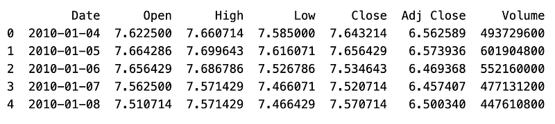
Data is read from a CSV file named “AAPL.csv” and stored in a variable called “data”.
In the pandas library, the “pd.read_csv()” function reads data from a CSV (comma-separated values) file. The function takes a file path as an argument and returns a pandas DataFrame, which is a two-dimensional tabular data structure. A CSV file containing Apple Inc. stock prices is assumed in this case. (AAPL). “print(data.head())” displays the first few rows of the DataFrame.
A DataFrame object’s “head()” method returns the first n rows, by default n=5. It is often used to quickly inspect the structure and contents of the data. The program will display the first few rows of the DataFrame after reading the “AAPL.csv” file. As a result, you are able to gain a better understanding of the data’s structure, column names, and values at the beginning of the table.
df = pd.read_csv('AAPL.csv')
df.shape
df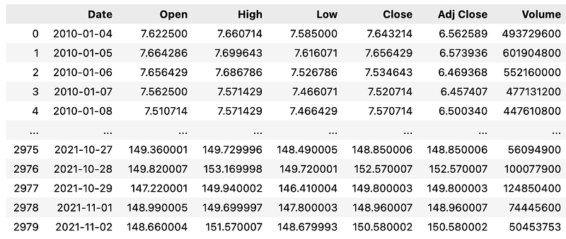
This code snippet performs several operations on a DataFrame object created from the data in the “AAPL.csv” file. Using pandas’ “read_csv()” function, the first line reads the data from the CSV file and assigns it to the variable “df”. DataFrames are two-dimensional tabular data structures with labeled axes (rows and columns) represented by the “df” variable. It is commonly used for data manipulation and analysis. “df.shape” retrieves the shape of the DataFrame. DataFrame’s “shape” attribute returns a tuple which represents its dimensions, i.e., the number of rows and columns.
By calling “df.shape”, we can obtain information about the size of the DataFrame. “df” simply displays the DataFrame. When executed in a Jupyter Notebook or interactive Python environment, the DataFrame is outputted as a formatted table, showing the contents of the DataFrame. In summary, this code reads the data from the “AAPL.csv” file and stores it in the “df” DataFrame. Then, it retrieves and displays the number of rows and columns in the DataFrame. In the final step, the DataFrame itself is displayed, showing the tabular data from the CSV file.
data.info()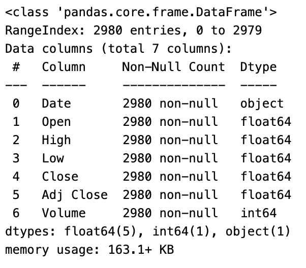
This code provides an overview of the structure and summary information about a DataFrame called “data”. It uses the “.info()” method to display a concise summary. It provides useful information such as the number of rows and columns, the types of the columns, and the amount of memory used by the DataFrame. This code produces the following information: — The number of rows in the DataFrame. — The number of columns in the DataFrame. — The column names. — The data type of each column (e.g., integer, float, object).
The number of non-null values in each column, which indicates the number of non-missing values. This summary information helps understand the overall structure and characteristics of the data. Users can identify potential issues such as missing values, inconsistencies in the data types, and the DataFrame’s composition by using it. By displaying information about the structure, column names, data types, non-null value counts, and memory usage of the DataFrame “data”, the “data.info()” code provides an overview of the DataFrame “data”.
def resumetable(df):
    print(f"Dataset Shape: {df.shape}")
    summary = pd.DataFrame(df.dtypes,columns=['dtypes'])
    summary = summary.reset_index()
    summary['Name'] = summary['index']
    summary = summary[['Name','dtypes']]
    summary['Missing'] = df.isnull().sum().values
    summary['Uniques'] = df.nunique().values
    return summary


resumetable(df)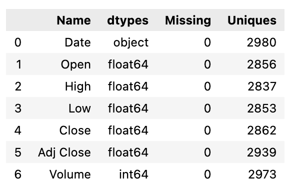
Using the “resumetable” function, this code returns a summary of the characteristics of a DataFrame, “df”, as input. The “resumetable” function first prints the shape of the DataFrame, indicating the number of rows and columns it contains. Then, using the “.dtypes” attribute, it extracts data types from the input DataFrame to create a summary DataFrame. There are two columns in the summary DataFrame: “Name” and “dtypes”. The “Name” column contains the column names, and the “dtypes” column contains the corresponding data types. The “index” column is removed from the summary DataFrame and replaced with “Name”. Then, the summary DataFrame is rearranged to include only the “Name” and “dtypes” columns.
Two additional columns are then added. Using the “.isnull().sum()” method, the “Missing” column is populated with the number of missing values in each column. With the “.nunique()” method, the “Uniques” column contains the number of unique values in each column. The function returns the Summary DataFrame. The function generates a summary table for the provided DataFrame, “df”, when called with “resumetable(df)”. This summary table contains information such as the column names, data types, the number of missing values, and the number of unique values for each column in the DataFrame. As a result of this code, a summary table can be generated for a given DataFrame, providing insight into the data structure and characteristics.
sns.heatmap(df.corr(), cmap=("Blues"))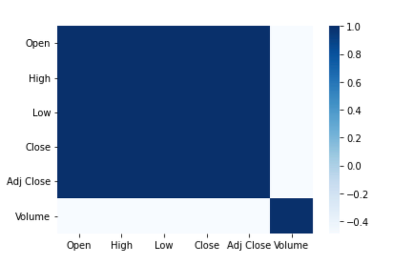
This code generates and displays a heatmap plot of the correlation matrix for a DataFrame called “df”. It calculates the correlation coefficients between all pairs of columns. The result is a square matrix where each element represents the correlation between two variables. To create a heatmap plot, the “sns.heatmap()” function is called.
A heatmap is a graphical representation of data using colors, where each cell in the plot corresponds to a pair of variables and the color represents the correlation coefficient. To select the color palette, set the “cmap” parameter to “Blues”. “Blues” is a sequential color map that ranges from light to dark blue, which is commonly used for visualizing positive correlations. When the code is executed, it generates a heatmap plot that visually displays the correlation matrix. The plot helps in understanding the patterns and strengths of the relationships between different variables in the DataFrame. To summarize, this code creates a heatmap plot using seaborn to represent the correlation matrix. In addition to providing a visual representation of correlations between variables, color variations can be used to identify strong positive or negative relationships.
data = pd.read_csv("AAPL.csv")
print(data.head())
data.info()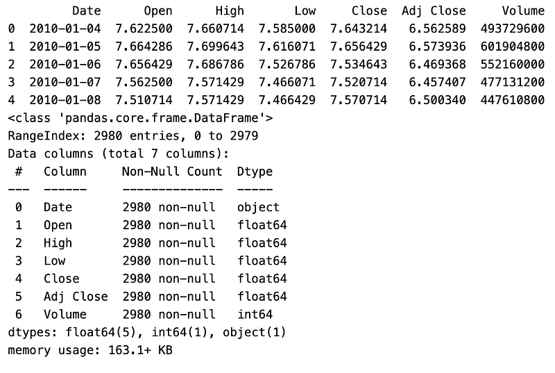
This code performs data reading, data preview, and information summary operations on a dataset stored in a CSV file named “AAPL.csv”. The first line reads the data from the CSV file using the pandas library’s “read_csv()” method. The data is then assigned to a DataFrame called “data”. The second line prints the first few rows of the DataFrame. This provides a quick preview of the data, displaying the column names and a subset of the records. The third line generates a summary using the “info()” method. It includes information on the number of rows and columns in the dataset, the data types for each column, and the amount of memory used by the dataset.
To gain an understanding of the dataset’s structure and content, the first few rows are printed after loading the data from the CSV file into a DataFrame. The “info()” method then offers a more detailed overview, which includes the data types and non-null values for each column. The code reads a CSV file into a DataFrame, prints a preview of its initial records, and summarizes its structure and contents. Prior to further analysis or processing, it is commonly used to gain an initial understanding of the data.
plt.figure(figsize=(20,10))
plt.xlabel("Date")
plt.ylabel("Adj Close ")
plt.plot(data)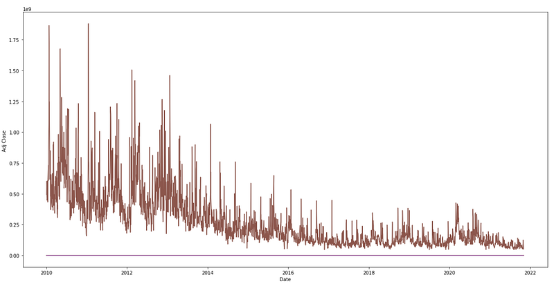
The provided code generates a line plot to visualize the historical trend of the “Adj Close” values over time from a DataFrame named “data”. The plot figure size is set in the first line, “plt.figure(figsize=(20,10)). “figsize” specifies the figure’s width and height in inches. The width is set to 20 inches and the height is set to 10 inches. This ensures that the resulting plot has a larger size, making it easier to view and analyze the data. The second line, “plt.xlabel(“Date”)”, adds a label to the x-axis. The label clearly indicates that the x-axis represents the variable “Date”. It helps users understand the information being presented along the horizontal axis. The third line, “plt.ylabel(“Adj Close”)”, adds a label to the y-axis. The y-axis represents the variable “Adj Close”. It helps in interpreting the information displayed along the vertical axis. In the fourth line, “plt.plot(data)”, the line plot is generated. Using the “data” DataFrame as input, the “plot()” function from the matplotlib library is called. This plots the values from the “Adj Close” column against the corresponding dates on the x-axis, creating a line plot that visually represents the historical changes in the adjusted closing prices of the stock.
The historical trend in the “Adj Close” values is visualized by executing this code, which creates a line plot. Plotting the adjusted closing price of the stock helps in understanding its patterns, fluctuations, and overall movement. It enables users to identify trends, potential reversals, and other significant aspects related to the stock’s performance. The code generates a line plot using matplotlib to represent the historical trend of the “Adj Close” values. Enhanced visibility is provided by properly labeled axes and a larger figure size. Using this tool, you can analyze and interpret the stock’s price movement over time visually.
rolmean=data.rolling(window=12).mean()
rolstd=data.rolling(window=12).std()
print(rolmean.head(15))
print(rolstd.head(15))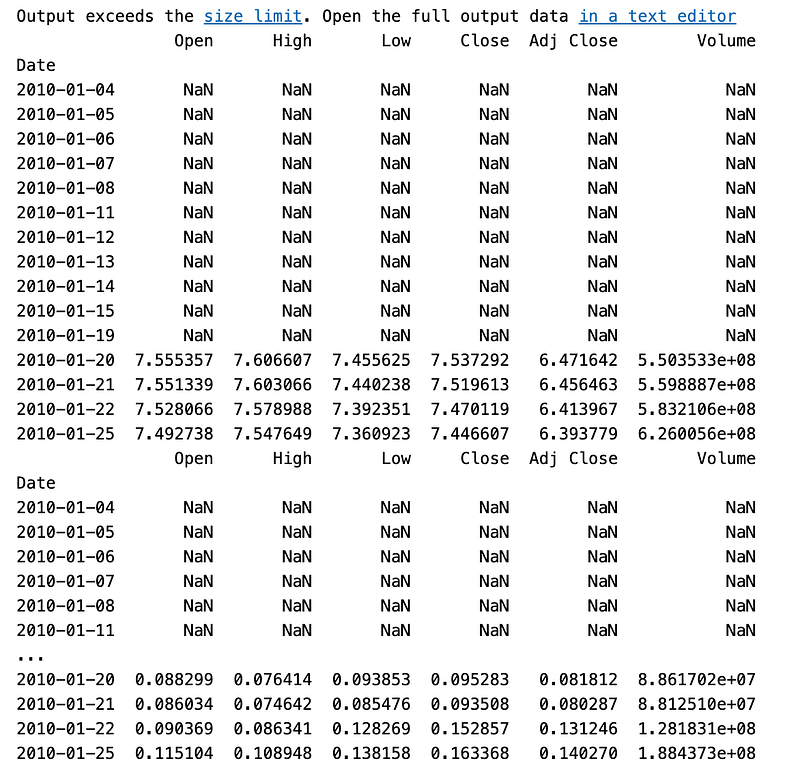
To calculate the rolling mean and rolling standard deviation of a DataFrame called “data”, this code performs rolling window calculations. With the “rolling()” function from pandas, the “rolmean = data.rolling(window=12).mean()” function applies a rolling window of size 12 to the “data” DataFrame. It creates a new DataFrame, “rolmean”, where each value represents the rolling mean of the previous 12 values. It computes the average value over a sliding window of 12 periods. The second line, “rolstd = data.rolling(window=12).std()”, calculates the rolling standard deviation using the same rolling window operation. The resulting DataFrame, “rolstd”, contains the rolling standard deviation values for each window of 12 periods in the “data” DataFrame. The third line prints the first 15 rows of the “rolmean” DataFrame.
This provides a preview of the calculated rolling mean values for the initial period of the dataset. The fourth line prints the first 15 rows of the “rolstd” DataFrame. This displays the rolling standard deviation values for the initial period of the dataset. Using a 12-window size, this code computes the rolling mean and rolling standard deviation for the “data” DataFrame. The data’s trend and variability over time can be analyzed using these calculations. The printed outputs provide a glimpse of the computed rolling mean and standard deviation values for the initial portion of the dataset.
To calculate the rolling mean and rolling standard deviation, the code uses a window size of 12 to calculate rolling windows on the “data” DataFrame. In the printed outputs, the results for the initial period of the dataset are shown, allowing insight into the trend and variability of the data over time.
plt.figure(figsize=(20,10))
actual=plt.plot(data, color='red', label='Actual')
mean_6=plt.plot(rolmean, color='green', label='Rolling Mean')
std_6=plt.plot(rolstd, color='black', label='Rolling Std')
plt.legend(loc='best')
plt.title('Rolling Mean & Standard Deviation')
plt.show(block=False)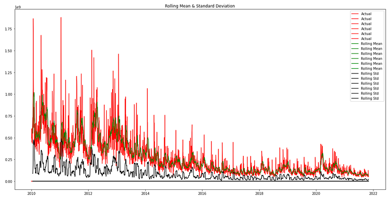
The provided code generates a line plot to visualize the actual data, rolling mean, and rolling standard deviation of a DataFrame named “data”. The plot size is specified in the first line, “plt.figure(figsize=(20,10))”. In inches, this line specifies the figure’s width and height. With a width of 20 inches and a height of 10 inches, the resulting plot will have larger dimensions, making it easier to view and analyze the data.
As part of the “actual=plt.plot(data, color=’red’, label=’Actual’)” function, the “plot()” function from the matplotlib library is used to plot the “data” DataFrame. In red, the line plot represents the actual data points. The “label” parameter assigns a label to this line plot, indicating that it represents the actual data. The third line, “mean_6=plt.plot(rolmean, color=’green’, label=’Rolling Mean’)”, also generates a line plot for the rolling mean. Rolling mean values are plotted in green in the “rolmean” DataFrame. The “label” parameter assigns a label to this line plot, indicating that it represents the rolling mean. The fourth line, “std_6=plt.plot(rolstd, color=’black’, label=’Rolling Std’), creates a line plot for the rolling standard deviation. Black color represents the “rolstd” DataFrame, which contains rolling standard deviation values. The “label” parameter assigns a label to this line plot, indicating that it represents the rolling standard deviation. The fifth line adds a legend. The legend displays the labels assigned to each line plot, allowing for easy identification of the actual data, rolling mean, and rolling standard deviation.
The title of the plot is set by the sixth line, “plt.title(‘Rolling Mean & Standard Deviation’). This descriptive title provides a summary of the information being presented in the plot, specifically highlighting that it shows the rolling mean and standard deviation. Finally, the seventh line, “plt.show(block=False)”, displays the plot. Users can view the line plots of the actual data, rolling mean, and rolling standard deviation by calling the “show()” function. “block=False” allows the program to continue without being blocked, meaning the plot window can be closed before the next line of code is executed.
In summary, the provided code creates a line plot using matplotlib to represent the actual data, rolling mean, and rolling standard deviation of the DataFrame “data”. Plotting these three components allows comparison of the actual data with the rolling mean and standard deviation. By identifying patterns and potential anomalies, the plot helps to understand the trends, central tendency, and variability of the data over time.
col_names = data.columns

fig = plt.figure(figsize=(24, 24))
for i in range(6):
  ax = fig.add_subplot(6,1,i+1)
  ax.plot(data.iloc[:,i],label=col_names[i])
  data.iloc[:,i].rolling(100).mean().plot(label='Rolling Mean')
  ax.set_title(col_names[i],fontsize=18)
  ax.set_xlabel('Date')
  ax.set_ylabel('Price')
  ax.patch.set_edgecolor('black')
  plt.style.context('fivethirtyeight')
  plt.legend(prop={'size': 12})
  plt.style.use('fivethirtyeight')

fig.tight_layout(pad=3.0)

plt.show()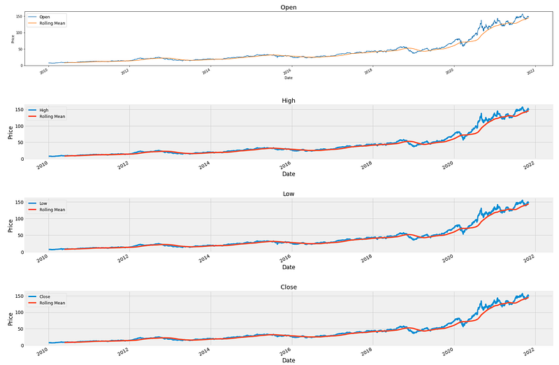
The provided code generates multiple line plots to visualize the price data for different variables within the DataFrame “data”. The first line retrieves and stores the column names of the DataFrame. These column names represent the different variables or attributes of the data. Matplotlib is used to create the figure object. The specified figure size of 24 inches by 24 inches ensures that the resulting plots will have sufficient space for clear visibility and readability. The loop iterates six times, indicating the number of variables to plot. Within each iteration, the code performs the following steps: The “fig.add_subplot(6,1,i+1)” function is used to add a new subplot to the figure. This creates a vertical arrangement of subplots, with each subplot representing a different variable. Data values are plotted using “ax.plot(data.iloc[:,i], label=col_names[i]). This line plot represents the price data for the specific variable. The rolling mean is calculated and plotted using “data.iloc[:,i].rolling(100).mean().plot(label=’Rolling Mean’). This adds a line plot that represents the rolling mean of the variable, using a window size of 100. The title, x-axis label, and y-axis label are set using “ax.set_title()”, “ax.set_xlabel()”, and “ax.set_ylabel()”. These labels provide clear descriptions for each subplot, aiding in understanding the information being presented.
Each subplot is customized. As part of this, “ax.patch.set_edgecolor(‘black’)” is used to set the edge color of the subplot, “plt.style.context(‘fivethirtyeight’)” is used to apply a specific visual style, and “plt.legend(prop=[‘size’: 12])” is used to set the global plot style. “fig.tight_layout(pad=3.0)” adjusts the spacing between subplots, enhancing readability by reducing overlapping elements after completing the loop, ensuring consistency across all subplots. Finally, “plt.show()” is called to display the generated plot, which displays the multiple line plots for the variables within the “data” DataFrame. In summary, the provided code generates multiple line plots to visualize the price data for different variables within the DataFrame. A “data set”. Variables are represented by line plots, accompanied by a subplot title, x-axis and y-axis labels, and customization options. A clear and organized visualization of the price data is provided by the line plots for the variables.
fig = plt.figure(figsize=(10,8))
sns.distplot(monthly_data['Adj Close']).set_title("Distribution Plot Adj Close -AAPL")
#ax.tick_params(labelsize=12)
sns.set(font_scale=1)
plt.xticks(fontsize=16)
plt.yticks(fontsize=16)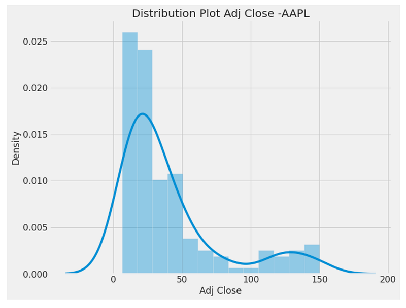
By using the “fig = plt.figure(figsize=(10,8))” line, a figure object with a specified size of 10 inches by 8 inches is created. This figure will be used to display a distribution plot. From the “monthly_data” DataFrame, we use the seaborn library to generate a distribution plot. As input data, the “sns.distplot()” function is called with the ‘Adj Close’ column. The resulting plot represents the distribution of the ‘Adj Close’ values and provides insights into their spread and shape. It is titled “Distribution Plot Adj Close -AAPL” using the “set_title()” function. This title provides a concise description of the plotted data and the company or asset it relates to (AAPL in this case). The following lines adjust the plot’s styling. The “sns.set(font_scale=1)” line sets the font scale for the seaborn library, ensuring that the plot’s text elements are displayed at an appropriate size.
A line like “plt.xticks(fontsize=16)” or “plt.yticks(fontsize=16)” specifies the font size for the x-axis tick labels and y-axis tick labels, respectively. This adjustment enhances the readability of the tick labels by increasing their font size. The figure below shows a distribution plot of the ‘Adj Close’ values from the “monthly_data” DataFrame. It is titled “Distribution Plot Adj Close -AAPL” and is styled with appropriate font sizes for the text elements and tick labels, improving its visual appeal.
fig = plt.figure(figsize=(8,6))
sns.boxplot(monthly_data['Adj Close']).set_title('Box Plot Apple Stock Price')
plt.style.context('fivethirtyeight')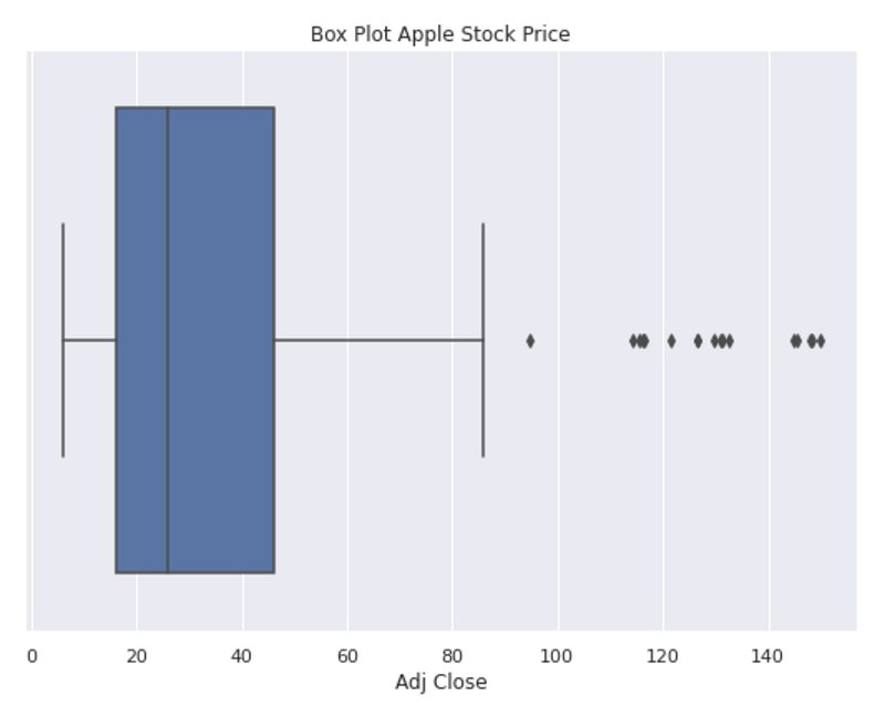
Using “fig = plt.figure(figsize=(8,6)),” this code creates a figure object with a size of 8 inches by 6 inches. This figure will be used to display a box plot. The seaborn library is used to generate a box plot from the “monthly_data” DataFrame. Data from the ‘Adj Close’ column is passed to the “sns.boxplot()” function. The resulting plot displays the distribution of the ‘Adj Close’ values through the use of a box and whisker representation. Its title is set to “Box Plot Apple Stock Price” by using the “set_title()” function. This title provides a descriptive label for the plotted data, specifying that it pertains to the stock price of Apple. “plt.style.context(‘fivethirtyeight’)” is used to apply a specific visual style to the plot. The “fivethirtyeight” style mimics the visual aesthetics of the popular FiveThirtyEight data journalism website. It enhances the plot’s appearance with a distinctive and visually appealing style. This code displays a box plot of the ‘Adj Close’ values from the “monthly_data” DataFrame. Stock prices are plotted to visualize key statistical measures such as medians, quartiles, and outliers. It is titled “Box Plot Apple Stock Price” and styled in the “fivethirtyeight” style, which enhances its visual appeal.
qq_plot = qq(monthly_data['Adj Close'],line='s')
plt.title('QQ Plot Apple Stock Price')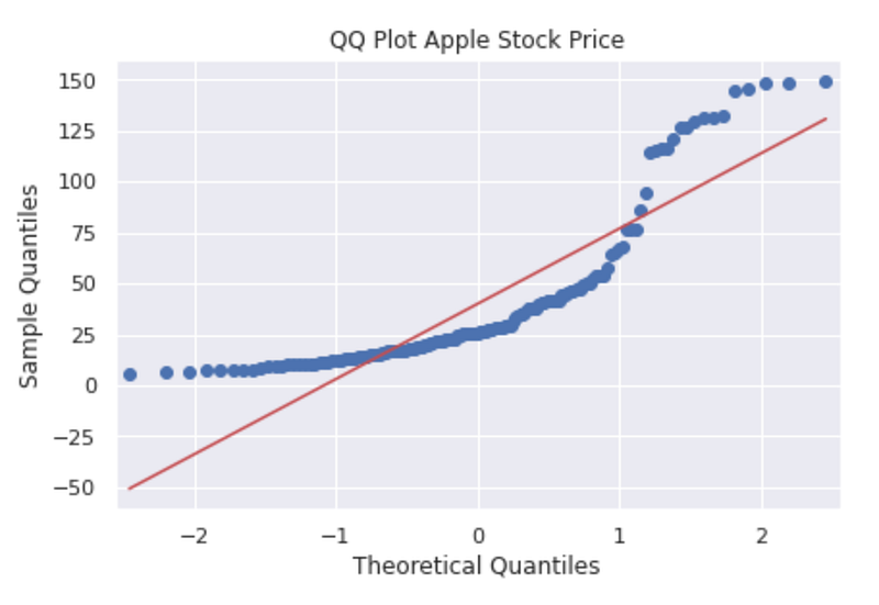
This code generates a Q-Q plot to assess the normality of the distribution of the ‘Adj Close’ values from the “monthly_data” DataFrame. It uses the “qq()” function, which is likely imported from a library. Input data for the Q-Q plot is the ‘Adj Close’ column. The “line=’s’’ parameter specifies that a standardized line should be added to the plot, which aids in assessing the deviation from normality. A descriptive label for the plotted data is provided on the second line of code, “QQ Plot Apple Stock Price”, indicating that it pertains to Apple’s stock price. The value of the ‘Adj Close’ variable from the “monthly_data” dataframe is displayed as a Q-Q plot by executing this code. The Q-Q plot compares the quantiles of a dataset with the quantiles of a theoretical distribution, usually the normal distribution. Analyzing the data helps determine if it follows a normal distribution or if it deviates from it. “QQ Plot Apple Stock Price” illustrates the normality of Apple’s stock price distribution.
fig, ax = plt.subplots(figsize=(20,10))
palette = sns.color_palette("mako_r", 4)
a = sns.barplot(x="Year", y="Adj Close",hue = 'Month',data=monthly_data)
a.set_title("Stock Prices Year & Month Wise",fontsize=15)
plt.legend(loc='upper left')
plt.show()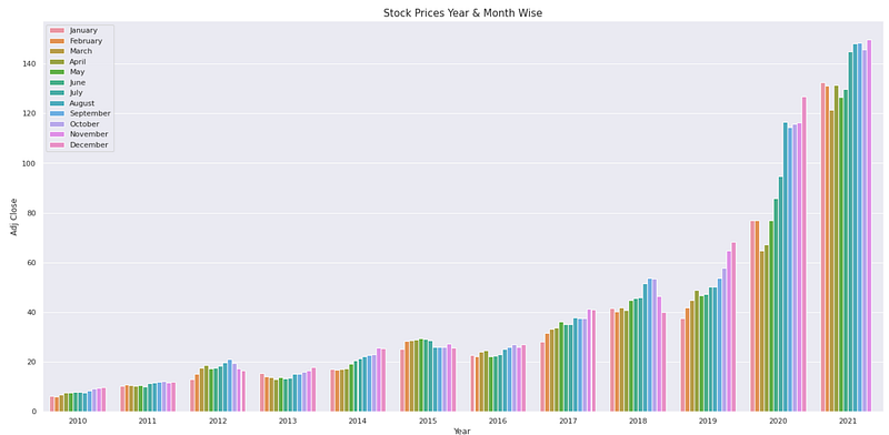
This code generates a grouped bar plot to visualize the stock prices year and month-wise from the “monthly_data” DataFrame. Fig, ax are initialized using “fig, ax = plt.subplots(figsize=(20,10)). This creates a plot figure with a specific size of 20 inches by 10 inches. The line “palette = sns.color_palette(“mako_r”, 4)” sets a custom color palette for the bars. The “mako_r” palette is used with 4 colors to provide a visually appealing and distinguishable color scheme. Next, the bar plot is created using “sns.barplot()”. The ‘Year’ column is used as the x-axis variable, the ‘Adj Close’ column as the y-axis variable, and the ‘Month’ column is used to group and differentiate the bars. The data source is the “monthly_data” DataFrame. The line “a.set_title(“Stock Prices Year & Month Wise”,fontsize=15)” sets the title of the bar plot to “Stock Prices Year & Month Wise”. This title provides a concise description of the plotted data and the variables represented in the plot. The line “plt.legend(loc=’upper left’)” adds a legend to the plot. The legend helps in identifying the different months represented by the bars.
Finally, “plt.show()” is called to display the generated bar plot.
By executing this code, a bar plot is generated that represents stock prices year- and month-by-year based on the “monthly_data” DataFrame. With a different color for each month, the plot compares the stock prices across different years and months. The plot title, “Stock Prices Year & Month Wise,” describes the plot’s content. The legend explains the different colors and months.
fig,(ax1,ax2) = plt.subplots(2,figsize=(12,12))
acf = plot_acf(monthly_data['Adj Close'],lags=90,ax=ax1)
ax1.set_title('AutoCorrelation Long Term')
acf = plot_acf(monthly_data['Adj Close'],lags=30,ax=ax2)
ax2.set_title('AutoCorrelation Short Term')    # auto correction
ax1.set_ylabel('Correlation')
ax1.set_xlabel('Lags')
ax2.set_ylabel('Correlation')
ax2.set_xlabel('Lags')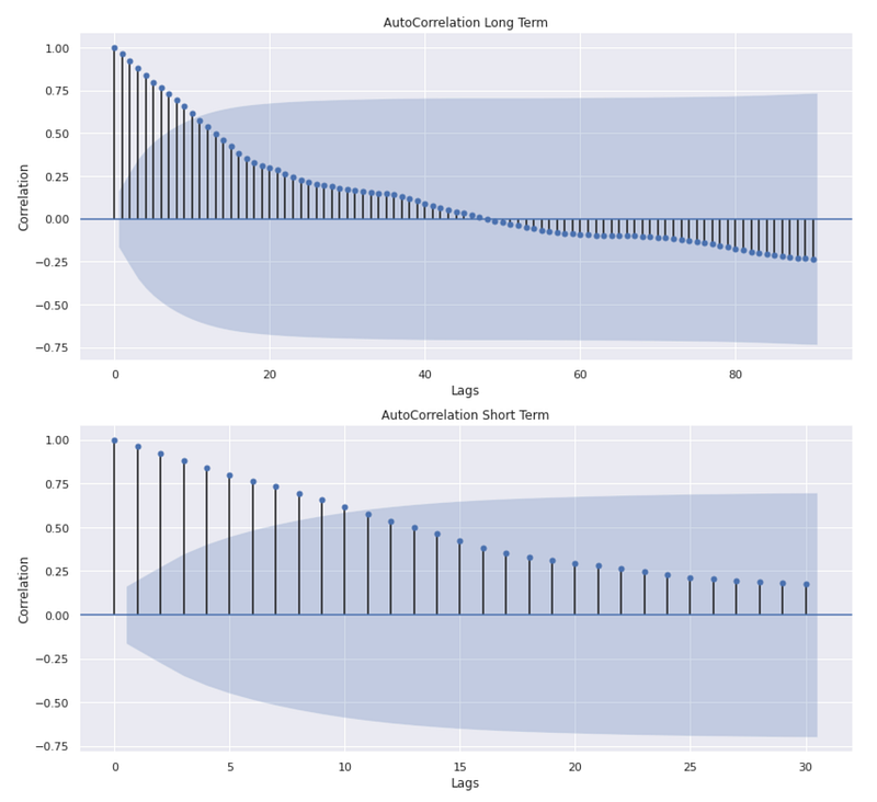
This code generates two subplots within a single figure to visualize the autocorrelation of the ‘Adj Close’ values from the “monthly_data” DataFrame. The first line of code creates a figure with two vertical subplots. The variable names “ax1” and “ax2” are assigned to the axes objects of the two subplots. Next, the plot_acf() function is used to plot the autocorrelation function (ACF) for the adjusted close values. ACF measures the correlation between a time series and its lagged values. The ACF plot visualizes the correlation coefficients as a function of the lag. The first subplot uses “lags=90” to generate the ACF plot with a maximum lag of 90. This plot represents the long-term autocorrelation of the ‘Adj Close’ values.
The following line of code sets the title of the first subplot as “AutoCorrelation Long Term”.
ACF plots are then generated again in the second subplot, but with a maximum lag of 30 using “lags=30”. Following this line of code, the title of the second subplot is “AutoCorrelation Short Term”. The plot represents the short-term autocorrelation of ‘Adj Close’ values. The code then sets the y-axis label as “Correlation” for both subplots and the x-axis label as “Lags.” The result is that two subplots are displayed in one figure. In the first subplot, the long-term autocorrelation of ‘Adj Close’ values is shown, while in the second subplot, the short-term autocorrelation is shown. The plots show how the ‘Adj Close’ values correlate with their lagged values at different time lags. Correlation coefficients are depicted on the y-axis, and time lags are shown on the x-axis. This figure provides a visual representation of any significant correlation patterns or trends in the ‘Adj Close’ series.
fig,(ax1,ax2) = plt.subplots(2,figsize=(10,10))
pacf = plot_pacf(monthly_data['Adj Close'],lags=90,ax=ax1)
ax1.set_title('Partial AutoCorrelation Long Term')
pacf = plot_pacf(monthly_data['Adj Close'],lags=30,ax=ax2)
ax2.set_title('Partial AutoCorrelation Short Term')
ax1.set_ylabel('Correlation')
ax1.set_xlabel('Lags')
ax2.set_ylabel('Correlation')
ax2.set_xlabel('Lags')
plt.tight_layout(pad=1)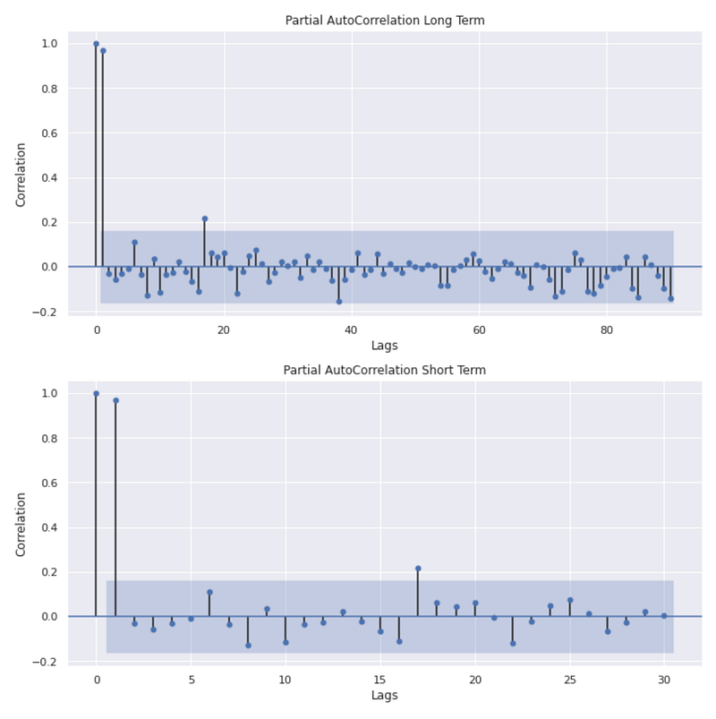
This code generates two subplots within a single figure to visualize the partial autocorrelation of the ‘Adj Close’ values from the “monthly_data” DataFrame. In the first line, the figure and axes objects are initialized, creating a figure with two subplots. The variable names “ax1” and “ax2” are assigned to the axes objects of the two subplots. Next, the “plot_pacf()” function is used to plot the partial autocorrelation function (PACF) of the ‘Adj Close’ values. The PACF measures the correlation between a time series and its lagged values while removing the correlation explained by shorter lags. The PACF plot for the first subplot is generated with a maximum lag of 90. The following line of code sets the title of the first subplot as “Partial AutoCorrelation Long Term” and represents the long-term partial autocorrelation of the ‘Adj Close’ values. A PACF plot is then generated again in the second subplot with a maximum lag of 30 with the “lags=30” parameter. This plot shows the short-term partial autocorrelation of the ‘Adj Close’ values.
The next line of code sets the title of the second subplot as “Partial AutoCorrelation Short Term”. For both subplots, the y-axis label is “Correlation” and the x-axis label is “Lags”. This code adjusts the spacing between the subplots in order to avoid overlapping or crowding. By executing this code, two subplots are displayed within one figure. This first subplot shows the long-term partial autocorrelation of the ‘Adj Close’ values, while the second subplot shows the short-term partial autocorrelation. By accounting for shorter lags, these plots provide insight into the correlation between the ‘Adj Close’ values and their lagged values. Correlation coefficients are plotted on the y-axis, while time lags are plotted on the x-axis. As a result of the figure, the ‘Adj Close’ series can be visually examined for any significant partial autocorrelation patterns or trends.
monthly_data['monthly_diff'][1:].plot(c='grey')
monthly_data['monthly_diff'][1:].rolling(20).mean().plot(label='Rolling Mean',c='orange')
monthly_data['monthly_diff'][1:].rolling(20).std().plot(label='Rolling STD',c='yellow')
plt.legend(prop={'size': 12})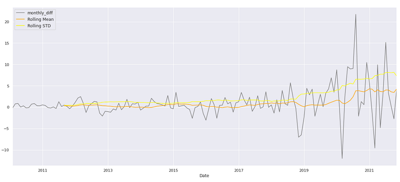
To visualize the differenced series, rolling mean, and rolling standard deviation of the ‘monthly_diff’ values from the “monthly_data” DataFrame, this code generates a line plot.
The first line of code plots the ‘monthly_diff’ values starting from the second index (excluding the first NaN value) using the “.plot()” function. The ‘c’ parameter is set to ‘grey’ to specify the color of the line. The second line plots the rolling mean of ‘monthly_diff’. “.rolling(20).mean()” computes the rolling mean using a window size of 20, which averages the previous 20 values. The resulting rolling mean values are plotted with the label ‘Rolling Mean’ and the color ‘orange’. The rolling standard deviation is plotted in the third line of code. The “.rolling(20).std()” function calculates the rolling standard deviation with a window size of 20, which calculates the standard deviation of the previous 20 values.
The resulting rolling standard deviation values are plotted with the label ‘Rolling STD’ and the color ‘yellow’. The fourth line of code adds a legend to the plot. The legend displays the labels ‘Rolling Mean’ and ‘Rolling STD’, allowing for easy identification of the plotted lines. Executing this code generates a line plot that visualizes the ‘monthly_diff’ series, its rolling mean, and rolling standard deviation. Using this plot, you can analyze the trend, variability, and changes in the differenced series over time. For further analysis or interpretation, the rolling mean and rolling standard deviation can be used to identify patterns or fluctuations in the differenced series.
def stationarity(timeseries):

    rolmean=timeseries.rolling(window=12).mean()
    rolstd=timeseries.rolling(window=12).std()

    plt.figure(figsize=(20,10))
    actual=plt.plot(timeseries, color='red', label='Actual')
    mean_6=plt.plot(rolmean, color='green', label='Rolling Mean')
    std_6=plt.plot(rolstd, color='black', label='Rolling Std')
    plt.legend(loc='best')
    plt.title('Rolling Mean & Standard Deviation')
    plt.show(block=False)

    print('Dickey-Fuller Test: ')
    dftest=adfuller(timeseries[1:], autolag='AIC') #BIC
    dfoutput=pd.Series(dftest[0:4], index=['Test Statistic','p-value','Lags Used','No. of Obs'])
    for key,value in dftest[4].items():
        dfoutput['Critical Value (%s)'%key] = value
    print(dfoutput)
This code defines a function called `stationarity` that examines the stationarity of a given time series. It calculates the rolling mean and rolling standard deviation of the input series. A rolling mean is calculated by taking the average of the values within a 12-point window, and a rolling standard deviation is calculated similarly. These measures help to identify trends and variations in the time series. A plot is created after calculating the rolling mean and standard deviation. Red represents the actual time series, green represents the rolling mean, and black represents the rolling standard deviation. A legend is included to label each line, and the resulting plot is presented to provide a visual representation of the data. The code then conducts a Dickey-Fuller test to determine whether the data is stationary. The `adfuller` function is utilized to perform this test, and it returns various statistical outputs including the test statistic, p-value, number of lags used, and other relevant information. Dfoutput is used to store the results.
The test statistic, p-value, lags used, and number of observations are stored in this Series. Additionally, the critical values for different significance levels are extracted from the test results and appended to the `dfoutput` Series. Lastly, the Dickey-Fuller output series is printed. It includes information such as the test statistic, p-value, lags used, and number of observations. The stationarity of the time series can be determined by analyzing these results. As a summary, the stationarity function calculates and plots the rolling average and standard deviation of a time series, and then performs a Dickey-Fuller test to determine the stationarity characteristics. Using this function, you can examine trends and determine if a given time series is stationary.
stationarity(monthly_data['monthly_diff'][1:])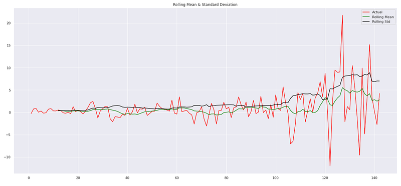
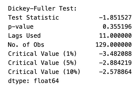
This code applies the `stationarity` function to a specific column, ‘monthly_diff’, of a pandas DataFrame called ‘monthly_data’. Stationarity is assessed by performing several operations. In this case, it focuses on the ‘monthly_diff’ column from the ‘monthly_data’ DataFrame, excluding the first element. First, it calculates the rolling mean and rolling standard deviation of the ‘monthly_diff’ column. This helps identify any trends or variations in the data. Next, it visualizes the ‘monthly_diff’ time series, the rolling mean, and the rolling standard deviation. A line in the plot represents a particular aspect of the data, with red representing the actual values, green representing the rolling mean, and black representing the rolling standard deviation. The code then performs a statistical test to determine whether a time series is stationary, the Dickey-Fuller test. Input for the test is the ‘monthly_diff’ column. The Dickey-Fuller test calculates a test statistic, p-value, number of lags used, and other relevant information. A summary of the test results is displayed along with the critical values. The summary provides information such as the test statistic, p-value, lags used, number of observations, and critical values. These results are helpful in determining whether the ‘monthly_diff’ time series is stationary or exhibits trend-like behavior.
By applying the `stationarity` function to the ‘monthly_diff’ column of the ‘monthly_data’ DataFrame, this code assesses the stationarity characteristics and trends in the data. Through plots and Dickey-Fuller test results, it aids in the analysis of time series properties by providing statistical insights into data.
monthly_data['differenced_trasnformation_demand'] = monthly_data['Adj Close'].diff().values
monthly_data.head()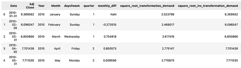
By creating a new column named ‘differenced_transnformation_demand’, this code modifies a pandas DataFrame called ‘monthly_data’.
Differences between consecutive values of the ‘Adj Close’ column are populated in the new column. To achieve this, we apply the diff() method to the ‘Adj Close’ column, which calculates the difference between each value and the previous one. The resulting differences are then assigned to the ‘differenced_trasnformation_demand’ column. The code then displays the first few rows of the modified ‘monthly_data’ DataFrame. This allows for a quick check of the DataFrame to verify the changes and observe the updated structure and content. To summarize, this code computes the changes between consecutive values by differencing the ‘Adj Close’ column. These differences are stored in a new column, ‘differenced_transnformation_demand’. Lastly, it displays the updated DataFrame with the initial rows.
df11.set_index('Date')['Adj Close'].plot(figsize=FIGURE_SIZE)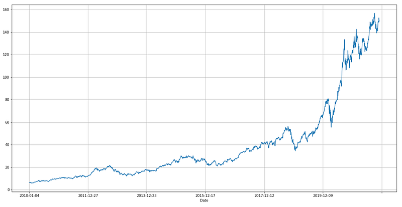
### Plotting
# shift train predictions for plotting
look_back=100
fig, ax = plt.subplots(figsize=(20,10))
trainPredictPlot = numpy.empty_like(y)
trainPredictPlot[:, :] = np.nan
trainPredictPlot[look_back:len(train_predict)+look_back, :] = train_predict
# shift test predictions for plotting
testPredictPlot = numpy.empty_like(y)
testPredictPlot[:, :] = numpy.nan
testPredictPlot[len(train_predict)+(look_back*2)+1:len(y)-1, :] = test_predict
# plot baseline and predictions
plt.plot(scaler.inverse_transform(y))
plt.plot(trainPredictPlot)
plt.plot(testPredictPlot)
plt.legend(['scaler.inverse-y','trainPredictPlot','testPredictPlot'])
plt.show()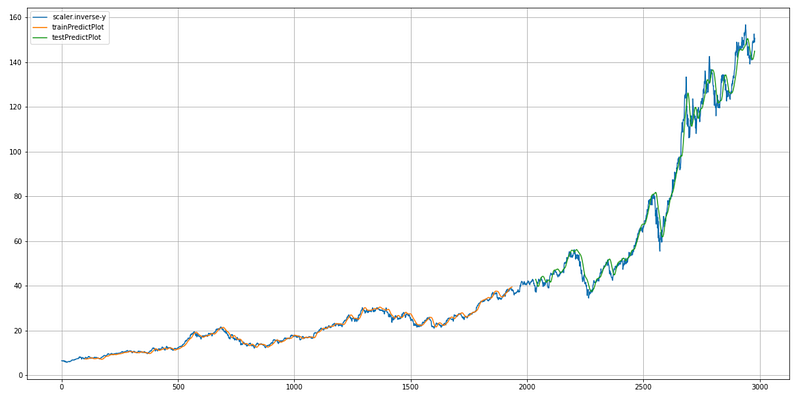
This code is responsible for plotting the actual stock prices, the predicted prices on the training dataset, and the predicted prices on the test dataset.
First, it creates an empty array called `trainPredictPlot` with the same shape as the target variable (`y`), and fills it with NaN (not a number) values. It then creates another empty array called `testPredictPlot` with the same shape as `y` and fills it with NaN values. This array will be used to plot the predicted prices on the test dataset. In the first step, the estimate prices are assigned from the train_predict array to the trainPredictPlot array, starting from the index look_back and adding the look_back index. This aligns the predicted values with the corresponding positions in the original `y` array.
Similarly, it assigns the predicted prices from the `test_predict` array to the `testPredictPlot` array, starting from the index `len(train_predict) + (look_back * 2) + 1` up to the index `len(y) — 1`. This aligns the predicted values with the corresponding positions in the original `y` array. It then plots the original stock prices (`scaler.inverse_transform(y)`), the `trainPredictPlot`, and the `testPredictPlot`. Each line in the plot is described in the legend. Using this code, you can compare and evaluate the model’s performance by visualizing the actual stock prices, the predicted prices on the training dataset, and the predicted prices on the test dataset.
# shift train predictions for plotting
look_back=100
fig, ax = plt.subplots(figsize=(20,10))
trainPredictPlot = numpy.empty_like(y)
trainPredictPlot[:, :] = np.nan
trainPredictPlot[look_back:len(train_predict)+look_back, :] = train_predict
# shift test predictions for plotting
testPredictPlot = numpy.empty_like(y)
testPredictPlot[:, :] = numpy.nan
testPredictPlot[len(train_predict)+(look_back*2)+1:len(y)-1, :] = test_predict
# plot baseline and predictions
plt.plot(scaler.inverse_transform(y))
plt.plot(trainPredictPlot)
plt.plot(testPredictPlot)
plt.legend(['scaler.inverse-y','trainPredictPlot','testPredictPlot'])
plt.show()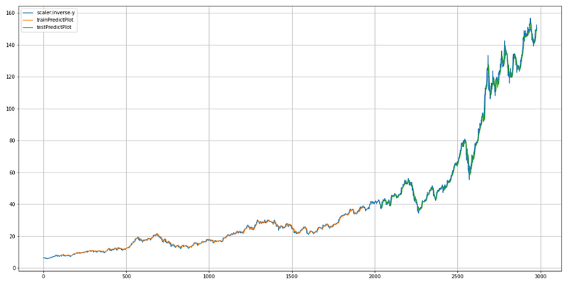
This code is responsible for plotting the original stock prices, the predicted prices on the training dataset, and the predicted prices on the test dataset.
First, it sets the variable `look_back` to 100, which determines the number of previous time steps to consider when making predictions.
Next, it creates a figure and axes object using `plt.subplots` to prepare for plotting. The `figsize` parameter specifies the size of the figure. Next, we create an empty array named `trainPredictPlot` with the same shape as the target variable `y`. These arrays are filled with NaN (not a number) values. Then the values in the train_predict array are assigned to the train_predict plot array, starting at the index `look_back` up to the length of `train_predict` plus `look_back`. This aligns the predicted values with the corresponding positions in the original `y` array.
Similarly, it creates an empty array called `testPredictPlot` with the same shape as `y` and fills it with NaN values.
Then, it assigns the values from the `test_predict` array to the `testPredictPlot` array, starting from the index `len(train_predict) + (look_back * 2) + 1` up to the index `len(y) — 1`. Then, it plots the original stock price (scaler.inverse_transform(y)), the trainPredictPlot, and the testPredictPlot. Throughout the plot, each line is labeled by the legend. In summary, this code generates a plot showing the original stock prices, the predicted prices on the training dataset, and the predicted prices on the test dataset, enabling visual comparison and evaluation of the model’s performance.
fig, ax = plt.subplots(figsize=(20,10))
plt.plot(scaler.inverse_transform(y), color='Green', label='Real Apple Stock Price')
plt.plot(trainPredictPlot, color='Red', label='Train Apple Stock Price')
plt.plot(testPredictPlot, color='Blue', label='Predicted Apple Stock Price')

plt.title('Apple Stock Price Prediction')
plt.xlabel('Time Steps')
plt.ylabel('Apple Stock Price')
plt.legend()
plt.show()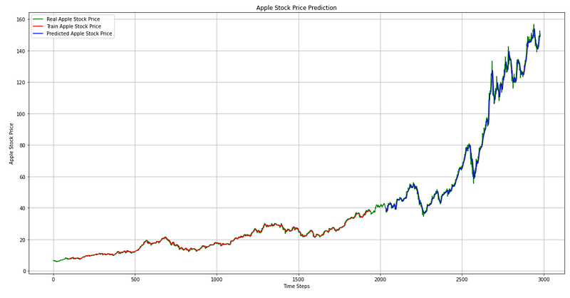
The code generates a plot showing the real Apple stock prices, the predicted prices on the training dataset, and the predicted prices on the test dataset. It prepares the plot by creating a figure and axes object. The `figsize` parameter specifies the size of the figure. It plots the real Apple stock prices using the scaler.inverse_transform(y) array. The `color` parameter sets the color of the line to green, and the `label` parameter provides a label for the line. Following that, it plots the predicted prices on the training dataset using the `trainPredictPlot` array. The color of the line is set to red, and the label is provided. Finally, it plots the predicted prices on the test dataset with plt.plot. The color of the line is set to blue, and the label is provided. The code then sets the title of the plot to ‘Apple Stock Price Prediction’ using `plt.title`, and sets the x-axis label to ‘Time Steps’ and the y-axis label to ‘Apple Stock Price’ using `plt.xlabel` and `plt.ylabel`, respectively. Finally, it adds a legend to the plot using `plt.legend` to show the labels for the different lines, and displays the plot using `plt.show`. In summary, this code generates a plot that visualizes the Comparison of actual and predicted Apple stock prices.
### Plotting
# shift train predictions for plotting
look_back=100
fig, ax = plt.subplots(figsize=(20,10))
trainPredictPlot = numpy.empty_like(y)
trainPredictPlot[:, :] = np.nan
trainPredictPlot[look_back:len(train_predict)+look_back, :] = train_predict
# shift test predictions for plotting
testPredictPlot = numpy.empty_like(y)
testPredictPlot[:, :] = numpy.nan
testPredictPlot[len(train_predict)+(look_back*2)+1:len(y)-1, :] = test_predict
# plot baseline and predictions
plt.plot(scaler.inverse_transform(y))
plt.plot(trainPredictPlot)
plt.plot(testPredictPlot)
plt.legend(['scaler.inverse-y','trainPredictPlot','testPredictPlot'])
plt.show()
This code generates a plot that visualizes the predicted Apple stock prices along with the actual prices.
First, it defines the `look_back` variable, which determines the number of time steps to shift the predictions for plotting.
Then, it creates a figure and axes object using `plt.subplots` to prepare for plotting. The `figsize` parameter specifies the size of the figure. Next, it creates empty arrays with the same shape as the original data array. These arrays will be used to store the predicted prices for plotting. Based on the look back index, the code assigns the predicted prices from the training dataset to the trainingPredictPlot array. This shifting is done to align the predicted prices with the original data for visualization.
Similarly, it assigns the predicted prices from the test dataset (`test_predict`) to the `testPredictPlot` array, starting from the index after the training dataset plus twice the `look_back` value. Again, this shifting aligns the predicted prices with the original data. After that, it plots the original data using `plt.plot` and the `scaler.inverse_transform(y)` array, which transforms the scaled prices back to their original values. Then, it plots the `trainPredictPlot` array, representing the predicted prices on the training dataset. Finally, it plots the `testPredictPlot` array, representing the predicted prices on the test dataset. The code adds a legend to the plot using In summary, this code generates a plot that compares actual and predicted Apple stock prices, allowing for visual inspection of the predictions’ accuracy.
fig = go.Figure()
fig.add_trace(go.Scatter(x=prediction['ds'], y=prediction['yhat'],
                    mode='markers',
                    name='Most Likely'))
fig.add_trace(go.Scatter(x=prediction['ds'], y=prediction['yhat_lower'],
                    mode='lines+markers',
                    name='Pessimistic'))
fig.add_trace(go.Scatter(x=prediction['ds'], y=prediction['yhat_upper'],
                    mode='lines',
                    name='Optimistic'))

fig.add_trace(go.Scatter(x=aapl_features['ds'], y=aapl_features['y'], name='Actual',
                         line = dict(color='goldenrod')))
fig.show()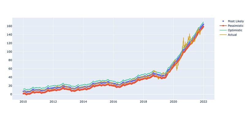
Using the plotly.graph_objects library, this code creates a plot. It initializes a new figure object `fig` to which various traces are added. The first three traces are scatter plots representing different predictions. Among these predictions are the most likely scenario (`yhat`), the pessimistic scenario (`yhat_lower`), and the optimistic scenario (`yhat_upper`). Each trace is plotted against the corresponding date (`ds`) from the prediction dataset. The fourth trace shows the actual values (`y`) from the original dataset (`aapl_features`). It is plotted against the corresponding date (`ds`). Lastly, the fig.show() function is called to display the plot once the additional traces have been added. Visualization of predicted and actual values allows comparison and analysis of the model’s performance.
#model = NeuralProphet(daily_seasonality=False)
model = NeuralProphet()
Using the NeuralProphet library, this code initializes a forecasting model. The model is created without specifying any specific settings, resulting in the default configuration being used. NeuralProphet adds neural networks to the popular Prophet forecasting model for enhanced accuracy and flexibility. It is designed to handle time series data and provide forecasting capabilities. When the model is instantiated by instantiating the `NeuralProphet` class, an instance of the model is created and assigned to the variable `model`. This instance can be used to train the model on historical data and make predictions for future time periods. By default, the model captures daily patterns through daily seasonality. A specific configuration and parameter set can, however, be customized based on the forecasting task requirements. Overall, this code sets up a NeuralProphet model for time series forecasting, which can be customized and trained to make accurate predictions.
metrics = model.fit(aapl_feature,
                    freq='D', epochs=1000)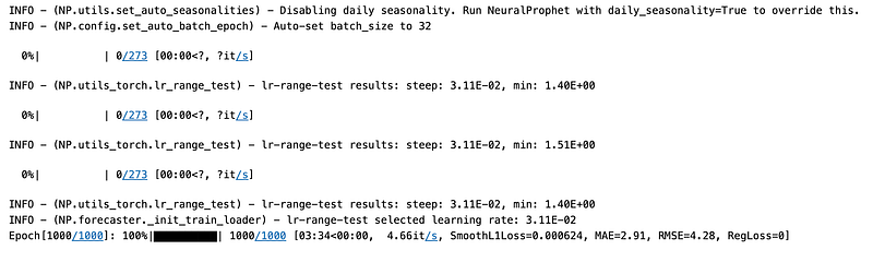
A NeuralProphet model that has previously been initialized is trained using the fit method in this code. The training data, represented by the `aapl_feature` variable, is provided as input to the model. The model learns from historical data to capture patterns and relationships. The goal is to optimize the model’s internal parameters so that it can make accurate predictions. The frequency is specified as ‘D’, representing daily data. Using this information, the model can identify daily patterns or seasonality in the data and understand its temporal structure. 1000 epochs are set as the number of iterations or passes the model will make over the training data during training. The model is trained for a forward pass to make predictions, followed by a backward pass to correct the parameters based on the errors made during the forward pass. It is possible for the model to learn complex patterns and perform better by training it for more epochs. It is important to strike a balance between training for too long and overfitting the data, however. In general, this code optimizes the NeuralProphet model’s performance for future predictions by using the specified training data, frequency, and number of epochs.
forecast = model.predict(aapl_feature)Using the trained NeuralProphet model, this code makes predictions for the given AAPL_feature dataset.
The `predict` method on the model is called with the input of the AAPL_feature data. This data represents the historical features used for training the model. Forecasts or predictions are generated using the trained model. The model takes into account the learned patterns and relationships from the training data to make these predictions.
The output of the `predict` method, stored in the `forecast` variable, is a forecasted time series that includes predictions for future time points based on the trained model. Forecasted values can be used for further analysis, evaluation, or visualization. Overall, this code generates predictions for future time points based on the trained NeuralProphet model, allowing for the forecasting of the target variable based on historical information.
fig_forecast = model.plot(forecast)
fig_components = model.plot_components(forecast)
#fig_model = model.plot_parameters()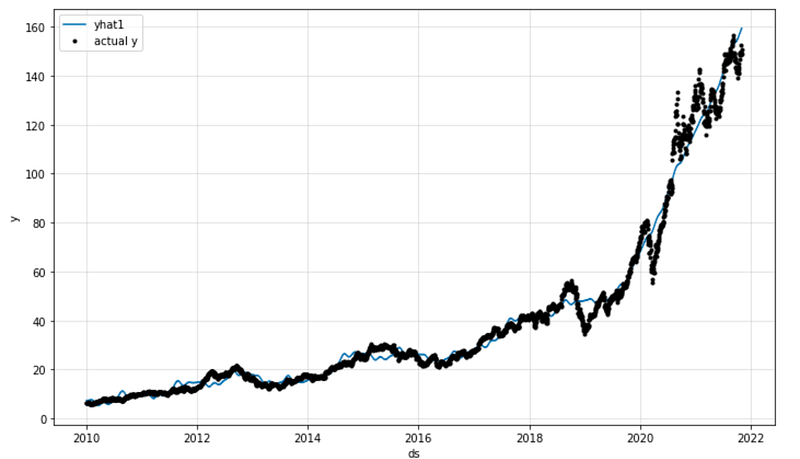
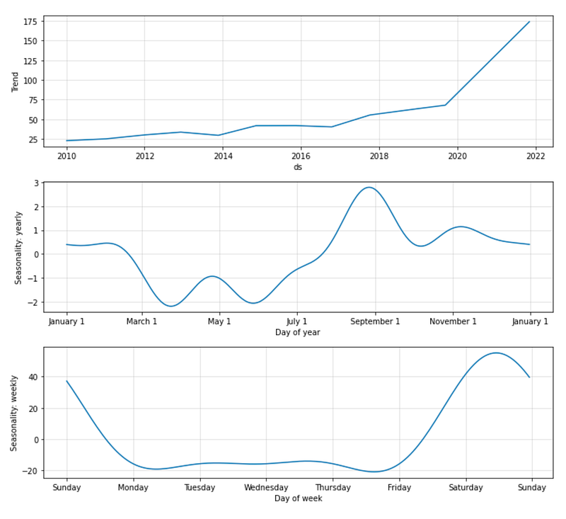
This code generates and displays plots related to the forecasted data and its components using the NeuralProphet model. It passes the forecast data to the plot method. This data represents the forecasted time series generated by the model. Data can be analyzed using various plotting methods. In this code, it is used to create two plots: `fig_forecast` and `fig_components`. The forecast plot shows forecasted values. It provides a visual representation of the predicted values for the future time points. Fig_components displays the individual forecast components. These components may include trend, seasonality, holidays, or any other patterns captured by the model. The plots assist in interpreting the forecasted data and identifying underlying patterns. This can be useful for determining whether the model is performing as expected, identifying anomalies, or finding outliers, and identifying what is influencing the forecasted value. Additionally, a comment indicates that another plot could be used to visualize the model’s parameters, although it isn’t executed at the moment. The plot can provide information about the learned weights and biases of the NeuralProphet model, which are internal parameters that affect predictions.
fig, ax = plt.subplots(figsize=(14, 10))
model.plot(forecast, xlabel="Date", ylabel="Stock Price", ax=ax)
ax.set_title("Apple stock price prediction", fontsize=28)
ax.legend(['Predicted', 'Actual'])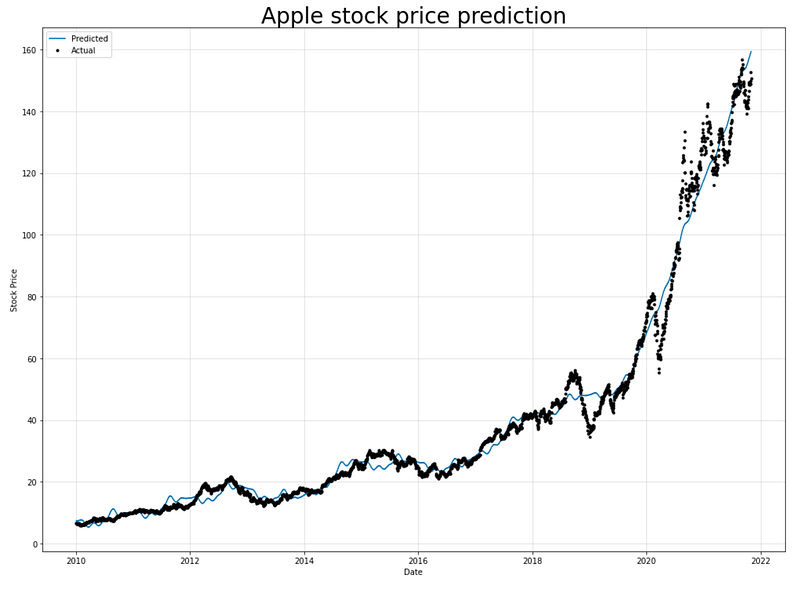
To visualize Apple’s predicted and actual stock prices, this code uses the Matplotlib library.
In the first step, a figure and axes object are created using plt.subplots(figsize=(14, 10)). The `figsize` parameter specifies the dimensions of the figure, determining its width and height. The plot method is called on the model object and passes in the forecast data. Based on the model, these are the predicted stock prices. The `xlabel` and `ylabel` parameters specify the labels for the x-axis and y-axis of the plot, respectively. Ax.set_title sets the title as “Apple stock price prediction” in 28 point font. This provides a descriptive title for the plot. Additionally, the `ax.legend` function adds a legend to the plot, labeling the two lines as “Predicted” and “Actual”. This allows for easy identification and differentiation between the predicted and actual stock prices.
As a result, this code generates a visual representation of Apple’s stock price predictions and actual stock prices, which makes it easier to compare and analyze the model’s performance.
m = NeuralProphet()
df_train, df_test = m.split_df(aapl_feature, valid_p=0.3,freq='D')
The provided code involves using the NeuralProphet library to split a dataset into training and testing sets. The first step involves initializing a NeuralProphet model on `m` using the `NeuralProphet()` constructor. This creates an instance of the NeuralProphet model that can be used for time series forecasting. Aapl_feature is then divided into training and testing sets using the NeuralProphet library’s split_df function. The `split_df` function takes several parameters: `valid_p` specifies the percentage of data to be used for validation (in this case, 30% or 0.3), and `freq` specifies the frequency of the time series data (in this case, ‘D’ for daily).
The `split_df` function separates the dataset into two parts: `df_train` and `df_test`. `df_train` contains a portion of the original dataset that will be used for training the model, while `df_test` contains the remaining portion that will be used to test the model on unseen data. A subset of the dataset is used to train a model, and unseen data is used to assess its generalization capabilities after it has been trained. A common practice in machine learning is to estimate a model’s performance and detect potential overfitting or underfitting.
fig_forecast = m.plot(forecast)
ax.set_title("Apple stock price prediction", fontsize=28)
#ax.legend(['Predicted', 'Actual'])
#fig_components = model.plot_components(forecast)
#fig_model = model.plot_parameters()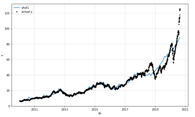
The provided code generates a forecast plot (`fig_forecast`) using the NeuralProphet model (`m`) and the forecast object (`forecast`) obtained from the previous step.
By calling the `plot` method on the NeuralProphet model with the forecast object as the input (`forecast`), the code generates a visualization of the predicted values for the target variable. This plot provides a visual representation of the predicted stock price values over time. The `set_title` function sets the title of the plot to “Apple stock price prediction” with a font size of 28. The lines that are commented out (`#ax.legend([‘Predicted’, ‘Actual’])`, `#fig_components = model.plot_components(forecast)`, `#fig_model = model.plot_parameters()`) indicate that there may be additional code or plot components related to the predicted values, such as the actual values or the There are components of the forecast, but they are not active or included in the code snippet.
fig, ax = plt.subplots(figsize=(14, 10))
m.plot(forecast, xlabel="Date", ylabel="Stock Price", ax=ax)
ax.set_title("Apple stock price prediction", fontsize=28)
ax.legend(['Predicted', 'Actual'])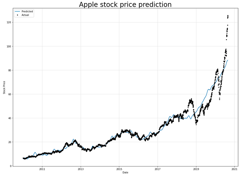
For plotting a graph, the provided code creates a figure and axes object. The figure size is set to 14 inches by 10 inches. It is plotted using the Forecast object as input to the NeuralProphet model. Plotting the predicted stock price values over time is generated by this method. The x-axis is labeled as “Date” and the y-axis is labeled as “Stock Price”.
The `set_title` method is used to set the title of the plot as “Apple stock price prediction” with a font size of 28.
The `legend` method is used to add a legend to the plot, which displays the labels “Predicted” and “Actual” associated with the plotted lines or markers. Using the legend, one can tell which lines or markers represent the actual values and which are the predicted values. Overall, this code creates a plot showing the predicted and actual stock price values over time, with appropriate labels and a legend to distinguish between them.


