avatarDarío Weitz

Free AI web copilot to create summaries, insights and extended knowledge, download it at here

6379

Abstract

turbed with customers leaving their credit card services (attrited customers vs. existing customers). So, <b>we are going to determine if there is any relationship between some categorical variables (education level, marital status) and the attrition condition</b>.</p><p id="e994">First, we imported Plotly Express as <i>px,</i> the Pandas library as <i>pd</i> and converted our <i>csv file</i> into a dataframe:</p><div id="fb56"><pre><span class="hljs-keyword">import</span> pandas <span class="hljs-keyword">as</span> pd</pre></div><div id="3d8a"><pre><span class="hljs-keyword">import</span> plotly.express <span class="hljs-keyword">as</span> px</pre></div><div id="c994"><pre><span class="hljs-attr">path</span> = <span class="hljs-string">'your path'</span></pre></div><div id="3550"><pre>df = pd.read_csv(<span class="hljs-type">path</span> + <span class="hljs-string">'CreditCardCustomersCols.csv'</span>, index_col = <span class="hljs-keyword">False</span>, <span class="hljs-keyword">header</span> = <span class="hljs-number">0</span>, sep = <span class="hljs-string">';'</span>, engine=<span class="hljs-string">'python'</span>)</pre></div><p id="8fff">Then, we selected <i>Customer Condition</i> as our main categorical variable and <i>Education Level</i> as the second categorical variable. In the Kaggle dataset, the customer condition is described by the <i>Attrition_Flag</i> column [2]. As the records in the dataset are in long form, we converted them to wide form using <i>df.groupby()</i>. We used the function <i>size(</i>) to count the number of elements to plot in absolute values (<i>Counts</i>) or percentage values <i>(Percentage)</i>.</p><div id="4e11"><pre>df_stack=df<span class="hljs-selector-class">.groupby</span>(<span class="hljs-selector-attr">[<span class="hljs-string">'Attrition_Flag'</span>,<span class="hljs-string">'Education_Level'</span>]</span>). <span class="hljs-built_in">size</span>()<span class="hljs-selector-class">.reset_index</span>()</pre></div><div id="b023"><pre>df_stack[<span class="hljs-string">'Percentage'</span>]=df.groupby([<span class="hljs-string">'Attrition_Flag'</span>, <span class="hljs-string">'Education_Level'</span>]).size().groupby(<span class="hljs-keyword">level</span>=<span class="hljs-number">0</span>).apply(lambda x:<span class="hljs-number">100</span> * x/<span class="hljs-type">float</span>(x.sum())).<span class="hljs-keyword">values</span></pre></div><div id="1ad2"><pre><span class="hljs-attr">df_stack.columns</span>= [<span class="hljs-string">'Attrition_Flag'</span>, <span class="hljs-string">'Education_Level'</span>, <span class="hljs-string">'Counts'</span>, <span class="hljs-string">'Percentage'</span>]</pre></div><div id="6850"><pre>df_stack<span class="hljs-selector-attr">[<span class="hljs-string">'Percentage'</span>]</span> =
df_stack<span class="hljs-selector-attr">[<span class="hljs-string">'Percentage'</span>]</span><span class="hljs-selector-class">.map</span>(<span class="hljs-string">'{:,.2f}%'</span>.format) </pre></div><p id="bce0">For the stacked bars in this article, the Plotly Express function is <i>px.bar</i> and the corresponding parameters are: <i>data_frame</i>; <i>x</i>= a name of a column in <i>data_frame</i> representing the main categorical variable; <i>y</i>= a name of a column in <i>data_frame</i> representing the absolute or percentage values of each subcategory; <i>color </i>a name of a column in <i>data_frame</i> representing the subcategories of the second categorical variable; <i>barmode </i>determines how bars at the same location coordinate are displayed on the graph. With “<i>stack</i>”, <b>the bars are stacked on top of one another</b>. We can choose <i>barmode = ‘overlay’</i> to plot the bars over one another for overlapped bar charts, or <i>barmode = ‘group’</i> to place bars beside each other for clustered bar charts (<a href="https://towardsdatascience.com/clustered-overlapped-bar-charts-94f1db93778e">https://towardsdatascience.com/clustered-overlapped-bar-charts-94f1db93778e</a>).</p><p id="899b">We updated the chart with <i>update.layout</i>: set the title, the name of the x-axis, the name of the y-axis, and set the figure dimensions with <i>width</i> and <i>height</i>. Finally, we draw the chart using the default template (<i>plotly</i>, “Histograms with Plotly Express, Themes & Templates”, <a href="https://towardsdatascience.com/histograms-with-plotly-express-e9e134ae37ad">https://towardsdatascience.com/histograms-with-plotly-express-e9e134ae37ad</a>).</p><div id="dbbc"><pre>fig = px<span class="hljs-selector-class">.bar</span>(df_stack, x = <span class="hljs-string">'Attrition_Flag'</span>, y = <span class="hljs-string">'Counts'</span>, <span class="hljs-attribute">color</span> = <span class="hljs-string">'Education_Level'</span>, barmode = <span class="hljs-string">'stack'</span>)</pre></div><div id="e6c3"><pre>fig.update_layout(<span class="hljs-keyword">title</span> = <span class="hljs-string">"Education Level Customers' Composition"</span>, xaxis_title = <span class="hljs-string">'Customer Condition'</span>, yaxis_title = <span class="hljs-string">'Counts'</span>, <span class="hljs-keyword">width</span> = <span class="hljs-number">1600</span>, height = <span class="hljs-number">1400</span>)</pre></div><div id="6269"><pre>fig.<span class="hljs-keyword">show</span>()</pre></div><figure id="a41e"><img src="https://cdn-images-1.readmedium.com/v2/resize:fit:800/1*Hr2N5iDctGaXFOAJo4WvRA.png"><figcaption>Fig. 1: Simple Stacked Bar. Chart made by the author with Plotly Express.</figcaption></figure><p id="cadd">Figure 1 shows a simple stacked bar of the composition of the educational level of the bank’s customers. This graphical representation does not allow us to make a good comparison, so we decided to plot the same data with a 100% stacked bar (<i>y=’Percentage</i>’):</p><div id="edbc"><pre><span class="hljs-attribute">fig2</span>=px.bar(df_stack, <span class="hljs-attribute">x</span>=<span class="hljs-string">'Attrition_Flag'</span>, <span class="hljs-attribute">y</span>=<span class="hljs-string">'Percentage'</span>, <span class="hljs-attribute">color</span>=<span class="hljs-string">'Education_Level'</span>, barmode =<span class="hljs-string">'stack'</span>)</pre></div><div id="a715"><pre>fig2.u

Options

pdate_layout(<span class="hljs-keyword">title</span> = <span class="hljs-string">"Education Level Customers' Composition"</span>, xaxis_title = <span class="hljs-string">'Customer Condition'</span>, yaxis_title =
<span class="hljs-string">'Percentage'</span>, <span class="hljs-keyword">width</span> = <span class="hljs-number">1600</span>, height = <span class="hljs-number">1400</span>)</pre></div><div id="7e2c"><pre>fi<span class="hljs-name">g2.</span>show<span class="hljs-comment">()</span></pre></div><figure id="33e4"><img src="https://cdn-images-1.readmedium.com/v2/resize:fit:800/1*OMGcucLN30NVZxM36KAgLA.png"><figcaption>Fig. 2: 100% Stacked Bar. Chart made by the author with Plotly Express.</figcaption></figure><p id="556b">Now we can make a visual comparison, but it would be better if we can include the numerical values:</p><div id="3207"><pre>fig3=px<span class="hljs-selector-class">.bar</span>(df_stack,x=<span class="hljs-string">'Attrition_Flag'</span>,y=<span class="hljs-string">'Percentage'</span>,<span class="hljs-attribute">color</span>=
<span class="hljs-string">'Education_Level'</span>, barmode = <span class="hljs-string">'stack'</span>,
text=df_stack<span class="hljs-selector-attr">[<span class="hljs-string">'Percentage'</span>]</span>)</pre></div><div id="47b9"><pre>fig3.update_layout(<span class="hljs-keyword">title</span> = <span class="hljs-string">"Education Level Customers' Composition"</span>, template = <span class="hljs-string">'simple_white'</span>, xaxis_title = <span class="hljs-string">'Customer Condition'</span>, yaxis_title = <span class="hljs-string">'Percentage'</span>, <span class="hljs-keyword">width</span> = <span class="hljs-number">1600</span>, height = <span class="hljs-number">1400</span>)</pre></div><div id="dcbe"><pre>fi<span class="hljs-name">g3.</span>show<span class="hljs-comment">()</span></pre></div><figure id="a15c"><img src="https://cdn-images-1.readmedium.com/v2/resize:fit:800/1*AoNovCMWJWFDk-38KvZD-Q.png"><figcaption>Fig. 3: 100% Stacked Bar with annotations. Chart made by the author with Plotly Express.</figcaption></figure><p id="6859">We used <i>text=df_stack[‘Percentage’]</i> for the annotations. We also changed the template to<i> ‘simple_white’</i>, a minimalist template for a clear chart. Now, we can make a proper comparison, as a result of which we can claim that there are no significant differences in the level of education between attrited customers and existing ones.</p><p id="4b4a">Finally, we want to know if the marital status has any relationship with the attrition condition (<i>color = ‘Marital_Status</i>’):</p><div id="cce7"><pre><span class="hljs-attr">fig4</span>= px.bar(df_stack2, x = <span class="hljs-string">'Attrition_Flag'</span>, y = <span class="hljs-string">'Percentage'</span>, <span class="hljs-attr">color</span> = <span class="hljs-string">'Marital_Status'</span>, barmode = <span class="hljs-string">'stack'</span>, <span class="hljs-attr">text</span>=df_stack2[<span class="hljs-string">'Percentage'</span>])</pre></div><div id="f798"><pre>fig4.update_layout(<span class="hljs-keyword">title</span> = <span class="hljs-string">"Marital Status Customers' Composition "</span>, template = <span class="hljs-string">'simple_white'</span>, xaxis_title = <span class="hljs-string">'Customer Condition'</span>, yaxis_title = <span class="hljs-string">'Percentage'</span>, <span class="hljs-keyword">width</span> = <span class="hljs-number">1600</span>, height = <span class="hljs-number">1400</span>)</pre></div><div id="6b64"><pre>fi<span class="hljs-name">g4.</span>show<span class="hljs-comment">()</span></pre></div><figure id="03d3"><img src="https://cdn-images-1.readmedium.com/v2/resize:fit:800/1*BTKCaWp5Eowjc0mWBxl6kg.png"><figcaption>Fig. 4: 100% Stacked Bar with Marital Status as the second categorical variable. Chart made by the author with Plotly Express.</figcaption></figure><p id="34b7">Similarly, we can affirm that there are no significant differences in marital status between attrited customers and existing ones.</p><h1 id="4dbc">To sum up:</h1><p id="d27f">You can draw Simple Stacked Bars or 100% Percent Stacked Bars with a few lines of code;</p><p id="91d2">It is usual to make a previous conversion of the dataset records from a long format to a wide format;</p><p id="f9d7">Be aware that although the long format is also called stacked, better storytelling is obtained with stacked bars with wide or unstacked data.</p><p id="af84">If you find this article of interest, please read my previous (<a href="https://medium.com/@dar.wtz">https://medium.com/@dar.wtz</a>):</p><p id="935b">“Scatter Plots with Plotly Express, Trendlines & Faceting”</p><div id="c511" class="link-block"> <a href="https://towardsdatascience.com/scatter-plots-with-plotly-express-1b7f5579919b"> <div> <div> <h2>Scatter Plots with Plotly Express</h2> <div><h3>Trendlines & Faceting</h3></div> <div><p>towardsdatascience.com</p></div> </div> <div> <div style="background-image: url(https://miro.readmedium.com/v2/resize:fit:320/1*PW8AaUA4rY-XYSM1nKnK4g.jpeg)"></div> </div> </div> </a> </div><p id="d855">“Histograms with Plotly Express, Themes & Templates”</p><div id="2a03" class="link-block"> <a href="https://towardsdatascience.com/histograms-with-plotly-express-e9e134ae37ad"> <div> <div> <h2>Histograms with Plotly Express</h2> <div><h3>Themes & Templates</h3></div> <div><p>towardsdatascience.com</p></div> </div> <div> <div style="background-image: url(https://miro.readmedium.com/v2/resize:fit:320/1*hocOKfdv1Mt-HJ93iGHvzg.jpeg)"></div> </div> </div> </a> </div><h1 id="f72d">References</h1><p id="4165">[1]: <a href="https://readmedium.com/introducing-plotly-express-808df010143d">https://readmedium.com/introducing-plotly-express-808df010143d</a></p><p id="aae9">[2]: <a href="https://www.kaggle.com/sakshigoyal7/credit-card-customers">https://www.kaggle.com/sakshigoyal7/credit-card-customers</a></p></article></body>

Stacked Bar Charts with Plotly Express

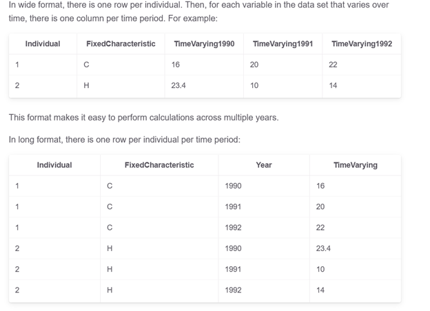
Long Format vs. Wide Format Data

Image by Bekir Donmez from Unsplash

Plotly Express

Plotly, a computing company headquartered in Montreal, Canada, developed plotly.py, an interactive, open-source visualization tool for Python. In 2019, the company released Plotly 4.0 which includes Plotly Express, a high-level wrapper fully compatible with the rest of the Plotly ecosystem.

Plotly Express (PE) is free and provides an object-oriented interface to figure creation. The tool can generate not only standard 2D plots (bars, lines, scatter, pies, etc.), but also complicated 3D scatter and surface charts. PE can take dataframes, lists, and dictionaries as input data for a quick plot generation. Particularly, “most plots are made with just one function call that accepts a tidy Pandas data frame” (1).

Long Format Data, Wide Format Data

Data comes in many varied formats. Related to tabular data (information presented in the form of a table with rows and columns), data can either be in long format (tidy, narrow, or stacked form) or can be in wide format (un-stacked or messy form).

Wide format data has one single column for each variable, while in the long format each row is a single variable-identifying combination. Long format is most convenient for filtering and performing some types of aggregations, while wide format is typical for data collected over time.

Source: https://lost-stats.github.io/Data_Manipulation/Reshaping/reshape_panel_data_from_long_to_wide.html

The Pandas library in Python has several methods to convert long format data to wide format: df.pivot().reset_index();df.pivot_table();df.groupby();pd.crosstab.

The process of converting from long form to the wide one is usually described as pivoting.

To convert from wide form to long form you can use: df.melt()or df.wide_to_long().

We are probably more familiar with the wide format since it is the format in which we are used to working in Excel spreadsheets. So, this format is intuitive and easier to understand. Tables with wide format are suitable for summarized information. Although long format data is seen less often, it is easy to store, allows quick transformations to other types, and is convenient for certain visualization tools like Seaborn. Tables with long format are suitable for consecutive data records.

The company released Plotly.py version 4.8 on May 26, 2020. Previous releases only supported long format Pandas dataframes. From now on, PE also operates with wide form tabular data. They also claim to work on mixed-form data, a hybrid between long-form and wide-form data. The following 2D-Cartesian functions can operate on wide-form and mixed-form data: px.scatter, px.line, px.area, px.bar, px.histogram, px.violin, px.box, px.strip, px.funnel, px.density_heatmap and px.density_contour.

Stacked Bar Charts

Stacked bar charts (SBC) show the quantitative relationship that exists between a main categorical variable and its subcategories. Each bar represents a principal category and it is divided into segments representing subcategories of a second categorical variable. The chart shows not only the quantitative relationship between the different subcategories with each other but also with the main category as a whole. They are also used to show how the composition of the subcategories changes over time.

Stacked Bar Charts should be used for Comparisons and Proportions but with emphasis on Composition. This composition analysis can be static -for a certain moment in time- or dynamic -for a determined period of time-.

SBC are represented through rectangular bars that can be oriented horizontally or vertically just like standard bar charts. They are two-dimensional with two axes: one axis shows categories, the other axis shows numerical values. Each principal category is divided into segments representing subcategories of a second categorical variable. The quantity of each subcategory is shown by the length or height of rectangular segments that are stacked end to end horizontally or vertically. The final height or length of each bar represents the total amount of each principal category (except in 100% stacked bar charts).

Equivalent subcategories must have the same color in each bar so as not to confuse the audience. Some space is usually left between principal bars to clearly indicate that they refer to discrete groups.

There are two different types of SBC:

1.- Simple Stacked Bars place the absolute value of each subcategory after or over the previous one. The numerical axis has a scale of numerical values. The graph shows the absolute value of each subcategory and the sum of these values ​​indicates the total for the category. Usually, the principal bars have different final heights or lengths.

2.- 100% Stacked Bars place the percentage of each subcategory after or over the previous one. The numerical axis has a scale of percentage figures. The graph shows the percentage of each segment referred to the total of the category. All the principal bars have the same height.

Stacked Bar Charts with Plotly Express

We worked with a dataset downloaded from Kaggle [2]. The dataset consists of 10,000 bank customers mentioning their age, salary, education level, marital status, credit card limit, credit card category, and additional features. The bank manager is disturbed with customers leaving their credit card services (attrited customers vs. existing customers). So, we are going to determine if there is any relationship between some categorical variables (education level, marital status) and the attrition condition.

First, we imported Plotly Express as px, the Pandas library as pd and converted our csv file into a dataframe:

import pandas as pd
import plotly.express as px
path = 'your path'
df = pd.read_csv(path + 'CreditCardCustomersCols.csv', index_col = 
     False, header = 0, sep = ';', engine='python')

Then, we selected Customer Condition as our main categorical variable and Education Level as the second categorical variable. In the Kaggle dataset, the customer condition is described by the Attrition_Flag column [2]. As the records in the dataset are in long form, we converted them to wide form using df.groupby(). We used the function size() to count the number of elements to plot in absolute values (Counts) or percentage values (Percentage).

df_stack=df.groupby(['Attrition_Flag','Education_Level']).
       size().reset_index()
df_stack['Percentage']=df.groupby(['Attrition_Flag',
       'Education_Level']).size().groupby(level=0).apply(lambda 
        x:100 * x/float(x.sum())).values
df_stack.columns= ['Attrition_Flag', 'Education_Level', 'Counts', 
       'Percentage']
df_stack['Percentage'] =  
       df_stack['Percentage'].map('{:,.2f}%'.format) 

For the stacked bars in this article, the Plotly Express function is px.bar and the corresponding parameters are: data_frame; x= a name of a column in data_frame representing the main categorical variable; y= a name of a column in data_frame representing the absolute or percentage values of each subcategory; color a name of a column in data_frame representing the subcategories of the second categorical variable; barmode determines how bars at the same location coordinate are displayed on the graph. With “stack”, the bars are stacked on top of one another. We can choose barmode = ‘overlay’ to plot the bars over one another for overlapped bar charts, or barmode = ‘group’ to place bars beside each other for clustered bar charts (https://towardsdatascience.com/clustered-overlapped-bar-charts-94f1db93778e).

We updated the chart with update.layout: set the title, the name of the x-axis, the name of the y-axis, and set the figure dimensions with width and height. Finally, we draw the chart using the default template (plotly, “Histograms with Plotly Express, Themes & Templates”, https://towardsdatascience.com/histograms-with-plotly-express-e9e134ae37ad).

fig = px.bar(df_stack, x = 'Attrition_Flag', y = 'Counts', color = 
    'Education_Level', barmode = 'stack')
fig.update_layout(title = "Education Level Customers' Composition",
     xaxis_title = 'Customer Condition', yaxis_title = 'Counts', 
     width = 1600, height = 1400)
fig.show()
Fig. 1: Simple Stacked Bar. Chart made by the author with Plotly Express.

Figure 1 shows a simple stacked bar of the composition of the educational level of the bank’s customers. This graphical representation does not allow us to make a good comparison, so we decided to plot the same data with a 100% stacked bar (y=’Percentage’):

fig2=px.bar(df_stack, x='Attrition_Flag', y='Percentage',
     color='Education_Level', barmode   ='stack')
fig2.update_layout(title = "Education Level Customers' Composition", 
      xaxis_title = 'Customer Condition', yaxis_title =  
      'Percentage', width = 1600, height = 1400)
fig2.show()
Fig. 2: 100% Stacked Bar. Chart made by the author with Plotly Express.

Now we can make a visual comparison, but it would be better if we can include the numerical values:

fig3=px.bar(df_stack,x='Attrition_Flag',y='Percentage',color=  
    'Education_Level', barmode = 'stack',  
     text=df_stack['Percentage'])
fig3.update_layout(title = "Education Level Customers' Composition", 
     template = 'simple_white', xaxis_title = 'Customer Condition', 
     yaxis_title = 'Percentage', width = 1600, height = 1400)
fig3.show()
Fig. 3: 100% Stacked Bar with annotations. Chart made by the author with Plotly Express.

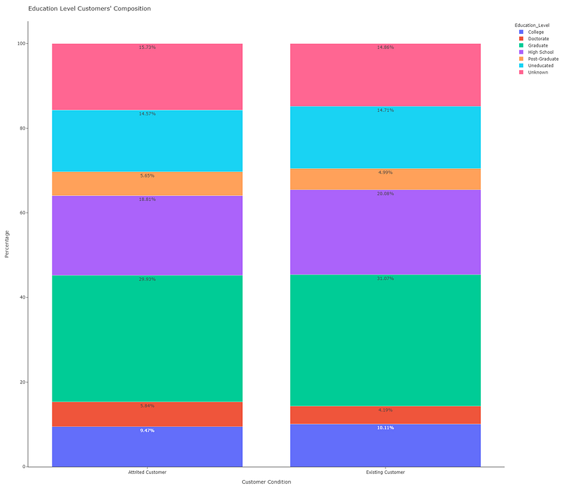
We used text=df_stack[‘Percentage’] for the annotations. We also changed the template to ‘simple_white’, a minimalist template for a clear chart. Now, we can make a proper comparison, as a result of which we can claim that there are no significant differences in the level of education between attrited customers and existing ones.

Finally, we want to know if the marital status has any relationship with the attrition condition (color = ‘Marital_Status’):

fig4= px.bar(df_stack2, x = 'Attrition_Flag', y = 'Percentage', 
      color = 'Marital_Status', barmode = 'stack', 
      text=df_stack2['Percentage'])
fig4.update_layout(title = "Marital Status Customers' Composition ",
      template = 'simple_white', xaxis_title = 'Customer Condition', 
      yaxis_title = 'Percentage', width = 1600, height = 1400)
fig4.show()
Fig. 4: 100% Stacked Bar with Marital Status as the second categorical variable. Chart made by the author with Plotly Express.

Similarly, we can affirm that there are no significant differences in marital status between attrited customers and existing ones.

To sum up:

You can draw Simple Stacked Bars or 100% Percent Stacked Bars with a few lines of code;

It is usual to make a previous conversion of the dataset records from a long format to a wide format;

Be aware that although the long format is also called stacked, better storytelling is obtained with stacked bars with wide or unstacked data.

If you find this article of interest, please read my previous (https://medium.com/@dar.wtz):

“Scatter Plots with Plotly Express, Trendlines & Faceting”

“Histograms with Plotly Express, Themes & Templates”

References

[1]: https://readmedium.com/introducing-plotly-express-808df010143d

[2]: https://www.kaggle.com/sakshigoyal7/credit-card-customers

Data Visualization
Data Science
Storytelling
Charts And Graphs
Bars
Recommended from ReadMedium