
Spotify to Spotipy
A deeper understanding of the audio data to understand taste in music
A friend of mine and I share the annual ritual of comparing our ‘year’ unwrapped data that is sent religiously by Spotify every year. We compare the number of minutes, new artists, new genres, most streamed song, most dominating genre and whatnot. This year was no different but this year I finally decided to wrap this project that I intended to finish for years.
Spotify has indeed changed the way I listen to music and has made me realise that there are certain beats that I gravitate to and the last few days were spent in the pursuit of understanding what kind of music do I prefer and what are those special undertones in certain songs that make me stream them 221 times a year. The other goal was to find some similar songs to the one that I am after. You can argue that one can rely on products that are already there for such purposes i.e. song recommenders, beat identifier etc but the point is to make myself suffer through an inordinate amount of python code and eventually gain first-hand insights that I would inject in conversations with friends and strangers to sound extra douchey.
So, without further ado. Here is the song that I have been listening for a few years. There are undertones that I wished to identify. They exist from 2:20 to 2:23 and repeat many times over in the song.
My hypothesis was there is a certain frequency at which these tones are getting produced and I merely need to find out what they are and I will be set. Haha! Little did I know that I am getting into a rabbit hole.
Python offers a pretty nice library -Librosa- for the audio analysis and that came to my rescue. A quick read and I was able to load the snippet of audio and separate it into its harmonic and percussive components. One can hear the components as well. The default frequency for librosa is 22050 Hz. The signal itself is an array of numerical values which must be the amplitudes. ‘z_harmonic’ is the harmonic component and it seems to have the note that I am interested in, so I’ll ignore z and z_percussive.
#Load the audio file in Librosa, I am loading only 6 second of the audio, starting at the 8th secondz, sr_z = librosa.load(audio_data, offset = 8.0, duration = 6.0)
z
sr_z# Verify length of the audio, it will be 6 secondsprint('Length of Audio:', np.shape(x)[0]/sr, "seconds")# Audio is a function in from IPython.display import Audio, it helps in ascertaining what you have loaded.Audio(data = z, rate = sr_z)# Use HPSS to get harmoic and percussive componentsz_harmonic, z_percussive = librosa.effects.hpss(z)Audio(data = z_harmonic, rate = sr_z)Audio(data = z_percussive, rate = sr_z)One could get some interesting info such as beats, tempo as well. Ok! so this song is at 130 bpm which seems right that I don’t appreciate much higher bpm music.
tempo, beat_frames = librosa.beat.beat_track(y=z, sr=sr_z)
tempo # Outputs the bpm
beat_frames
beat_times = librosa.frames_to_time(beat_frames, sr=sr_z)
beat_times # An array of time values when the beats occur
# array([0.23219955, 0.69659864, 1.18421769, 1.64861678, 2.11301587,
2.57741497, 3.04181406, 3.50621315, 3.9938322 , 4.45823129,
4.92263039, 5.38702948])The obvious thing to do here is to plot the amplitudes and feel like a jackass!
def plot_wave(signal, sampling_rate):
    plt.figure(figsize=(20, 10))
librosa.display.waveplot(signal, sr=sampling_rate)plot_wave(z_harmonic, sr_z)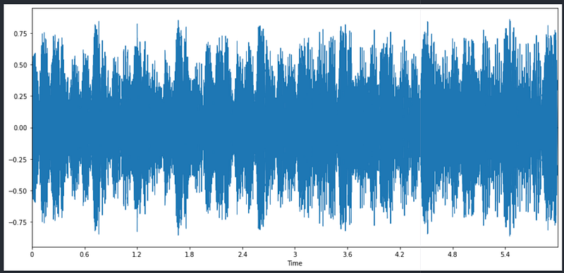
Finally, my engineering degree paid off and I remembered the Fourier transform that helps in converting the signals from the time domain to the frequency domain. FFT(Fast Fourier Transform) or DFT are applicable to digital signals while a Fourier transform can be applied directly to a continuous signal. Ours is a digital one, so FFT it is.
z_fft = scipy.fftpack.fft(z_harmonic, sr_z)def fft_plt(z_fft):
len_z_fft = len(z_fft)
xf = np.linspace(0.0, sr/(2.0), int(len_z_fft/2))
plt.figure(figsize=(15, 7))
plt.plot(xf, 2.0/len_z_fft * np.abs(z_fft[:len_z_fft//2]))
plt.xlabel("Frequency")
plt.ylabel("Amplitude")
plt.xlim(0, 1500)
plt.show()fft_plt(z_fft)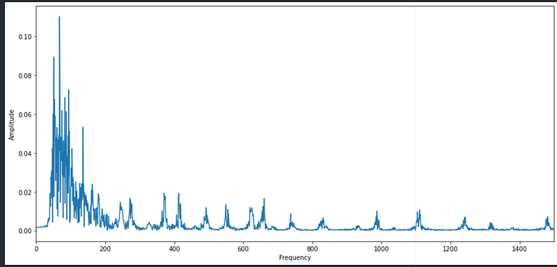
So, it seems my signal has lower frequencies than higher frequencies. It is a simple plot of amplitude vs frequency and doesn’t give me anything other than that there is a peak in the beginning and the others are some repetitive patterns at high freq or maybe noise, I am not sure.
What I wanted to find was what is the frequency at certain time intervals in this 6-second snippet of audio. All I have right now are a bunch of delinquent frequencies on a graph that is serving me no purpose.
What I need is a plot of frequencies against the time. Enters Spectrogram!!
Spectrograms
# Let's plot spectrograms #Extract stft
window = 2048
slider_length = 512#This is STFT which is in complex domain
z_stft = librosa.stft(z, n_fft = window, hop_length = slider_length)
z_stft.shape
type(z_stft[0][0]) # This will be numpy.complex64#Real domain from the complex domain
z_real = np.abs(z_stft) ** 2
z_real.shape
type(z_real[0][0]) # This will be numpy.float32Here STFT(a form of FFT), short-time Fourier transform converts the discrete-time signal to frequency one but it produces the results in complex domain i.e. the values have both real and imaginary parts. A spectrogram is nothing but the square of the magnitude of the STFT values. The spectrogram brings the results of STFT from complex domain to the real domain.
Let’s plot this Spectrogram.
def plot_spectrogram(signal, sampling_rate, slider_length, y_axis="linear"):
    plt.figure(figsize=(10, 6))
    librosa.display.specshow(signal, sr=sampling_rate, hop_length=slider_length, x_axis="time",
                             y_axis=y_axis)
plt.colorbar(format="%+2.f")plot_spectrogram(z_real, sr_z, slider_length)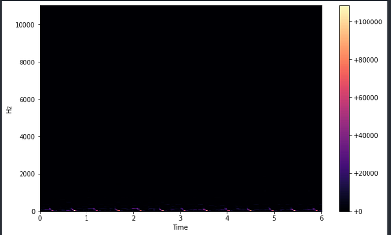
And I can’t see anything except a few faint colours at the bottom. Maybe some issue with my eyesight or you and I are in the same visual boat here?
This seems futile but let’s carry on. Do humans perceive sound linearly? I mean C note is a lower frequency that E note, does it mean that difference between C4 and C6 will be similar to the difference between E4 and E6? If humans understand sound linearly then they should be able to tell E4 and E6 apart the same ay they can do so for C4 and C6.
I know that we use the decibel system for the sound which is a logarithmic scale, so maybe I should plot my spectrogram on a logarithmic scale as well because humans understand sound on a logarithmic scale than a linear scale.
# Log amplitde spectogram because above simple amplitude didn't give # much info. We percieve sounds logarithmically.
# So, we need to change the amplitude of the signal from linear to logarithmic
z_real_log = librosa.power_to_db(z_real)
plot_spectrogram(z_real_log, sr_z, slider_length)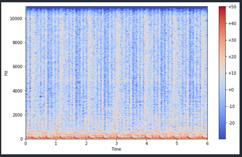
This looks much better with some bands that I can observe. The red/amber portion is where most frequencies are but they are squished down. How can I correct this?
#Log frequency spectogram
#Above is quite squished, so let's transform the frequency logarithmically tooplot_spectrogram(z_real_log, sr_z, slider_length, y_axis="log")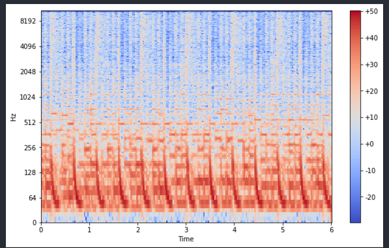
This seems much better. We changed the y_axis parameter from linear to log and life became much better.
Essentially what we did was to convert frequency on the y-axis from linear to log and also have the colour scale or the amplitudes on the decibel scale.
Obviously, there is a lot of repetition in the pattern but an observation for me is that I like this song which has lower fundamental frequency repetition. Generally speaking, C2 to C6 lie between 60 to 260 Hertz.
By the way, if I plot the spectrogram of harmonic components and percussive components then what we get is an interesting observation.
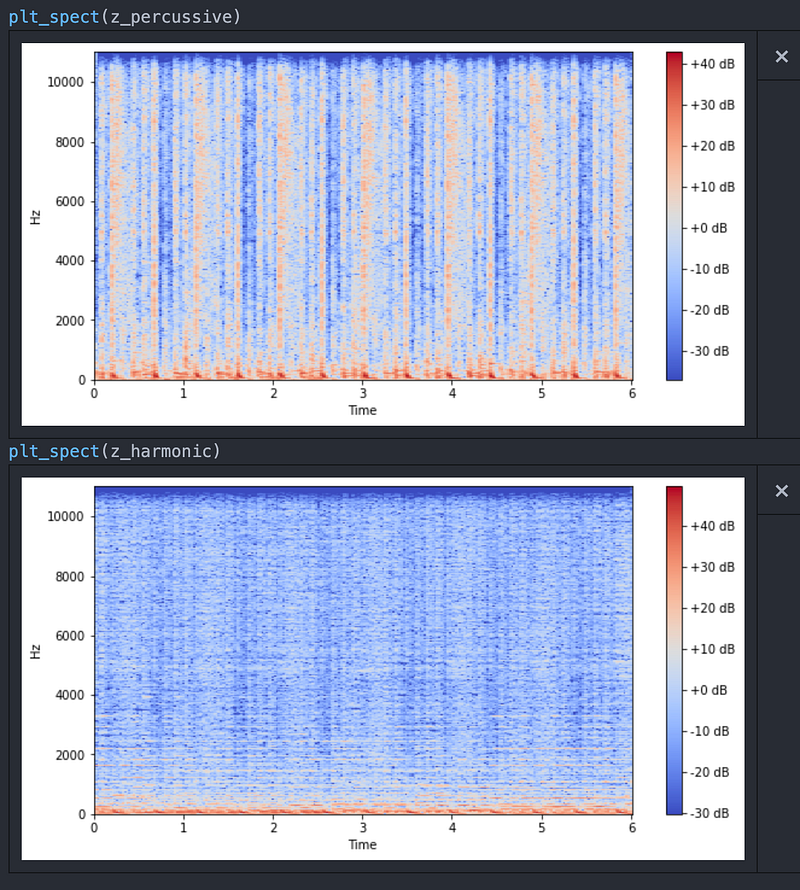
The percussive one is noisier compared to the harmonic one and that is expected.
Harmonics are more horizontal indicating stable tones and percussive are vertical stripes.
While talking to someone on Slack channel of MIR group(Music Information Retrieval) I came to know a little about Mel Spectograms which are spectrograms on steroids.
Not exactly!
In Spectrogram, we changed the y-axis from linear to logarithmic scale while in Mel spectrogram, we change it to Mel scale which is another logarithmic scale and is created on how we perceive sound. In crude words, Mel scale provides the way to differentiate between two frequencies not as difference between their values but as difference perceived by the human ear and maybe that’s why it is better to use Mel spectrograms.
Librosa comes to rescue again as it is quite easy to plot them.
# Mel Spectrogramn_fft = 2048
hop_length = 256
n_mels = 5mel_spect = librosa.feature.melspectrogram(z, sr=sr, n_fft=n_fft, hop_length=hop_length, n_mels=n_mels)log_mel_spect= librosa.power_to_db(mel_spect)# Plot the Mel Spectrogramdef mel_grams():
plt.figure(figsize=(10, 6))
librosa.display.specshow(log_mel_spect,
x_axis="time",
y_axis="mel",
sr=sr)
plt.colorbar(format="%+2.f dB")
plt.show()mel_grams()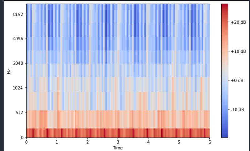
In the input, we put n_mels = 10, which means there are 10 buckets on the y_axis and you can see the 10 horizontal rectangles on the y-axis.
As before, the undertone I am interested in and that is present in the music lies in the lower frequency region. Another thing that can be observed from this spectrogram is the there are a lot of parallel lines above the red/amber signals. They are called the overtones of the fundamental frequency. Had they been absent, the timbre of the music would have been dark but here it can be said that it is bright.
Maybe there is more information that can be derived from the spectrograms and visual analysis of audios but I decided to call it a day and armed with the info such as freq, tempo, timbre I moved towards the quantitative data in which I duelled with Spotipy.
I will present my analysis of Spotify’s data in the next post.
Oh, if there are any comments, please do let me know and if you want the code then you can email me at [email protected] or drop a comment. You can check it on Githhub as well.
Till then, keep streaming!


