
Sketch Visual Design Excercise
Take me to Miami (But NEVER go to Collins st)
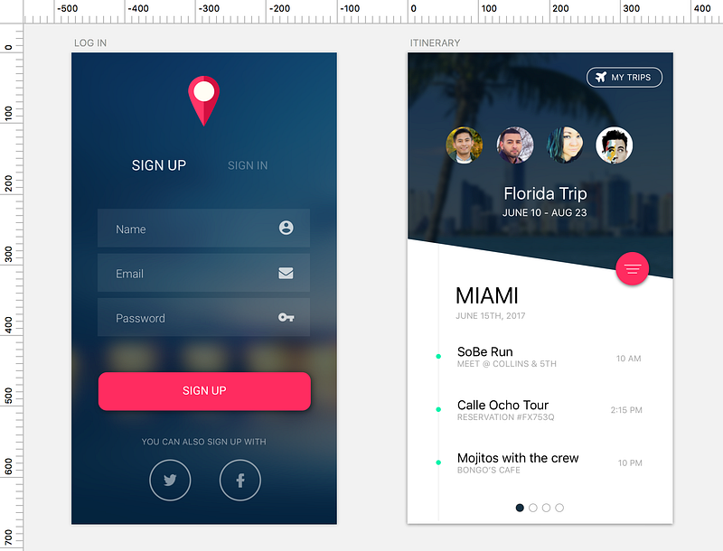
In this project, I learned in Sketch, how to emulate a login screen and an itinerary for an app. For reference, here is the screen we’re learning to emulate. :
The first thing I learn with this project is how many different ways there are to do the same thing. For example with my artboards, I added the background layouts in two different ways. For one, the image was very large and appeared as the top layer, I couldn't mask it directly on to the artboard. googled it, created a rectangle the same size as the artboard and then masked the image over the rectangle. The second image I was able to somehow superimpose that layer INSIDE the artboard object over to my layers toolbar on the left. I believe the second method is superior because it‘s’ quicker and easier. Also it’s more organized because you make fewer layers. Maybe most importantly I think this method reduces your margin for error. You’re less likely to make sizing errors since you don't have to worry about whether your backgrounds “rectangle shape” is a few degrees off from the actual artboard size. That sort of mistake will be harder to view and fix retroactively, and it takes away from the simplicity of your end product. I edited artboard one to reflect the technique done on the second screen.
The next thing I learned was how opacity and blur can create a “feeling”. I used it in my second screen to create stylistic consistency with the first screen, which had a blurred background image. I then wanted to create the “white space” so I tried using a rectangle shape a line to cut part of the rectangle. Here’s an example.
From there I used the boolean operation “subtract” to remove the top left triangular portion of the rectangle. This didn't work. I remembered by pressing enter on the rectangle I could edit the corners of the shape, which I did, from which I then used point type styling to create a soft edge.
At this point in the process, I’m feeling great, excited, engaged. Creating the meat of the screens wasn’t too bad. Inserting text is simple and I used a plug-in that detects onscreen lettering to give you a list of font styles similar to the image. The font that the plugin from the original isn’t one I had natively in the app, and since I don’t know much about importing fonts yet, I end up going with a common sans-serif font for a similar look to the original. Next, I realize that my background images aren’t going to work. The lettering on top of the background image against the itinerary page is supposed to be white, and there’s no way that will show up against the white background! More subtly, I notice that the login screen has too much brightness in the bottom half, so my icons and font there will not show up well either.
I spend some time finding new backgrounds using Unspash, a fantastic tool for free images. This time, I’m sure to look for a similar color scheme that will allow for high contrast white lettering, that keeps true to the original image.
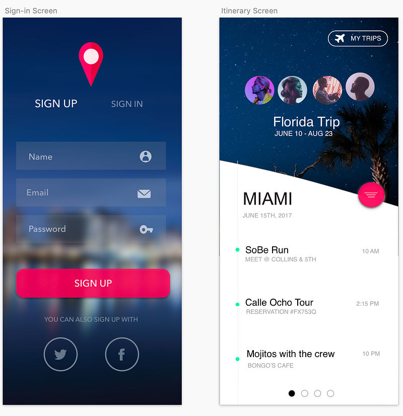
Enough mean for now, let's skip to the good stuff. Here is my final result:
Another interesting thing was learning how to make the location icon on the sign-in screen. To be fair, I’m not sure I did it in the most simple way. Essentially, I took a circle, and a triangle then merged the images.
From there I used the option key to copy the image. I used the eyedropper tool (click the object that you want to edit the color for) then control + c to get a hovering magnifying glass that you can hover over any other object on your screen, to get the Hex color code. I got my color-code perfect color for the object and tweaked the opacity so that it would look a bit more like our original image. I then found a way to splice the object in half, and drag it onto the original. I made sure to layer the new shape with a new color on top, and then added the white circle.
Playing with opacity and shadow were key in getting some of the buttons on the screen to feel right, and to look as close as I could get it to the original image.
Something else worth mentioning was learning to use symbols properly. I downloaded the icon font plugin and played around with different ways to access the library. Which leads me to the technical issue that for this project was the bane of my existence…

This thing.
I spent a few hours trying to resize this symbol when I printed it onto my page, checking out various tutorials along the way. I must have spent at least 3 hours working on getting it bigger…until I figured out that the symbols that you get from your plugins toolbar in Sketch (as seen below)
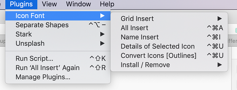
actually, print as if they were a letters or a number… in other words- they print as a font!
Eventually, I figured out I could resize the bird not by clicking and dragging, or by editing the pixel height and width, but by altering the font size. After this, the rest of the project was a relative breeze, where I focused on renaming my layers and grouping them in order to stay organized, and on getting shapes, distances, and small aesthetic details correctly. I can tell there are some areas where I used brute force rather than a strategy to complete this task, and I look forward to taking the time outside of class to slow down and practice good habits so that keyboard shortcuts and an efficient workflow become part of my Sketch vocabulary.