
Simplifying centering of divs with Tailwind CSS
All you need to do is add these 5 classes.
Tailwind CSS is a widely used tool for making websites look good. It’s like a set of building blocks for web designers.
These blocks come with ready-made styles and layouts, so designers don’t have to make everything from scratch.
Instead, they can pick the blocks they need and use them to quickly and easily create web pages. It’s a big time-saver for web developers!
<!doctype html>
<html>
<head>
<meta charset="UTF-8">
<meta name="viewport" content="width=device-width, initial-scale=1.0">
<script src="https://cdn.tailwindcss.com"></script>
</head>
<body>
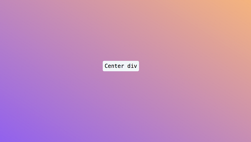
<div class="w-screen min-h-screen bg-gradient-to-tr from-violet-500 to-orange-300">
<div class="absolute top-1/2 left-1/2 -translate-x-1/2 -translate-y-1/2">
<h1 class="font-mono text-3xl border p-2.5 rounded-lg border-slate-100 bg-slate-100">Center div</h1>
</div>
</div>
</body>
</html>This code makes the div center of the whole screen. These are TailwindCSS class with their CSS definition
Create a whole screen layout.
w-screen:width 100vw;— 100% viewport width.min-h-screen:min-height;— 100vh, minimum height is 100% viewport height.
Center the div
absolute top-1/2 left-1/2 -translate-x-1/2 -translate-y-1/2
absolute:position: absolute;This positioning makes the<div>independent of the document flow, so it can be placed precisely.top-1/2:top: 50%;andleft-1/2:left: 50%;These classes position the<div>at the vertical and horizontal center of its parent container.-translate-x-1/2:— transform-translate-x: 50%;and-translate-y-1/2:— transform-translate-y: 50%;These classes further fine-tune the positioning by moving the<div>left and up by half of its own width and height. This centers<divcompletely both horizontally and vertically within its parent container.
I really like using Tailwind CSS in web development for its efficiency and ease of use. It helps developers make modern and flexible websites with less complicated code and more uniformity.


