
Say Goodbye to Screenshot and Use Datapane for Data Science Report
A complete tutorial of Datapane in 7 min read

Motivation
I frequently like to write data science related article on blogs. More, precisely I write on medium and Quora. Sometimes, I create some interactive data visualizations with python or aesthetic representation with jupyter notebook’s markdown option. But when I wanted to post it on the blogs like medium, I was bound to use the screenshots or gifs for sharing the interactive visualization or representation. A few days ago I was searching for finding out any way to share these interactive plots and markdown representations. After searching a lot, I have come across some articles where a few directions are given . Unfortunately, there are no complete guidelines so that I can use the technique easily for sharing interactive visualizations and representations. With a bit research, Datapane seems the most useful tools for doing the job. Now, it’s time to share my findings to make your data science related blog post more interactive and aesthetic.
It’s easy and fun.. Let’s get started…….
Overview of Datapane
Datapane is for the people who analyse data and create reports programmatically. Datapane supports the following libraries, languages and file formats to generate interactive reports till now.
- Pandas DataFrames
- Plots from Python visualization libraries such as Bokeh, Altair, Plotly, and Folium
- Markdown and text
- General files, such as images, PDFs, JSON data, etc.
Datapane reports are flexible and can also contain pages, tabs, drop downs, and more.
Once created, reports can be uploaded to the web, dynamically generated in the cloud, or embedded into your own application, where data can be explored, and visualizations can be used interactively.
Getting started with Datapane
Before using Datapane you should know that Datapane is an open-source Python library which makes it easy to build interactive reports in Python. Datapane Community is a free service to publish your Python reports online and collaborate.
Now, just follow the steps
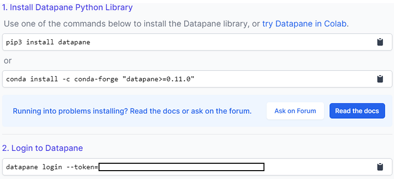
- Install Datapane library on your pc
Run the command in your cmd or anaconda command prompt
pip3 install datapane
or
conda install -c conda-forge "datapane>=0.11.0"
If you are a mac or linux user you may follow the guidelines provided here.
2. Login to the Datapane
Firstly, you have to sign up in the Datapane website . After signing in, they will provide you a token. Using the token you can easily login to the Datapane from your local pc. The token can be found from the link. If you hit the link you will be landed onto a page where you may find the token as below.
Here is a gif of the total process
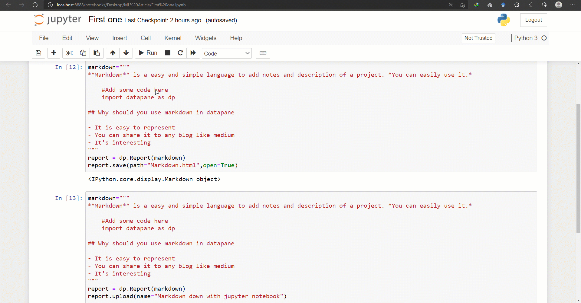
3. Render markdown text in Datapane text editor or jupyter notebook and share it to medium
You can use to create a sharable markdown both with Datapane text editor and python. The following gif demonstrate the whole process of creating markdown text with Datapane text editor and share it to medium.
Let’s do the same with python. I have written the following code for doing so.
The code will save a html version of the markdown text in your local directory. If you want to upload it to the Datapane website just change the last line of the code from report.save(path=”Markdown.html”,open=True) to report.upload(name=”Markdown down with jupyter notebook”) . It will save a the output to Datapane report. Complete guideline is shown below. The sharing process is same as shown in Datapane text editor gif.
And you will have a text as below.
4. Render HTML code in python and create interactive table
Datapane also facilities rendering html code in python. I have created an interactive table by following the code below.
The code will upload the table to the Datapane report. If you want to save it to your local directory just use .save(path=’report.html’, open=True) in the last line of the code that’s it. Sharing process in medium is same as shown in markdon section gif.
Output —
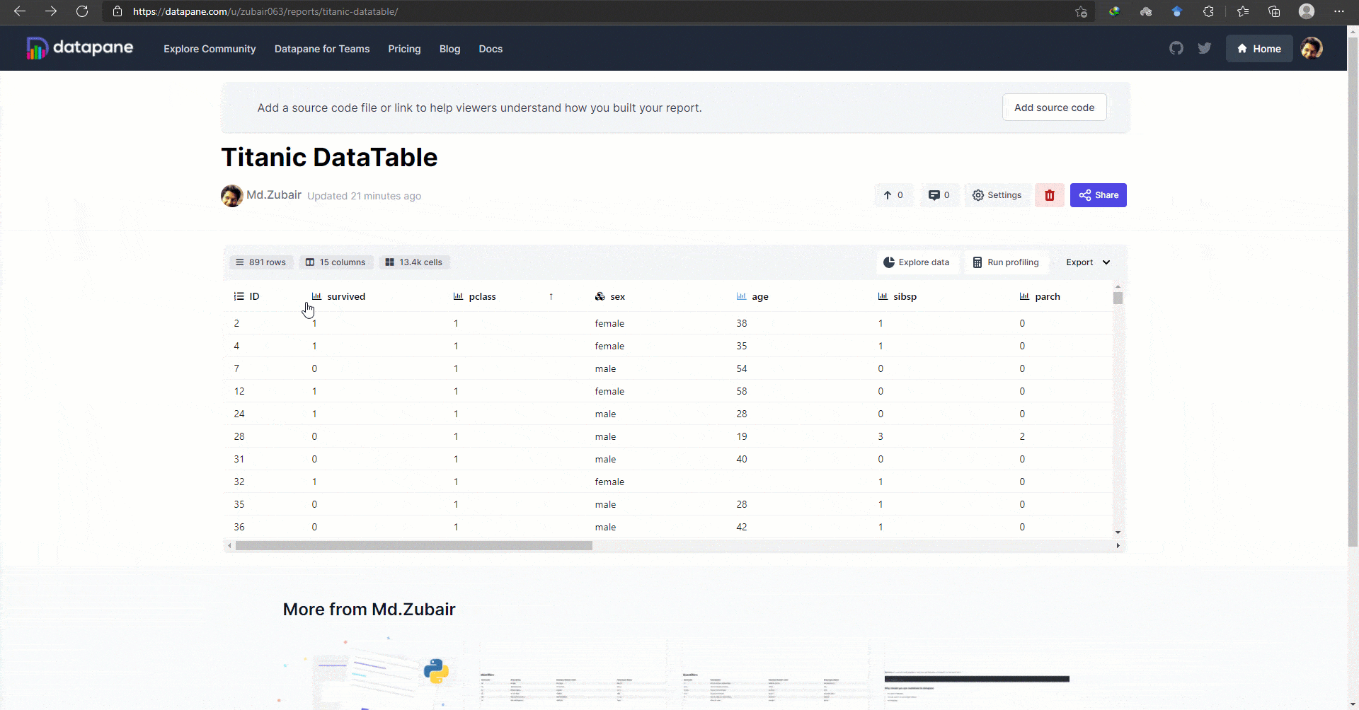
5. Interactable Data Table with Datapane
The interactive data table of Datapane is awesome and handly tool to represent your dataset in a interactive way.
I have written a peace of code for building a built-in dataframe with seaborn library and export it as a data table using datapane. It generates the following output.
I think it’s incredible. You can search, filter, sort, explore , in built EDA and many more. It covers a total reports of a dataset. The gif demonstrate the features of the data table.
6. Interactive plots and visualization
There is no other comparable tools to share such types of interactive plots and visualizations. Currently Datapane supports Altair, Matplotlib / Seaborn, Bokeh, Plotly ,Folium libraries for visualization. The dp.Plot block takes a plot object from one of the supported Python visualisation libraries and renders it in your report. I have shown a demo with Plotly as an example.
Output on Datapane
7.Combined plot with markdown
It’s more interesting because it seems like a creating an interactive report with any text editing tools. Markdown text is easily integrated with the interactive plot. An example along with code.
Output in datapane
8. Write formula and share
The formula block allows you easily to add LaTeX-formatted equations to your report, with an optional caption. A brief intro into LaTeX formulas can be found here.
import datapane as dpdp.Report(
dp.Formula(r"\frac{1}{\sqrt{x^2 + 1}}", caption="Formula")
).upload(name="First formula")Output
Under the hood Datapane uses MathJAX to render the equations in the browser and not a full TeX engine. This means that some of your TeX input may not be rendered correctly on Datapane system — read the MathJAX documentation for more info.
9. Integrate code on medium or other blog
The code block allows you to embed syntax highlighted source code into your report. This block currently supports Python and JavaScript. It is more lucrative than github gist.
Sharable code in datapane
10. Add Grid layout to your report
If you pass a list of blocks (such as Plot and Table) to a Report, they are -- by default -- laid out in a single column with a row per block. If you would like to customize the rows and columns, Datapane provides a Group component which takes a list of blocks and a number of columns and/or rows and lays them out in a grid.
If we take the example in the earlier tutorial, but want to lay the plot and dataset side-by-side, we can use specify this using Group and specifying the number of columns.
Datapane sharable report
11. Add multiple pages to your report
Reports on Datapane can have multiple pages, which are presented to users as tabs at the top of your report. These can be used similarly to sheets in an Excel document.
To add a page, use the dp.Page block at the top-level of your report, and give it a title with the title parameter. An example is given below.
Datapane multiple pages report
12. Multiple tabs and select report
It is useful while we need background context along with the report.
Datapane provides two select options on the dp.Select block: drop downs and tabs. Tabs are the default if you have fewer than five options, otherwise dropdowns will be used. To override the default, pass in the parameter type = dp.Select.DROPDOWN or type=dp.Select.TABS to your dp.Select block.
Datapane report
Moreover, If you want you can add files and images, python objects, embeds to your report. Find more details in the link .
I personally believe that data is beauty if you can represent it in a aesthetic way. The best way of data visualization is interactive visualization. Interactive and aesthetic data visualization can provide a meaningful insights into data. And Datapane has made the process super easier to us. Before get introduced to the Datapane library, it was a big issue for me to share data science report to any blogs whether I would use screenshot or create git to share it.
Hopefully, the article will help help you in case of sharing data science report to any blog post.
I have also picked up an interesting article for your further reading…


