
Say Goodbye to React-DnD, Hello to Dnd Kit: The Future of Drag and Drop is Here!
One of the best libraries to create drag-and-drop capabilities.

Previously, the go-to option for implementing drag-and-drop functionality in React was React-DnD. This library was widely recommended due to its robust features and ease of use for React developers.
However, there is now a new player in town that provides an even more powerful, better, and easier-to-learn solution: Dnd Kit.
While it’s important to acknowledge that React-DnD is still a good library, Dnd Kit offers a number of advantages that make it a compelling alternative.
For example, In terms of functionality, Dnd Kit offers a number of improvements over React-DnD. It’s more powerful, more efficient, and provides a better user experience. However, it’s up to individual developers to decide which library is the best fit for their needs.
If you ask me, I prefer Dnd Kit and used it most often and that’s the reason I am writing this post to make you familiar as well.
Please keep in mind that I followed the official documentation, thus the code appears identical. But I’ve done my best to explain the concept as simply as possible.
Also, there will be a series of posts in the future where I will explain some complex examples so follow me to get updated when I publish the next post.
Now let’s proceed further.
Why Dnd Kit?
According to the official website, Dnd Kit is a lightweight, modular, performant, accessible, and extendable drag-and-drop toolkit for React.
It makes it simple for you to drag and drop your components.
Talking about what you can create, there are literally tons of examples. Some of the best ones are as follows:
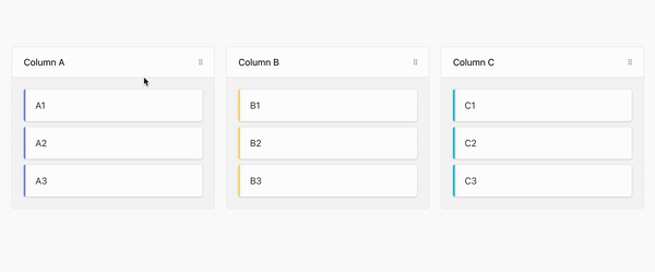
1. Kanban Board
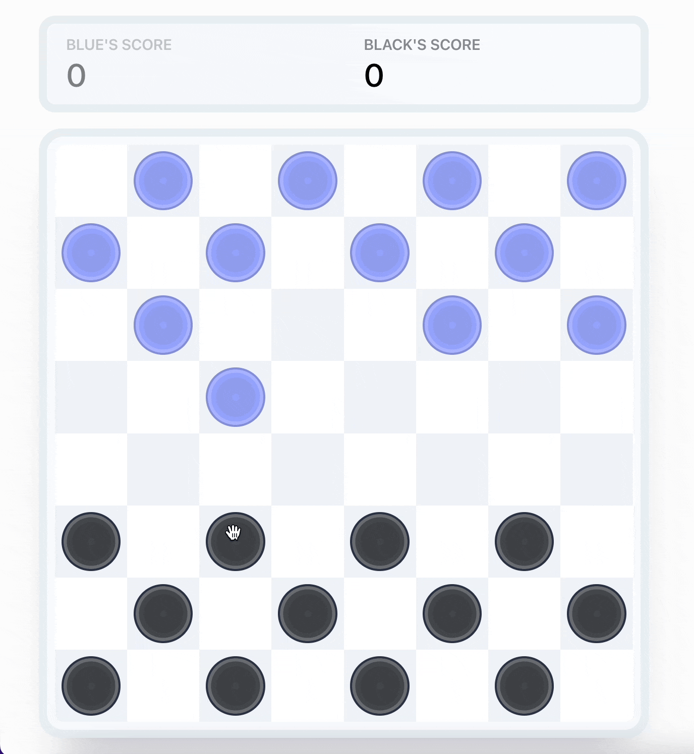
2. Checker Game
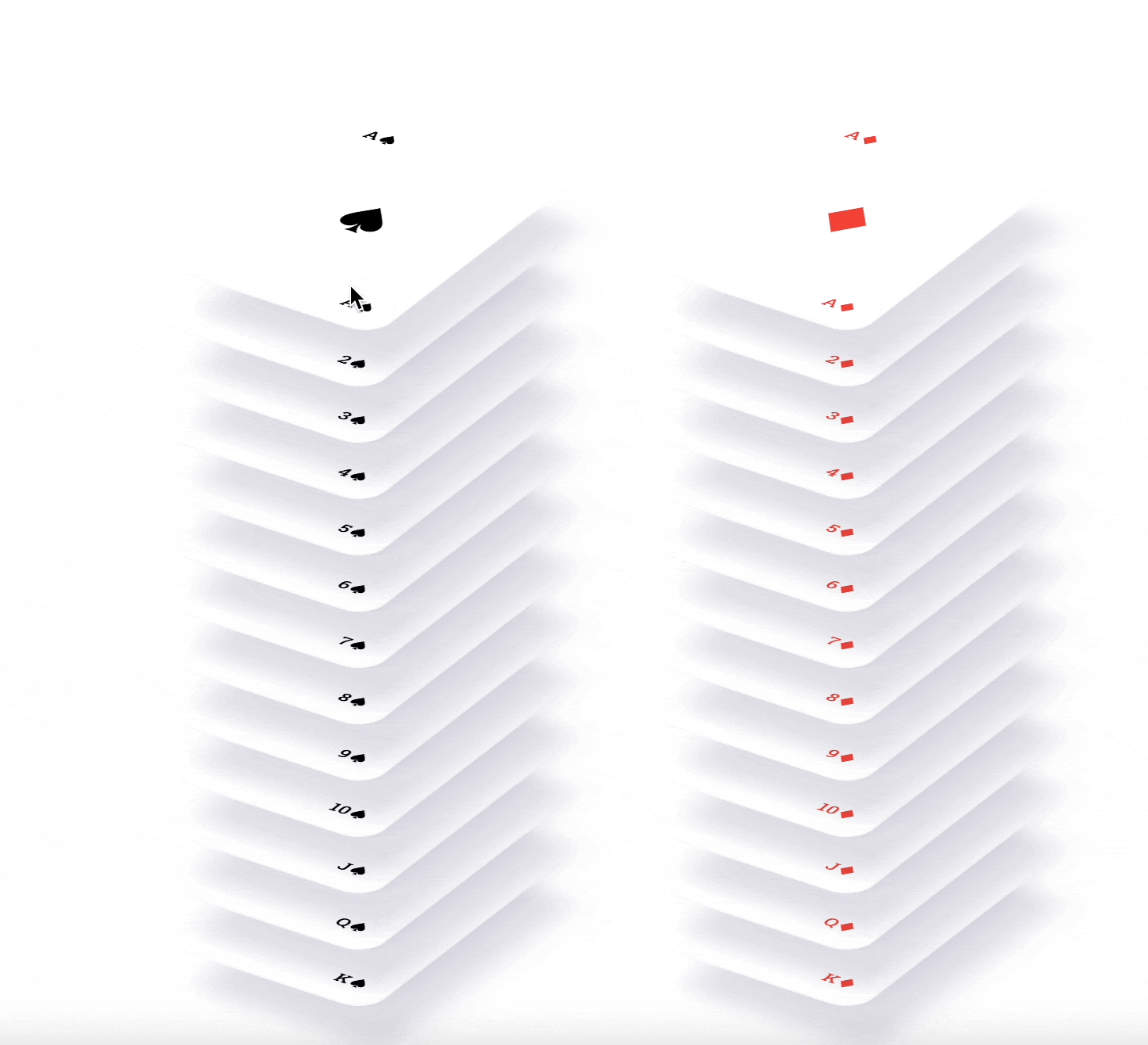
3. Card Game
Cool, right?
Similarly, you can implement any drag-and-drop capability as you prefer.
So let’s deep dive and use Dnd Kit.
Making Use of Dnd Kit in Your React Application
First, we have to install Dnd Kit.
And it’s quite easy to install Dnd Kit inside your React project.
1. Installation
You should first have to create a React app using the standard command.
npx create-react-app appnameAnd then you can install the Dnd Kit package. For that, you simply need to install the core library which consists of most of the main functionality that you need.
So, within your React app, run the following command.
npm install @dnd-kit/core
There are some more Dnd Kit packages i.e. modifier and sortable which we will use in a later post.
2. Understand the Fundamentals of Dnd Kit
First, let me explain some fundamental concepts behind the Dnd Kit library.
Before using Dnd Kit, you should be familiar with ref in React. If you don’t know here is the documentation for that.
Now let’s proceed further.
To use the Dnd Kit library, you will need to define two components: a Draggable component and a Droppable component.
The Draggable component is the element that can be dragged and the Droppable component is where the Draggable component can be dropped.
Lastly, to ensure interaction between the Draggable and Droppable components, both components must be placed inside a DndContext component, which acts as a parent component.
This way, the DndContext component can manage the interactions between the two components and provide a centralized place to handle the drag-and-drop functionality.
Here is the sample code about what I have explained.
import React from 'react';
import {DndContext} from '@dnd-kit/core';

import {Draggable} from './Draggable';
import {Droppable} from './Droppable';

function App() {
  return (
    <DndContext>
      <Draggable />
      <Droppable />
    </DndContext>
  )
}
Don’t worry if the above code doesn’t make sense; we’ll go over it thoroughly later. Just remember that we have a DndContext parent component and two additional components within it.
3. A Drag and Drop Example
Now, you have understood some basic concepts of Dnd Kit let’s take a simple example of it.
Before that, let me show you what we are creating.
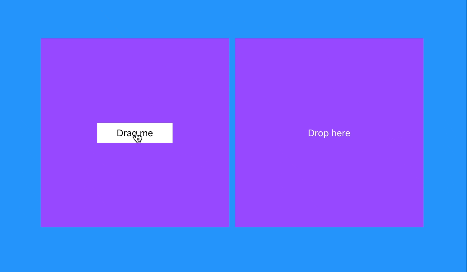
Here, the left column consists of a Draggable component, and the right column consists of a Droppable component.
So let’s create these two components.
- Creating a Draggable Component
Create a new file name Draggable.jsx inside the src folder of your React app and paste the below code.
import React from 'react';
import { useDraggable } from '@dnd-kit/core';

export function Draggable(props) {
    const { attributes, listeners, setNodeRef, transform } = useDraggable({
        id: 'draggable',
    });
    const style = transform ? {
        transform: `translate3d(${transform.x}px, ${transform.y}px, 0)`,
    } : undefined;

    return (
        <button ref={setNodeRef} style={style} {...listeners} {...attributes}>
            {props.children}
        </button>
    );
}
Here, we defined a React component named Draggable which implements the functionality of a draggable element using the Dnd Kit library. The code imports the useDraggable hook from the @dnd-kit/core library, which is used to provide the drag-and-drop functionality for the component.
Then we used the ‘useDraggable’ hook which returns an object that contains several properties that are used to implement the draggable functionality.
The object contains the following properties:
- attributes: an object containing the HTML attributes required to make the component draggable
- listeners: an object containing event listeners that are triggered when the user drags the component
setNodeRef: a function that is used to set a reference to the DOM node of the component- transform: an object that contains the current x and y translation of the component in pixels
The ‘Draggable’ component uses the ‘transform’ property to apply a translation to the component. This is done by creating a ‘style’ object that contains the translation and applying it to the component using the ‘style’ property.
Lastly, we defined a button element that uses the ‘ref’ property to set the reference to the DOM node using the ‘setNodeRef’ function from the ‘useDraggable’ hook. The ‘listeners’ and ‘attributes’ objects from the hook are spread onto the component using the ‘…listeners’ and ‘…attributes’ syntax, respectively.
Hope you got it.
- Defining a Droppable Component
Now create a new file name Droppable.jsx inside the src folder of your React app and paste the below code.
import React from 'react';
import { useDroppable } from '@dnd-kit/core';

export function Droppable(props) {
    const { isOver, setNodeRef } = useDroppable({
        id: 'droppable',
    });
    const style = {
        color: isOver ? 'blue' : undefined,
    };


    return (
        <div ref={setNodeRef} style={style}>
            {props.children}
        </div>
    );
}
Here, the useDroppable hook returns an object that contains two properties:
isOver: a boolean value indicating whether the draggable component is currently over the droppable componentsetNodeRef: a function that is used to set a reference to the DOM node of the component
Then the code is simple, if the draggable component is over the droppable component then isOver will be true and because of that the color blue will be applied.
- Defining a Parent Component
Remember, we have to create a parent component that takes these two components.
So now let’s create that.
import React, { useState } from 'react';
import { DndContext } from '@dnd-kit/core';
import './App.css'
import { Droppable } from './Droppable';
import { Draggable } from './Draggable';

function App() {
  const [isDropped, setIsDropped] = useState(false);
  const draggableMarkup = (

    <Draggable >
      <div className='drag_item'>
        Drag me
      </div>
    </Draggable>
  );

  return (
    <DndContext onDragEnd={handleDragEnd}>
      <div className='section'>
        <div className='draggable'>
          {!isDropped ? draggableMarkup : null}
        </div>
        <div className='draggable'>
          <Droppable>
            {isDropped ? draggableMarkup : 'Drop here'}
          </Droppable>
        </div>
      </div>
    </DndContext>
  );

  function handleDragEnd(event) {
    if (event.over && event.over.id === 'droppable') {
      setIsDropped(true);
    }
  }
}

export default App;
Here, in the App component, we have defined a state variable isDropped that keeps track of whether the draggable item has been dropped into the droppable area.
In simple terms, we have conditions to either display the draggable item or a message indicating where the item can be dropped.
In the main render function, the code returns a DndContext component with a callback function handleDragEnd passed as a prop. The callback will be called when the drag-and-drop action is finished. Then we have two divs with the class "draggable"(for applying the same styles).
The first div has the draggableMarkup component as its child, but only if isDropped is false. The second div has a Droppable component as its child. If isDropped is true, the draggableMarkup component will be displayed, otherwise, it will display the text "Drop here".
Lastly, the handleDragEnd function checks if the event.over property exists and if the id of the event.over object is "droppable". If so, it updates the state by calling setIsDropped(true).
- Add styles to your react app
Lastly, we need to apply styles to our React app. And for that, you can use any CSS framework but I will simply create a new App.css file inside the src folder and add the below code to it.
.section {
  display: flex;
  align-items: center;
  justify-content: center;
  height: 100vh;
  background-color: rgb(37, 148, 251);
}

.draggable {
  display: flex;
  align-items: center;
  justify-content: center;
  width: 20rem;
  height: 20rem;
  background-color: #9749FF;
  margin-right: 10px;
  color: white;
}

.drag_item {
  padding: 5px 10px;
  width: 8rem;
  height: auto;
  color: black;
  background-color: white;
}
That’s it, now you can run the app and see the output.
Hope you like it.
That’s it — thanks.
Also, there will be a series of posts about Dnd Kit in the future, so be sure to follow me.
Consider becoming a Medium member if you appreciate reading stories like this and want to help me as a writer. It costs $5 per month and gives you unlimited access to Medium content. I’ll get a little commission if you sign up via my link.