
RNA-Seq Data Analysis using PCA (Principal Component Analysis)

Today I’ll tell you how RNA Sequencing analysis is transforming the medical research.
After reading you will know: how to use Machine Learning Algorithms to get a proper insight into various diseases.
You will know the Python code for this process at the end. So, let’s first build an understanding of the whole scenario.
Introduction:
Pancreatic Adenocarcinoma (PAAD) is the third most common cause of death from cancer, with an overall 5-year survival rate of less than 5%
It is predicted to become the second leading cause of cancer mortality in the United States by 2030.
Ribonucleic acid ( RNA ) is a polymeric molecule essential in various biological roles in coding, decoding, regulation, and expression of genes.
RNA-Seq (RNA sequencing), is a sequencing technology to detect the quantity of RNA in a biological sample at a given moment.
Here we have a dataset of normalized RNA Sequencing reads for pancreatic cancer tumors. The measurement consists of ~20,000 genes for 185 pancreatic cancer tumors.
The file format is GCT, a tab-delimited file used for sharing gene expression data and metadata (details for each sample) for samples.
The GCT file is like a multi-dimensional DataFrame, which consists of 3 DataFrames combined in 2-D.
These are:
- data_df: It has 18465 rows (Gene ID) and 183 columns (Sample Name/ID)
- row_metadata_df: It has row metadata and When we see the type, It is an empty data frame. This means in our data, the row metadata is not present.
- col_metadata_df: It has 183 columns (Sample Names/ID) and 124 rows (Column metadata like histological_type, Patient_ID, status(is he alive or not)) for each sample.

Data cleaning and check the distribution of gene expression across samples:
Out of 18465 rows, 4367 rows had NULL values at some of the columns.
So I removed them in the data cleaning process. So after data cleaning 14098 rows are there and 183 columns.
These 14098 rows represent Gene ID, and 183 columns represent 183 different samples.

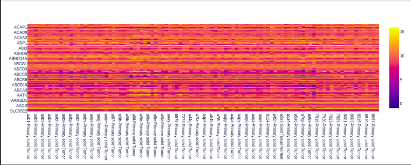
Generation of gene expression distribution for all samples:
Here we plot the expression (the numerical value which ranges from 0 to 15, e.g. 7.5 or 11.2, etc.) Points for the understanding graph:
- the x-axis of the heatmap graph has sample names.
- The y-axis of the heatmap graph has the gene id.
- The color signifies the value of gene expression corresponding to each sample.
- So the color bar on the right helps us to get insight into the distribution of gene expression as the values are encoded via color.

Visualization of all the data using the Phantasus tool online.
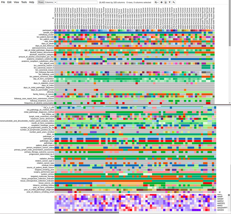
Image of all sample gene distribution:
Identify only the Exocrine (adenocarcinoma) tumors and remove Neuroendocrine tumors:
Preparing the data for PCA:
Using PCA result for plotting the data.
We already know that the data is for two broad categories of Pancreatic Cancer:
- Exocrine
- Neuroendocrine So based on that, there will be 2 different clusters of data points.
Here I used the ‘histological_type_other’ data to separate the two types of cancers.
Image of PCA plot:
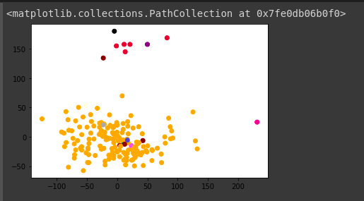
We can see that most of the points are concentrated in a particular range of PC1 and PC2 values. So we can separate the samples from Neuroendocrine and Exocrine.
The outliers are -100 > PC1 and PC1 > 100 . I choose this range as it is PC1 and a more prominent feature. and another constraint is PC2 < 50.
It will provide us to separate outliers. So in the next step, We’ll remove the outlier samples from the data frame.

Understand the effect of Interferons in Pancreatic Adenocarcinoma:
Interferons (IFNs) are a group of signaling proteins made and released by host cells in response to the presence of several pathogens, such as viruses, bacteria, parasites, and also tumor cells.
Type I interferons (IFNs) are a large subgroup of interferon proteins that help regulate the activity of the immune system.
The genes responsible for type 1 Interferons are called Type 1 IFN signature and consist of a set of 25 genes in homo sapiens.
Now, we know the samples, which fall in the category of Pancreatic Adenocarcinoma, and we also know the genes responsible for type1 interferons (Type 1 IFN Signature).

These genes are a set of 25 genes in homosapians. So To plot the gene expression, for pancreatic adenocarcinoma, We’ll create a dataframe with these 25 genes as rows and the Sample name (Which is the index of the pp dataframe.) as columns.
Image of the Type 1 IFN genes (25 genes) → it’s a distribution across samples of Exocrine.
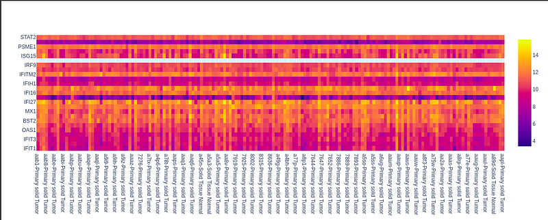
So, we can see the distribution of genes across different samples is like it has most values near 10 and 12, as the color of heatmap near 10 and 12 is most likely observed. The blue has less frequency. So it signifies that a few values are around 4.
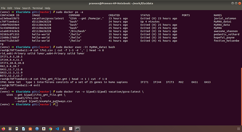
The output from the GSVA algorithm is shown as the screenshot from the command terminal. I ran this algorithm in Docker.
Summary:
- We learned about RNA Sequencing data.
- The data storage format of RNA Sequencing for better analysis.
- Use of Machine Learning Algorithms like PCA (Principal Component Analysis) for Medical Research.
- The layman’s understanding of the output of the algorithm.
- The Interferons and How they affect the immune system.
- At last we used GSVA (Gene Set Variation Analysis) algorithm in Docker to get specific insights.

Read more at https://praveenpareek11.github.io/
For more interesting blog posts, install medium app and follow me!


