
Ridge Plots with Python’s Seaborn
A fascinating way of visualizing multiple distributions
This visualization is composed of line charts stacked vertically with slightly overlapping lines that share the same x-axis.
Those overlaps reduce the whitespace, many times at the cost of precision, and create a compact chart that’s relatively uncommon and great for catching the viewer's attention.
The names Ridge plot or Ridgeline plot is quite fitting; The charts do look like mountains. And they are also known as Joy Plots — Mainly because of the band Joy Division which used this visualization in one of its album covers.

KDE Plots and Facet Grids
Now let’s get to the example. We’ll use this dataset from Kaggle, which contains Netflix's original productions and their IMDB scores.
import matplotlib.pyplot as plt
import seaborn as sns
import pandas as pd
df = pd.read_csv('../data/netflixoriginals.csv')languages = ['English', 'Hindi', 'Spanish',
'French', 'Italian', 'Portuguese']df_filtered = df[df['Language'].isin(languages)]df_filtered
We’ll need Seaborns FacetGrid to create a plot for each category systematically. The function is straightforward; we only need the data frame and the field's name to group the values.
sns.set_theme(style="white")g = sns.FacetGrid(df_filtered, row="Language")g.map_dataframe(sns.kdeplot, x="IMDB Score")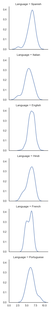
With this default configuration, it’s hard to see and compare all the distributions. One of the main advantages of Ridge plots is to make the chart compact while still informative.
Of course, there are many different solutions for this issue, using the columns, changing plot sizes, or using another visualization.
Let’s try making the charts broader and shorter.
sns.set_theme(style="white")g = sns.FacetGrid(df_filtered, row="Language", aspect=9, height=1.2)g.map_dataframe(sns.kdeplot, x="IMDB Score")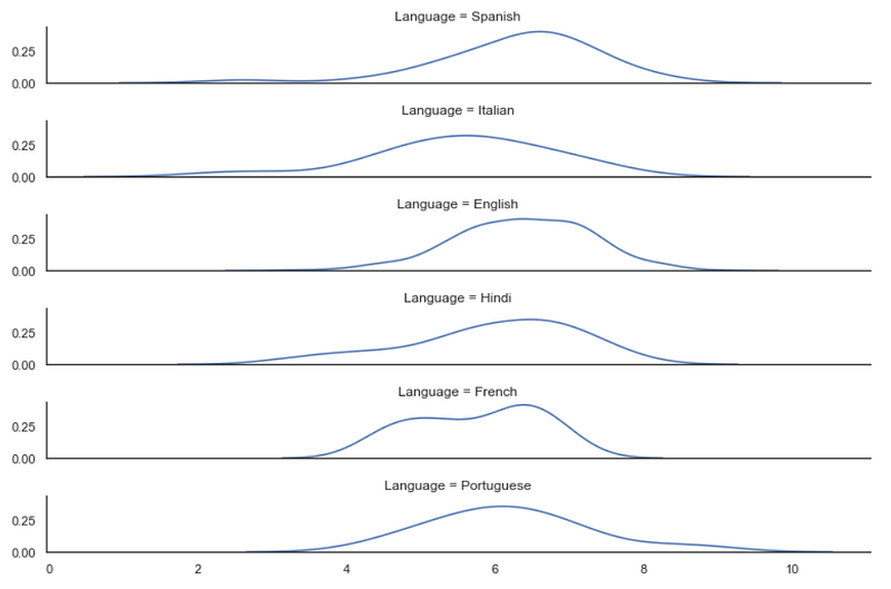
That solves the problem, but there isn’t anything special about this visualization. The simple fact that Ridge plots are unconventional makes them more attractive.
Kernel Density Estimation plots are not known for representing the data with precision; they’re great for simple tasks such as visualizing the modality or central tendency.
That means we want the user to focus on the shape of the data, and the Y-ticks aren’t needed here.
sns.set_theme(style="white")g = sns.FacetGrid(df_filtered, row="Language", aspect=9, height=1.2)g.map_dataframe(sns.kdeplot, x="IMDB Score")g.set_titles("")
g.set(yticks=[])
g.despine(left=True)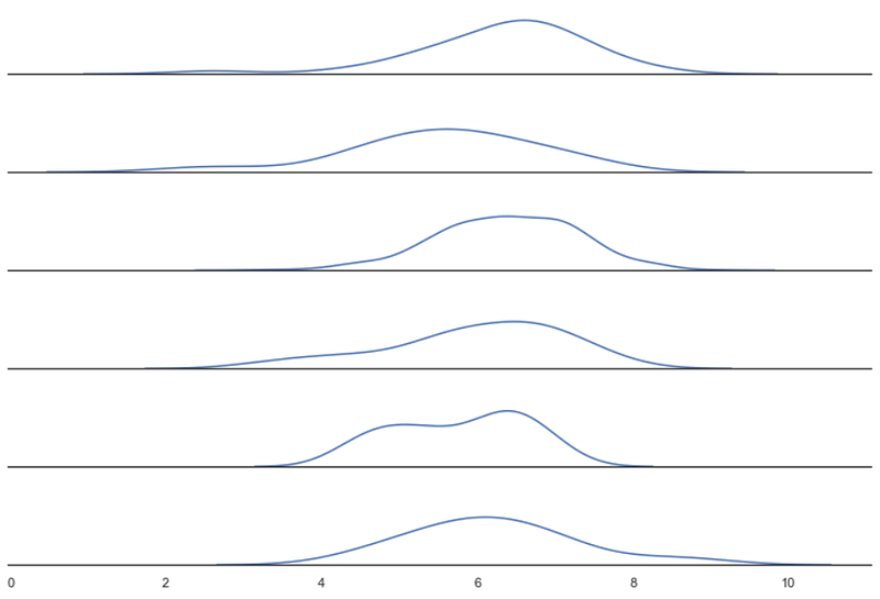
We’re ready to turn our density plots into a Ridge plot.
Ridge Plot
First, we’ll need to make sure the axis background is transparent.
sns.set_theme(style="white", rc={"axes.facecolor": (0, 0, 0, 0)})Second, we’ll need to paint/fill the inside area of the lines.
g.map_dataframe(sns.kdeplot, x="IMDB Score", fill=True, alpha=1)We also need to differentiate the plots once they overlap. We can use different colors for each row or draw another density plot to outline the first.
Finally, we’ll need Matplotlib’s subplots_adjust to control the height space between the plots.
sns.set_theme(style="white", rc={"axes.facecolor": (0, 0, 0, 0)})g = sns.FacetGrid(df_filtered, row="Language", aspect=9, height=1.2)g.map_dataframe(sns.kdeplot, x="IMDB Score", fill=True, alpha=1)
g.map_dataframe(sns.kdeplot, x="IMDB Score", color='black')g.fig.subplots_adjust(hspace=-.5)g.set_titles("")
g.set(yticks=[])
g.despine(left=True)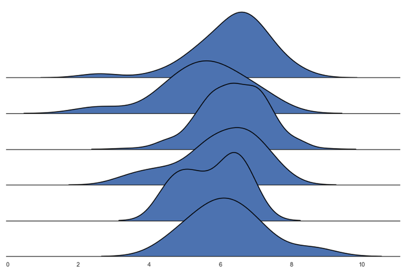
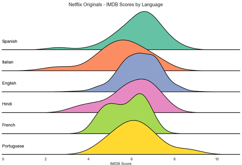
We have our Ridge plot!
Now we can customize it as we wish. FacetGrid is great for creating multiple visualizations, and the methods .map and .map_dataframe are appreciable since they allow us to use functions to interact with all the subplots.
sns.set_theme(style="white", rc={"axes.facecolor": (0, 0, 0, 0), 'axes.linewidth':2})palette = sns.color_palette("Set2", 12)g = sns.FacetGrid(df_filtered, palette=palette, row="Language", hue="Language", aspect=9, height=1.2)g.map_dataframe(sns.kdeplot, x="IMDB Score", fill=True, alpha=1)
g.map_dataframe(sns.kdeplot, x="IMDB Score", color='black')def label(x, color, label):
ax = plt.gca()
ax.text(0, .2, label, color='black', fontsize=13,
ha="left", va="center", transform=ax.transAxes)
g.map(label, "Language")g.fig.subplots_adjust(hspace=-.5)g.set_titles("")
g.set(yticks=[], xlabel="IMDB Score")
g.despine( left=True)plt.suptitle('Netflix Originals - IMDB Scores by Language', y=0.98)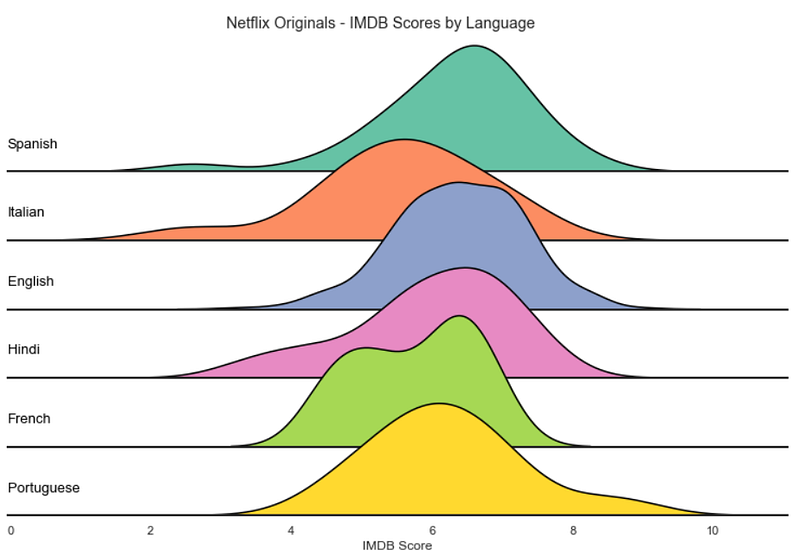
Conclusions
Overall, Ridge plots are great for focusing on the distribution of the data. They attract the viewer’s attention with an appealing aesthetic, making them an excellent option for introducing the user to the analysis.
The overlap of the lines makes it harder to position y-ticks, limiting this visualization to pretty much density plots and histograms.
They shine when there are apparent differences in the distributions of the categories but can require some extra polishing since the overlaps may obscure too much information.
It’s an exciting graphic with a limited amount of information that viewers can effortlessly consume.
Below you can see the code I used to replicate the Joy Division album cover. The data comes from a gist from Borgar, and it’s an approximation of the actual graphic.
import pandas as pd
import seaborn as sns
import matplotlib.pyplot as plt
url = "https://gist.githubusercontent.com/borgar/31c1e476b8e92a11d7e9/raw/0fae97dab6830ecee185a63c1cee0008f6778ff6/pulsar.csv"df = pd.read_csv(url, header=None)
df = df.stack().reset_index()
df.columns = ['idx', 'x', 'y']sns.set_theme(rc={"axes.facecolor": (0, 0, 0, 0), 'figure.facecolor':'#000000', 'axes.grid':False})g = sns.FacetGrid(df, row='idx', aspect=50, height=0.4)# Draw the densities in a few steps
g.map(sns.lineplot, 'x', 'y', clip_on=False, alpha=1, linewidth=1.5)
g.map(plt.fill_between, 'x', 'y', color='#000000')
g.map(sns.lineplot, 'x', 'y', clip_on=False, color='#ffffff', lw=2)# Set the subplots to overlap
g.fig.subplots_adjust(hspace=-0.95)g.set_titles("")
g.set(yticks=[], xticks=[], ylabel="", xlabel="")
g.despine(bottom=True, left=True)plt.savefig('joy.png', facecolor='#000000')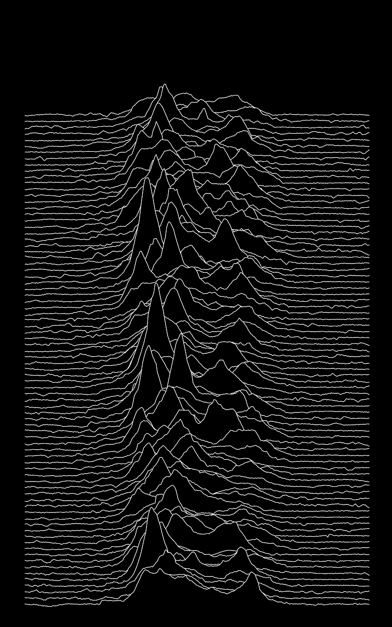
Thanks for reading my article! — More Python DataViz tutorials.
Resources: Seaborn — Ridge Plot Example; Seaborn — FacetGrid; Matplotlib — Subplots Adjust; Eagereyes — Joy Plots
More content at plainenglish.io


