
Revealing the Spatial Dimension in Power BI: A Comprehensive Guide to Charts and Graphs
Exploring Power BI Charts for Visualizing Data Spatially.

Introduction
Spatial data analysis means understanding the geographical patterns, locations, and relationships within the datasets.
Power BI offers various charts and visualizations specifically designed to showcase spatial data.
In this blog post, we will explore the various chart options available in Power BI which helps to find out the spatial information of a particular dataset.
Definition:
Map
The Map view of Power BI allows users to show the spatial distribution of data, identify hotspots, and visualize patterns across regions.
Filled Map
Filled map visualization is a chart that uses a choropleth map to shade or colour regions based on associated data values. It highlights variations, concentrations, and disparities across different geographical areas.
Shape Map
Shape map visualization displays data points in custom-defined regions or boundaries, combining the power of geographic maps and custom shapes.
Hands-on:
Map: Let’s start with a basic map.
It needs location information with bubble-size data. With this, we can add legend data too.
Using latitude and longitude information, you can also create a map.
Filled Map: Here you will not find any bubble size section.
By default, data will be displayed in a filled manner if we select location and tooltip info. Using conditional formatting, we can display data in a different colour.
Shape Map: It displays the shape of that country or location. It doesn’t contain latitude and longitude information.
In the video below, let’s explore how you can create these map views in Power BI.
Download Code
Please find the code in the location below.
Data Analysis in Power BI — Chapter 17
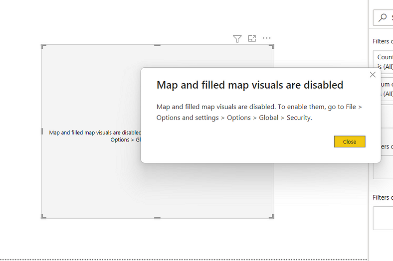
Possible Error
You may get the below error if you use any map view.
Then please enable maps from “Options and Settings”.
ArcGIS Maps:
Power BI integrates with ArcGIS Maps, which offers advanced spatial analysis capabilities.
Users can generate a variety of map-based visualizations to explore spatial relationships, identify clusters, and analyze patterns within their data. Such visualizations include heat maps, cluster maps, and custom layers.
Hands-On:
In the video below, let’s explore how you can create this map view in Power BI.
Download Code:
Please find the code in the location below.
GitHub Link: Data Analysis in Power BI — Chapter 23
Conclusion:
In this blog, you learn about the below items
In Power BI, many chart options are available to showcase and analyze spatial data.
It includes classic maps, shape maps, ArcGIS maps etc. By using these charts, users can gain insights into geographical patterns, trends, and relationships within their datasets, which can help them make data-driven decisions.
If you have any questions related to this project, please feel free to post your comments.
Please like, comment and subscribe to my YouTube channel which you have already seen. :-) Keep Learning.


