Recency, Frequency, Monetary Model with Python
The last time we analyzed our online shopper date set using the cohort analysis method. We discovered some interesting observations around our cohort data set. While cohort analysis provides us with customer behavior overtime and understand retention rates, we also want to be able to segment our data by their behavior as well.
What is RFM?
Behavioral segmentation by 3 important features:
- Recency — number of days since the last purchase
- Frequency — number of transactions made over a given period
- Monetary — amount spent over a given period of time
We will then have to group these features by:
- Percentiles or quantiles
- Pareto Rule — 80/20
- Business Acumen
We will be implementing the percentile grouping for our approach.
Now let’s get on with some Python.
These are the libraries we will need for our analysis today. We will be using squarify to plot our segmentation into a tree map later on.
# Import libraries
import pandas as pd
from datetime import timedelta
import matplotlib.pyplot as plt
import squarify
We will be analyzing our online shopper data set again, but this time with our RFM model.
# Read dataset
online = pd.read_csv('../data.csv', encoding = "ISO-8859-1")
# Convert InvoiceDate from object to datetime format
online['InvoiceDate'] = pd.to_datetime(online['InvoiceDate'])Let’s take a closer look at the data we will need to manipulate.
Input:
print('{:,} rows; {:,} columns'
.format(online.shape[0], online.shape[1]))print('{:,} transactions don\'t have a customer id'
.format(online[online.CustomerID.isnull()].shape[0]))print('Transactions timeframe from {} to {}'.format(online['InvoiceDate'].min(),
online['InvoiceDate'].max()))Output:
541,909 rows; 8 columns
135,080 transactions don't have a customer id
Transactions timeframe from 2010-12-01 08:26:00 to 2011-12-09 12:50:00Input:
# Drop NA values from online
online.dropna()The first we need to do is to sort customers based on recency, frequency, and monetary values. To calculate recency, we will be taking one day after the last invoice date of our data set as the snapshot date ‘2011–12–10 12:50:00’. The date difference will give us how recent the last transaction was made. With that, we can then group our ‘online’ dateframe by customer ID and assign it to ‘data_process’ for our data pre-processing.
# --Group data by customerID--# Create TotalSum column for online dataset
online['TotalSum'] = online['Quantity'] * online['UnitPrice']# Create snapshot date
snapshot_date = online['InvoiceDate'].max() + timedelta(days=1)
print(snapshot_date)# Grouping by CustomerID
data_process = online.groupby(['CustomerID']).agg({
'InvoiceDate': lambda x: (snapshot_date - x.max()).days,
'InvoiceNo': 'count',
'TotalSum': 'sum'})# Rename the columns
data_process.rename(columns={'InvoiceDate': 'Recency',
'InvoiceNo': 'Frequency',
'TotalSum': 'MonetaryValue'}, inplace=True)Let’s take a look at our progress so far.
# Print top 5 rows and shape of dataframe
print(data_process.head())
print('{:,} rows; {:,} columns'
.format(data_process.shape[0], data_process.shape[1]))Output:
Recency Frequency MonetaryValue
CustomerID
12346.0 326 2 0.00
12347.0 2 182 4310.00
12348.0 75 31 1797.24
12349.0 19 73 1757.55
12350.0 310 17 334.40
4,372 rows; 3 columnsGreat, we have 4,372 customer records grouped by recency of their purchase, the frequency by their quantity, and the monetary value of the purchases. Now we can get into the meat of things and use the .qcut() method to assign the relative percentile to their RFM features. But before that, let’s examine the distribution of our Recency, Frequency, and Monetary.
# Plot RFM distributions
plt.figure(figsize=(12,10))
# Plot distribution of R
plt.subplot(3, 1, 1); sns.distplot(data_process['Recency'])# Plot distribution of F
plt.subplot(3, 1, 2); sns.distplot(data_process['Frequency'])# Plot distribution of M
plt.subplot(3, 1, 3); sns.distplot(data_process['MonetaryValue'])# Show the plot
plt.show()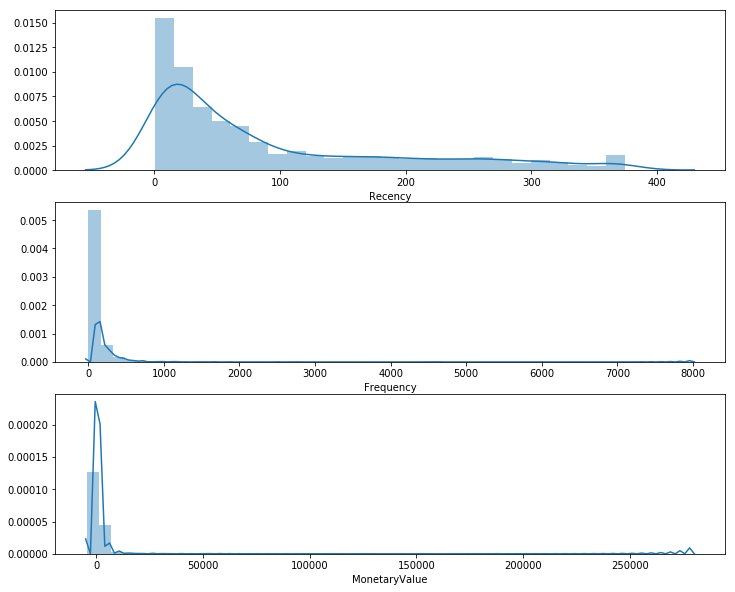
This plot provides us with some very interesting insights and how skewed our data is. The important thing to take note here is that we will be grouping these values in quantiles. However, when we examine our customer segmentation using K-Means in the next, it will be very important to ensure that we scale our data to center the mean and standard deviations. More on that next time. Let us proceed with the .qcut() for our RFM.
# --Calculate R and F groups--# Create labels for Recency and Frequency
r_labels = range(4, 0, -1); f_labels = range(1, 5)# Assign these labels to 4 equal percentile groups
r_groups = pd.qcut(data_process['Recency'], q=4, labels=r_labels)# Assign these labels to 4 equal percentile groups
f_groups = pd.qcut(data_process['Frequency'], q=4, labels=f_labels)# Create new columns R and F
data_process = data_process.assign(R = r_groups.values, F = f_groups.values)
data_process.head()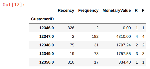
We create a 4 labels for our f_labels, where 4 is the “best” quantile. We do the same for our f_label. We then create new columns “R” and “F” and assign the r_group and f_group values to them respectively.
Next, we do the same for our monetary value by grouping the values into 4 quantiles using .qcut() method.
# Create labels for MonetaryValue
m_labels = range(1, 5)
# Assign these labels to three equal percentile groups
m_groups = pd.qcut(data_process['MonetaryValue'], q=4, labels=m_labels)# Create new column M
data_process = data_process.assign(M = m_groups.values)Finally, with these 3 scores in place, R, F, and M, we can create our first RFM segment by concatenating the values together below. Let’s assign our data_process dataframe to our newly created rfm dataframe.
# Concat RFM quartile values to create RFM Segments
def join_rfm(x): return str(x['R']) + str(x['F']) + str(x['M'])
data_process['RFM_Segment_Concat'] = data_process.apply(join_rfm, axis=1)
rfm = data_process
rfm.head()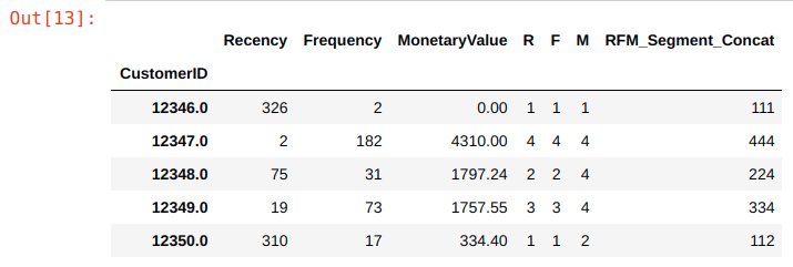
From the output, you can see that we have our concatenated segments ready to be used for our segmentation, but wait, there is one issue…
# Count num of unique segments
rfm_count_unique = rfm.groupby('RFM_Segment_Concat')['RFM_Segment_Concat'].nunique()
print(rfm_count_unique.sum())
Output:
62Having 62 different segments using the concatenate method quickly becomes unwieldy for any practical use. We will need a more concise way to define our segments.
Summing the Score
One of the most straightforward methods is to sum our scores to a single number and define RFM levels for each score range.
# Calculate RFM_Score
rfm['RFM_Score'] = rfm[['R','F','M']].sum(axis=1)
print(rfm['RFM_Score'].head())Output:CustomerID
12346.0 3.0
12347.0 12.0
12348.0 8.0
12349.0 10.0
12350.0 4.0
Name: RFM_Score, dtype: float64We can get creative and hypothesize about what each score range entails, but for this exercise I will take inspiration from some common segment names.
# Define rfm_level function
def rfm_level(df):
    if df['RFM_Score'] >= 9:
        return 'Can\'t Loose Them'
    elif ((df['RFM_Score'] >= 8) and (df['RFM_Score'] < 9)):
        return 'Champions'
    elif ((df['RFM_Score'] >= 7) and (df['RFM_Score'] < 8)):
        return 'Loyal'
    elif ((df['RFM_Score'] >= 6) and (df['RFM_Score'] < 7)):
        return 'Potential'
    elif ((df['RFM_Score'] >= 5) and (df['RFM_Score'] < 6)):
        return 'Promising'
    elif ((df['RFM_Score'] >= 4) and (df['RFM_Score'] < 5)):
        return 'Needs Attention'
    else:
        return 'Require Activation'
# Create a new variable RFM_Level
rfm['RFM_Level'] = rfm.apply(rfm_level, axis=1)# Print the header with top 5 rows to the console
rfm.head()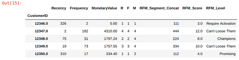
Finally, we can then group our customers by their RFM level.
# Calculate average values for each RFM_Level, and return a size of each segment
rfm_level_agg = rfm.groupby('RFM_Level').agg({
    'Recency': 'mean',
    'Frequency': 'mean',
    'MonetaryValue': ['mean', 'count']
}).round(1)
# Print the aggregated dataset
print(rfm_level_agg)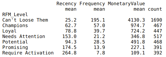
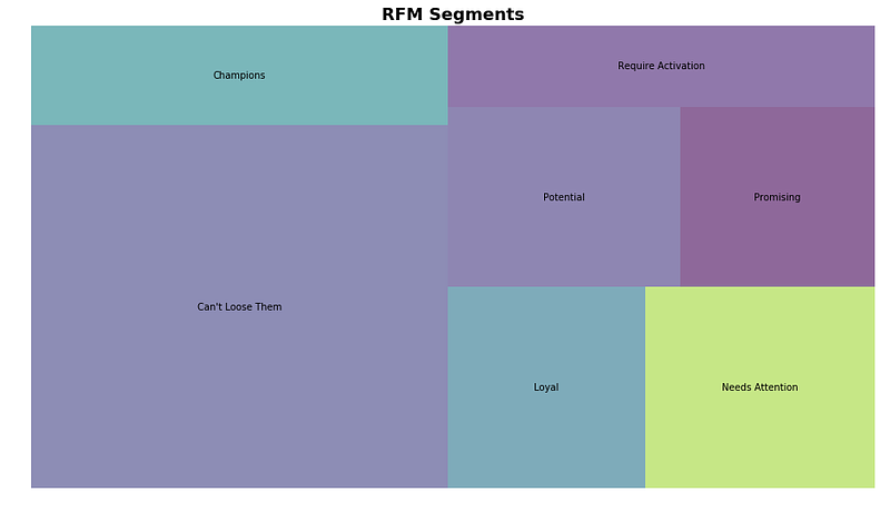
From here, we can see that a large percentage (~60%) of our customers are in the top tier RFM levels. The store must be doing something right to be maintaining their loyalty!
The other 40% will need some work. Let’s explore using some ads to re-target them:
- Potential — high potential to enter our loyal customer segments, why not throw in some freebies on their next purchase to show that you value them!
- Promising — showing promising signs with quantity and value of their purchase but it has been a while since they last bought sometime from you. Let’s target them with their wishlist items and a limited time offer discount.
- Needs Attention — made some initial purchase but have not seen them since. Was it a bad customer experience? Or product-market fit? Let’s spend some resource build our brand awareness with them.
- Require Activation — Poorest performers of our RFM model. They might have went with our competitors for now and will require a different activation strategy to win them back.
But before we end, let’s create a nice visualization for our data.
rfm_level_agg.columns = rfm_level_agg.columns.droplevel()
rfm_level_agg.columns = ['RecencyMean','FrequencyMean','MonetaryMean', 'Count']
#Create our plot and resize it.
fig = plt.gcf()
ax = fig.add_subplot()
fig.set_size_inches(16, 9)squarify.plot(sizes=rfm_level_agg['Count'],
label=['Can\'t Loose Them',
'Champions',
'Loyal',
'Needs Attention',
'Potential',
'Promising',
'Require Activation'], alpha=.6 )plt.title("RFM Segments",fontsize=18,fontweight="bold")
plt.axis('off')
plt.show()