
ReactNative: TabBar With Float Button
I usually observe designers work on different designers’ resources to find something complicated to implement with ReactNative for the ability to propose new features for my customers that want to have in their applications interesting design solutions, I found that Curved TabBar more and more popular among designers but it’s quite complicated to implement using ReactNative.
Shadow first of all
ReactNative provides shadow capability for both platforms iOS and Android. iOS platform supports different properties to set up your shadow in needed element or group of elements, so can easily apply shadow props to container and shadow will flow around all elements in that group. For the Android, ReactNative using Elevation API that developed for the material design with flat surfaces and it more looks line rectangle with gradient.
Interaction possibilities
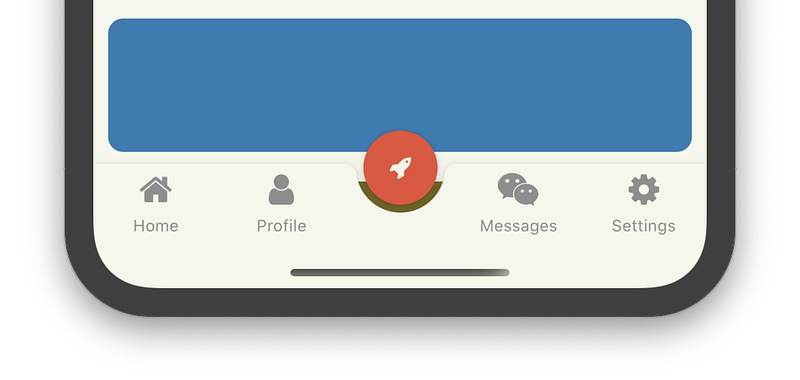
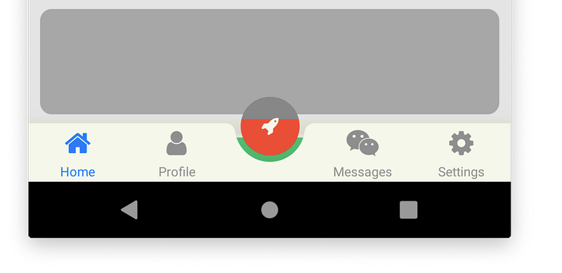
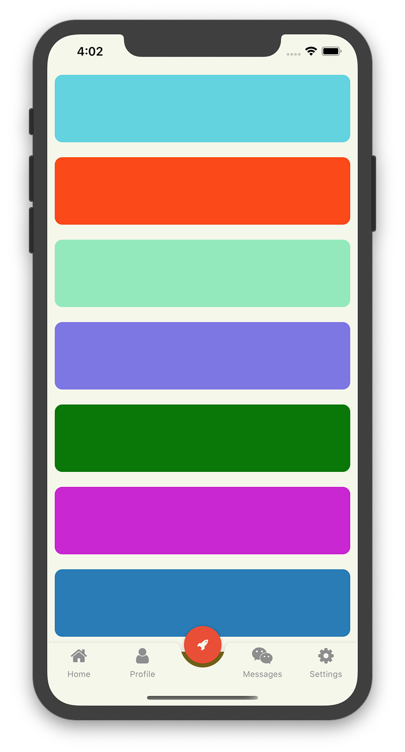
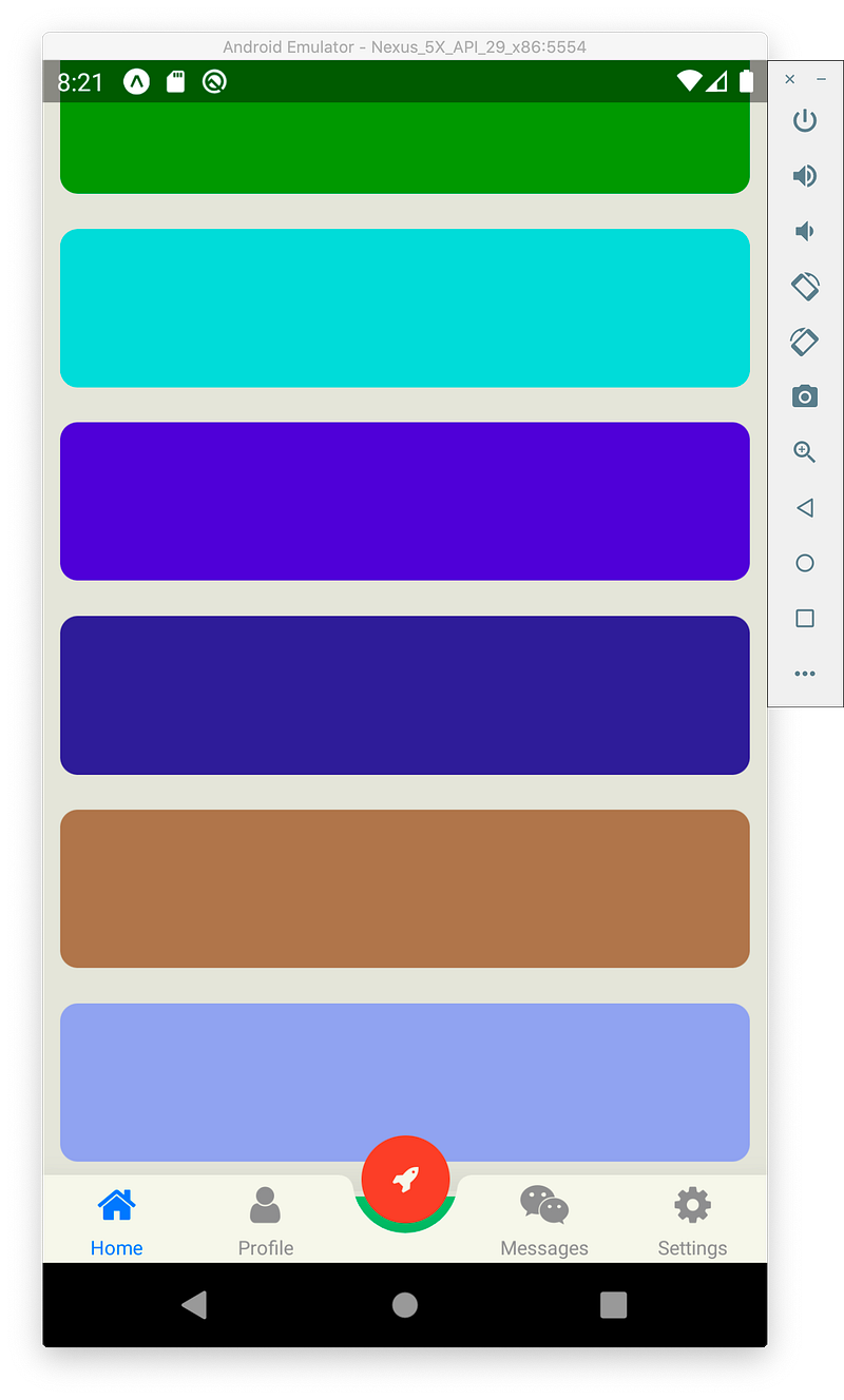
ReactNative provides a few Touchable components like TouchableOpacity, TouchableWithoutFeedback, etc. that allow us to handle user interaction in the app, also you can use View component if you do want to handle “press in/out” manually, so you can make everything touchable. Android has one restriction/bug in this feature. When element appears out of the parent component it won’t rise any handler, but only part of the touchable element that renders in the parent component will be responsible for example colored part of the image below is touchable, so we can leave that as it is or expand TabBar area to extend touchable area of the rocket button.
Implementation
I usually use React Navigation for the navigation flow in the app, for the react-navigation v5 you’ll need to install needed modules separately for our task it’s:
- @react-navigation/native
- @react-navigation/bottom-tabs
We don’t need to build own TabBar but we need to modify TabBar of react-navigation:
const BottomBar = createBottomTabNavigator();export const TabBar: React.FC<Props> = ({ barColor }) => (
<NavigationContainer>
<BottomBar.Navigator
tabBar={(props) => (
<View style={styles.navigatorContainer}>
<BottomTabBar
{...props}
/>
{IS_IPHONE_X && (
<View style={[styles.xFillLine, {
backgroundColor: barColor
}]}/>
)}
</View>
)}
tabBarOptions={{
showIcon: true,
style: styles.navigator,
tabStyle: {
backgroundColor: barColor
}
}}
>
<BottomBar.Screen
...First of all, import and wrap BottomTabBar into View that allows us to apply shadow to the whole container not only for BottomTabBar, then add one more View after BottomTabBar to provide filled space on iPhone X coz we also clear background color by setting backgroundColor: transparent. By default navigator style uses elevation with some value, so we need to clear it by setting elevation: 0 to avoid side effects, also we need to set up absolute positioning to the container to see content under it. To fill tabs with a color we are using tabStyle property to colorize each tab separately that allows us to make a custom tab button in the center without background color.
const styles = StyleSheet.create({
container: {
flex: 1
},
navigatorContainer: {
position: 'absolute',
bottom: 0,
left: 0,
right: 0,
// SHADOW
shadowColor: "#000",
shadowOffset: {
width: 0,
height: 1,
},
shadowOpacity: 0.22,
shadowRadius: 2.22,
},
navigator: {
borderTopWidth: 0,
backgroundColor: 'transparent',
elevation: 30
},
xFillLine: {
position: 'absolute',
bottom: 0,
left: 0,
right: 0,
height: 34
}
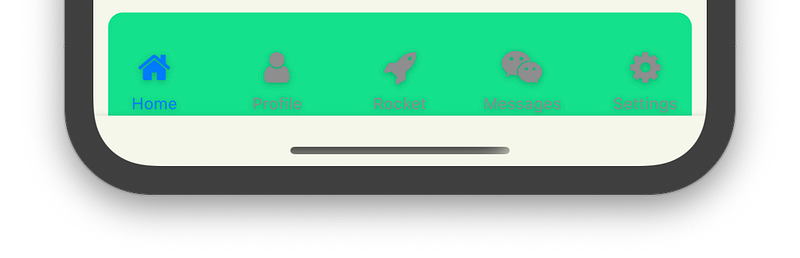
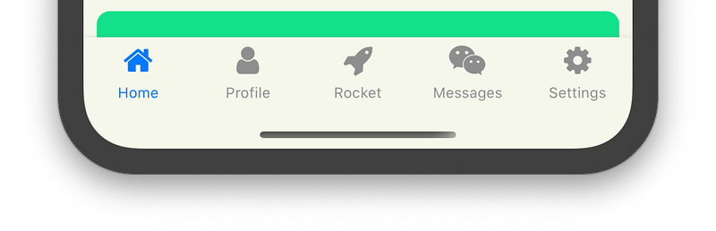
});After adding screens to the BottomTabBar in JSX we will see something like that:
Build a custom tab
The BottomBar.Screen provides options attribute that you can use to customize tab and related screen options, we need to build own component that we pass to the tabBarButton option, it will render it instead of the standard tab.
<BottomBar.Screen
  name="Rocket"
  component={EmptyScreen}
  options={{
    tabBarButton: (props) => (
      <TabBarAdvancedButton
        bgColor={barColor}
        {...props}
      />
    )
  }}
/>
I’ve noticed that sometimes I used barColor variable, it contains common color for TabBar which use for the background, we pass it to the custom button to render it with the same color as TabBar, also we passing props from arguments.
Our tab should contain background, touchable component with an icon inside. For the background, I’ve used SVG instead of PNG to avoid blurring on the corners.
export const TabBg: React.FC<Props> = ({
  color = '#FFFFFF',
  ...props
}) => {
  return (
    <Svg
      width={75}
      height={61}
      viewBox="0 0 75 61"
      {...props}
    >
      <Path
        d="M75.2 0v61H0V0c4.1 0 7.4 3.1 7.9 7.1C10 21.7 22.5 33 37.7 33c15.2 0 27.7-11.3 29.7-25.9.5-4 3.9-7.1 7.9-7.1h-.1z"
        fill={color}
      />
    </Svg>
  )
};
export const TabBarAdvancedButton: React.FC<Props> = ({
bgColor,
...props
}) => (
<View
style={styles.container}
pointerEvents="box-none"
>
<TabBg
color={bgColor}
style={styles.background}
/>
<TouchableOpacity
style={styles.button}
onPress={props.onPress}
>
<Icon
name="rocket"
style={styles.buttonIcon}
/>
</TouchableOpacity>
</View>
);TabBg — is a background and placed with absolute positioning under a touchable element, also a center of the tab is not a correct center for the touchable we move it upper.
const styles = StyleSheet.create({
  container: {
    position: 'relative',
    width: 75,
    alignItems: 'center'
  },
  background: {
    position: 'absolute',
    top: 0,
  },
  button: {
    top: -22.5,
    justifyContent: 'center',
    alignItems: 'center',
    width: 50,
    height: 50,
    borderRadius: 27,
    backgroundColor: '#E94F37',
  },
  buttonIcon: {
    fontSize: 16,
    color: '#F6F7EB'
  }
});
That’s all folks, so right now you have a curved tab bar that you can use in ReactNative development, but remember Android issues before proposing this functionality for customers.
Source code and demo you can see there GitHub/Expo.
As usual, all sources are open and available on my GitHub repository so good luck!
Please help me if you want to improve this article, so don’t shy — write down your comments!


