
React Native & TypeScript: Scroll Aware Header Transitions
How to implement fluid header transitions with Typescript and React Native

The optimisation that matters — dynamic headers
Although optimising header behaviour comes at the latter stages of an app’s development pipeline to polish the UX experience, doing so can make a big difference to the overall user experience of an app. Enhancing a static header to become responsive and dynamic results in more screen space, a deduplication of content, along with the aesthetically pleasing manner when header content transitions in and out, adding more distinct personality to the app.
This article walks through the process of transitioning a header as the user scrolls, focussing on text content and the header’s underlying shadow property. These elements will react to a wrapping the the screen content, that feeds its scroll offset to a React Context.
The techniques used here are not limited to header components only — they can be used to transition other components relative to scroll position, such as animations of a how-to guide, other UI elements such as back-to-top buttons, etc. However, with headers being a generally very familiar concept, they are a good place to start exploring such techniques.
Project Overview
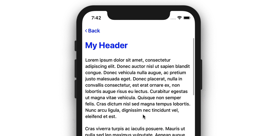
The full project can be found here on Github to experiment with or build upon for your own React Native projects. The final result resembles the following demo:
There are actually two transitions happening here to compliment both header text content and the gradual fade of the shadow:
- The My Header title only fades in and out once the
<ScrollView />offset has reached certain thresholds. This ensures the header text will not be only partly visible if the user stops scrolling half way through the transition. - The header shadow fades as the
<ScrollView />is scrolled, between the same two thresholds, where theopacityof the shadow gradually changes as the user scrolls between those thresholds. Unlike the header text, it feels more fluid for the shadow to always react to the<ScrollView />offset —unlike text, it does not impair reading if it is only partly visible.
Achieving these transitions is done with standard React JS and React Native APIs that work together to create a native feeling experience. React Native’s Animated API is, after-all, hooked into the native animation frameworks of the both iOS and Android, resulting in low latency header transitions that feel fluid and part of the native experience.
More specifically, the following components have been implemented to make the transition happen, and will be the focus of this article:
- A
<ScrollContext />component that hosts a React Context is wrapped around the entire application. From here, any<Header />component within the app will be able to access the transition state values, such as the current scroll offset, the resulting opacity and whether the title is showing. - A wrapped
<ScrollView />component. This component will also be namedScrollView, and acts as the defaultScrollViewcomponent of the project. It simply wraps the default React NativeScrollViewcomponent, but also defines itsonScroll behaviour and plugs in any props passed through to it. By doing this, everyScrollViewis hooked up to ourScrollContextout of the box. - A custom
<Header />component that leveragesScrollContextto display the correct transition state. This component is a simple 3-row header that users will be accustomed to — but also contains fade animations along withAnimated.View components to handle the transitions. We’ll delve more deeply into<Header />along with its styling and hosted animations further down.
With this being said, the full component tree is relatively simple, resembling the following component hierarchy:
// project component hierarchy<ScrollContextProvider>
<Document>
<Header />
<ScrollView>
// content...
</ScrollView />
</Document>
</ScrollContextProvider>The Header and ScrollView are both nested within Document —Document being the only screen component of the app. ScrollContextProvider wraps the entire application, providing the means of managing every Header and ScrollView transition state.
There will only ever be one header present on each screen, so only one context is needed for the app. For a multi-screen app — perhaps with a react-navigation stack — ScrollContext could be reset upon each screen transition.
With this conceptual understanding, let’s explore how ScrollContext has been implemented, acting as the transition manager between the scroll view and header components.
Scroll Context Implementation
The full ScrollContext implementation can be found here on Github. The context itself holds vital state for the header to react to scroll events.
Upon visiting its type, ScrollContextInterface, we can see exactly what the context consists of:
// interface for `ScrollContext`export interface ScrollContextInterface {
opacity: number;
maxOffset: number;
offset: number;
titleShowing: boolean;
updateOffset (val: number): void;
};Property names have been intentionally kept short — the offset and maxOffset properties contain the current scroll position and maximum threshold of the transition respectively. titleShowing simply keeps track of whether the header text should be showing, and opacity reflects a value between 0 and 1 of how much the Header should be showing.
None of these transition state values are tied to a certain header element. opacity could be plugged into any element to coincide with the transition, whereas titleShowing could be changed to contentShowing and be used for other header elements.
Default values have been provided in the context definition to coincide with its type, including an empty function for updateOffset:
// ScrollContext definition with default valuesexport const ScrollContext = React.createContext<Partial<ScrollContextInterface>>({
opacity: 0,
maxOffset: 0,
offset: 0,
titleShowing: false,
updateOffset: (val: number) => { }
});// define hook to access context in functional componentsexport const useScroller = () => React.useContext(ScrollContext);The updateOffset() property carries a function to update the context offset value, that is defined in the <ScrollContextProvider /> component further down the file. For these default values though, we’ve just given it an empty function that coincides with the ScrollContextInterface type.
Using the Partial type with default values
Sometimes it is challenging to provide default values for a context that match its typing, given that we provide the actual values in the Context Provider. For those times, there is the useful Partial type, that tells the typing of the particular object that it is ok to not be complete. Even though all default values have been provided for ScrollContext, Partial has still been used:
export const ScrollContext = React.createContext<Partial<ScrollContextInterface>>({
   ...
This is good practice as it ensures our typing does not break when defining awkward default values that sometimes are not possible to define until initialisation in the Context Provider.
Initialising the Context Provider
Still in ScrollContext/index.tsx, a ScrollContextProvider component has been defined for initialising and managing the Provider along with its state values.
This component itself wraps the rest of the app, in App.tsx:
...
import { ScrollContextProvider } from './ScrollContext'
export const App = () =>
<ScrollContextProvider>
<Document />
</ScrollContextProvider>;Note on Prop type for props.children
When examining the signature of ScrollContextProvider, we see that a type of ChildProps has been used for typing the component props:
export const ScrollContextProvider = (props: ChildProps) => {}As the only thing we are leveraging from props is props.children, we can confidently expect one or more JSX elements to be passed through that property. This makes the type definition simple to define:
export interface ChildProps {
  children: JSX.Element[] | JSX.Element
}
Where components use props.children, an interface like ChildProps can be useful to use either singularly or as a union type with component-specific props. E.g. props: ChildProps & ComponentProps.
Defining Context State
Let’s delve deeper and explore how the context values are calculated and updated through useState hooks.
Within the provider component, some state initialisation firstly takes place, giving the context a means of updating:
// defining constants and state of Context Providerconst minOffset: number = 0;
const maxOffset: number = 30;const [offset, setOffset] = useState(0);
const [titleShowing, setTitleShowing] = useState(false);
const [opacity, setOpacity] = useState(0);Each transition property has been kept independent in their own useState hook; this design pattern will aid in adding or removing more transition properties as projects grow, rather than bundling every property into one useState object.
the minOffset and maxOffset define the area the transition takes place. These two offset values essentially provide the range of y scroll positions the transition takes place in:
opacityis interpolated as0at a scroll offset of0, and1at a scroll offset of30titleShowingis set totrueafter the maximum offset of30, andfalseunder that offset
These calculations are actually done within the updateOffset() function, defined within this component. Where we gave an empty function as its default value, now we can define it’s real implementation using the hooks and offset values defined above it:
// `updateOffset` implementation
const updateOffset = (val: number) => {
   setOffset(withinLimits(val, minOffset, maxOffset));
   setTitleShowing(val > maxOffset);
   setOpacity(withinLimits(val * maxOffset / 1000, 0, 1));
}
Essentially, all this function does is update the 3 state hooks defined before it, and that is it. A withinLimits() helper function has been used to keep these state values in a suitable range; we only want the opacity between 0 and 1, and offset to be between and minimum and maximum offset provided.
withinLimits() ensures this is the case:
// `withinLimits` implementation
const withinLimits = (val: number, min: number, max: number): number =>
  val > max
    ? max
    : val < min
      ? min
      : val
The conditional (ternary) operator has been leveraged here to minimise the syntax of the function. If the val provided is greater than max or less than min, then those thresholds will be returned. Else, simply return val.
This function used with setOffset is self explanatory, where the offset is limited between 0 and 30. The setOpacity hook however has an interpolation calculation as its argument:
setOpacity(withinLimits(val * maxOffset / 1000, 0, 1));val * maxOffset / 1000 gives us a decimal percentage value (between 0 and 1) of how far val is through the transition. withinLimits() then ensures that the opacity does not go beyond this range.
With the state values now updated through updateOffset(), the context Provider can be returned with its state values, wrapping the child props in the process:
...
return (
  <ScrollContext.Provider value={{
    opacity: opacity,
    maxOffset: maxOffset,
    offset: offset,
    titleShowing: titleShowing,
    updateOffset: updateOffset,
  }}>
    {props.children}
  </ScrollContext.Provider>
)
With the context fully implemented, the idea now is that any <ScrollView /> can access the context and update its properties with updateOffset(). To make this process streamlined, a custom <ScrollView /> has been defined, with the context automatically updated on the onScroll event.
Custom ScrollView Implementation
The full implementation of ScrollView has been separated into the following Gist:
This component essentially wraps React Native’s default ScrollView component and returns it, as the same name, along with plugging in its onScroll event handler:
- The default
ScrollViewcomponent has been imported asScrollViewNativeto not conflict with the new component name - The
useScroller()context hook is used to accessScrollContextvalues updateOffset()is called upon theonScrollevent, taking thenativeEvent.contentOffset.yvalue as the current y offset of the scroll view
Wrapping vanilla components with additional configuration is an elegant way to expand the functionality of the component to coincide with your app’s needs.
A custom Text component has also been defined in the project, with the purpose of defining certain styling properties with just a prop name. This is very useful when theming components too, by hosting all your theme logic at the Text component level.
This shorthand syntax is a lot easier to manage, simply passing prop names to style the component. E.g, when defining a text colour:
<Text primaryColor>My Text</Text>Limiting context re-renders
The scrollEventThrottle prop has been used to limit the amount of times onScroll is called. This safe-guard have been implemented alongside onScroll, while giving enough leeway for a smooth opacity transition:
onScroll={({ nativeEvent }) => {
  const offset = nativeEvent.contentOffset.y;
  updateOffset(offset);
}}
scrollEventThrottle={200}
Header Implementation
Putting everything together, Header is the component that reacts to the scroll context accordingly to transition its content:
- The
opacitycontext value is plugged in directly inViewstyle props - The
titleShowingcontext value, is used to determine whether a fading animation should take place
Embedding opacity directly is straight forward, with the value simply being used within the style prop of certain views. For the top-level header View itself, opacity has been applied to the shadowOpacity property:
<View style={{
   ...styles.header,
   shadowOpacity: opacity,
 }}>
   ...
</View>
Title fading on the other hand is achieved by triggering animations, provided by the Animated API. These animations have been defined within a useEffect hook.
Embedding animations within useEffect will ensure they are started after the render phase of the component, or once JSX has been rendered in the DOM.
Let’s take a quick look at how these animations have been set up. An Animated.Value is firstly initialised in state to handle the fade value:
const [titleFade] = useState(
   new Animated.Value(0);
);
And then either a fade-in or fade-out animation is triggered depending on whether titleShowing is true or false:
useEffect(() => {
    titleShowing === false &&
      Animated.timing(
        titleFade, {
        toValue: 0,
        duration: 200,
        useNativeDriver: true,
        easing: Easing.sin
      }).start();
titleShowing === true &&
Animated.timing(
titleFade, {
toValue: 1,
duration: 200,
useNativeDriver: true,
easing: Easing.sin
}).start();
});Lastly, titleFade is plugged into an <Animated.View /> wrapping the header title:
<Animated.View
   style={{
     opacity: titleFade,
       ...styles.headerTitle,
     }}
>
   <Text style={styles.title}>
      {props.title}
   </Text>
</Animated.View>
Header flexbox layout
Header adopts a flexbox row layout to mimic the iOS header layout. There are 3 columns across, each with their own props allowing developers to slot elements into each column:
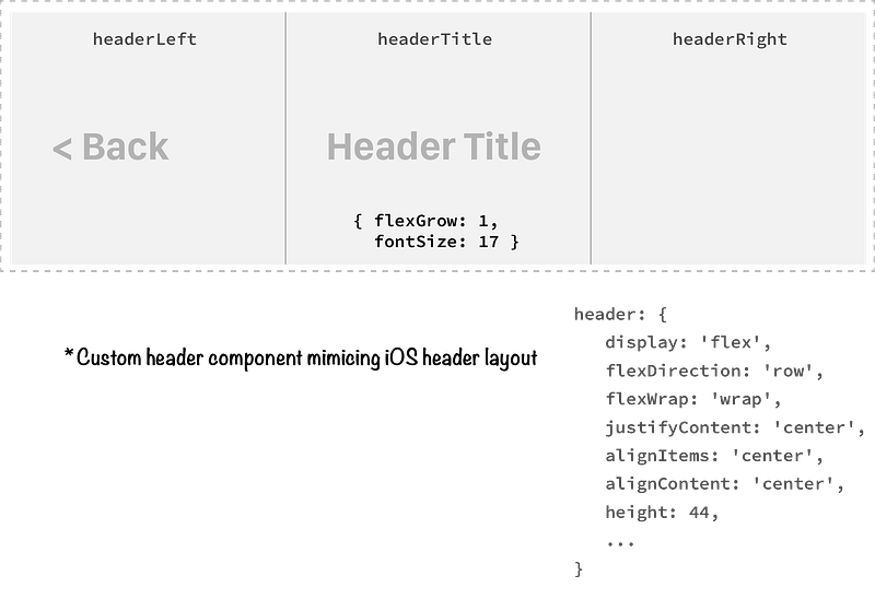
The key styles to look out for when re-creating a header are:
- A text size of
17, and a font weight of'600' - A height of
44 - Giving the header title area precedence with a
flexGrowproperty of1 - Vertically aligning the content to the
center
Now, when plugging the Header component into a screen view, we can go ahead and provide a Back link for the headerLeft prop, a title, and an optional headerRight prop. Check out how it is used within the Document component of the demo project:
<Header
   title='My Header'
   headerLeft={
     <Text
        style={headerStyles.headerText}
        onPress={() => console.log('Go Back')}
        primaryColor heading>
        <FontAwesome
           name='ios-arrow-back'
           size={15}
        /> Back
     </Text>
   }
/>
Remember, the custom Text component is being utilised here for the primaryColor and heading shortcut props.
The optional headerLeft and headerRight props expect a JSX.Element, per their types. Being able to pass any component into the header gives us the flexibility to insert text, icons, images, or anything else your app requires.
In the example above, we’re passing a Text component with the ios-arrow-back icon of Font Awesome, keeping in line with the iOS styling of the header. This would also be the place to plug in React Navigation links, replacing the placeholder console.log() above.
The full implementation of Header can be found here on Github.
In Summary
This concludes the walkthrough. We’ve explored a lot of code and conventions in this article, that will hopefully be useful for your own projects.
I hope this project is a useful reference point for developers in their React Native and Typescript endeavours, from the scroll context setup to the Header implementation and animations.
There are parts of the demo project that have not been covered here to prevent the article becoming too long, so I encourage the reader to explore the rest of the project for more insights on the structure of the code, the TypeScript used, and how the components come together to create the header transition effect. Also, leave a comment with any questions or suggestions and I will be sure to follow them up!


