
Quantitative Finance using Python-2: Basic Statistical Methods Using Python for Analyzing Stocks
Statistical Methods are part of the tools for analyzing securities. The following article explains the central limit theorem, returns, ranges, boxplots, histograms, and other sets of statistical measures for the analysis of securities using Yahoo Finance API.
The Central Limit Theorem
The Central Limit Theorem (CLT), which is a component of the study of probability theory, asserts that if random samples of any population are taken at intervals of a particular size (n), the sample will tend toward a normal distribution. The distribution is normal when there is no left or right bias in the data. The usual representation of a normal distribution is the Bell Curve which looks lithe a bell, hence the name
Typically, the mean is split into two categories: (1) population mean and (2) sample mean. When examining the data that will be used, these factors are crucial.
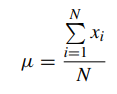
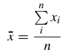
N=number of items in the population n=number of items in the sample
The formulae are almost identical, with one significant exception: the population mean is focused on the total number of items in a population, whereas the sample mean is focused on a particular sample. The sample is often a portion of the population that is chosen, and the population should be viewed as the entire observations that may be made.
Code :
Importing libraries
import numpy as np
%matplotlib inline
import pandas as pd
import matplotlib.pyplot as plt
import pandas_datareader as pdr
import datetime
import pandas_datareader.data as web
import ffn
import plotly.express as px
import yfinance as yf
getting the data using Yahoo finance( explained in part-1 about how to get data using yfinance)
Microsoft = yf.Ticker("MSFT").history(period='5y')
MSFT=Microsoft['Close']
Given that the information used for the MSFT security is from 2017 to 2022, this is considered a sample. As a result, the x¯ value will be regarded as the security’s mean. The equation shows that the mean is equal to the total of the elements divided by their count.
MSFT.mean()>> 179.84391941012987The other aspect mentioned on the CLT is the median. The median is the middle value of the set of numbers. To calculate the median in Python it should be calculated as follows:
MSFT.median()
>>162.32456970214844
Which one to choose? The rule of thumb is to use the mean when there are no outliers and to use the median when there are outliers.
The third measure of the CLT is the mode. The mode is the most frequent point of data in our data set. In a histogram, it is the highest bar. To calculate it in Python:
MSFT.mode()>> 298.17The process can be combined with the function describe function:
MSFT.describe()
>>count    1259.000000
mean      177.754387
std        79.782912
min        67.939636
25%       103.273239
50%       158.399643
75%       249.507164
max       341.606354
Creating histograms
A histogram is one of the most important plots to display information in finance. A histogram demonstrates the frequency of data that is continuous. Continuous, refers to continuous data, which means that the data can take any value within a range.
The histogram for analyzing security has to be elaborated with the total security return. To calculate the total stock return, the following formula will be used:
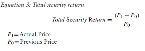
Once the variable MSFT is created there are different approaches to which prices should be used to calculate returns.The conventional approach is to use closing prices, since the prices are registered as the last price on the stock. This is useful when working on a historical database.
creating returns
msft_return= MSFT.pct_change(1)The pct_change is part of Pandas that gives the percentage of change between the current and prior numbers. Establishing the number one (1) compares the actual price with the previous price.
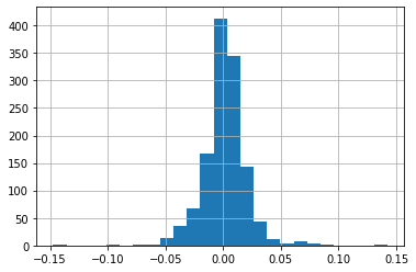
The msft_returns can now be converted into a histogram. For this the matplotlib. pyplot. hist will be used. One of the most important attributes of hist is the number of bins. The number of bins has as a Rule of Thumb the Sturge’s Rule.
K = 1 + 3.322 logN, N is number of observations in this case we have 1259 observations. After doing calculations we get the bin number is 25.
msft_returns.hist(bins=25
>>
The above results can be charted into the histogram and the line plot. To add the results into the histogram an axvline can be added as a part of the plot. The axvline allows a line to be created to defne the plot.
msft_return= MSFT.pct_change(1)
msft_return.hist(bins=25);
_ = plt.xlabel('MSFT Return')_ = plt.ylabel('Frequency')_ = plt.title('MSFT Returns Frequency')_ = plt.axvline(msft_return.mean(), color='k', linestyle='dashed', linewidth=1, label ='mean')
_ = plt.axvline(msft_return.median(), color='g', linewidth=0.5,label='median')plt.legend();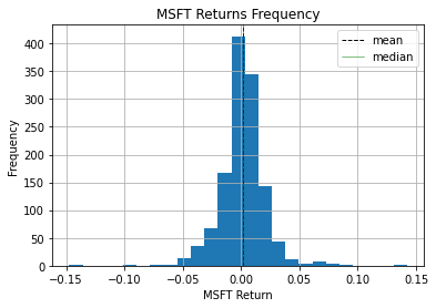
The plt.axvline was created with the mean function and with the median function. The color4 was modifed and a label was added so that the legend becomes useful when analyzing the data. Given that the mean and the median are very similar, there is almost no difference in the graph but in extreme cases the difference between the mean and the median can be considerable.
To do this, the topic of skewness must be covered. Skewness is a valuable metric for determining the absence of symmetry since it is crucial to comprehend symmetry. When discussing skewness, it is possible for the information to be skewed to the left, to the right, or to the centre.
msft_return.skew()
>>-0.028772066071004406
The skewness for a normal distribution should be zero and the symmetric data should be near this number.
- If the values are positive: data is skewed to the right
• If the values are negative: data is skewed to the left
In the example of MSFT, it can be concluded that the data is skewed to the left and that is near zero which leads to being considered symmetric.
Conjointly with measuring skewness it is important to measure kurtosis. Kurtosis is the measure of the tails in a normal distribution. A high kurtosis is related to having heavy tails, which means outliers. A low kurtosis means lack of outliers which is light tails. It is uncommon to have a uniform distribution. To obtain a kurtosis in Python, the command should be as follows:
msft_return.kurtosis()
>>7.757124673905919
There are three options of kurtosis for interpreting the result.
- Leptokurtic: the value of kurtosis is greater than (>) than zero. The interpretation is that the data is centered around the mean.
- Mesokurtic: the value of the kurtosis is equal (=) to zero. This represents a normal distribution
• Platykurtic: the value of the kurtosis is less than zero.The interpretation is that the data is far from the mean
In the example of MSFT, the kurtosis is leptokurtic, since the values are around the mean and the shape of the bell is taller in its area.
Creating histogram using two variables
The process for creating a comparison with two companies concerning returns is the same as the process for one company. To create returns using the append method, it can be done as follows
msft_return= MSFT.pct_change(1)
aapl_return= AAPL.pct_change(1)
_ = plt.xlabel('Stock Return')
_ = plt.ylabel('Frequency')_ = plt.title('Apple & Microsoft- Histogram')plt.legend();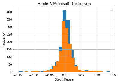
Next, we’ll discuss IQR, Correlation, covariance and scatter plots
stay connected and do follow me on github @ https://www.github.com/AIM-IT4
Thanks for reading :)