
Python for Industrial Engineers
Quality Control Charts with Python
Creating Quality Control Charts using Python libraries

Quality Control Charts
Quality control charts represent a great tool for engineers to monitor if a process is under statistical control. They help visualize variation, find and correct problems when they occur, predict expected ranges of outcomes and analyze patterns of process variation from special or common causes. Quality control charts are often used in Lean Six Sigma projects and DMAIC projects under the control phase and are considered as one of the seven basic quality tools for process improvement.
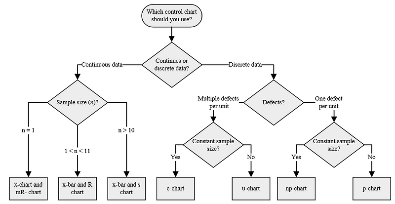
The appropriate control chart to use is determined by the type of data (i.e. measurement), the number of defects and the sample size. The following decision tree illustrates the conditions for each control chart, respectively:
Control Limits
Control limits are plotted lines above and below the center line (i.e. mean) in quality control charts that function as thresholds to identify signals (i.e. points beyond control limits) and help determining if a process is under statistical control. They are defined by formulas specific to each type of control chart that include constants, which vary depending on the sample size. Such constants are listed in the following table:

For the following examples, each type of quality control chart will be built from scratch using Python. In the same way, a brief description of each control chart will be provided. Let’s take a look at the Python codes.
Control Charts for Continuous Data
x chart and mR chart
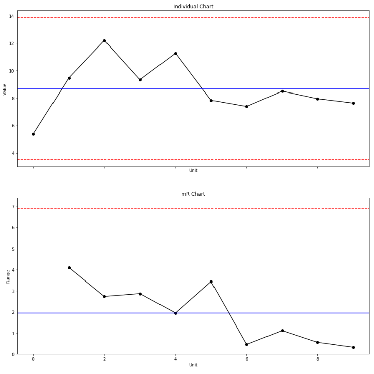
The x chart (also known as individual chart) and mR chart are used to monitor the mean and variation of a process based on individual samples taken in a given time. In order to use the mR chart along with the x chart, the sample size n must be equal to 1. On the x chart, the y-axis shows the mean and the control limits while the x-axis shows the sample units. On the mR chart, the y-axis shows the moving range grand mean and the control limits while the x-axis shows the sample units.
x-bar chart and R chart
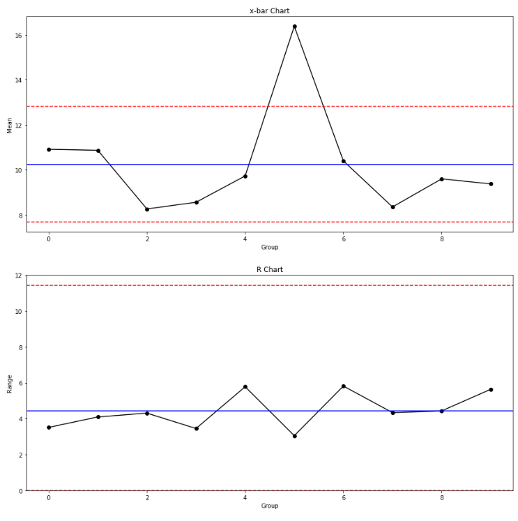
The x-bar and R-chart are used to monitor the mean and variation of a process based on samples taken in a given time. In order to use the R chart along with the x-bar chart, the sample size n must be greater than 1 and less than 11.On the x-bar chart, the y-axis shows the grand mean and the control limits while the x-axis shows the sample group. On the R chart, the y-axis shows the range grand mean and the control limits while the x-axis shows the sample group.
x-bar chart and s chart
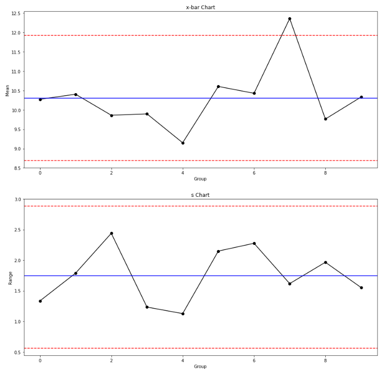
In the same way, the x-bar and s chart are used to monitor the mean and variation of a process based on samples taken in a given time. In order to use the s chart along with the x-bar chart, the sample size n must be greater than 10 units. On the x-bar chart, the y-axis shows the grand mean and the control limits while the x-axis shows the sample group. On the s chart, the y-axis shows the standard deviation grand mean and the control limits while the x-axis shows the sample group.
Control Charts for Discrete Data
c-chart
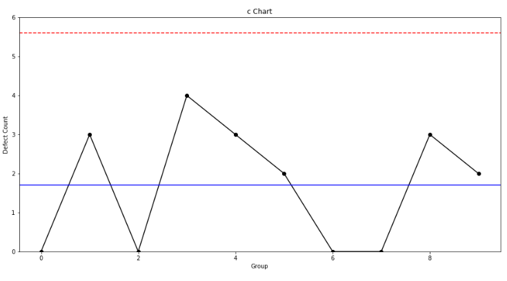
The c-chart is used to monitor the total count of defects in fixed samples of size n. The y-axis shows the number of nonconformities per sample while the x-axis shows the sample group.
u-chart
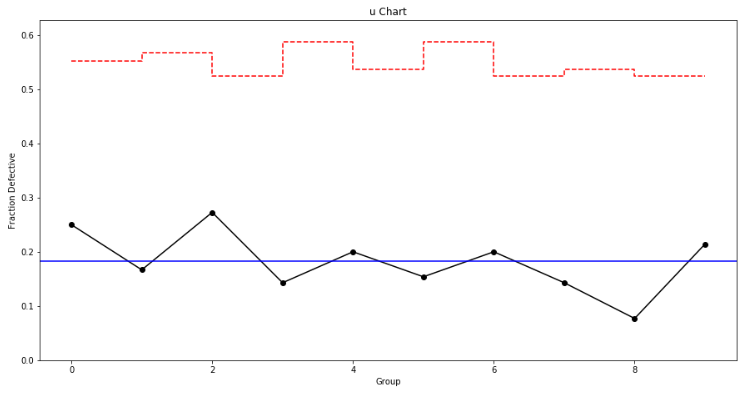
The u-chart is used to monitor the total count of defects per unit in different samples of size n; it assumes that units can have more than a single defect. The y-axis shows the number of defects per single unit while the x-axis shows the sample group.
p-chart
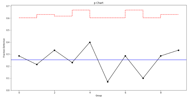
The p-chart is used to monitor the proportion of nonconforming units in different samples of size n; it is based on the binomial distribution where each unit has only two possibilities (i.e. defective or not defective). The y-axis shows the proportion of nonconforming units while the x-axis shows the sample group.
np-chart
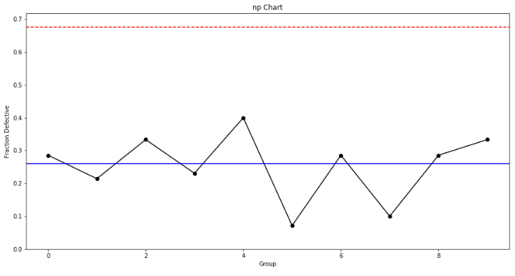
The np-chart is used to monitor the count of nonconforming units in fixed samples of size n. The y-axis shows the total count of nonconforming units while the x-axis shows the sample group.
Concluding Thoughts
Quality control charts represent great tools for analyzing processes stability and obtaining significant statistical information to be used during Lean Six Sigma and DMAIC projects for process improvement. Quality and industrial engineers must be capable of interpreting them accurately to identify undesirable trends that could lead to potential nonconformities in order to take preventive actions rather than corrective actions, and thus, reduce scrap and waste.
This guide covers step-by-step tutorials on how to build quality control charts from scratch using multiple Python libraries. Taking into consideration its high popularity among professionals and academics, Python represents a great tool capable of building quality control charts for statistical purposes. While there are other programs and software available where they can be built as well (e.g. Minitab, R, Microsoft Excel), it is up to quality and industrial engineers to decide which one to use based on their coding and analytical skills while complying with the organization’s objectives and the customers’ specifications.
— —
If you found this article useful, feel welcome to download my personal code on GitHub. You can also email me directly at [email protected] and find me on LinkedIn. Interested in learning more about data analytics, data science and machine learning applications in the engineering field? Explore my previous articles by visiting my Medium profile. Thanks for reading.
- Robert


