
Python Seaborn: Creating Your Own Color Palettes
Color is a critical aspect of data visualization. It helps convey information, highlight patterns, and evoke emotions. Seaborn, a powerful data visualization library in Python, allows you to create custom color palettes that align with your data and visual storytelling goals.

In this article, we’ll explore how to design and implement your own color palettes in Seaborn, providing step-by-step guidance and practical code examples.
Why Create Custom Color Palettes?
Seaborn’s default palettes are versatile, but custom palettes enable you to tailor your visualizations to specific contexts. Whether you’re working with brand colors, adhering to accessibility guidelines, or aiming for a unique look, custom color palettes give you creative control.
1. Building Your Custom Color Palette with Hex Color Code
Seaborn’s color palettes are built on a sequence of color specifications. These can be:
- Hex color code (e.g., ‘#FF5733’)
import seaborn as sns
import matplotlib.pyplot as plt

# Define your custom colors
custom_colors = ['#FF5733', '#FFB933', '#99e2b4', '#33A2FF', '#a663cc']

# Set the custom palette
sns.set_palette(custom_colors)

# Sample data for the bar chart
categories = ['Category A', 'Category B', 'Category C', 'Category D', 'Category E']
values = [15, 30, 22, 18, 25]

# Create a bar plot using the custom color palette
sns.barplot(x=categories, y=values)
plt.xlabel('Categories')
plt.ylabel('Values')
plt.title('Bar Chart with Custom Color Palette')
plt.xticks(rotation=45)
plt.show()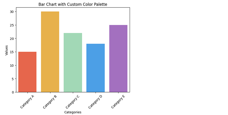
2. Building Your Custom Color Palette with Single-named Color
Seaborn’s color palettes are built on a sequence of color specifications. These can be:
- Single-named color (e.g., ‘red’, ‘blue’)
import seaborn as sns
import matplotlib.pyplot as plt

# Define your custom colors as single-named colors
custom_colors = ['coral', 'gold', 'lightblue']

# Set the custom palette
sns.set_palette(custom_colors)

# Sample data for the box plot
data = sns.load_dataset('iris')

# Create a box plot using the custom color palette
sns.boxplot(x='species', y='sepal_length', data=data)
plt.xlabel('Species')
plt.ylabel('Sepal Length')
plt.title('Box Plot with Custom Color Palette')
plt.show()
3. Using Linear Segmentations
Seaborn allows you to use linear segmentations for a smoother transition between colors in your palette. This can be useful for gradients or diverging visualizations.
# Using linear segmentations
custom_palette = sns.color_palette(['#FF5733', '#4ED6FF'])
sns.palplot(custom_palette)
plt.title('Custom Palette with Linear Segmentation')
plt.show()
4. Using Cubehelix Palettes
Cubehelix is a versatile system for generating custom color maps. Seaborn provides functions to create Cubehelix palettes with different properties like start, rotation, and gamma.
# Creating a Cubehelix palette
cubehelix_palette = sns.cubehelix_palette(start=2, rot=0, dark=0.2, light=0.8, reverse=True)
sns.palplot(cubehelix_palette)
plt.title('Cubehelix Palette')
plt.show()
5. Using a Palette Generator
Seaborn provides a palette generator function that creates palettes based on hls (hue, lightness, saturation) or husl (human-friendly hls).
# Creating a palette using hls
hls_palette = sns.color_palette('hls', n_colors=6)
sns.palplot(hls_palette)
plt.title('HLS Palette')
plt.show()
Conclusion
Creating custom color palettes in Seaborn empowers you to personalize your data visualizations, align them with branding, and convey information effectively. By understanding Seaborn’s palette structure and experimenting with various color specifications, you can design palettes that enhance the impact and appeal of your plots.
Thank you for your reading!
- My other articles about Python: Comprehensive Python Articles
- My other articles about SQL: Comprehensive SQL Articles
Are you interested in Data Science? Let’s connect on Linkedin.


