
Python for Algorithmic Trading: A to Z test.
I have tested in real-time the implementation coded with Python of a famous mathematical technics to predict market movement (Bollinger Band) to check the gap between theory and reality. And here is the result.

Before to get started, let’s take a quick look at what we have covered during the previous articles. If you have not read my previous articles, you should cover these articles first. To get more details on how to draw Bollinger Bands and to get live market data with your API. (Link at the end of this article).
Otherwise, if you are too lazy to cover these articles, let’s have a short brief of what we covered along with these articles.
Let’s start by defining what the Bollinger Bands are.
Bollinger Bands?
Created in the early 80s and named after its developer (John Bollinger), Bollinger Bands represent a key technical trading tool for financial traders.
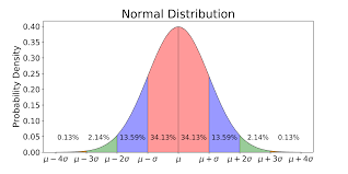
Bollinger Bands are an indicator of volatility. This mathematical technic uses the normal distribution to predict market movement. The normal distribution (also called gaussian) is a common feature of nature and psychology.
If we simplify the Bollinger Bands mathematical theory for the financial market:
There is 97.5% of chance that a share price is going up if we reach - 1.96 x σ(1), and conversely, there is 97.5% of chance for a share price to go down if we reached a value of + 1.96 x σ(1)
(1): σ is the standard deviation of the 20 latest periods.
As a result, Bollinger Bands can be used to draw a buying signal line which will be located at -1.96 times the standard deviation of the 20 last period, and a selling signal line which will be located at +1.96 times the standard deviation.
Let’s go back to our process.
As a scientist, I believe in what has been tested.
So, I chose to test these equations in live using my Jupyter Notebook for you.
To achieve this task I will use our best friend to automate this process, draw these lines, and give me the answer, I named: Python 3!
Are we gonna make or lose money, the result will be surprising, but I will not spoil you.
Let’s start the investigation.
The plan:
We will divide the plan into 3 distinct steps.
First of all, we will query, live market data using Yahoo Finance API.
Second, define a period of time and create new columns for our calculated fields and update these values each minute.
Third, draw this graph live, and check if we can predict market movement.
If you are too impatient and want to know now how to implement this strategy, you can directly look at the recording at the end of this article. I recorded myself coding and gave extra information on the way to code. You can apply it at home.
Otherwise, let’s start the challenge.
Again, I will not go too much into details regarding the code and API; you can find more information on how to get live market reading the article below:
I will cover the process more superficially inside this article.
Import live Market Data
The first step will consist of importing the necessary packages. These packages are detailed in the article cited above.
So, you will start by importing your packages previously installed by using the following lines of code:
Once we are set up, let’s pursue the next step.
Now that libraries are imported, we can import markets data.
II. Get connected to the market
Now that the different packages needed have been uploaded. We are going to use the SP500 to test our hypothesis.
So, we will call live market data using Yahoo Finance API.
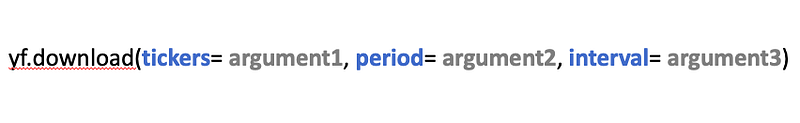
For your information, Yahoo Finance API will need 3 mandatory arguments in this order:
- Tickers (1)
- Start date + End date or Period (2)
- Interval (3)
For our case, the ticker(argument 1) will be SPY. Furthermore, we are going to choose for our test the last day period(argument 2) instead of defining a Start and End date. And we will set up an interval(argument 3) of 1 minute.
As a quick reminder, SP500's ticker is SPY.
To call your data, you will have to use the following structure:
Now that we have the structure let’s run the code.
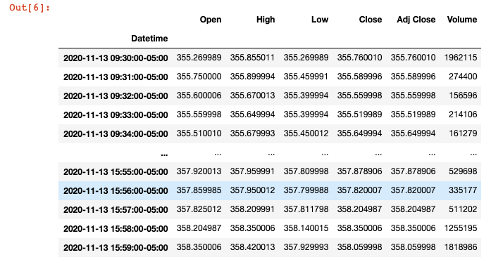
Below a sample of the output you should get:
Now, that we have downloaded and stored our data, we can continue and define our moving average, buying & selling signals.
If you want more in-depth information, you can go across the link below:
III. Define our calculated fields
So, we will now create the following calculated field:
- Moving Average
- Upper Band
- Lower Band
For the middle band, we will use the rolling function to get the mean value of the 21 latest periods. We are going to apply our strategy for the 21 last minutes, which means that we are going to calculate the mean for the 21 minutes before.
MiddleBand(t) = Average(Close(t-1 -> t-22))
For the Upper Band and Lower Band, we are going to use the rolling function as well, but instead of calculating the mean, we are going to calculate the standard deviation.
So, let’s code it on Python:
Now that you have defined your bands, 3 extra columns must have been created.
We can finally deploy our strategy and test it.
Draw this graph live
Now, the last step of our plan is to plot our data and check if we can predict market movement. I have recorded this part live in the video below:
Boom! We made it.
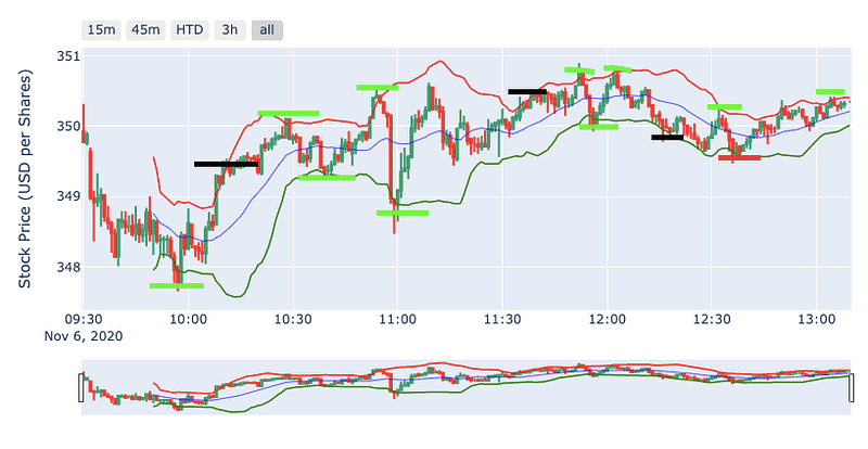
If you cannot run the video, watch the result and hear my comments. Here a sample of what you should have once you have plotted your graph.
I have coloured in green in the graph below, the good prediction and black the wrong prediction.
Furthermore, I have uploaded the full Python script described in the video above and you can now develop it at home:
Final thought
Regarding the final output, using the Bollinger band theory, made us take the right choice 11 times and the wrong choice 3 times.
However, the wrong choice did not lead to making us lose money. It will just reduce our benefits (2 times sell too early, and 1 time buys too early).
Otherwise, the theory developed by John Bollinger in the 80’s looks to be up to date.
I have made a short calculation, and it would generate a 1.7% return in 3 hours if you would have used the Bollinger band for trading between 10 AM and 1 PM on this day, which surprises me.
What is even more interesting, I believe, it is to see how accurate it is. When the price was hitting an upper or lower band, the share price was correcting itself. You can see that on the graph above.
Overall, that has been an outstanding experience to compare theory vs reality.
Feel free to give feedback and ask if you have any question; I will do my best to help to unlock you.
I appreciate your attention.
Happy coding!
Source:
Articles which must be read before:
How to implement the Bollinger Band using Python:
How to get live market data:


