
Python for Financial Analysis Series — Python Tools Day 6

Let’s Matplotlib! This is the last session of the series. We will do the essential data visualization with Matplotlib. We’ll plot lines, scatter, and bars.
Tip before start
Visualization is cool, but for analysis, it’s a tool
The VALUE comes from the STATS and METRICS. Imagine we do the backtest of a trading strategy. It’s nice if we could plot the PnL (Profit Loss), but it is the metrics, like return, trading frequency, and maximum drawdown, that tells the true story. We are more likely to evaluate the strategies by comparing the metrics rather than visually picking up the charts.
The goal of this session is to provide examples of the essential charts in an easy way, which is supplementary to the core data anlaysis.
IMPORTANT UPDATE
Since Microsoft Azure Notebooks has moved to GitHub driven, which may be challenging for a beginner to start with. I have put all the material under Google Colab. It is a very similar Jupyter Notebook environment and you may check it out by click here.
All my code and files are shared and you may click here to open.
Get the Real Data
If you haven’t read the last session and haven’t got the API key to retrieve the stock price from IEX Cloud, please check out the last one below.
We will work with two stocks’ data, MSFT and IBM, so let’s download a one-year historical price for both with IEX Cloud.
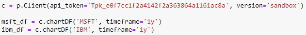
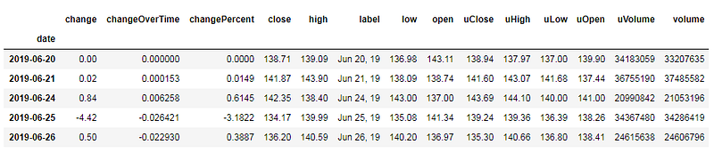
The same as the last session, we first install the IEX Cloud SDK with the command “!pip install”, then we import all the packages, including Matplotlib. Once all packages imported, we will initialize the connection to IEX Cloud with our sandbox testing token. Finally, we can download the historical price with the function “chartDF”.
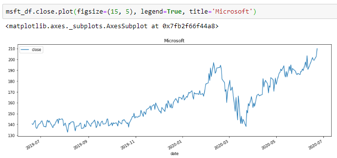
Simple Line Chart
Now we can start plotting. Good news is that Pandas is so integrated with Matplotlib that we can plot directly with DataFrame, using the function “plot”. Here’s the simple example of a line chart for Microsoft daily price.
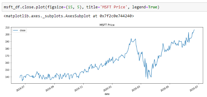
It just cannot be simpler than that. Get the column you want and apply the function “plot”, then we get a chart! Here we used three parameters.
figsize: it’s a Python tuple, defining the width and height of the chart
title: the header on the top middle of the chart
legend: show/hide legend
What if we need to plot IBM as well? Just add one more similar line for IBM.
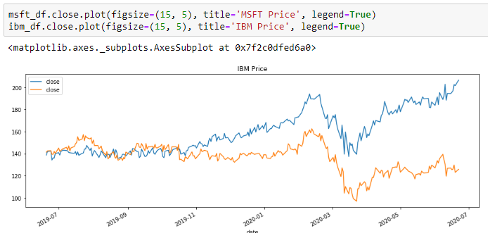
As we can see, the default plotting will be in the same chart (more precisely the same figure) and it will automatically use the same x-axis and y-axis scales.
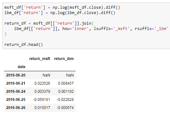
Another way to plot the lines in the same chart is to plot DataFrame with multiple columns. Let’s do one example. Imagine we want to compare the cumulative log-returns of both stocks.
We will first calculate the daily log-returns and join two DataFrames together. Please check Day 5 for detail explanation.
With the daily log-returns, we can do simple math to compute the cumulative returns.
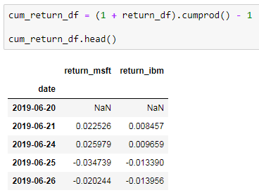
Finance is all about compound returns, so we used the function “cumprod”. It starts from the second row and for each row, it does the multiplications with all previous rows. In Excel, we usually need two columns with iterative multiplications. Now we can plot the chart with the DataFrame directly.
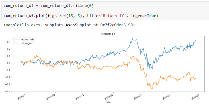
Notice the difference is that, in the first example, we selected the column first, then plotted the column. Here we applied the function “plot” with the whole DataFrame.
Scatter
Scatter is one of the most common charts people use in Finance. Let’s check this out with another example. We could use it to visualize the correlation between two stocks, MSFT and IBM.
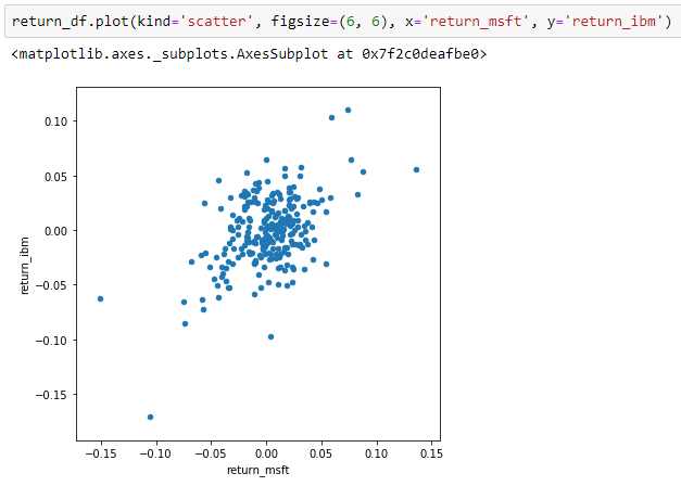
As a default, the function “plot” does the line chart. If we need a different type of charts, we can use the parameter “kind”. For the scatter chart, we need to supply column names of x and y, which should match the column names with the DataFrame.
Bar
Another common chart people do and let’s do another simple example. Say we want to compare the one-year return between two stocks with a bar plot.
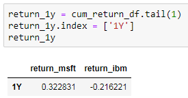
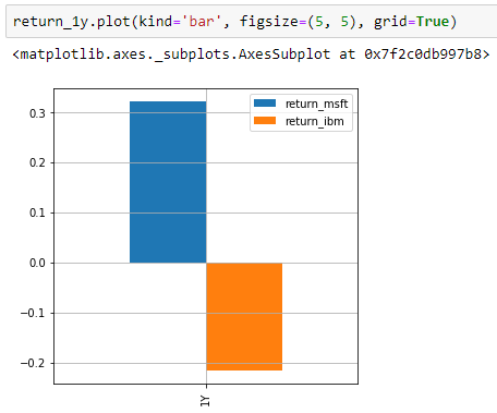
First, we take the last row from the DataFrame “cum_return_df”. Then to give it a better name, we replaced the value of the index with “1Y”. Finally, we plot the chart by telling we need “kind” to be “bar”. To better visualize the bar, we show the gridlines too by setting the parameter “grid” to be true.
Two Axes Two Scales
One of the common needs in financial analysis is to have two axes with two scales. For example, if we want to plot price with volume, we cannot place them into one scale, because the volume has much larger numbers than price. So, let’s do this example.
First, we plot a regular line chart of price, just as what we did previously.
Second, we add another “area” plot (basically a line with the area below filled with colour).
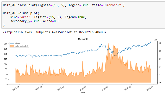
Notice this time, we used two more parameters:
secondary_y: have the plot using secondary y axis (right handside)
alpha: to make the area transparent, value between 0 and 1, where 0 means fully transparent
There are several things we can improve. First, there’s overlapping between the price line and the volume area. We can push the volume a bit down by increase the maximum value of y-axis on the right. Second, we can make the colour of the right y-axis and ticks orange to match the colour of the area plot. Let’s improve our code.
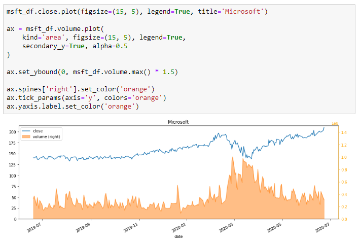
One of the major differences is that we now assign the plot as a variable “ax”. This variable can then be used to modify the components of the chart. To understand the chart components, we can check the official tutorial of Matplotlib below.
https://matplotlib.org/3.1.1/tutorials/introductory/usage.html
Fill Between Lines
Many technical indicators require highlighting upper and lower bounds. For example, Bollinger Band is a typical one. We can see how to do so with a simple example of a rolling standard deviation band.
We start the example by calculating the rolling standard deviation and upper/lower bands.
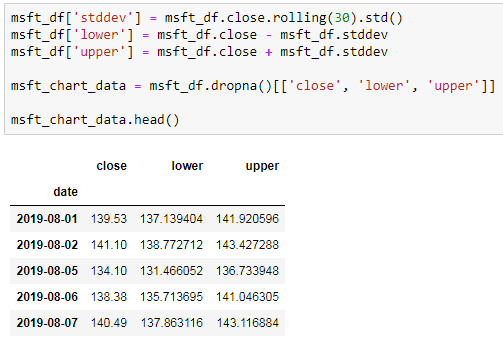
Again, please check Day 5 for details of the function “rolling”.
Then we can plot the simple line chart as before and adding the highlight of the bands with the function “fill_between”.
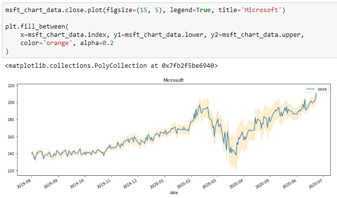
Remember we imported “plt” from Matplotlib at the beginning. It provides the function “fill_between”, where we need to give the following inputs:
x: the x-axis values
y1: one of the band series
y2: another series of the band
color: the colour of the band
alpha: transparency level of the band
Why not Candlestick?
The number one chart people do in Finance. But it won’t be optimal to plot in Jupyter. Candlestick is used for us to add annotations interactively for analyzing the market trend. We will need a good technical analysis platform and Jupyter just not good for that analysis. You may find many technical analysis platforms online, such as TradingView.
The key use of Jupyter and Python is to do the systematic and quantitative analysis so that we could implement precisely. Plotting Candlestick here may not be helpful. However, if we do want to plot such a chart, it is still straight forward. Check out the following link for Plotly.
Congratulations! We have done Python for Financial Analysis Series — Python Tools. If you are new to Python or would like to refresh some basic Python knowledge, please check out the first series, Python Core.
NEXT STEP
This is my first time blogging the tutorials on Medium. For the last three months, I have written two series, 12 articles. It was such a milestone for me, as a non-native English speaker. I hope it helps financial professionals advancing the daily works with new Python skills.
From here I plan to start writing about practical case studies. One thing I notice is that many people on Medium writing about very futuristic topics such as AI and ML. However, the majority of people in the financial market still need to apply basic Python solving ordinary day to day tasks. I hope by writing more practical case studies, it may help more people to improve the daily workflows.
Bye for now and I will talk to you very soon!