Python Exploratory Data Analysis (EDA) libraries
Introduction
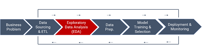
A typical machine learning workflow consists of six critical tasks that are important to the success of the project.
- Defining Problem
- Data Acquisition and ETL
- Exploratory Data Analysis
- Data Preparation
- Modeling (Model training and selection)
- Deployment and Monitoring
Exploratory Data Analysis
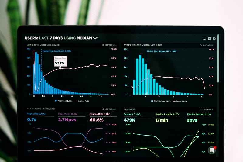
Exploratory Data Analysis is a process of performing initial investigations on data so as to discover patterns, identify anomalies, test business hypotheses, and test assumptions with the help of statistical summary and visualizations. In short, the process of getting to know your data in depth is called Exploratory Data Analysis.
There are three ways you can do EDA:
- Using libraries/frameworks in Python / R
- Using automated EDA libraries in Python / R
- Using licensed softwares such as Microsoft Power BI or Tableau, etc.
This article will provide a list of libraries and automated EDA frameworks in Python. The list in this article has no particular order and is not intended to be seen in any way as a type of ranking.
Matplotlib
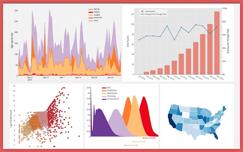
Matplotlib is a comprehensive library for creating static, animated, and interactive visualizations in Python. Matplotlib makes easy things easy and hard things possible. A large number of packages extend and build on Matplotlib’s functionality, including several higher-level plotting interfaces (seaborn, HoloViews, ggplot, etc.)
It allows the user to visualize data using a variety of different types of plots, including but not limited to scatterplots, histograms, bar charts, error charts, and boxplots. in just a few lines of code.
Learning Matplotlib is easy. You can get started with the official user guide, tutorials, or some amazing code examples.
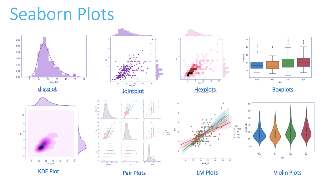
Seaborn
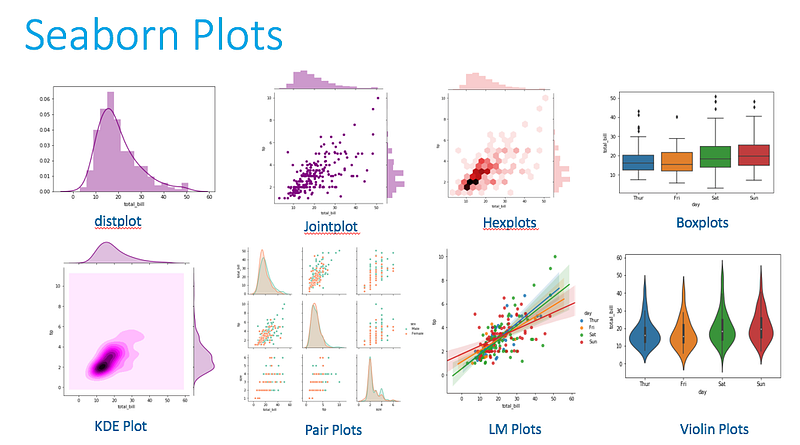
Another popular Matplotlib-based Python data visualization framework, seaborn is a high-level interface for creating aesthetically appealing and valuable statistical visuals, crucial for studying and comprehending data. This Python library is closely linked with NumPy and pandas data structures. Seaborn strives to make visualization a key component of data analysis and exploration, and its dataset-oriented plotting algorithms use data frames comprising entire datasets.
If you want to learn Seaborn, the official user guide and tutorials are the best sources. They are intuitive and easy to follow.
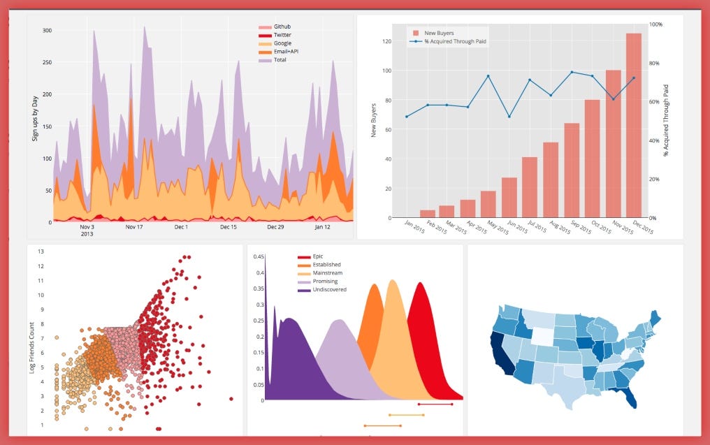
Plotly
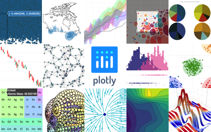
Plotly is an open-source graphing library that can be used to create interactive data visualizations. Plotly is built on top of the Plotly JavaScript library (plotly.js) and can be used to create web-based data visualizations that can be displayed in Jupyter notebooks or web applications using Dash, or saved as individual HTML files.
It provides more than 40 unique chart types such as scatter plots, histograms, line charts, bar charts, pie charts, error bars, box plots, multiple axes, sparklines, dendrograms, and 3-D charts. Plotly also offers contour plots, which are not that common in other data visualization libraries.
Plotly is a great and impressive skill to have for data scientists. The best way to learn is through the official user guide or if you prefer a structured video approach, this course on Udemy, Data Visualisation with Plotly and Python is a great start.
Bokeh
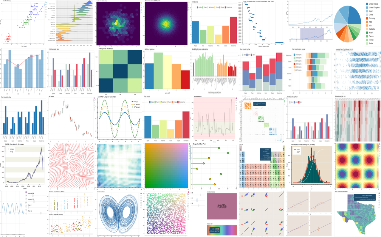
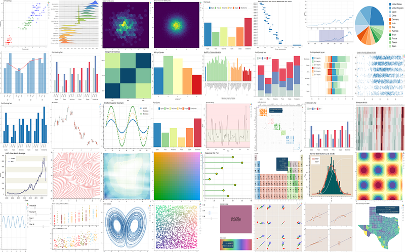
Bokeh is a Python library for creating interactive visualizations for modern web browsers. It helps you build beautiful graphics, ranging from simple plots to complex dashboards with streaming datasets. With Bokeh, you can create JavaScript-powered visualizations without writing any JavaScript yourself. Some of the key features of the Bokeh library are:
- Bokeh makes it simple to create common plots but also can handle custom or specialized use-cases.
- Work completely in Python.
- Tools and widgets to make your visualization truly interactive.
- Plots, dashboards, and apps can be published and shared.
- Everything, including the Bokeh server, is BSD licensed and available on GitHub.
Altair
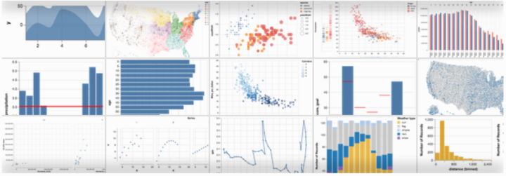
Altair is a declarative statistical visualization library for Python, based on Vega and Vega-Lite, and the source is available on GitHub. Altair’s API is simple, friendly, consistent, and built on top of the powerful Vega-Lite visualization grammar. This elegant simplicity produces beautiful and effective visualizations with a minimal amount of code.
Altair charts work out-of-the-box on Jupyter Notebook, JupyterLab, and related notebook environments which is convenient for analyzing machine learning models or creating figures for publications. You can also export Python-generated visualizations as Vega or Vega-lite specifications.
However, something to note is that Altair is a high-level visualization library and faces the same limitations as Vega-lite (i.e., less fine-grained control of how data values map to graphical marks).
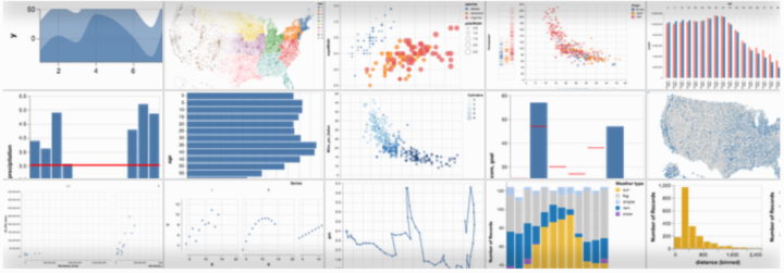
The best to get started with Altair is to check out the official Altair Notebook Examples.
Pandas-profiling
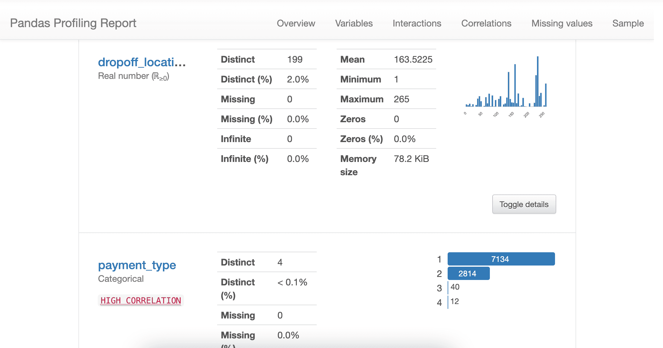
pandas-profiling library automatically generates profile reports from a pandas DataFrame. The panda's describe function is great and pandas-profiling extends the capabilities with its low-code interface. For each column of the dataset, this library presents the following information in an interactive HTML report:
- Type inference: detect the types of columns.
- Essentials: type, unique values, missing values
- Quantile statistics like minimum value, Q1, median, Q3, maximum, range, interquartile range
- Descriptive statistics like mean, mode, standard deviation, sum, median absolute deviation, coefficient of variation, kurtosis, skewness Most frequent values
- Histogram
- Correlations — Spearman, Pearson, and Kendall matrices Missing values matrix, count, heatmap, and dendrogram of missing values
- Text analysis learns about categories (Uppercase, Space), scripts (Latin, Cyrillic), and blocks (ASCII) of text data.
- File and Image analysis extract file sizes, creation dates, and dimensions and scan for truncated images or those containing EXIF information.
To learn more about pandas-profiling, check out the project GitHub page.
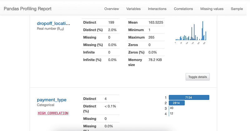
Sweetviz
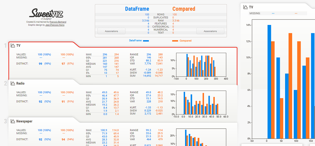
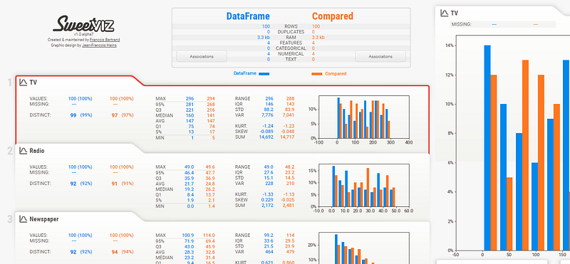
Sweetviz is pretty similar to pandas-profiling in terms of what it does. It is an open-source Python library that generates beautiful, high-density visualizations to start the Exploratory Data Analysis process with just two lines of code. Output is a fully self-contained HTML application.
The system is built around quickly visualizing target values and comparing datasets. Its goal is to help quick analysis of target characteristics, training vs testing data, and other such data characterization tasks.
Features:
- Target analysis
- Shows how a target value (e.g. “Survived” in the Titanic dataset) relates to other features
- Visualize and compare
- Mixed-type associations
- Type inference
- Summary information
SweetViz GitHub.
AutoViz
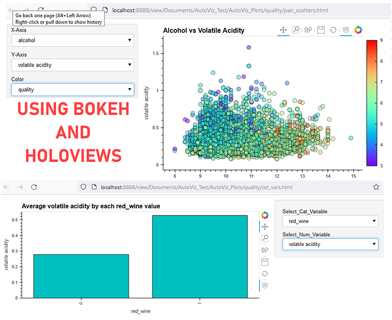
AutoViz is another option when it comes to Automated EDA frameworks. It competes closely with Sweetviz and pandas-profiling in terms of its functionalities. AutoViz performs automatic visualization of any dataset with just one line of code. AutoViz can find the most important features and plot impactful visualizations only using those automatically selected features. Also, AutoViz is incredibly fast so it creates visualization within seconds.
AutoViz can generate both interactive visualization as well as static. For interactive visualization, it uses bokeh under the hood.
Check out the official AutoViz Example Notebooks.
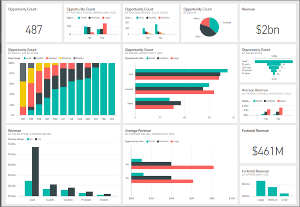
Microsoft Power BI
Power BI is an interactive data visualization software developed by Microsoft with a primary focus on business intelligence. It is part of the Microsoft Power Platform. Power BI is a collection of software services, apps, and connectors that work together to turn unrelated sources of data into coherent, visually immersive, and interactive insights. Data may be input by reading directly from a database, webpage, or structured files such as spreadsheets, CSV, XML, and JSON.
Unlike all the libraries above, Power BI is not open-source. It's a paid enterprise tool with a free desktop version available. There are many resources available online for learning Power BI. You can start with Microsoft’s Official learning guide for Power BI.
If you prefer a more structured and hands-on approach to learning Power BI, check out this amazing Power BI course.
Tableau
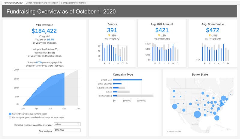
Tableau is a leading data visualization tool used for data analysis and business intelligence. Gartner’s Magic Quadrant classified Tableau as a leader in analytics and business intelligence.
Tableau is a tool that is transforming the way we use data to solve problems — empowering people and organizations to make the most of their data.
Conclusion
There are plenty of options when it comes to choosing the right tool for your Exploratory Data Analysis tasks. There is no right or wrong tool in most cases. The choice of tool depends on a combination of your skillset, availability of tool in the organization, open-source vs. paid, and a few other factors that are outside the scope of this article.
For the most part, open-source libraries and frameworks are backed by huge communities and you can find a lot of learning material on them. In fact, in most cases, the official documentation of the library is enough for getting started.
However, when it comes to enterprise tools like Tableau and Power BI, there is are shortage of online courses to learn, but it is really important to pick the course that provides a very structured pathway to learn.
Author:
I write about data science, machine learning, and PyCaret. If you would like to be notified automatically, you can follow me on Medium, LinkedIn, and Twitter.