
Protein dashboard visualization with blender
Viruses such as Covid-19 are biological entities that infect cells to reproduce itself. Once the virus introduces its genetic material to the host, it highjacks the host machinery to make new copies of the virus. Then, the virus components are synthesized with the molecular machinery inside the cell, usually, as polyproteins, the newly synthesized polyproteins needs to be processed to be functional. Covid-19 uses two proteases to cut the polyproteins making them functional, from those two proteases, the principal Cov protease has been crystallized with the PDB identifier 6LU7. In the following post, I will show how to create a data visualization with the protease information. The visualization will contain individual elements that can be arranged in different forms, each one will be an independent element. Each element will need a central location to be used as a local coordinate system. First, we relocate the camera, change the horizon color and change the render engine to the cycles engine
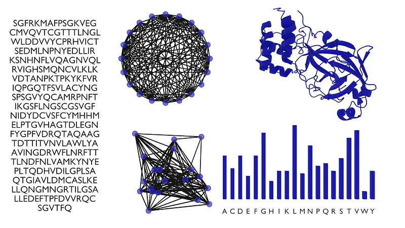
Each protein synthesized by any biological entity can be represented by its amino acid sequence. That sequence contains all the amino acids needed to synthesize the protein. We are going to add a text block to represent the protease as a sequence of characters. To do so, we insert a text element and delete the original text, then each amino acid is written with the standard one-letter code.
Sequences can be represented as graphs, where each node represents an amino acid and each edge represents the bond between the nth aminoacid and the nth+1 aminoacid. We add the Graph representation with.
A compact representation of the protein can be drawn by measuring the frequency of each amino acid inside the sequence. To measure the frequency of each amino acid we split the sequence into a list of characters, then we iterate through the sequence and update the vector of frequencies as the amino acids are found in the sequence.
With the measured frequencies, we add a basic bar plot with the frequencies of each amino acid with
Protein crystalization is the most accurate method to determine the structure of a protein. That structure can be used to develop new drugs and to elucidate how the protein works. We can add a ribbon representation of the protein by importing the obj file int blender with.
Finally, we add the materials to each element in the scene with the following
Each panel in the data visualization represents the same biological entity. However, every panel is different and tries to represent different aspects of the same object. The sequence represents the protein as text, it might be hard to find any useful patter with that representation, nonetheless, it changes an almost invisible entity into something tangible. The graph representation tries to put some order into the messy sequence, some nodes have a higher density of incoming edges, thus giving the appearance that those nodes or amino acids could be important. And that higher density of edges is conserved regardless of the graph layout. Representing the protein as the frequency of amino acids removes some of the ordering in the sequence, but make it easier to find amino acids with high an low frequency. And the 3D ribbon representation shows some pockets were potential drugs could interact to suppress the action of the protein. Representing the same object in a variety of forms is a useful task that can help us to create new and easier to read visualizations. Also, increases the chances to find meaningful cc characteristics and patterns in the data. Now you know how to create a simple dashboard visualization with blender. The complete code for this post can be found in my GitHub by clicking here. See you in the next one.


