
Printing Medium stories
❦
On the other hand, cheap, rough paper with a beautifully set textblock hanging just so on the page makes those in the know, smile (and those who don’t, feel welcome). It says: We may not have had the money to print on better paper, but man, we give a shit. Giving a shit does not require capital, simply attention and humility and diligence. Giving a shit is the best feeling you can imbue craft with. Giving a shit in book design manifests in many ways, but it manifests perhaps most in the margins. — Craig Mod, Let’s talk about margins
Printing articles off of Medium might not be commonplace, but we want it to be a great experience. It is, perhaps, partly a nod to centuries of print history, mixed with a dash of nostalgia (a few of us at Medium designed for print some time ago, or still do in our rare spare time). It might be a desire to keep our craft sharp; after all, print is a form of responsive design. There are practical reasons, too — printing your draft, grabbing a pen, and going outside helps in looking your article very differently and making that last batch of corrections. We can imagine our writers doing that every so often.
But perhaps the most important reason is this: we respect what people write on our platform. We know writing is an often personal, rarely easy affair, and we want you to know we care. That we, to quote Craig Mod above, give a shit. The idea that printing could leave your words mangled or stories disfigured, felt like breaking our part of the deal we feel we have with everyone who writes and reads on Medium.
❦
We wanted to design the best printing output we could given the technological support given by the browsers. Here are the most important changes between screen Medium and print Medium, illustrated using a fake article (you can open that article yourself if you want to follow along.)
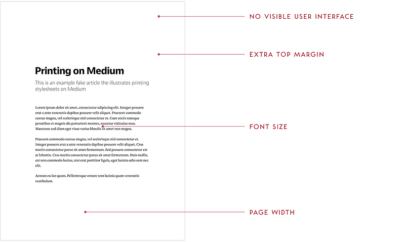
No visible user interface. We removed most of the user interface since it’s irrelevant in print. We also set up our stylesheets so that any future screen UI we might add or change will also be hidden by default.
Extra top margin. We added a generous margin at the top of first page only, to leave room for possible handwritten annotations.
Font size. We adjusted the main font size down from 22px to 15px (and other font sizes accordingly) so that it is the most comfortable to read on typical paper sizes.
Page width. We changed the maximum width of the main column to be 4.95" for the same comfortable number of characters (50–75) per line as on the screen. And, it leaves generous margins for your fingers (or your annotations) to rest on.
We do it regardless of paper size: it will work for most typical portrait and landscape paper types, and we don’t want to waste time preparing for all the exotic possibilities. Note that we changed maximum width, not actual width, so that printing on pages smaller than 4.95" would still work without clipping.
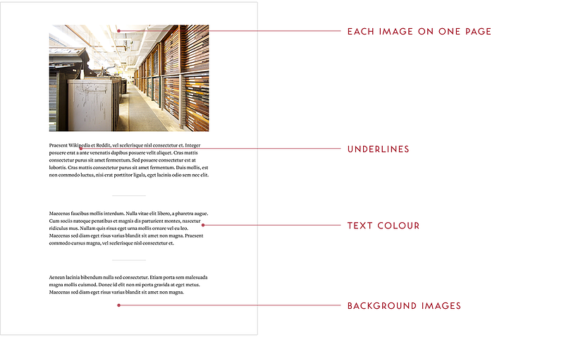
Each image on one page. An image will be moved to the next page instead of being half on one page, and half on another.
Underlines. We remove those underlines we carefully put together for the screen — no reason to tire the eye with decorations that don’t make sense in print.
Text colour. The on-screen text in Medium is not 100% black, offering slightly lower contrast and an ability for pure black images to stand out more. However, we change the text colour to pure black for printing, since printers don’t do well with dithering.
Background images. This section has a background image and white text on the screen, but we remove the image in print. We can’t reliably print it since different browsers treat CSS background images differently in print, plus it would often be a great waste of ink or toner — not to mention making text harder to read.
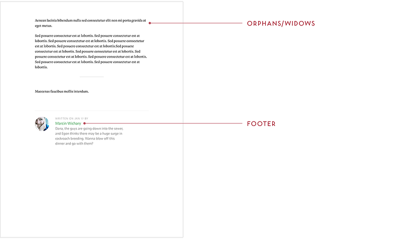
Orphans/widows. Even though we could fit one of these two lines on the previous page, we don’t. We make sure it’s not possible for a solitary opening line to appear at the bottom of the page (orphan) or closing line to appear at the top of the page (widow).
Footer. We keep only the interesting parts of the footer — no buttons to recommend or share (how would you use them on paper?), no follow actions.
❦
Interested in some of the technical details of the above? Find them in the technical supplement. Questions? Comments? Leave a note, email us at [email protected], or tweet at us at @MediumDesign.
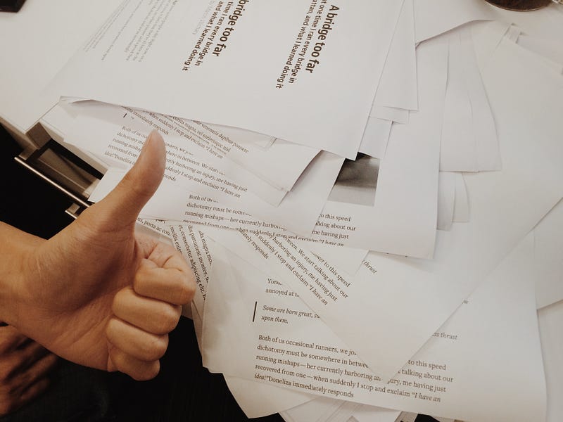
(We feel bad about wasting so much paper and generally try to avoid it… but needed to the below for debugging. Fortunately we only had to do it once.)
❦
Thanks to Gianni Chen for being my co-pilot on this project, and to Craig Mod for feedback and inspiration.
In the Medium typography series, we previously covered underlines, hanging quotes, Whitespace, pilcrows, and Polish S. Are we missing something interesting? Want to know more? Email us at [email protected].


