
Predictive Analytics in Finance: Utilizing XGBoost for Stock Trend and Price Forecasting
In this article, I will use XGBRegressor from XGBoost library to predict future prices of stocks using technical indicators as features.
Let’s start coding:
import os
import numpy as np
import pandas as pd
import xgboost as xgb
import matplotlib.pyplot as plt
from xgboost import plot_importance, plot_tree
from sklearn.metrics import mean_squared_error
from sklearn.preprocessing import MinMaxScaler
from sklearn.model_selection import train_test_split, GridSearchCV

# Time series decomposition
!pip install stldecompose
from stldecompose import decompose

# Chart drawing
import plotly as py
import plotly.io as pio
import plotly.graph_objects as go
from plotly.subplots import make_subplots
from plotly.offline import download_plotlyjs, init_notebook_mode, plot, iplot

# Mute sklearn warnings
from warnings import simplefilter
simplefilter(action='ignore', category=FutureWarning)
simplefilter(action='ignore', category=DeprecationWarning)

# Show charts when running kernel
init_notebook_mode(connected=True)

# Change default background color for all visualizations
layout=go.Layout(paper_bgcolor='rgba(0,0,0,0)', plot_bgcolor='rgba(250,250,250,0.8)')
fig = go.Figure(layout=layout)
templated_fig = pio.to_templated(fig)
pio.templates['my_template'] = templated_fig.layout.template
pio.templates.default = 'my_template'
Here in this code we import a series of libraries including XGBoost, NumPy, Pandas, and plotly. We also install library STLDecompose. We define various functions and sets default values, such as muting warnings and changing the background color of visualisation.
Read Historical Prices
ETF_NAME = 'CERN'
ETF_DIRECTORY = '/kaggle/input/price-volume-data-for-all-us-stocks-etfs/Data/Stocks/'

df = pd.read_csv(os.path.join(ETF_DIRECTORY, ETF_NAME.lower() + '.us.txt'), sep=',')

df['Date'] = pd.to_datetime(df['Date'])
df = df[(df['Date'].dt.year >= 2010)].copy()
df.index = range(len(df))

df.head()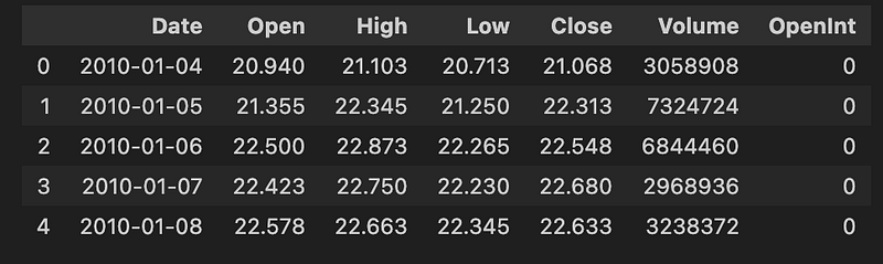
In this code we load our dataset from a specified directory, filters out the data to only include dates from 2010 or later, and then displays the first few rows of the dataset.
OHLC Chart
fig = make_subplots(rows=2, cols=1)

fig.add_trace(go.Ohlc(x=df.Date,
                      open=df.Open,
                      high=df.High,
                      low=df.Low,
                      close=df.Close,
                      name='Price'), row=1, col=1)

fig.add_trace(go.Scatter(x=df.Date, y=df.Volume, name='Volume'), row=2, col=1)

fig.update(layout_xaxis_rangeslider_visible=False)
fig.show()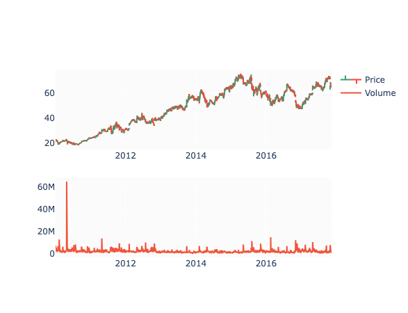
Here we create a subplot with two rows and one column, and then add two trace elements to it — one for stock’s open, high, low, and close prices and one for its volume. Then we update the layout to hide the range slider on the x-axis and show the resulting plot.
Decomposition
df_close = df[['Date', 'Close']].copy()
df_close = df_close.set_index('Date')
df_close.head()

decomp = decompose(df_close, period=365)
fig = decomp.plot()
fig.set_size_inches(20, 8)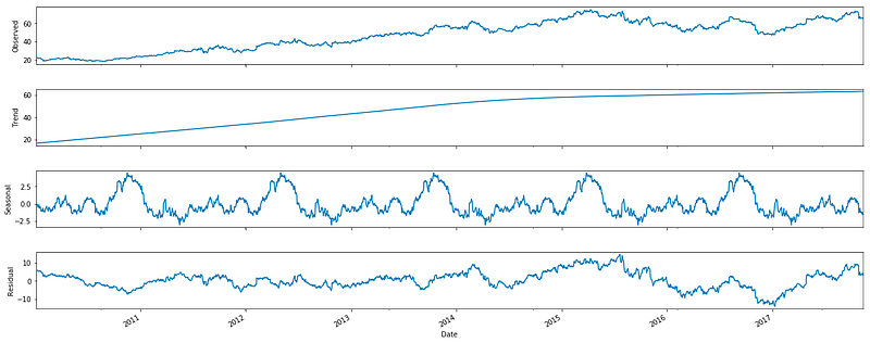
Now we create a copy of a dataframe that contains two columns Date and Close, set the Date column as the index, performs a decomposition on the data with a period of 365, and then plots the decomposition on a figure.
Technical Indicators
df['EMA_9'] = df['Close'].ewm(9).mean().shift()
df['SMA_5'] = df['Close'].rolling(5).mean().shift()
df['SMA_10'] = df['Close'].rolling(10).mean().shift()
df['SMA_15'] = df['Close'].rolling(15).mean().shift()
df['SMA_30'] = df['Close'].rolling(30).mean().shift()

fig = go.Figure()
fig.add_trace(go.Scatter(x=df.Date, y=df.EMA_9, name='EMA 9'))
fig.add_trace(go.Scatter(x=df.Date, y=df.SMA_5, name='SMA 5'))
fig.add_trace(go.Scatter(x=df.Date, y=df.SMA_10, name='SMA 10'))
fig.add_trace(go.Scatter(x=df.Date, y=df.SMA_15, name='SMA 15'))
fig.add_trace(go.Scatter(x=df.Date, y=df.SMA_30, name='SMA 30'))
fig.add_trace(go.Scatter(x=df.Date, y=df.Close, name='Close', opacity=0.2))
fig.show()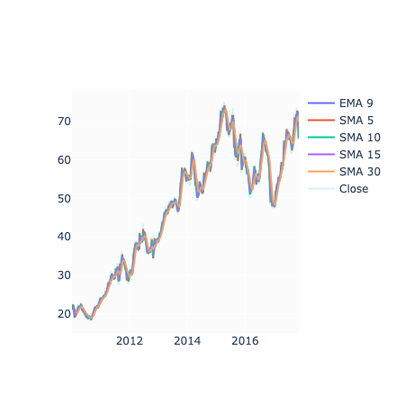
This code adds several new columns to the dataframe, each containing the mean of the ‘Close’ column for different time periods. It then creates a graph using this data, with each line representing one of the calculated means and the opacity set for the original ‘Close’ data. Finally, it displays the graph.
Relative Strength Index
def relative_strength_idx(df, n=14):
    close = df['Close']
    delta = close.diff()
    delta = delta[1:]
    pricesUp = delta.copy()
    pricesDown = delta.copy()
    pricesUp[pricesUp < 0] = 0
    pricesDown[pricesDown > 0] = 0
    rollUp = pricesUp.rolling(n).mean()
    rollDown = pricesDown.abs().rolling(n).mean()
    rs = rollUp / rollDown
    rsi = 100.0 - (100.0 / (1.0 + rs))
    return rsi

df['RSI'] = relative_strength_idx(df).fillna(0)

fig = go.Figure(go.Scatter(x=df.Date, y=df.RSI, name='RSI'))
fig.show()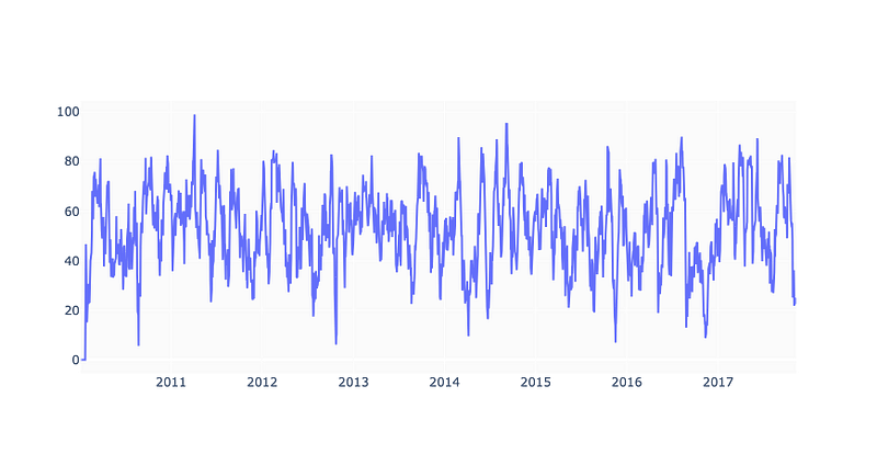
In this code we calculate the RSI of our stock. The function relative_strength_idx takes in a dataframe of our stock and calculate the RSI using a default period of 14 days, unless specified otherwise. The RSI is then added as a new column RSI to the original dataframe and any missing values are filled with 0. The result is then plotted using the plotly library and then displayed.
MACD
EMA_12 = pd.Series(df['Close'].ewm(span=12, min_periods=12).mean())
EMA_26 = pd.Series(df['Close'].ewm(span=26, min_periods=26).mean())
df['MACD'] = pd.Series(EMA_12 - EMA_26)
df['MACD_signal'] = pd.Series(df.MACD.ewm(span=9, min_periods=9).mean())

fig = make_subplots(rows=2, cols=1)
fig.add_trace(go.Scatter(x=df.Date, y=df.Close, name='Close'), row=1, col=1)
fig.add_trace(go.Scatter(x=df.Date, y=EMA_12, name='EMA 12'), row=1, col=1)
fig.add_trace(go.Scatter(x=df.Date, y=EMA_26, name='EMA 26'), row=1, col=1)
fig.add_trace(go.Scatter(x=df.Date, y=df['MACD'], name='MACD'), row=2, col=1)
fig.add_trace(go.Scatter(x=df.Date, y=df['MACD_signal'], name='Signal line'), row=2, col=1)
fig.show()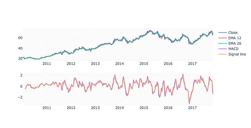
This code calculates the Exponential Moving Average (EMA) and Moving Average Convergence Divergence (MACD) indicators for a financial dataset and creates a visual representation of the data using a plot.
Drop Invalid Samples
df = df.iloc[33:] # Because of moving averages and MACD line
df = df[:-1]      # Because of shifting close price

df.index = range(len(df))
Using this code we select rows from the df dataframe starting from index 33 until the end and assign it to the variable df. It also removes the last row of the dataframe and updates the index based on the new length of the dataframe.
test_size  = 0.15
valid_size = 0.15

test_split_idx  = int(df.shape[0] * (1-test_size))
valid_split_idx = int(df.shape[0] * (1-(valid_size+test_size)))

train_df  = df.loc[:valid_split_idx].copy()
valid_df  = df.loc[valid_split_idx+1:test_split_idx].copy()
test_df   = df.loc[test_split_idx+1:].copy()

fig = go.Figure()
fig.add_trace(go.Scatter(x=train_df.Date, y=train_df.Close, name='Training'))
fig.add_trace(go.Scatter(x=valid_df.Date, y=valid_df.Close, name='Validation'))
fig.add_trace(go.Scatter(x=test_df.Date,  y=test_df.Close,  name='Test'))
fig.show()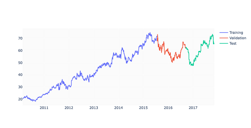
Crafting a dataset the code splits an existing dataset into three segments: training, validation, and test. The dimensions of the test set and validation set are dictated by the test_size and valid_size variables. The dataset is severed at a certain index based on the size of the dataset multiplied by the test size or validation size. The training set encompasses all data up to the validation split index, the validation set contains data between the validation split index and the test split index, and the test set holds all the data after the test split index. Lastly a plot is fashioned using three distinct Scatter objects one for each dataset and then displayed.
Fine Tune
%%time

parameters = {
    'n_estimators': [100, 200, 300, 400],
    'learning_rate': [0.001, 0.005, 0.01, 0.05],
    'max_depth': [8, 10, 12, 15],
    'gamma': [0.001, 0.005, 0.01, 0.02],
    'random_state': [42]
}

eval_set = [(X_train, y_train), (X_valid, y_valid)]
model = xgb.XGBRegressor(eval_set=eval_set, objective='reg:squarederror', verbose=False)
clf = GridSearchCV(model, parameters)

clf.fit(X_train, y_train)

print(f'Best params: {clf.best_params_}')
print(f'Best validation score = {clf.best_score_}')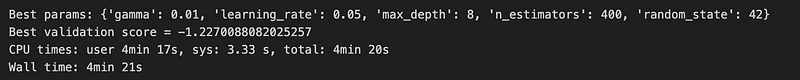
Constructing a dictionary of parameters for a machine learning model the code sets up an evaluation set creates a model using the XGBRegressor class and then employs GridSearchCV to discern the best combination of parameters for the model. It then outputs the best parameters and the best validation score for the model.
plot_importance(model);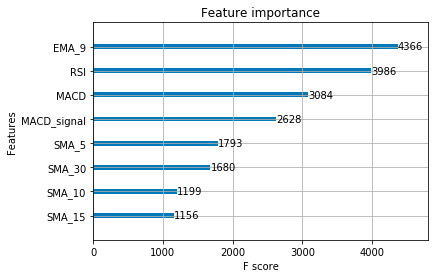
We plot the importance of different features in a model.
Calculate and Visualise Predictions
y_pred = model.predict(X_test)
print(f'y_true = {np.array(y_test)[:5]}')
print(f'y_pred = {y_pred[:5]}')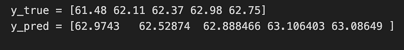
In this code we use a trained model to predict outcomes for a given set of data. It then prints the first 5 actual outcomes from the test data and the first 5 predicted outcome.
predicted_prices = df.loc[test_split_idx+1:].copy()
predicted_prices['Close'] = y_pred

fig = make_subplots(rows=2, cols=1)
fig.add_trace(go.Scatter(x=df.Date, y=df.Close,
                         name='Truth',
                         marker_color='LightSkyBlue'), row=1, col=1)

fig.add_trace(go.Scatter(x=predicted_prices.Date,
                         y=predicted_prices.Close,
                         name='Prediction',
                         marker_color='MediumPurple'), row=1, col=1)

fig.add_trace(go.Scatter(x=predicted_prices.Date,
                         y=y_test,
                         name='Truth',
                         marker_color='LightSkyBlue',
                         showlegend=False), row=2, col=1)

fig.add_trace(go.Scatter(x=predicted_prices.Date,
                         y=y_pred,
                         name='Prediction',
                         marker_color='MediumPurple',
                         showlegend=False), row=2, col=1)

fig.show()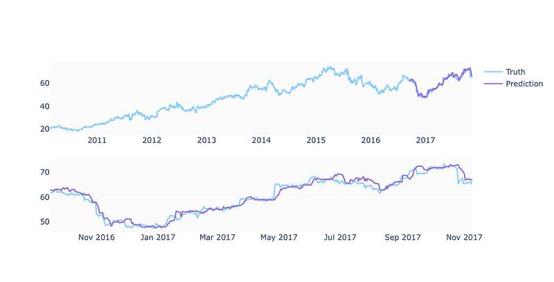
Here are our final predictions.
And this is how we can forecast stock using xgboost.


