Predicting stocks: Not a trivial matter!
Surely, you have probably seen a lot of tutorials on using Time Series Analysis to predict the stock market. In reality, even field experts often have trouble making accurate predictions. The natural question that should come to your mind is “why is it so hard to predict stocks?”. As a little exercise, I decided to put to test my knowledge on Time Series Analysis and attempted to build a prediction model for stocks closing prices of a certain company, call it X (for legal reasons), based on three months of historical data. What were the results? Let’s explore together!
Loading the packages
Let’s first load the packages that we will need for this tutorial:
Note that I have used a particular package called ggtheme .This allows personalizing ggplot plots with different backgrounds and the like. Here, I have used the custom theme theme_stonks , but you could use something else!
The data
Let’s first take a look at the data in R (which you can download here); you will have to change the PATH according to your download location:
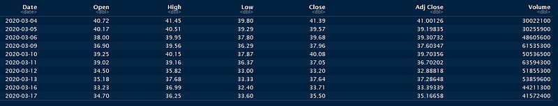
The picture above shows the output you should see. For this tutorial, we will only work with the Datecolumn and Close prices column (you could try on your own with the Adj Close one instead!).
Preprocessing the data
We will now extract the columns of interest, as well as convert them to appropriate time series objects; in this case, xts objects from the xts package.
Note that first, we convert the Date column to a POSIXct format, as this is required by the xts constructor.
Inspecting the data
Let’s now inspect the data by plotting the points using the autoplot function:
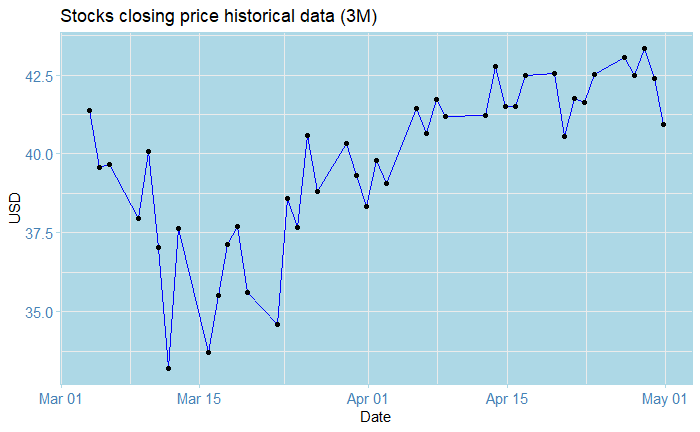
The plot above shows the closing price for the stocks of company X from Mars 03 to May 01, weekly Monday-to-Friday data. What do we see? Perhaps that it goes a little bit like crazy, initially starting at around 41.30$ on Mars 04, and dropping to a disastrous ~ 33.0$ on Mars 14. After this, we notice a recovery, but nonetheless volatility almost every day. On May 01, we see a drop of roughly 2.5$ in price. So what can we conclude from all of this? Well… not much, really. Knowing all of this gives us some cues, but it doesn’t really help us see into the future!
Let’s now inspect the ACF and PACF to check for stationarity:
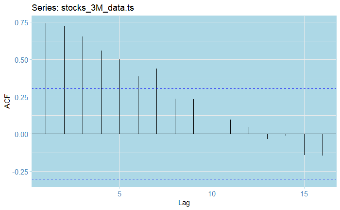
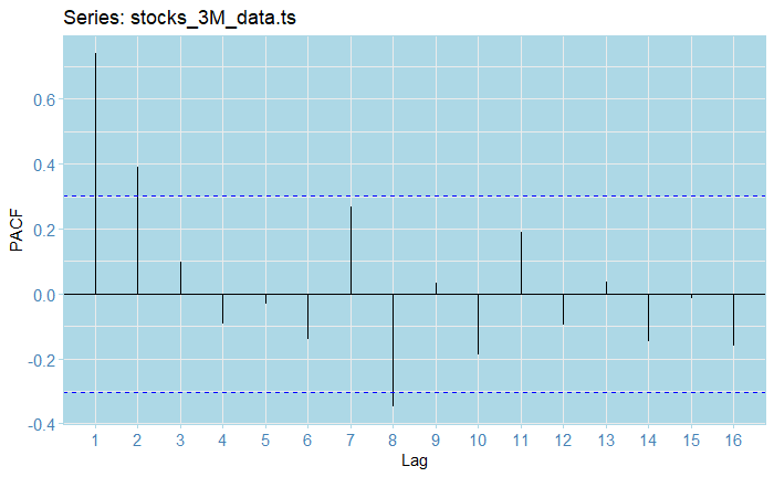
From the ACF plot, we see that our raw series is clearly not stationary, as almost half of the lags fall out of the confidence bounds. As for the PAC, the first volatility and somehow exponential decreasing (in absolute value) seem to indicate some kind of AR model might seem appropriate.
Estimating the trend
Of course, the first most obvious step is to fit some models for the trend.We will now estimate and plot a bunch of different trends for our data:
Let’s see what happened here: the tslm function allows us to fit linear models to ts objects (which is why we cast from xts ! ). We fit a linear and an order-5 polynomial trend, along with an order-5 moving average. We then stack all the trends in a data frame and plot them all together using the forecast::autoplot() and geom_line() functions. The scale_color_manual() function allows us to create appropriate labels with colours for each fitted trend.
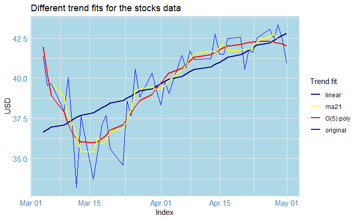
Note that our plots all of this look very pretty, its intention is not to gives us predictions, but rather, to help us create a process without the trend; otherwise, the analysis becomes much harder than it already is. In this case, I decided to use the order-five polynomial in this example, although you could try something else. We subtract the estimated trend from the original data and inspect the residuals, along with their ACF and PACF plots.
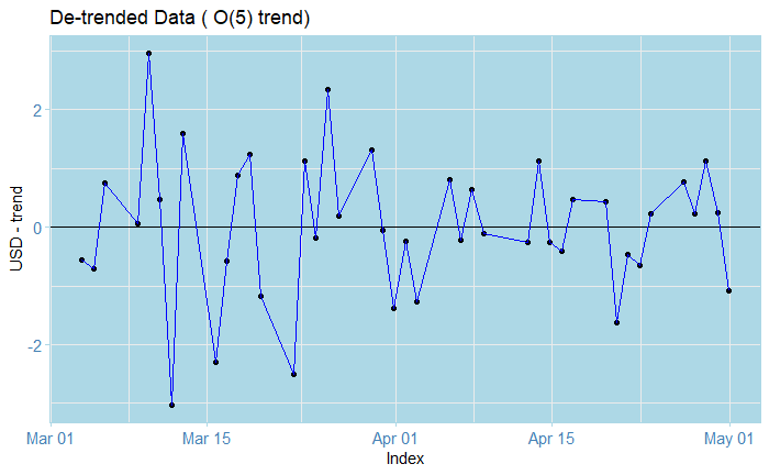
The residuals look zero-trended.
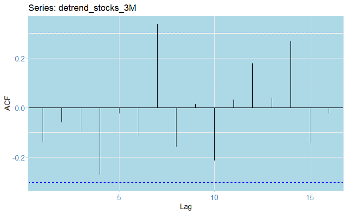
The ACF lags all, except for one fall within the 0.25 confidence bounds.
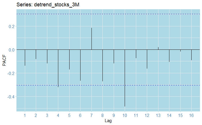
The PACF residuals mostly fall within the confidence bounds; whoever there seems to be some negative autocorrelation present across lags. However, from all the previous, there doesn't seem to be a strong seasonal component present.
Train-test split
We will now split the data into 32 training data points and 10 test data points. We will produce predictions and compare them to assess fit. We also check the resulting objects formats to make sure everything is in order.
Fitting an ARIMA model
Next step is fitting an ARIMA (or SARIMA) model: we use the auto_arima() function, allowing for seasonal search, with a maximum differencing order of d=2, with a selection based on AIC, AICc, and BIC.
We obtain an ARIMA(1,1,0) as our best model, that is, a model to which applying differencing once would yield an AR(1) process. We can inspect this model and check the estimated coefficients, log-likelihood, and information criteria:
Inspecting the residuals
So, how good is our model? We can use the checkresiduals function to obtain a plot of the residuals, the ACF, distribution, and a Ljung-Box test output as well.
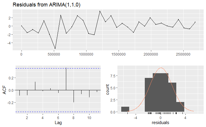
We can observe from the residuals that although the process seems to be somehow mean-zero, there is a point in which it totally goes off. You could also argue that all of the lags fall within the confidence bounds, and the data looks somehow normal (given that we don’t have that much data to start with). Indeed, all of these seem to indicate that there is a major outlier. We will ignore this. The Ljung-Box test has a huge value, which indicates strongly non-stationarity. However, this is common when fitting ARIMA models; especially since for instance, we have an ARIMA(1,1,0), which indicates that differencing would indeed create stationarity. The right tests to use are the Augmented Dickey-Fuller test, whose null hypothesis is non-stationarity, and the KPSS test, whose null defines stationarity.
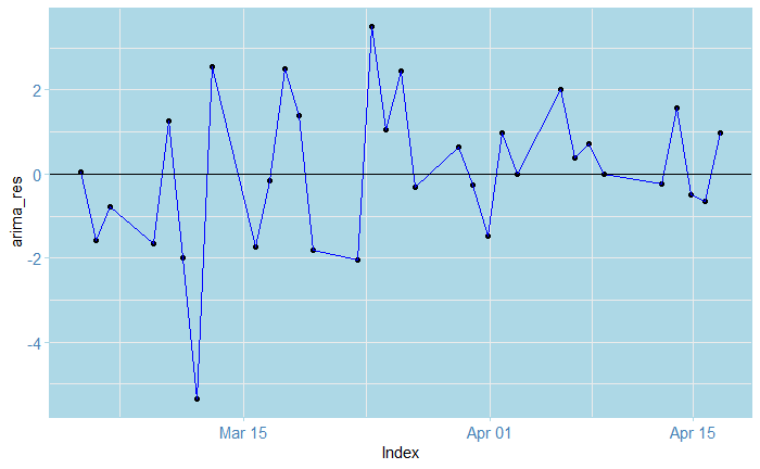
So here, we reject for the DFS test, and fail to reject for the KPSS. This indicates that the process would indeed be stationary. Note that we difference the series first! We can also check the other residuals (using only the train-data dates!):
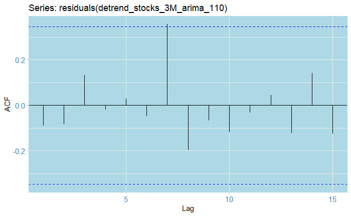
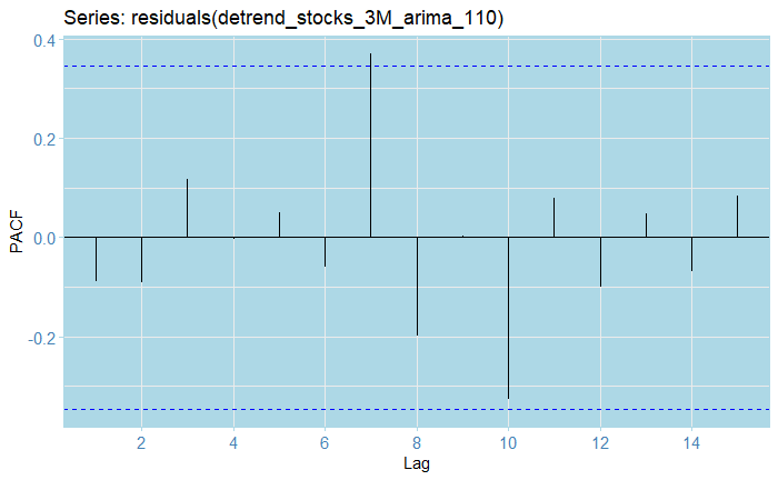
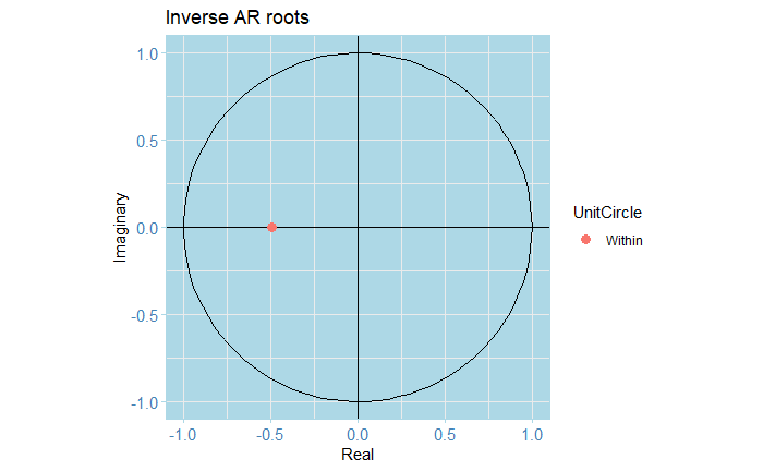
In particular, inspecting the inverse roots of the AR(1) polynomial guarantees the process is stationary and causal, and of course, it is also invertible.
Forecasting
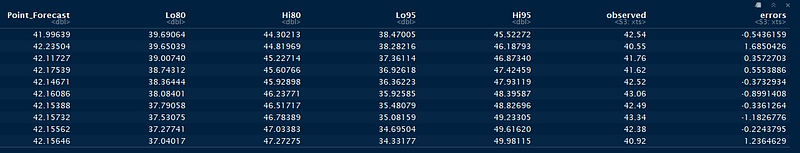
Let’s now produce a table with the point forecast values along with the errors and confidence intervals for predictions
Next, we extract the values as plain vectors for plotting: we paste this to a bunch of `NA` values to be able to plot altogether.
If we plot just the forecasts directly, we obtain the following
But wait, what happened with the scale! Somehow, the xts and ts objects are not entirely compatible, so this happens. We can, however, correct this manually as follows:
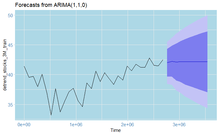
Which produces
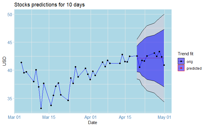
And that’s the cool plot you saw at the beginning of the article!
For this exercise, I originally had 42 data points (that is, weekdays data for 3 months, I leave the math to you), from which I used 32 for training and 10 for testing. The results after adjusting the trend are shown by the graph above; the squiggly lines represent the original data points, while the almost straight line at the end represents the predictions from the model. They look pretty close to the real ones eh? Here’s the catch: notice the blue area and the bigger area around it? these are 80% and 95% confidence bounds respectively. This is saying: 80% and 95% of the time, respectively, the real value, as opposed to our predictions, will fall inside that interval. In this case, these are huge!!! In particular, the farther we predict into the future, the wider they become. Notice, for instance, the one for May 01: the lowest value of the 95% lower bound is roughly 34$, while the biggest one is 15$. In a real-world situation, this prediction is absolutely flawed and disastrous; this is as good as guessing by eye what tomorrow’s value will be! (or even worse). The truth is, even domain professionals often have a hard time doing these kinds of predictions. This shows just how hard it is to predict the stock market.
Disclaimer
Although this exercise was based on very real data, recent as to May 06, 2020, this is no more than an educational toy exercise and does not represent in any way a professional analysis or opinion. I don’t recommend doing this kind of analysis on your own, and I am not liable in any way, as by reading these tutorials you accept that it is your own responsibility for whatever happens if you do decide to use them for that purpose. If you wish to invest in the stock market, you should seek advice from a professional in the field!

Last words
Make sure to check out my tutorial series “A Complete Introduction to Time Series Analysis (with R)”, which are based on a full-book that I am currently writing at the moment. Also, you can find the full code and data for this tutorial here .Stay tuned, and happy learning!
Follow me at
Copyright