HOE-HUMDINGERS
I Harvested 10 Lessons When I Weeded My Portfolio Garden
Stuff freelancers can have for dinner, and marketers, too
I’m a freelance illustrator, so naturally I’ve got a portfolio. Actually I’ve got three portfolios: a simple 14-piece portfolio on Facebook, what they call “work samples” on LinkedIn, and a long column of samples that runs down the righthand side of my homepage.
If I’m talking to a new prospect, I send them to my FB portfolio because it’s the simplest. They can evaluate my style at a glance and decide if I’m the guy they want to work with.
Confession: once I set up a portfolio, I tend to forget it. It just sits there gathering dust. I forget to weed outdated work and replace it with new work. Not good.
(Side note: there’s always a great temptation to include too many samples in your portfolio. That’s another good reason to weed the same.)
Recently, I deleted six pieces and replaced them with newer work. I was ruthless, but I did stop to reminisce about each assignment. I realized I learned something from each. They were valuable lessons, so here they are, along with each deleted illustration.
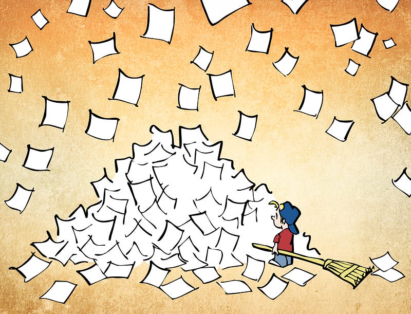
- A holiday card for The Losey Carleton Group in Concord, NH, a division of RBC Dain (financial advisors). They sent it to all their clients.
Infographics can be funny and entertaining. They can even become part of one’s brand. (RBC’s client reports use lots of pie charts and bar graphs to convey complex financial information.)
By using a funny infographic for their Seasons Greetings to clients, they were poking a little fun at themselves (which always makes a good impression), and on some level they were also reinforcing their brand.
Something else that jumps out for me here: infographics work best when you keep them very simple. It’s always tempting to squeeze too much information into an infographic. That’s a mistake. Infographics are suppose to simplify information, not compound it.
2. A header image for my X (formerly Twitter) profile page.
The first thing you might be saying to yourself is: Why didn’t you use that extra space on the right for something?
Or maybe: The image is little out of balance. Why didn’t you move the house and the moon and the mountain a little more to the right? It would have helped the white text stand out better.
It’s because header images display differently on different devices. That “empty” righthand side would be cropped out on a mobile phone.
I did some research before I designed the header. I was glad I did. The header required specific dimensions, and, as noted, certain areas aren’t visible on some devices.
Header images are part of your brand. You need to make sure they’re going to inspire confidence and make a good impression.
Any project is a chance to demonstrate your expertise. So I wrote a how-to post after creating my header. It’s a little dated, but I think I come across as someone who does his homework.
3. For Partner Channel Magazine (now part of Dynamic Communities).
The author began by asking this question: How do you get inside of people’s heads to get them to buy from you?
He answered the question by explaining Dr. Robert Cialdini’s “principles of persuasion,” the psychological triggers that influence the way people buy and behave.
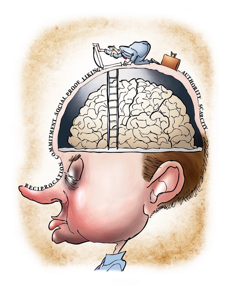
Every assignment is a chance to expand your skill set. I created this image in Photoshop. Previous to this assignment, I had never applied text to a path. I learned how to do it to create the effect you see above.
It was also my first exposure to “sales triggers.” Learning about them gave me a much better grasp of marketing principles.
4. An editorial illustration for an article about the state of Connecticut mandating recycling for all types of batteries. That’s former Governor Dan Malloy as the Energizer Bunny, leading the parade. You can read more about the assignment here.
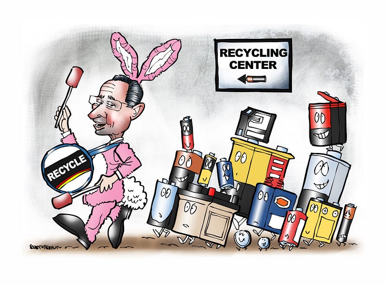
I had fun with this assignment, but for me, it’s a reminder that you can’t do better than the market you serve.
What does that mean, exactly?
This was one of several assignments for a business magazine. They all required a lot of time and research, and I had very little artistic freedom. The editor usually had a very specific idea in mind. This particular drawing (my own idea) was the lone exception.
All for very little pay.
It was a mistake I think every freelancer makes at some point. You simply cannot undervalue your work by accepting assignments which pay less than your work is worth. By doing so, you will attract similar clients and be trapped in a vicious cycle.
You cannot get the clients you want, if you accept work from clients you do not want.
5. A header image for a guest post I wrote on how freelancers need to be proactive. I also published it on Medium and you can read it here.
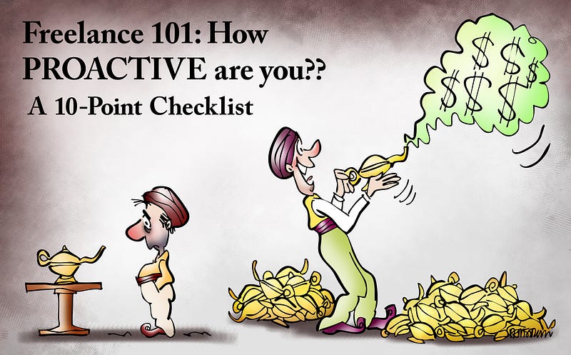
Every freelance creative has to be a businessperson.
You have to embrace that side of it, because unless you’re a superstar with an agent or have clients beating down your door, you have to market yourself. You have to be proactive about pitching projects and seeking new clients.
What does being proactive mean? Writing the guest post forced me to think about that and identify specific behaviors. That’s an invaluable lesson for anyone.
6. This one was originally created as a fun birthday tribute, then recycled for a post about using illustrated quotes to boost your brand.
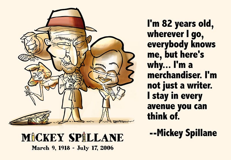
Mickey Spillane is best remembered (if he’s remembered at all today) for his hardboiled detective novels featuring private eye Mike Hammer. His books are dated now. Not surprising, since his first came out in 1947.
He died in 2006, but he was ahead of his time. He knew any creative has to stay visible. Back in the 1970’s and 80’s he made a series of very funny TV commercials for Miller Lite Beer. He would have excelled at today’s social media marketing.
Summing Up
1. Keep your infographics simple.
2. Don’t be afraid to poke a little fun at yourself (like the financial advisors who put a funny pie chart on their holiday card).
3. Images display differently on different devices. Know what image sizes work best on different social media platforms.
4. Header images are part of your brand. Make sure they’re sending the right message.
5. Never miss a chance to demonstrate your expertise.
6. Every assignment is a chance to learn something new.
7. A freelancer can’t do better than the market they serve. You can’t get the clients you want if you accept work from clients you do not want.
8. Freelancers need to market themselves. You have to be proactive about pitching projects and seeking new clients.
9. Never miss an opportunity to repurpose your work.
10. Being a “starving artist” is a conceit. Creatives need to be merchandisers. The whole idea is to make a living doing what you like to do.
Mark Armstrong is an illustrator. He writes about marketing, branding, and communication. He also writes humor pieces. Learn more at Mark Armstrong Illustration.