

Poor color choices that discriminate the part of your audience
Incremental Improvements #15: Color-blind-friendly palette
Have you ever wondered if the visualization that you’ve created was understandable? If the chart you’ve chosen delivered the right message? Or if the data told the story you want? As you are reading this article, I assume that you did.
However, have you ever checked if the colors that you’ve used are understandable for everyone? You might think that red is red, end of the story. Well, unfortunately, it’s not that simple and color perception depends on the cone cells present in our eyes. If you lack some cone types, then you might have some trouble distinguishing certain colors (if you are interested in more technicalities I recommend this site).
So using some colors together on a scale discriminates against some of your audience. And this is not as uncommon as we might think. Up to 8% of men and 1% of women are struggling with some form of color vision deficiency, which means that worldwide, there are approximately 300 million people that might have trouble when reading our charts.
Luckily, changing to a color-blind-friendly palette is very easy. We can just use the one that is already created by ColorBrewer or we can check how our palette will be perceived using Color Blind Vision Simulator (and adjust if needed).
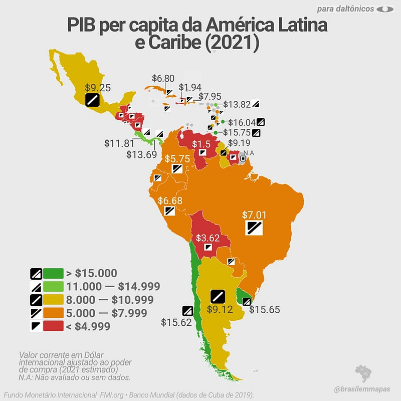
This week's example is a chart that shows GDP per country in Latin America and the Caribbean — to be more precise, a special version created especially for color-blind people. This “color-blind-friendly” chart adds supplementary encoding of the data by assigning not only the color but also the icon.
So what is wrong with this chart beside the fact that icons are rather inconsistent and random, and I admire anyone able to properly identify the icon of each of the Caribbean countries?
Original dataviz by Brasilemmapas
Good data visualization solutions✔️
Elements that work in this chart
- Showing overview and details — By showing both colors and labels it’s possible to analyze the map on two levels — general and detailed one. We can get the overview by scanning the map or analyze it more thoroughly by reading the labels. I would just rethink the number of digital points provided to avoid obscuring the data.
Bad data visualization choices❌
Elements that don’t work in this chart
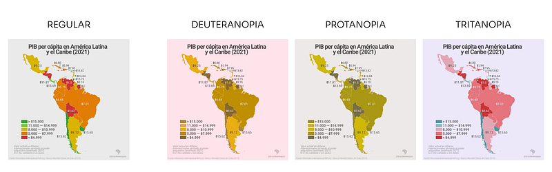
- Palette choice — that uses colors combination that is not properly distinguishable by people with decreased ability to see the color. For people with the absence/defect of red or green receptors (respectively deuteranopia/deuteranomaly or protanopia/protanomaly) the red and green look almost the same, so pairing them together is not a good idea. In the picture below there is a simulation of how the chart is perceived by people with different color vision deficiencies. Another argument against the green-yellow-red combination is that it gives the feeling of a diverging palette rather than a sequential one, which suggests that the value assigned to the yellow color is a meaningful middle point.
- Junk double-encoding — Because the palette is not color-blind friendly there is a need for additional encoding of the categories so the lowest values (encoded with red) are distinguishable from the highest values (encoded with green). This only overcomplicates the charts and can be avoided by changing the palette.
- Grey background — The biggest problem with using the other background color than white is lowering the contrast between the background and the data.
How to make this data visualization better❔
Step-by-step improvements

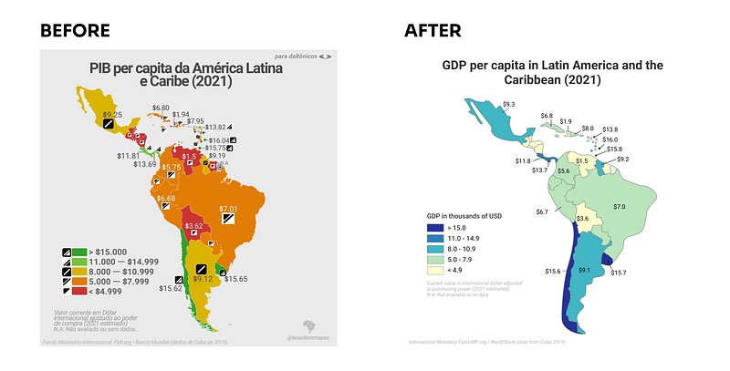
- Remove symbols — which are obscuring the chart and use only the color for encoding the data. Btw, have you noticed that the symbol choice was rather random and therefore meaningless?
- Switch to the inclusive palette — that is not only properly perceived by almost everyone but also it sends the proper message about the data that the categories are ordered from smaller (lighter color) to higher (darker color). Because the contrast between yellow (the lowest category) and white (our background) is very low I added a grey border around each country.
- Simplify and unify the numbers — In the original chart, the format of the numbers used in the labels was different than the format of the numbers in the legend. One of the labels (GDP for Mexico) was equal to $9.25, which suggests that is slightly more than 9 dollars, while in fact, it was more than 9 thousand dollars. To avoid this confusion I simplified the number format and kept it in thousands of dollars in both the legend and the labels.
What do you think about these changes? Would you improve something else? If you have some suggestions for the next makeover feel free to drop them in the comments.
Links
- Orginal chart: GDP per capita in Latin America and the Caribbean @ brasilemmapas Instagram
- Tool to create a color-blind-friendly palette: ColorBrewer
- Other resources: Color Blind Vision Simulator, Colblindor
About Incremental Improvements
This is a series dedicated to small changes that can be done in order to make a visual design better. In each post, I analyze the data visualization to see what works, what doesn’t, and what to do to improve it.
You can find the list of all previous makeovers here


