
Plotting the Learning Curve with a Single Line of Code
To see how much your model benefits from adding more training data

The Learning Curve is another great tool to have in any data scientist’s toolbox. It is a visualization technique that can be to see how much our model benefits from adding more training data. It shows the relationship between the training score and the test score for a machine learning model with a varying number of training samples. Generally, the cross-validation procedure is taken into effect when plotting the learning curve.
A good ML model fits the training data very well and is generalizable to new input data as well. Sometimes, an ML model may require more training instances in order to generalize to new input data. Adding more training data will sometimes benefit the model to generalize, but not always! We can decide whether to add more training data to build a more generalizable model by looking at its learning curve.
Plotting the learning curve typically requires writing many lines of code and consumes more time. But, thanks to the Python Yellowbrick library, things are much easy now! By using it properly, we can plot the learning curve with just a single line of code! In this article, we will discuss how to plot the learning curve with Yellowbrick and learn how to interpret it.
Prerequisites
To get the most out of today’s content, it is recommended to read the “Using k-fold cross-validation for evaluating a model’s performance” section of my k-fold cross-validation explained in plain English article.
In addition to that, having knowledge of Support Vector Machines and Random Forests algorithms is preferred. This is because, today, we plot the learning curve based on those algorithms. If you’re not familiar with them, just read the following contents written by me.
Installing Yellowbrick
Yellowbrick doesn’t come with the default Anaconda installer. You need to manually install it. To install it, open your Anaconda prompt and just run the following command.
pip install yellowbrickIf that didn’t work for you, try the following with the user tag.
pip install yellowbrick --useror you can also try it with the conda-forge channel.
conda install -c conda-forge yellowbrickor try it with the DistrictDataLabs channel.
conda install -c districtdatalabs yellowbrickAny of the above methods will install the latest version of Yellowbrick.
Plotting the learning curve
Now, consider the following example codes where we plot the learning curve of an SVM and a Random Forest Classifier using the Scikit-learn built-in breast cancer dataset. That dataset has 30 features and 569 training samples. Let’s see adding more data will benefit the SVM and Random Forest models to generalize to new input data.
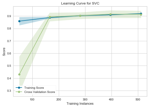
Learning curve — SVM
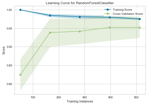
Learning curve — Random Forest Classifier
Interpretation
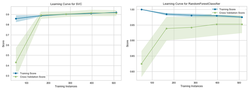
In the above graphs, the accuracy score of the train set is marked as the “Training Score” and the accuracy score of the test set is marked as the “Cross-Validation Score”. Until about 175 training instances, the training score of the SVC (Support Vector Classifier) model (graph at left) is much greater than the test score. Therefore, if your current dataset has much less than 175 training instances (e.g. around 100), adding more training instances will increase generalization. But, after the 175 level, the model will probably not benefit much from adding more training data. For the Random Forest Classifier (graph at right), we can see that the training and test scores have not yet converged, so potentially this model would benefit from adding more training data (e.g. around 700–1000 training instances).
How it works!
When we execute the learning_curve() function, a lot of work happens behind the scenes. We only need to run a single line of code to plot the learning curve. That’s the power of Yellowbrick! The first argument of the learning_curve() function should be a Scikit-learn estimator (here it is an SVM or a Random Forest Classifier). The second and third ones should be X (feature matrix) and y (target vector). The “cv” defines the number of folds for the cross-validation. Standard values are 3, 5, and 10 (here it is 10). The scoring argument contains the method of scoring of the model. In classification, “accuracy” and “roc_auc” are most preferred. In regression, “r2” and “neg_mean_squared_error” are commonly used. In addition to those, there are many evaluation metrics. You can find all of them by visiting this link.
When we execute the learning_curve() function, the cross-validation procedure happens behind the scenes. Because of this, we just input X and y. We don’t need to split the dataset as X_train, y_train, X_test, y_test. In cross-validation, the splitting is done internally based on the number of folds specified in cv. Using cross-validation here guarantees that the accuracy score of the model isn’t much affected by the random data splitting process. If you just use the train_test_split() function without cross-validation, the accuracy score will vary significantly based on the random_state you provide inside the train_test_split() function. Here in cross-validation, the accuracy is calculated using the average of 10 (cv=10) such iterations!
Key takeaways
The learning curve is a great tool that you should have in your machine learning toolkit. It can be used to see how much your model benefits from adding more training data. Sometimes, adding more data will benefit the model to generalize to new input data. Generally, the cross-validation procedure is taken into effect when plotting the learning curve to avoid the effect of the random data splitting process.
The learning curve should not be confused with the validation curve which is used to plot the influence of a single hyperparameter. The functionalities of both curves are totally different. If you’re interested to learn more about the validation curve, you may read my “Validation Curve Explained — Plot the influence of a single hyperparameter” article.
Thanks for reading!
This tutorial was designed and created by Rukshan Pramoditha, the Author of Data Science 365 Blog.
Read my other articles at https://rukshanpramoditha.medium.com
2021–04–26


