
Plotting live data with Matplotlib
How to visualize real-time data with Python’s Matplotlib
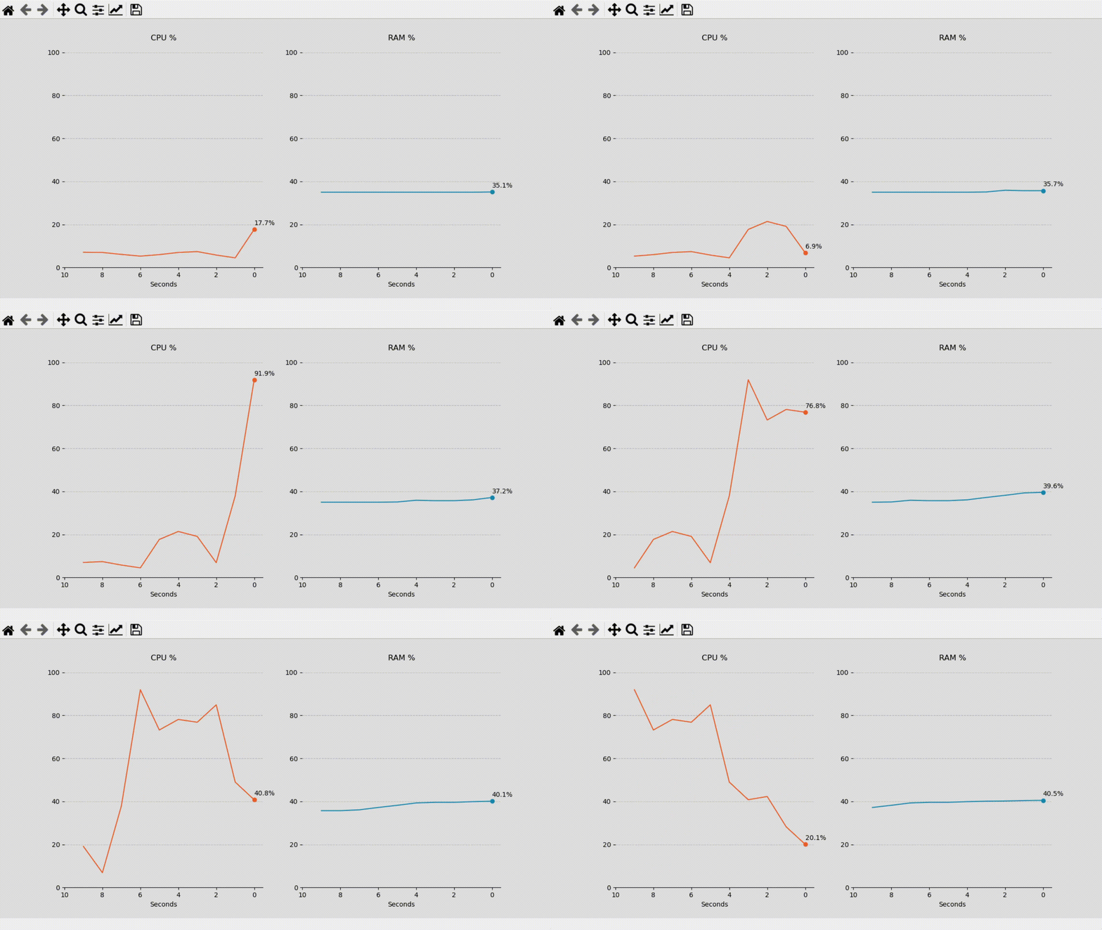
Whether you’re working with a sensor, continually pulling data from an API, or have a file that’s often updated, you may want to analyze your data in real-time.

This article will explore a simple way to use functions to animate our plots with Matplotlib’s FuncAnimation.
The data for this first example is from the OS, and to retrieve this information, we’ll use psutil.
pip install psutilWe’ll handle the data with deques, but you can adapt the example to work with most collections, like dictionaries, data frames, lists, or others.
By the end of the article, I’ll quickly show another example with Pandas and Geopandas.
import matplotlib.pyplot as plt
import numpy as np
from matplotlib.animation import FuncAnimation
import psutil
import collections
Let’s start with collecting and storing the data. We’ll define two deques filled with zeros.
cpu = collections.deque(np.zeros(10))
ram = collections.deque(np.zeros(10))print("CPU: {}".format(cpu))
print("Memory: {}".format(ram))
Then we’ll create a function to update the deques with new data. It’ll remove the last value of each deque and append a new one.
def my_function():
    cpu.popleft()
cpu.append(psutil.cpu_percent(interval=1)) ram.popleft()
ram.append(psutil.virtual_memory().percent)cpu = collections.deque(np.zeros(10))
ram = collections.deque(np.zeros(10))# test
my_function()
my_function()
my_function()print("CPU: {}".format(cpu))
print("Memory: {}".format(ram))
Now we can define the figure and subplots. Besides updating the deques, our function will also need to add this data to our chart.
# function to update the data
def my_function():
cpu.popleft()
cpu.append(psutil.cpu_percent(interval=1))
ax.plot(cpu) ram.popleft()
ram.append(psutil.virtual_memory().percent)
ax1.plot(ram)# start collections with zeros
cpu = collections.deque(np.zeros(10))
ram = collections.deque(np.zeros(10))# define and adjust figure
fig = plt.figure(figsize=(12,6), facecolor='#DEDEDE')ax = plt.subplot(121)
ax1 = plt.subplot(122)ax.set_facecolor('#DEDEDE')
ax1.set_facecolor('#DEDEDE')# test
my_function()
plt.show()
When we add FuncAnimation, it’ll repeatedly call our function to refresh the chart.
But when we use .plot() multiple times on the same axis, it won’t update the line but rather plot new ones.
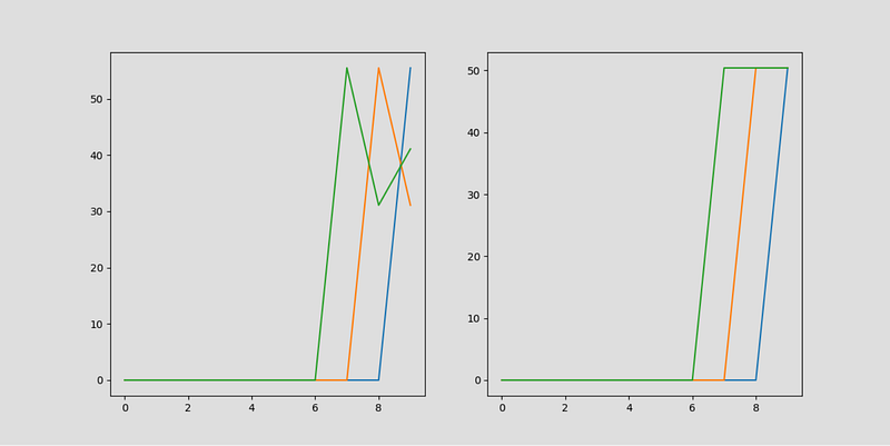
It’s hard to append to a line that’s already plotted, and other types of visualization like maps, bars, and pie charts, can be even more challenging to update.
A more straightforward solution is to clear the axis before plotting and draw a new plot at every iteration.
Adding axis.cla() to our function will give us that result.
That way, we don’t need to worry about texts, annotations, or other elements of our chart either. Every time we plot, the axis will reset, and the function will draw everything again.
# function to update the data
def my_function():
# get data
cpu.popleft()
cpu.append(psutil.cpu_percent(interval=1))
    ram.popleft()
ram.append(psutil.virtual_memory().percent) # clear axis
ax.cla()
ax1.cla() # plot cpu
ax.plot(cpu)
ax.scatter(len(cpu)-1, cpu[-1])
ax.text(len(cpu)-1, cpu[-1]+2, "{}%".format(cpu[-1]))
ax.set_ylim(0,100) # plot memory
ax1.plot(ram)
ax1.scatter(len(ram)-1, ram[-1])
ax1.text(len(ram)-1, ram[-1]+2, "{}%".format(ram[-1]))
ax1.set_ylim(0,100)# start collections with zeros
cpu = collections.deque(np.zeros(10))
ram = collections.deque(np.zeros(10))
# define and adjust figure
fig = plt.figure(figsize=(12,6), facecolor='#DEDEDE')
ax = plt.subplot(121)
ax1 = plt.subplot(122)
ax.set_facecolor('#DEDEDE')
ax1.set_facecolor('#DEDEDE')
# test
my_function()
my_function()
my_function()
plt.show()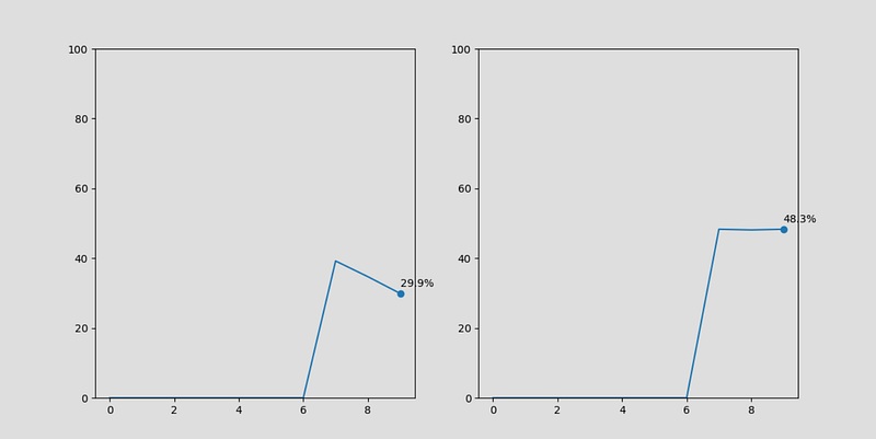
We have everything we need to make our chart come to life.
Now we can add FuncAnimation and pass our figure and function as parameters.
ani = FuncAnimation(fig, my_function, interval=1000)When we defined the figure, we assigned it to a variable called fig.
A different approach would be to skip that and rely on the default figure created by Matplotlib. Replacing the first parameter for plt.gcf(), which will automatically get the current figure for us.
Note that we also set an interval of 1,000 milliseconds at FuncAnimation. We’re not required to put it. By default, it’ll call the function every 200 milliseconds.
Since we already have an interval, we can also remove the one from .cpu_percent().
Without getting into too much detail about psutil, when we don’t set the interval, it will calculate from the last time the function was called — Which means the first value it returns will be zero. After that, it’ll work as before.
Lastly, FuncAnimation will call our function and use frames as the first argument. Since we won’t define any custom values for this parameter, it will work as a counter, passing the iterations count.
The only thing we have to do is make sure our function can receive this argument, even if we’re not using it.
# function to update the data
def my_function(i):
    # get data
    cpu.popleft()
    cpu.append(psutil.cpu_percent())
    ram.popleft()
    ram.append(psutil.virtual_memory().percent)
# clear axis
ax.cla()
ax1.cla() # plot cpu
ax.plot(cpu)
ax.scatter(len(cpu)-1, cpu[-1])
ax.text(len(cpu)-1, cpu[-1]+2, "{}%".format(cpu[-1]))
ax.set_ylim(0,100) # plot memory
ax1.plot(ram)
ax1.scatter(len(ram)-1, ram[-1])
ax1.text(len(ram)-1, ram[-1]+2, "{}%".format(ram[-1]))
ax1.set_ylim(0,100)# start collections with zeros
cpu = collections.deque(np.zeros(10))
ram = collections.deque(np.zeros(10))# define and adjust figure
fig = plt.figure(figsize=(12,6), facecolor='#DEDEDE')
ax = plt.subplot(121)
ax1 = plt.subplot(122)
ax.set_facecolor('#DEDEDE')
ax1.set_facecolor('#DEDEDE')# animate
ani = FuncAnimation(fig, my_function, interval=1000)plt.show()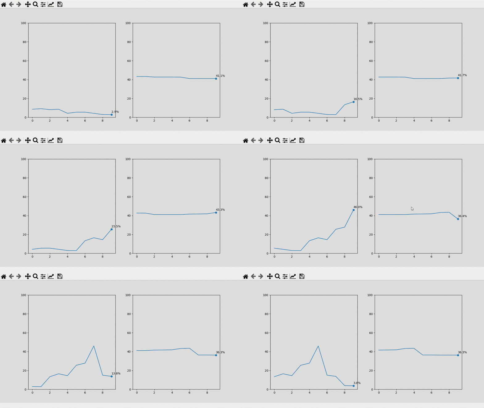
In the next example, we’ll use Pandas and Openpyxl to read an Excel file and Geopandas to plot a map. When we change something in the Excel file and save it, the plot should reflect the difference.
import matplotlib.pyplot as plt
import numpy as np
from matplotlib.animation import FuncAnimation
import pandas as pd
import geopandas as gpd
# function to update the data
def my_function(i):
# get data
try:
df = pd.read_excel('w.xlsx', engine='openpyxl')
except:
print('error reading file') # merge with world map
world_values = world.merge(df, how='right',
on='name', copy=True) # clear axis
ax.cla()
ax1.cla() # plot map
world_values.plot(column='Val', ax=ax1,
cmap='coolwarm_r', edgecolors='black',
linewidths=0.5, alpha=0.8) # remove spines and ticks
ax1.spines['left'].set_visible(False)
ax1.spines['right'].set_visible(False)
ax1.spines['top'].set_visible(False)
ax1.spines['bottom'].set_visible(False) ax1.set_yticks([])
ax1.set_xticks([]) # get records with a value higher than 0.97
alert = world_values[world_values['Val'] > 0.97]
alert = alert.sort_values('Val', ascending=False) # plot bars
ax.bar(alert.name, alert.Val, color='#E9493C', alpha=0.8) # limits, labels, and spines
ax.set_ylim(0.9, 1)
ax.set_xticklabels(alert.name, fontsize=11)
ax.spines['right'].set_visible(False)
ax.spines['top'].set_visible(False)# world map
world = gpd.read_file(gpd.datasets.get_path('naturalearth_lowres'))# define and adjust figure
fig, (ax, ax1) = plt.subplots(2, 1, figsize=(16,12), facecolor='#707576', gridspec_kw={'height_ratios': [1, 3]})ax.set_facecolor('#707576')
ax1.set_facecolor('#707576')# animate
ani = FuncAnimation(fig, my_function, interval=500)fig.tight_layout()
plt.show()
Animations with Matplotlib can appear intimidating, but they’re relatively straightforward.
Different data sources and visualizations may impose unique challenges, but overall the process is the same. You define a function to systematically update your chart and use FuncAnimation to do it repeatedly.
You can find the code for this article here.
I’ve also added another example in this repository for plotting a clock with Matplotlib.
Thanks for reading my article. I hope you enjoyed it.


